30+ Best Outline Fonts
An outline font is a great choice for adding titles and headlines that attract attention. As the name suggests, an outline font features a character design that only consists of outlines without a fill. Whether you're designing a logo, branding, stationery, or a digital design, an outline font can add unique character and a distinct look-and-feel.
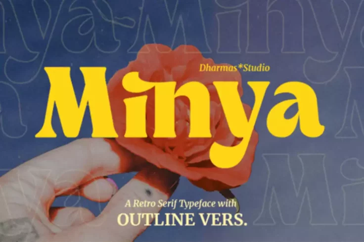
Minya Font
Minya is a beautiful and distinctive font from Fontesk. It has a unique and playful feel to it that makes it perfect for use in branding, logos, websi...
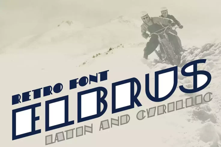
St. Elbrus Outline Font
St. Elbrus is a popular serif typeface that was created by Alexander Shimanov. It is a contemporary, high-contrast typeface with an emphasis on legibi...
Learn About Outline Fonts
How Should I Use Outline Fonts?
Tips and ideas for working with outline fonts in your next design project.
How Do I Add Fonts to Photoshop?
Learn how to add fonts and start working with them quickly.
What Is a Font License?
Learn the ins and outs of what type of font license you need for your project.
Where Can I Find Free Fonts?
Our pick of the greatest free sources for typefaces online.
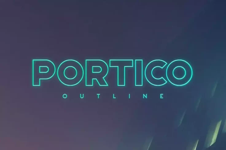
Portico Outline Font
Portico is a popular font choice for outlining in sci-fi, modern, avant-garde, or futuristic design projects. Its bold design makes it ideal for use a...
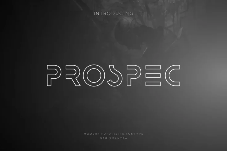
Prospec Font
Prospec is a modern and versatile font that is suitable for a wide range of design projects. The font is an outline style, which means it features a t...
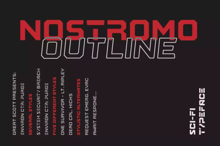
Nostromo Classic Font
Nostromo is a font that captures the futuristic essence of science fiction. Ideal for use by companies in the gaming or technology industries, it supp...
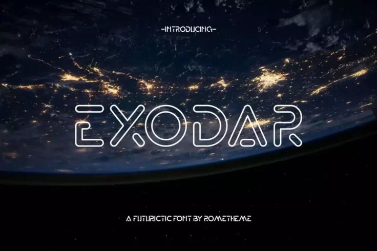
Exodar Space Font
Exodar is a dynamic, futuristic font that uses a thick outline design to create a bold and distinctive shape. Despite its dramatic style, it is also s...
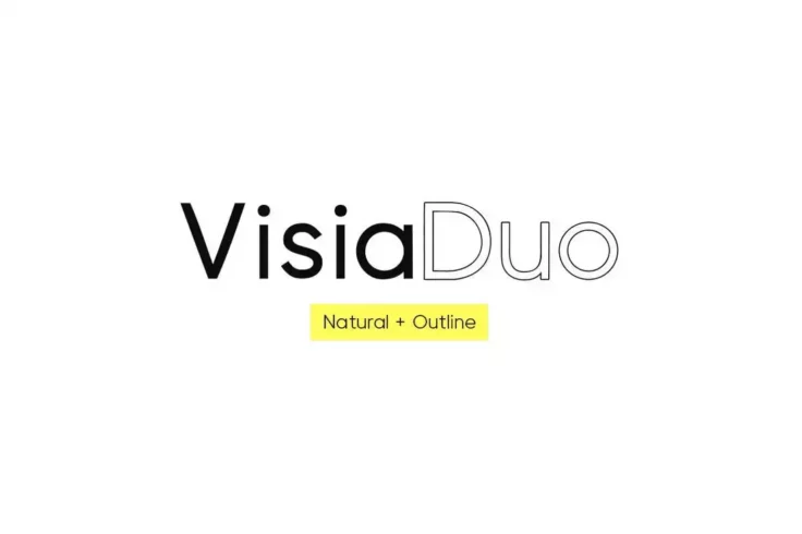
VISIA Duo Geometric Font
Visia Duo is a combination of neo-grotesque fonts that will enhance any project. It boasts clean, minimal lettering, making it ideal for a variety of ...
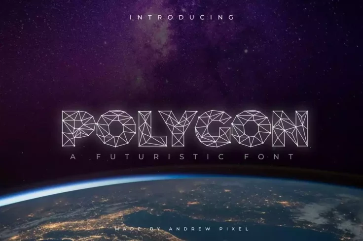
Polygon Technology Font
Polygon is an abstract font that seamlessly blends futuristic elegance with innovation. Its disciplined mesh design, featuring thin lines, creates a d...
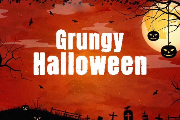
Grungy Halloween Outline Font
Grungy Halloween is a unique, spooky font perfect for adding a touch of horror to your projects. The font has a rough, hand-drawn look with a heavy te...
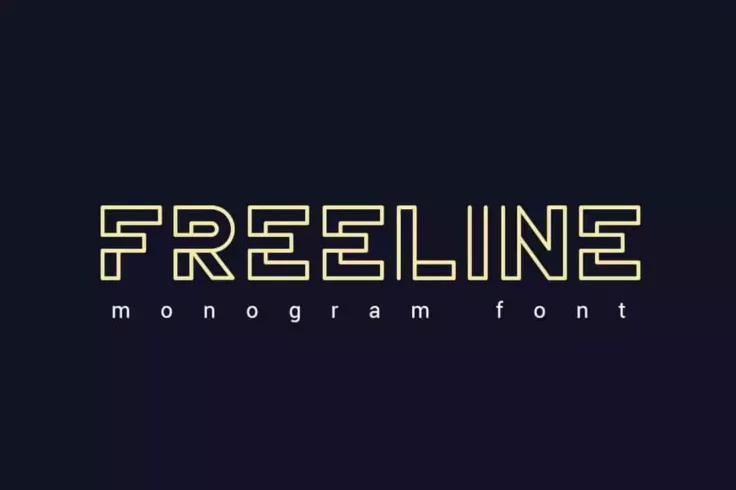
Freeline Monogram Font
The Freeline font is a sleek and modern typeface designed to add a touch of elegance to any project. With its clean and minimalistic design, it is per...
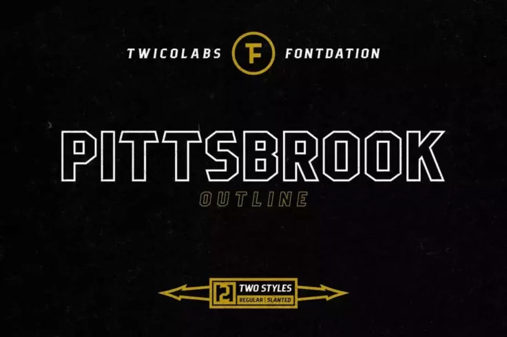
Pittsbrook Outline Font
Pittsbrook is a classic outline font featuring a sharp, and blocky design that is great for creating E-sport logos, liquor/food labels, headlines, mer...

Hikou Font
Hikou is a really cool font that’s perfect for fashion and apparel brands. It’s an outline font, which means it’s great for creating...

Becak Font
Becak is a hand-drawn font that exudes a playful and bold style. Available in two styles (solid and outline), Becak is an ideal choice for creating a ...

Robinson Outline Font
Introducing “Robinson,” a trendy outline font that does a swell job of bringing a retro feel to a modern set of sans-serif characters. Mod...
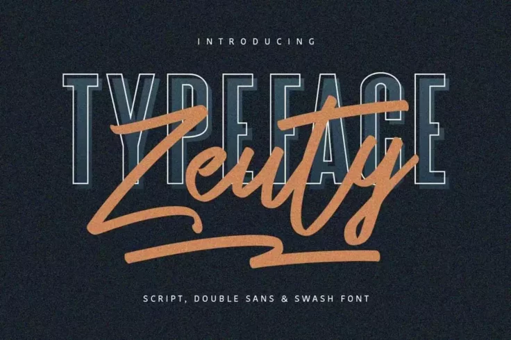
Zeuty Font
The Zeuty collection offers a variety of 4 distinct font styles to enhance your design projects. It includes an outlined font, a script font, a regula...
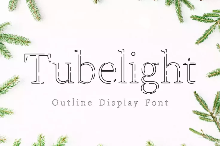
Tubelight Font
Tubelight is a charming, delightful, and remarkable typeface that can be used in your creative projects to add a delicate feel. The font is inspired b...
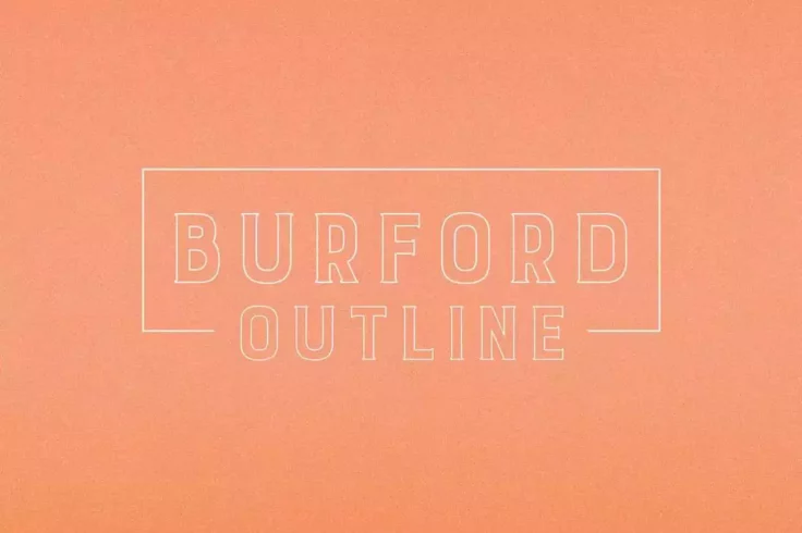
Burford Outline Font
Burford is a font family that was created by a designer who was inspired by the unique typography found throughout Europe. The designer spent hours in...

Playbook Creative Font Family
Playbook is an energetic and hand-drawn outline font that adds a touch of fun to any design. It is perfect for creating playful and eclectic designs. ...

Liorentin Font
Liorentin is a graceful font with delicate lines that gives it a timeless appeal. It can be used for a wide range of designs, from personal projects s...
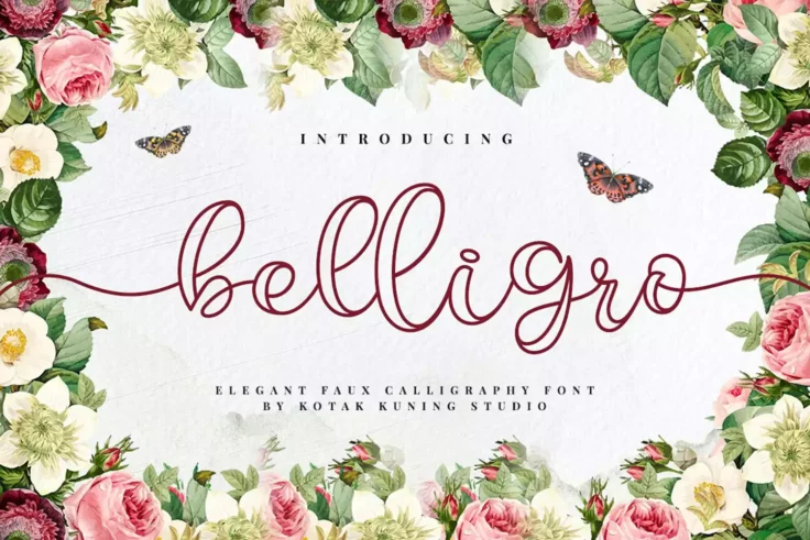
Belligro Outline Family
Belligro is a unique and versatile script font that is perfect for a wide range of projects, from invitations and posters to branding and packaging. T...
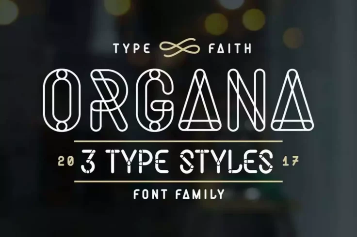
Organa Caps Font Family
Organa is a display font that features a unique, hand-drawn style with a slightly rough edge. The font is characterized by its thick, bold lines and c...
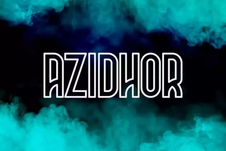
Azidhor Font
The Azidhor font is a unique, all-caps typeface that boasts a distinctive design. Each letter has a creative flair that is sure to grab attention. The...
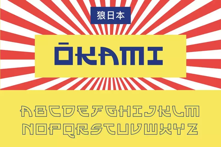
Okami Outline Font
Okami is a modern font that pays homage to Japanese design and culture. It incorporates elements from logo graphic Japanese characters and has a disti...

Legacy Vintage Font
Check out Legacy, a font that blends the typography of the 70s and 80s with a vintage writing style. It offers a clean and traditional aesthetic, maki...

Fuera Duoline Font
Fuera is a dual-line style font having a similar appearance to an outline font. Despite not being an actual outline font, it was too irresistible not ...

Superline Font
SuperLine is a modern display font, created to add a contemporary touch to your design projects. It comes in three distinct styles – regular, li...
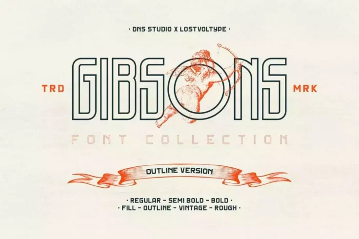
Gibsons Fonts
The Gibsons collection offers a variety of 20 fonts, including regular, semi-bold, and bold versions with 2-3 weights. Each weight comes with 4 unique...

Tuck Shop Font
Tuck Shop is a one-of-a-kind typeface that brings a playful and authentic touch to any project. The hand-drawn design mimics the look of chalk writing...

Decurion Family
Decurion is a highly legible font featuring clean, geometric shapes and sharp edges, giving it a modern and sleek appearance. It is heavily influenced...
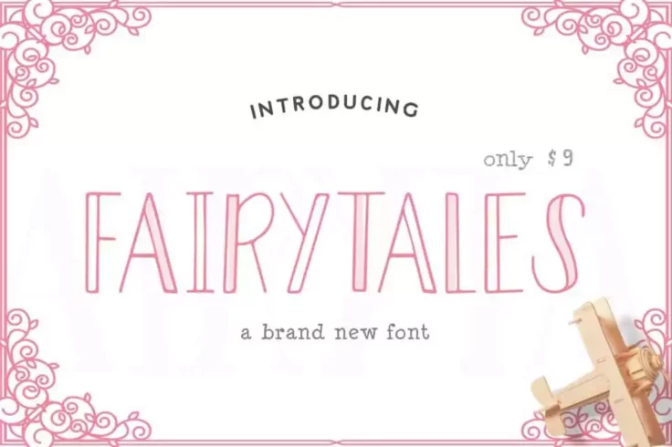
Fairytales Font
Fairytales is a font that features a unique and whimsical design, inspired by classic fairytales and children’s stories. The font includes both ...
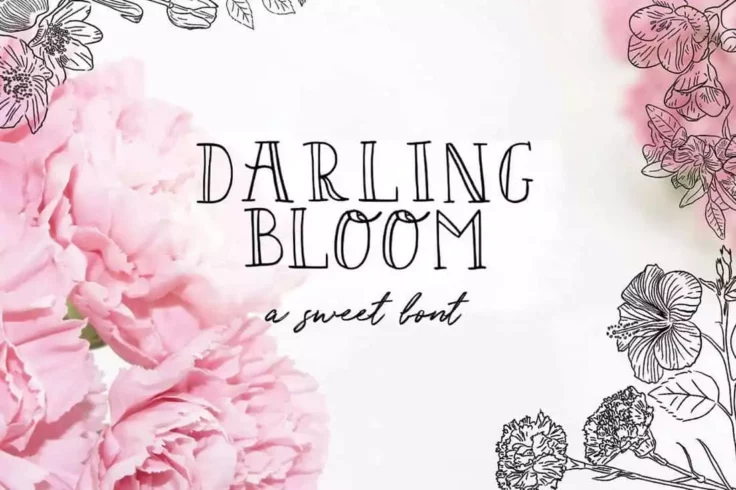
Darling Bloom Feminine Font
Darling Bloom is a stunning hand-drawn serif typeface that exudes a delicate and feminine charm. According to the designer, it is “fabulously fr...
FAQs About Outline Fonts
What are Outline Fonts?
Outline fonts, also known as hollow or line fonts, are typefaces that consist of outlined letterforms without a filled-in body. These fonts create an impression of letters drawn with a single line, as they display just the contours or outlines of the characters, leaving the inner space transparent.
Outline fonts can come in all shapes and sizes, reflecting the wide range of styles seen in solid typefaces. They can be bold or delicate, geometric or organic, modern or traditional. This versatility makes them suitable for various applications, from minimalist designs to more elaborate and decorative ones.
Where are Outline Fonts Typically Used?
Outline fonts are frequently used in situations where a visual impact is desired, or where the text needs to interact interestingly with a background image or color. They're often seen in logos, posters, headlines, or any design where a unique, visually striking text treatment can add to the overall aesthetic.
However, due to their hollow nature, outline fonts may not be the best choice for body text or other instances where high legibility is necessary. These fonts are usually best used sparingly, as accents or focal points within a design.
What is the History of Outline Fonts?
The use of outline fonts can be traced back to the early days of printing, where they were sometimes used for decorative or emphasis purposes. In the digital era, the ability to create and customize outline fonts has increased dramatically, leading to a vast array of outline fonts available for use.
Today, outline fonts are a common tool in the designer's toolbox, offering a simple yet effective way to add visual interest to a design. From bold and impactful to delicate and intricate, outline fonts offer a wide range of aesthetic possibilities.
What Factors Should Be Considered When Using Outline Fonts?
When using outline fonts, designers should consider several factors. The first is legibility: while outline fonts can be visually striking, they can also be challenging to read, particularly at small sizes or in large blocks of text. Using them sparingly, for headers or brief pieces of text, can help mitigate these legibility issues.
Designers should also consider the interaction between the font and its background. The transparent nature of outline fonts means that the background can significantly impact the font's visibility and overall appearance. Designers should carefully consider color, contrast, and pattern choices to ensure that the text remains legible and visually appealing.
Can Outline Fonts Be Paired with Other Types of Fonts?
Yes, outline fonts can be paired effectively with solid fonts to create visual hierarchy and contrast. For example, an outline font could be used for a title or headline, with a solid font used for body text. This approach allows the outline font to provide visual interest and emphasis, while the solid font ensures legibility for longer pieces of text.
As with any font pairing, balance is key. The outline and solid fonts should complement each other and work together to support the overall design. Factors such as size, weight, and style should all be considered when pairing fonts.