20+ Best Groovy 70’s Fonts
Travel back in time with our groovy 70’s fonts. Perfect for vintage designs, music posters, or any project that requires a nostalgic, retro vibe. These fonts capture the free-spirited essence of the 70's era.

Retro Groovy 70s Bubble Font
A fun and creative retro font with a bubbly letter design. It has big and groovy letters that will fit in with any kind of print or digital design. It...

Ramdone 70s Retro Script Font
A true classic script font done in the 70s style. With this font, you can design badges, logos, and signage that will take your customers back in time...

Happy Monday 70s Funky Font
Happy Monday is another classic font that comes with a funky and groovy letter design. It features chunky letters with long swashes that add a beautif...

Regina Modern Vintage 70s Font
Regina is a vintage 70s-style font for your modern designs. It has a clean and stylish letter design that will fit nicely with modern branding, produc...

Forever Dreaming Cute Retro 70s Font
Design cute greeting cards, social media posts, and creative posters using this beautiful retro font. It features 70s-style letters with bubble design...

Horriblys Decorative 70s Funky Font
Horriblys is a handwritten-style retro font that mixes funky 70s letter designs with groovy decorative elements. This font comes with lots of ligature...

Funkies Bold Script 70s Font
Looking for a funky 70s font with a touch of modern design? Then give this font a try. It comes with a beautiful and bold script lettering design mixe...

Retro Brown Vintage 70 Style Font
This font is a great choice for adding a funky and groovy look to your designs. It has casual letters with beautifully flowing retro vibes. The font i...

MUKSTI Bold 70s Style Font
If you want to design a 70s-style title or heading with a subtle and bold design, this font is perfect for you. It comes with a classic letter design ...

Flying Soul Groovy Retro 70s Font
Flying Soul is a beautiful retro font that features psychedelic-style letters with a groovy design. This font is great for various types of print and ...

Weirdtopia Groovy Retro 70s Font
Weirdtopia is another stylish and groovy font that features classic 70s-style lettering. This font will make your title designs, product packaging des...
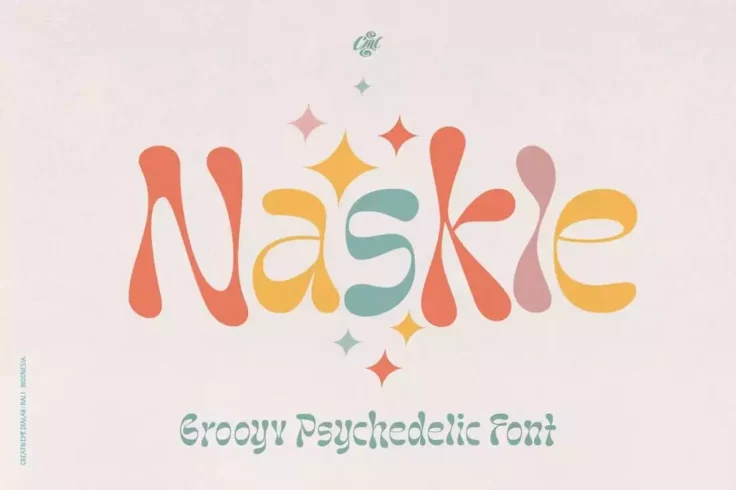
Naskle Groovy 70s Font
Naskle is another classic font that takes inspiration from old-school typography designs. It has a set of psychedelic-style wobbly letters that will m...

Gruvilicious Retro 70s Groovy Font
Gruvilicious is one of the wildest and weirdest fonts on our list. This font has very unique characters with groovy designs. It may not help improve t...
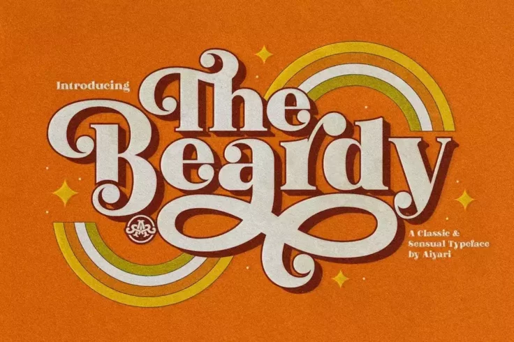
The Beardy Classic 70s Font
The Beardy is a unique 70s-style font that features a bold, classy, and stylish look unlike any other font on our list. It captures the essence of vin...

Retro Vintage Groovy 70s Style Font
You can design groovy signage, logos, and badges with this 70s-style font. It blends design elements from retro and vintage trends to create a classic...

NT Tonight Show Classic 70s Font
This font takes inspiration from the title and signage design from the popular American late-night talk show. It has a wild and creative letter design...

Surreal Psychedelic 70s Font
Surreal is a classic psychedelic font that has a set of unique squiggly letters. It has some unique letters with weird decorative elements. Your desig...

Pasta Retro Serif 70s Font
This retro serif font features a very over-the-top groovy design that will remind you of signage and banner designs from the 70s. It comes in two diff...

Lucidity Psychedelic 70s Font
Lucidity is a neo-psychedelic font inspired by typography designs from the 70s. This font has a wild character design with a groovy vibe. It also come...

The Sooky 70s Groovy Retro Bubble Font
Bubble fonts were a popular choice back in the 70s, especially for designing fun and casual typography designs. This font features a set of characters...

Psychoart Psychedelic 70s Font
This font also comes with a thin and modern design that will add a groovy look to your bold posters, flyers, and social media graphics. It has the per...
FAQs About Groovy 70’s Fonts
What are Groovy 70’s Fonts?
Groovy 70’s fonts are types of typefaces that reflect the design trends of the 1970s era. These fonts are typically characterized by their bold, funky, and often psychedelic designs, much like the fashion and design trends of that decade. Some examples include Brush Script, Cooper, Futura, and Mistral.
The details involved in these fonts like the loops, curves and strokes were very emblematic of the freedom and creativity that was popular during the 70's. They are a very popular choice for graphic design projects aiming to evoke a sense of nostalgia or a retro vibe.
What are some uses of Groovy 70’s Fonts?
Groovy 70’s fonts can be used in a variety of ways, primarily in design and media platforms. They’re a great option for album covers, posters, logos, or even websites aiming for a retro/vintage aesthetic. They’re also an excellent choice for emphasizing titles and headlines in print and digital media.
These fonts are also often used in advertisement campaigns for their dynamic and eye-catching nature. They can also appear in event invitations, fashion brands, and anywhere that wants to impart a dose of playfulness and nostalgia.
How do Groovy 70’s Fonts affect the overall design style?
Groovy 70’s fonts add a distinct character to your designs. They can change the viewer’s perception and draw them in due to their striking and fun designs. These fonts have the effect of transporting viewers back to the 70's, providing your project with an authentic retro impact.
The fonts' vibrant and artistic nature also adds a unique style to the design that is hard to achieve with more conventional fonts. They stimulate visual interests, and can make even a simple design look captivating and original.
How to choose the best Groovy 70’s Font for my project?
Choosing the best Groovy 70’s font for your project depends on a few factors. The first thing you should consider is the message you want to convey. Some 70's fonts are more playful, while others are more structured, so it's important to choose a font that suits your project's tone and content.
Also consider legibility and size. Some 70’s fonts may become hard to read when scaled down. It's also advisable to limit the use of these fonts for key design elements only, as excessive usage can lead to a cluttered and visually overwhelming design.
Can Groovy 70’s Fonts be used in a modern context?
Absolutely. While Groovy 70’s fonts are indicative of a particular era, they can undoubtedly be used in a modern context. Designers often incorporate these fonts into contemporary designs to create a vintage or retro-inspired look, especially in the world of fashion, music, and arts.
In today's design landscape where vintage and retro styles are becoming increasingly popular, Groovy 70's fonts add an effortlessly cool and nostalgic touch that helps designs stand out. Also, innovative use of these fonts can help strike an intriguing balance between past and present styles.