15+ Best Movie Fonts
Roll out the red carpet for your designs with our movie fonts. These fonts are perfect for film posters, cinematic themes, or any project that requires a touch of Hollywood magic.
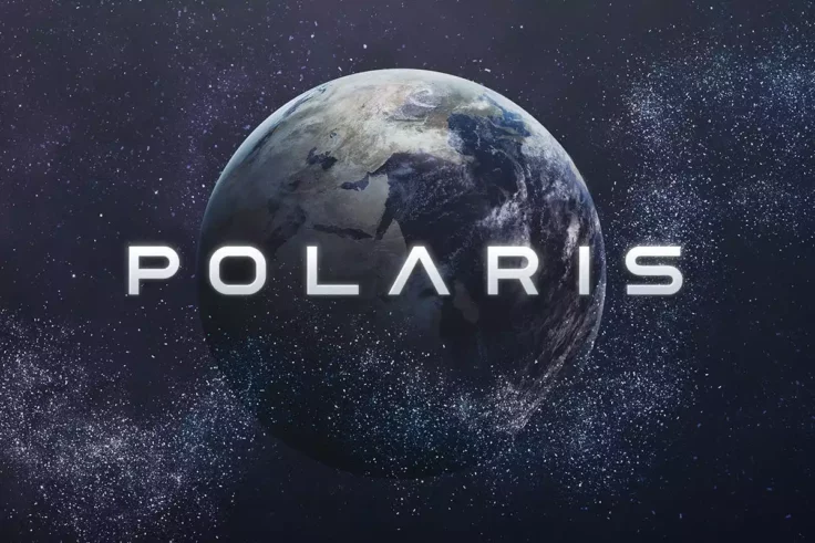
Polaris Space Font
Polaris is a space-themed font designed for futuristic projects. Polaris includes uppercase multilingual letters, numbers, and punctuation marks, maki...

Hitchcut Font
Hitchcut is a font that is heavily inspired by the iconic movie poster for Alfred Hitchcock’s Vertigo. The design of this font is an ode to the ...
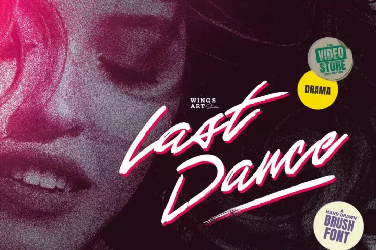
Last Dance Retro Movie Script Font
Last Dance is a hand-drawn brush font designed inspired by the dance movies from the 1980s. It shares the same vibes of the classics like Dirty Dancin...
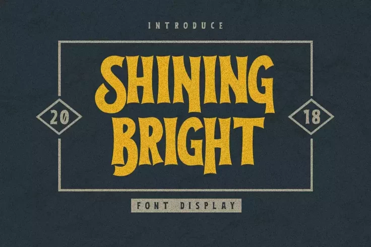
Shining Bright Spooky Movie Font
If you’ve watched the classic 1980 Stanley Kubrick film, you’ll have noticed the resemblance this font has to the title designs of the Shi...

Mars Attack Narrow Movie Font
Mars Attack is a tall and narrow movie font that’s simply perfect for crafting an attractive title. It will fit in nicely with movie posters, bo...

Warden Casual Movie Font
If you’re looking for a font with a fun and casual design, start your design with this one. It’s ideal for designing titles for kid’...
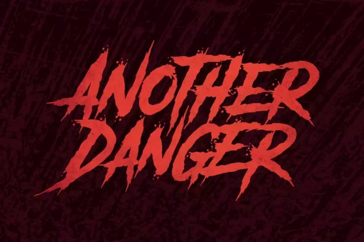
Another Danger Horror Movie Font
Whether you’re making a title for a horror movie or designing a flyer for a scary film festival, this font will help you design a killer title (...
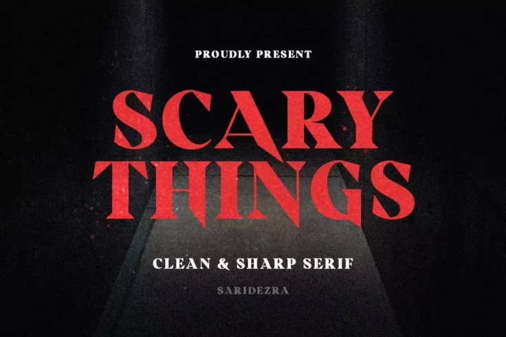
Scary Things Sharp Horror Movie Font
Just as the name suggests, this font will fit in well with all scary thins. It has a subtle scary look that’s just what you need to add a freaky...

Sci Fi Bronze Futuristic Sci-Fi Font
With this sci-fi font, you can design titles with a bold and futuristic feel. It features blocky and square letters that will add a unique look to you...
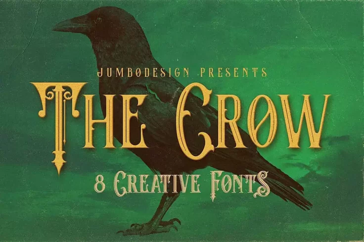
The Crow Vintage Movie Font
This font takes inspiration from vintage typography while integrating a bit of Victorian-era gothic design to each letter. The result of this abominat...
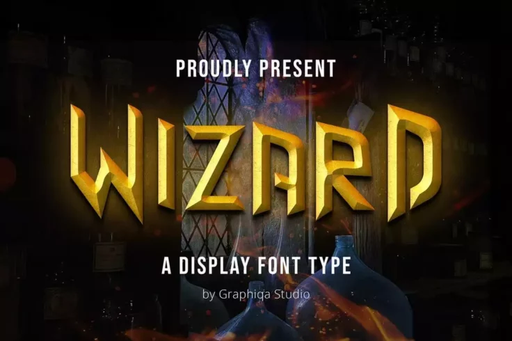
Wizard Magic & Fantasy Movie Font
Wizard is a font that comes with a classic fantasy look that you can use with your magic-themed designs. Whether it’s for a children’s par...
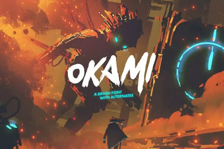
Okami Brush-Style Movie Font
Okami is a brush-style font that features a rough letter design that also gives it an anime-like look and feel. This makes it a great choice for desig...
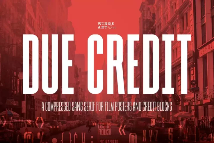
Due Credit Movie Poster Credits Font
This font is designed with movie posters and DVD covers in mind. It features a tall and narrow design to help you craft credit blocks on posters and c...

GORE Bold Violent Movie Font
Gore is a bold and chunky font but don’t let that thick letter design fool you. It also has a suspense-filled scary look that will go along grea...
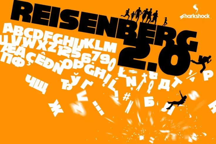
Reisenberg 2.0 Classic Movie Font
This is a cool font you can use to design a classic and minimalist poster design. It actually looks a lot similar to (or at least inspired by) the fon...
FAQs About Movie Fonts
What are movie fonts?
Movie fonts are typeface styles that are frequently used in movie titles, credits, or promotional materials. They often set the tone for the film, hinting at the genre, era or overall aesthetic. Some fonts are linked to certain films because of their iconic use, like the Harry Potter styled font 'Harry P', or the Star Wars styled font 'Star Jedi'.
They represent a vital part of brand identity and can often be strongly associated with specific film franchises. Using a consistent font can contribute to recognition and recall of the movie name, especially in the film industry where standing out and being remembered is crucial.
How are movie fonts selected?
Movie fonts are chosen very carefully by the film's creative and marketing team. The right font contributes significantly to the overall mood and feel of the movie. It's not just about the way it looks, but how it represents the film's atmosphere, theme, and genre. For example, mystery or horror films may use fonts with sharp, jagged edges to convey suspense, while romantic movies may opt for cursive or handwritten fonts to symbolize love and intimacy.
While some productions choose to use popular existing fonts, others prefer to create their own unique typefaces to personalize and emphasize the originality of their film.
Can I use movie fonts in my personal projects?
Yes, but it’s important to be aware of copyright implications. Some movie fonts may be protected under copyright laws and require purchase or permission for use. Generally, fonts used in famous films are the intellectual property of film corporations and their usage may be limited.
However, there are many alternatives and similar styles available that are not copyrighted or are free for personal use. Always make sure to check the license of a font before using it in your projects to avoid any legal complications.
What is the impact of movie fonts on audience perception?
Movie fonts greatly impact audience perception as they evoke specific emotions and expectations about a film. For example, a bold, capitalized font may suggest an action-packed film, while a softly curved, lower-case font might hint at a more gentle, introspective storyline.
Fonts also transmit cultural associations. Just think of a Wild West movie poster; the typical 'wooden' styled fonts immediately transport the viewer to a specific place and time. In this way, fonts play a key role in framing the narrative even before a viewer has watched the movie.
Are there any technical requirements for movie fonts?
Yes, movie fonts need to be easily readable at all sizes, whether on a large cinema screen, a mobile device, or a printed poster. They also need to be versatile enough to be used in different contexts, such as promotional materials, merchandise, and more.
Moreover, movie fonts should be consistent in terms of weight and spacing. These technical considerations are vital to ensure that the title is legible and attracts attention in all venues and formats. The true art of selecting the right font consists of marrying visual appeal with functional practicality.