15+ Best Number Fonts
Bring clarity to your numeric designs with our number fonts. Ideal for data visualization, infographics, or any project that requires distinctive numerical display. These fonts make your numbers stand out.

Didone Room Numbers Display Font
This modern and attractive font comes with a set of creatively designed number digits and currency symbols as well as punctuations. The font features ...

Drugsther Number Font
Simple with soft curves, Drugsther is a fantastic visual solution for design projects that don’t require all that much drama. Futuristic and a t...

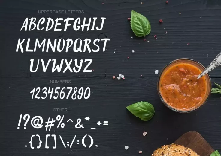
Hakuna Creative Number Font
A creative font you can use to design everything from fun greeting cards to posters and more. This font also has a set of creative numbers that you ca...

Tiny Lemon Number Font
This cute and stylish font is perfect for crafting fun and quirky designs. It comes with a set of matching numerals as well. The font is especially su...

Vaporfuturism Trendy Number Font
Neonize your text designs with Vaporfuturism, a trendy and colorful font featuring a full set of letters and corresponding numbers. The pack also come...

System Glitch Number Font
System Glitch is a display font that provides exactly what its name is about. Featuring futuristic-inspired digits, this set’s characters sport ...

Barokah Unique Number Font
Barokah is a unique font that comes with a set of characters featuring an unusual design. The font includes numbers that share this same design style....

Pumpkin Alphabet & Numbers Font
Pumpkin is another unique font that comes with a hand-crafted design. This font comes with the complete set of the alphabet and matching numerals. You...

Valencia Art-Deco Font With Numbers
Valencia is a beautiful font featuring a design inspired by art-deco trends. The font is most suitable for various luxury and high-end branding design...

Whitefield Number Font
Sporting thick, wide, and hand-drawn characters, Whitefield is a handcrafted serif that’s both playful and elegant-looking. Suitable for brandin...

Gardena Holmes Script Number Font
Gardena Holmes is a fabulous font that combines the classic serif with handwritten script style, providing you the best of both worlds. Its PUA encode...

Rosterine Condensed Number Font
If you want to add a touch of vintage nostalgia to your text, look no further than Rosterine. It’s a condensed font ideal for logotypes, invitat...

Scourge Creative Number Font
Arguably the most distinct number font in all of the web, the Scourge Typeface packs additional strokes in many of the 0 to 9 digits. It’s uniqu...
Original Burger Font With Numbers
You may have seen this style of fonts in small restaurant menus and burger shops. Just as the name suggests, it’s the perfect font you can use t...

Airbag Trendy Display Font
Airbag is a creative display font that comes with uppercase and lowercase letters as well as a set of unique number digits, including popular currency...

Manise Lovely Script Font With Numbers
Finding a creative script font that comes with a matching set of numbers is not an easy task. Thankfully, this lovely script font not only includes nu...

Devasia Sans Serif Font Family Pack
Devasia is a font family that comes in multiple font weights. It’s the perfect font for designing titles for posters and flyers. The font also i...
Rogtrilla Unique Number Font
Here we have Rogtrilla, a unique font style suitable for a wide range of creative and professional applications. It comes with uppercase and lowercase...
FAQs About Number Fonts
What are Number Fonts?
Number fonts refer to the varied styles and designs in which numbers can be presented in written form. Just like the alphabets, numbers can also take on different looks depending on the font style being applied. In typography, they're an essential part of the ensemble, giving typographers a chance to express or share information in more aesthetically pleasing ways.
Number fonts are used extensively across diverse sectors, from graphic design to mathematics and science, advertising, architecture, etc. They play a crucial role in presenting numerical data effectively, creatively, and elegantly.
How are Number Fonts Significant in Design?
Number fonts hold great significance in design. The type of number font used can heavily influence the overall aesthetics and tone of a design. A well-chosen number font can enhance readability, establish an atmosphere, communicate a brand's identity, or simply add an artistic touch.
Different number fonts evoke different feelings and can convey different meanings. For example, bold ones are typically used to represent strength and reliability, while script ones could denote elegance and creativity. Therefore, selecting the right number font becomes crucial in design to ensure that the intended message is effectively communicated.
What are Old Style Figures?
Old Style Figures, also known as lower-case or hanging numbers, are numeral designs that have varying heights and alignments, similar to lowercase letters. Some of them extend below the baseline and others sit on it, and their tops do not all align. This style of number font was commonly used in older typesetting, hence the name.
They are commonly used in text setting, as they blend in with regular text more effortlessly than their counterparts, lining numbers. Due to their organic appearance and feel, they are typically utilized in more traditionally styled aesthetic designs.
How does a Proportional Number Font differ from a Tabular one?
Proportional and tabular refers to the space allocation for each numeral in a number font. In a proportional number font, every numeral occupies just as much width as it requires. This means that 1 would take lesser space than 8. This type of font is great for most text usage, as it acquires less space and seems more balanced visually.
On the other hand, in tabular number fonts, every numeral, irrespective of its width, gets equal space or tab stops. This leads to more uniformity and alignment, especially in tabular data, where numbers need to align vertically for clarity. Hence, tabular number fonts are common in financial statements, spreadsheets, and timetables.
What are the Different Types of Number Fonts?
There are countless types of number fonts available spanning various styles and designs. Some popular types include Serif, which are classic and sophisticated with small lines attached at the end of each stroke; Sans Serif, which are more modern and do not have the small lines; Script, which emulate handwriting and are typically used for formal or elegant designs; and Display, which are unique and often used for large-scale designs, such as banners and headlines.
Other types include Monospace, where each letter or numeral occupies the same amount of horizontal space; Proportional, where different letters or numerals take up different amounts of space; Old Style Figures, which sit on a baseline like lowercase letters; and Lining, wherein all figures rest on the cap height. The choice of type relies largely on the application and the overall aesthetic one seeks to achieve.