20+ Best Chunky Fonts
Explore our chunky fonts for commanding attention. With their bold, wide letters, these fonts are great for headlines and titles that need a strong, modern look. Whether you're creating a poster or a logo, chunky fonts help your text make a bold statement.

Cinderheart Rough Blocky Font
If you’re looking for a fat blocky font design, this is the perfect font for you. It features a rough textured design and it’s perfect for...

Thiket Creative Chunky Typeface
This font will probably remind you of someone who lives in a pineapple under the sea. The character design of this font is quite unique and it comes i...

BoldenVan Fun Children’s Fonts
Want to design big titles that grab attention from far away? Then be sure to use this font in your designs. It has big chunky letters that are made ju...

Kitty Fat Handwritten Fat Font
Just as the name suggests, this chubby font features a creative character design with a handwritten style. The font is ideal for designing all kinds o...

Mickmickey Casual Chunky Font
Mickmickey is another creative chunky font that comes with uppercase and lowercase characters. According to its designer, this font looks great in des...

Rono Fat Sans-Serif Font
Rono is an elegant font that comes with chunky character design. This font is perfect for designing stylish titles and headings for posters and websit...
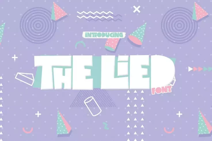
The Lied Creative Chunky Font
If you’re working on a design related to kid’s entertainment, cartoons, or book covers, this font is perfect for you. It features a unique...

Wonkids Bold Psychedelic Font
Wonkids has a perfectly mellow letter design for designing cool product packaging designs and titles for posters. You can find many creative ways to t...

Kania Thick Brush Script Font
Who says chunky fonts don’t look professional? With this stylish brush script font, you can design unique titles and headings for various types ...
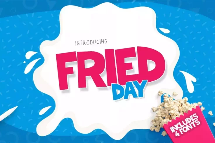
Fried Day Modern Chunky Font
At a glance, this chubby font will remind you of posters and banners at movie theaters. And it’s made just for that type of design and more. The...
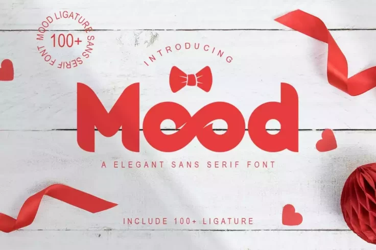
Mood Elegant Chunky Font
Chunky fonts are not just for children’s designs. This elegant font is proof of that. It features a set of chubby characters that are suitable f...

Block Party Bold Funky Font
Block Party is a fun, and happy-go-lucky typeface that will bring a fresh, and child-like feel to your creative projects. It’s a stunning option...

Blitzen Deer Fun Children’s Font
An adorable chunky font you can use to craft titles and headings for children’s designs. This font comes in both OpenType and TrueType versions....
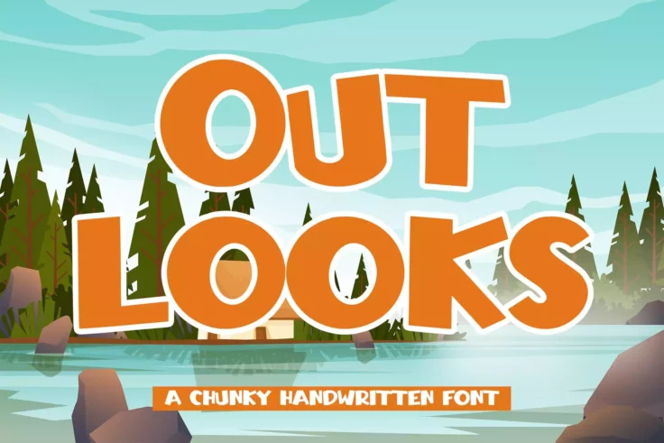
Outlooks Chunky Handwritten Font
Outlooks is a painstakingly created font featuring a chunky handwritten design that will look good on a variety of branding and packaging projects. It...

Colombo Sans Font
Colombo is a casual and creative title font that features a modern look and feel. The font is most suitable for designing titles for feminine and fash...

Hey Comic Fun Bold Font
This is a fun and slightly chunky font that features a design inspired by comic book splash panels. The font is ideal for designing all kinds of child...

Big Jelly Bold Chunky Font
Big Jelly is a bold, and thick font that will help you create fun and playful designs, and bring a smile to the beautiful faces of your target audienc...

Big Fellas Multipurpose Chubby Font
This fun and creative font come with a unique and inconsistent character design that will help give your designs a handmade look and feel. The font is...

Nick Nock Bulky Display Font
Nick Nock is a blob and chubby typeface that comes in 2 different styles. It’s an incredibly unique, and one of its kind font guaranteed to work...

SPOT Headline Font
Spot is an attractive and creative font you can use to create titles and headers that instantly grabs attention. The font features all-caps letters an...
FAQs About Chunky Fonts
What are Chunky Fonts?
Chunky fonts, also known as bold or heavy fonts, are typefaces that feature thicker and heavier strokes. They are often used to create a strong visual impact and draw attention due to their large size and weight.
These fonts can be utilized in various design projects, including headlines, logos, posters, or any materials that require a bold statement. However, due to their density and heaviness, they are usually not appropriate for body text or prolonged reading.
When Should I Use Chunky Fonts?
Chunky fonts are best used when you want to create a strong, impressive visual impression. They are ideal for headlines, titles, posters or any short text that needs to stand out. These bold typefaces can make a big statement, and grab a viewer's attention instantly.
However, due to their heavy and bold nature, chunky fonts can be overwhelming if used excessively. Therefore, it’s always important to maintain a balance in your design and use chunky fonts sparingly.
How Can Chunky Fonts Improve Design Aesthetics?
Chunky fonts can significantly contribute to the visual aesthetics of a design due to their dominant and distinguished appearance. They can give the design a modern, fresh look, or create a sense of intensity or urgency, depending on the content and purpose of the design.
They also provide great contrast when paired with lighter, thinner fonts, providing a dynamic and engaging visual experience. The choice of a chunky font can, therefore, be a key aspect in defining the overall mood and style of your design.
What Should Be Considered When Choosing Chunky Fonts?
When selecting a chunky font, consider the context and purpose of your design. The font should not only suit the overall design aesthetic but also align with the message you want to convey. For instance, some chunky fonts may give a playful, informal vibe, while others might exude more formality or seriousness.
Also, consider readability when choosing fonts for your design. Although chunky fonts make a strong impression, some may be difficult to read, especially at smaller sizes or when used for longer text blocks. Always ensure the font you choose is legible and complements your overall design.
Can I Use Multiple Chunky Fonts in One Design?
While you can use more than one chunky font in a single design, it's advisable to use them sparingly. Since chunky fonts are attention-grabbing, using too many can create competition on a page, distracting the viewer and causing confusion or strain.
However, mixing a chunky font with a lighter one can create an interesting contrast and hierarchy, guiding the viewer's attention through the design. Therefore, pair chunky fonts with lighter or regular fonts for an appealing, balanced composition.