30+ Best Art Nouveau & Art Deco Fonts
Delve into the era of art nouveau and art deco with our handpicked fonts. They bring elegant curves and geometric shapes to your designs, perfect for projects with a vintage or sophisticated touch. Celebrate these classic styles and breathe new life into your work.
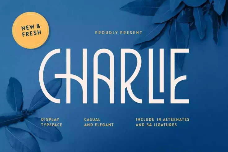
Charlie Modern Art Deco Font
This font features a modern take on the art deco font design and it does a pretty good job at it. The font features elegant and clean letters that wil...

Cartinz Modern Art Deco Font
Cartinz is a unique art deco font with a modern design. This font will allow you to use art deco typography in a different way than traditional design...

Brigmore Unique Art Deco Font
This font will make your designs immediately noticeable no matter where you use it. There’s a certain classy and rugged look to this font that s...
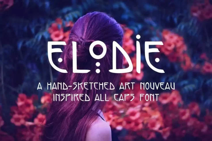
Elodie Hand Sketched Art Nouveau Font
This font is definitely not the usual art nouveau font you’re used to seeing. It actually combines several design styles to create a unique set ...

Agendra- Swirly Serif Font
Agendra is modeled after the serif typeface but brings a little personality to the table with deeply curved edges, yet clear and distinctive line work...
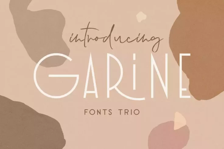
Garine Art Deco Display Fonts Trio
This font mixes modern typography designs with art deco style to create a very beautiful and feminine font. It’s actually perfect for magazine c...

Peachy Fantasy Art Nouveau Font
This is a creative art nouveau font with a psychedelic look and feel. This font also gives off a subtle fantasy vibe, which makes it suitable for book...
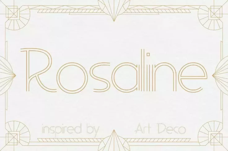
Rosaline Art Deco Display Font
Rosaline is a beautiful outline font with a classic art deco-inspired design. This font features an iconic and elegant look that will make your profes...

Onamura Experimental Art Nouveau Font
Onamura is a unique experimental font that’s been designed by mixing a few different art styles. It shares different elements from the art nouve...

Wallington Pro Elegant Art Nouveau Font
Wallington Pro is a stylish and elegant font that checks all the boxes of a perfect art nouveau font. It has a bold serif lettering design, long curvy...

Ironclad Bold Art Deco Font
If you’re looking for a bold and creative art deco font to craft an attractive title for a movie poster or a book cover, this font is perfect fo...
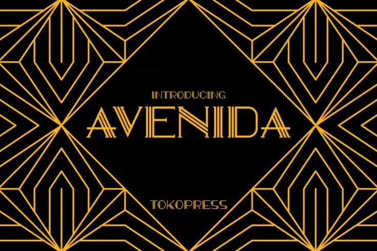
Avenida Art Deco Font
Taking an art deco look, Avendia is all about classic, elegance, and high-class feel all over it. Suit perfectly for high-end market audiences, poster...

Avoner Elegant Art Deco Fonts
Avoner is a bold art deco font with thick letters. This font is excellent for designing big titles and headings for posters, flyers, and websites. The...
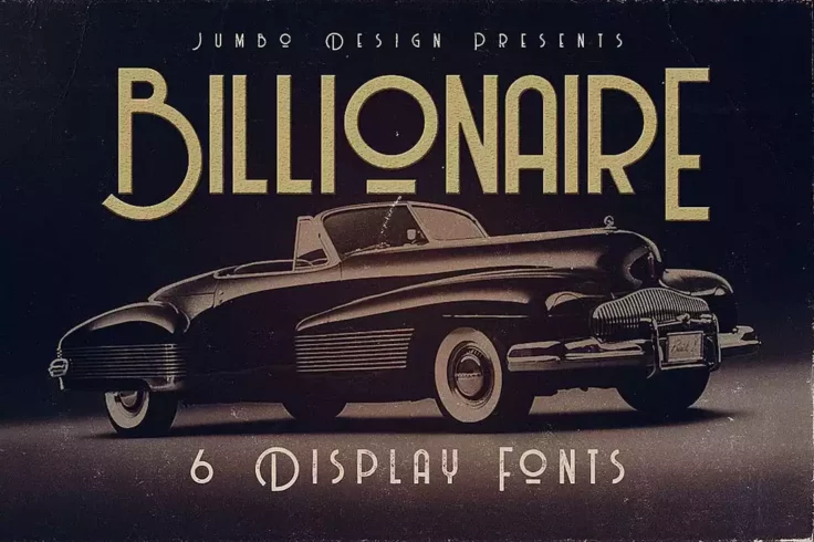
Billionaire Art Deco Display Font
A collection of vintage display fonts featuring art deco-style letter designs. This pack includes 6 fonts featuring grunge style typefaces. It include...

Indentia Art Deco Font
Indentia is a very interesting font, which has been inspired by Art Deco art. It is formed from very careful lines with stylistic set and ligature fea...

Marmalede Classic Art Deco Font
Marmalede is another classic art deco font you can use for creative and branding designs. It comes with a set of letters featuring clean-cut corners a...
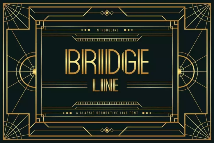
Bridge Line Elegant Art Deco Font
Bridge Line is an elegant art deco font that features the same classic design from vintage posters and signage. This font includes both uppercase and ...

Voltdeco Stylish Art Deco Font
At first glance, this font looks quite incredible for designing business cards, logos, labels, and other branding designs. It has a beautiful and narr...

Caylee- Art Deco Script Font
Caylee is a script font with an expansive typeface ready for any occasion. Designed around a fast hand sweep style, the script is a trusted companion ...
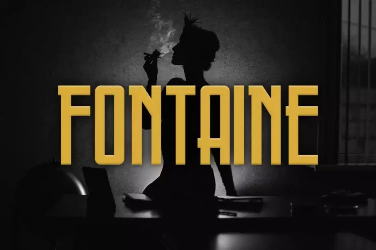
Fontaine Narrow Art Deco Font
A tall and narrow font with only all-caps letters? Then it must be a title font. Fontaine is a bold art deco font that’s been made just for craf...
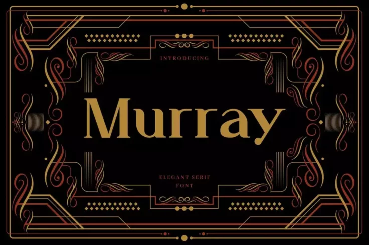
Murray Art Deco Display Font
Murray is another art deco font that comes with a simple letter design with a subtle nod to the 20th century. The font looks quite elegant on greeting...

Haarlem- Decorative Serif Font
Haarlem is an exquisite font with an all-caps design. With a beautiful combination of vertical and horizontal lines, and the availability of both ital...
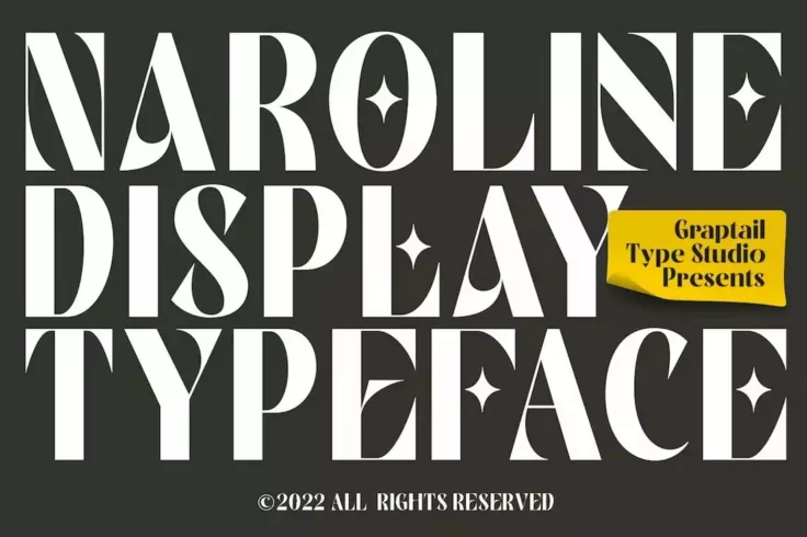
Naroline Creative Art Nouveau Font
A beautiful art nouveau font with a creative letter design. This font features a mix of both modern and classic design elements to give each letter a ...
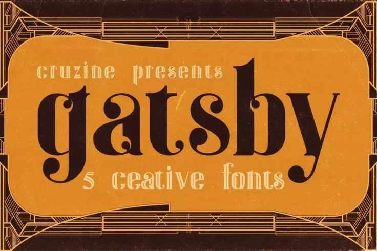
Gatsby Creative ArtDeco Fonts
The novel The Great Gatsby by F. Scott Fitzgerald has some of the best descriptions of the art deco movement. This was later visualized in the 2013 mo...
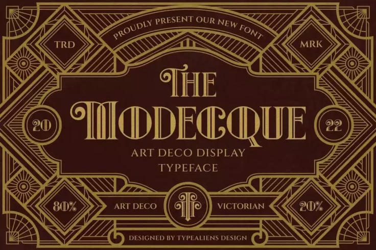
Modecque Classic Art Deco Fonts
If you’re a fan of classic Victorian-era art deco designs, this font is perfect for your projects. It features a very unique design with creativ...

Bagerich Stylish Art Nouveau Font
Bagerich is a classy font that features a stylish design that you’d normally see in high-end brandings such as Gucci or Victoria’s Secret....
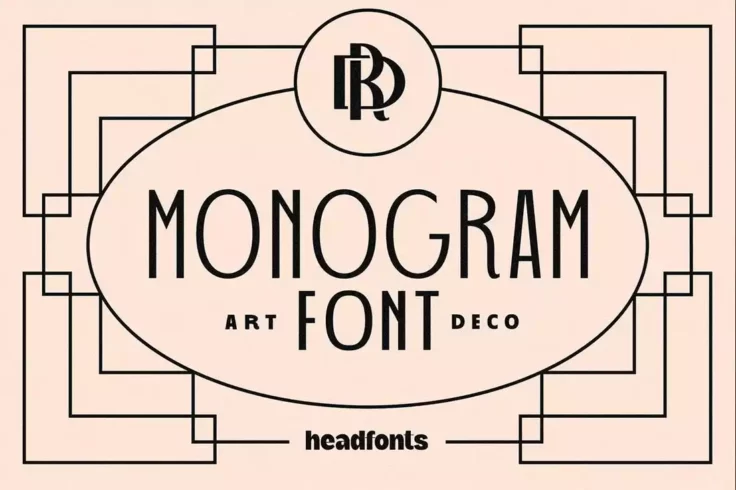
Art Deco Monogram Font
Art deco typography is a common choice in monogram logo and signage designs. This font is made specifically for that type of design work. It features ...
Ager Art Nouveau Logo Font
When it comes to designing logos for luxury, lifestyle, and fashion brands, you can’t go wrong with an art nouveau font. This font in particular...
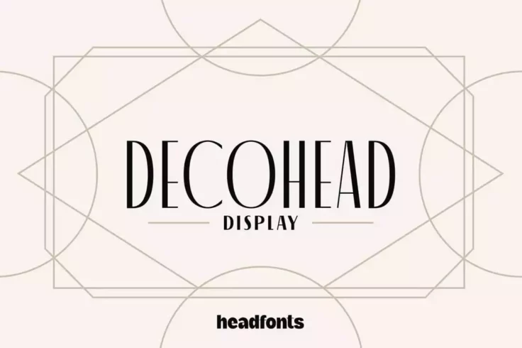
Decohead Minimal Art Deco Font
Similar to art nouveau fonts, art deco fonts share the same elegant look and feel. Except art deco is all about creating a clean look while maintainin...
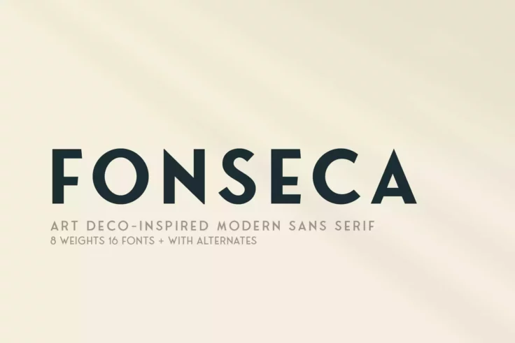
Fonseca Font Family
This modern geometric font finds its inspiration from art-deco style designs. It’s a complete font family that features 8 weights, alternate charact...
FAQs About Art Nouveau & Art Deco Fonts
1. What are Art Nouveau & Art Deco Fonts?
Art Nouveau and Art Deco fonts are typefaces inspired by two different art movements that marked the late 19th and early 20th centuries respectively. Art Nouveau fonts are known for their ornate, intricate, and often nature-inspired designs, reflecting the organic forms that defined the Art Nouveau movement. They often feature highly stylized, swooping lines and have a decorative, elegant feel.
On the other hand, Art Deco fonts echo the streamlined, modern and geometric aesthetic of the Art Deco period. They have more angular and strong lines, and often include bold, sleek and symmetrical designs. Both of these font styles can be used to evoke a specific time period or artistic style in design projects.
2. When should I use Art Nouveau & Art Deco Fonts?
Art Nouveau and Art Deco fonts are typically used when the design project requires a distinctive vintage or stylistic touch. Art Nouveau fonts, with their elegant and ornate designs, are often used in designs that aim to evoke a classy, romantic, or nostalgic feel. They are popular in designs related to events like weddings or in industries such as fashion and jewellery.
Art Deco fonts, with their modern, geometric, and bold designs, are suitable for projects that need to express sophistication, glamour, or a strong sense of style. These fonts are commonly used in logo designs, prints, publications, and digital designs related to the fashion, architectural or automotive industries.
3. How do Art Nouveau and Art Deco Fonts affect the aesthetic of a design?
The choice of font can significantly impact the overall aesthetic of a design by conveying specific moods or invoking particular time periods. Art Nouveau fonts, with their intricate and flowy detailing, can lend a sense of organic elegance, sophistication, and femininity to the design. These fonts often aid in creating an atmosphere of warmth and charm.
Conversely, Art Deco fonts, with their emphasis on symmetry and bold lines, impart a more modern and glamorous vibe to any design. They evoke a sense of luxuriousness and boldness, and can be very striking in their simplicity and streamlined forms. The right choice can make or break the effectiveness and appeal of any design.
4. How can I differentiate between Art Nouveau and Art Deco Fonts?
Identifying and differentiating between Art Nouveau and Art Deco fonts is all about understanding their characteristic design elements. Art Nouveau fonts incorporate elaborate, flowing lines, organic forms, and delicate curves, often inspired by nature and plant motifs. Few examples of Art Nouveau fonts include Parisian, Arnold Boecklin, and Eccentric.
Art Deco fonts, on the other hand, feature more geometric shapes, bold lines, sharper angles, and symmetry, reflecting the influence of industrialisation and machinery. Examples of Art Deco fonts include Broadway, Metropolis, and Gotham. This contrast in aesthetics is the main distinguishing factor between the two.
5. How can I learn to use Art Nouveau and Art Deco Fonts effectively in designs?
Learning to use Art Nouveau and Art Deco fonts effectively in your designs depends on understanding the spirit and principles of both these art styles. Look at examples of both art movements and their use of typography. Study how designers have incorporated these fonts into their work and how they pair them with other design elements.
Furthermore, design and typography courses or tutorials can assist you in understanding the best practices for font use, such as pairing, spacing, alignment, and hierarchy. It requires experimentation and practice to aptly integrate these fonts in a design, while also maintaining a balance with other design elements. Always remember, the font you choose should enhance your design and not overwhelm it.