20+ Best Title & Headline Fonts
The headline or title can often be the most important part of a design. Which is why it’s always worth taking extra time to choose the best title font for your next project. The typeface you choose for your headline can draw people in, and grab their attention. We've picked the best title fonts to use with all kinds of posters, flyers, websites, social media posts, and many other types of designs.

Quart Headline Font
Quart is an amazingly unique font for headlines, big text, branding, logotypes & display usage. This font is also perfect for creating outstandin...

Visage Demolished Font
Visage features a very unique textured design with a slightly vintage look and feel. It’s perfect for crafting titles for posters and book covers. I...
Learn About Title Fonts
How Should I Choose a Title or Headline Font?
Tips and ideas for working with outline fonts in your next design project.
How Do I Add Fonts to Photoshop?
Learn how to add fonts and start working with them quickly.
What Is a Font License?
Learn the ins and outs of what type of font license you need for your project.
Where Can I Find Free Fonts?
Our pick of the greatest free sources for typefaces online.
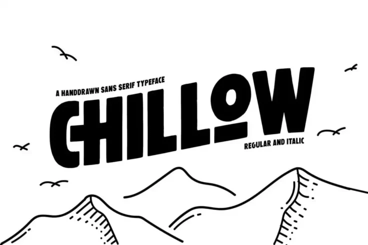
Chillow Title Font
Chillow is a creative title font that comes with a unique hand-drawn design. It’s a sans-serif font with a touch of retro vibes. This all-caps font ...

Bogem Font
Bogem is an outstanding font that can be used for movie titles, posters, headlines, banners, and billboards. Don’t hesitate to take this incredi...

Colombo Sans Font
Colombo is a casual and creative title font that features a modern look and feel. The font is most suitable for designing titles for feminine and fash...

Gemosh Title Font
Perfect for a variety of purposes, Gemosh is a creative and unique title font that is as impressive as it’s effective. It offers a vintage vibe ...
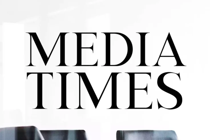
Media Times Font
Media Times is a classic serif font that has been modernized with a clean and minimalist design that gives it a professional and high-end look. Its el...
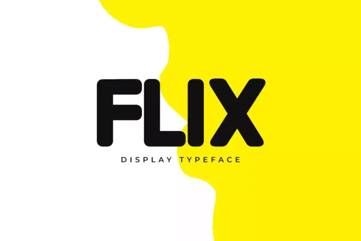
FLIX Font
Flix is a modern and versatile display title font that is ideal for branding and design projects. With its curved edges and smooth letter design, Flix...

Gayeng Font
Gayeng is an outstanding headline font. It is known for its super bold style and contains up to 6 alternatives for each character. This great font inc...

Etna Title Font
Etna features a bold design with thick letters. You can use this font to craft attractive headlines for all kinds of print and digital designs. It als...
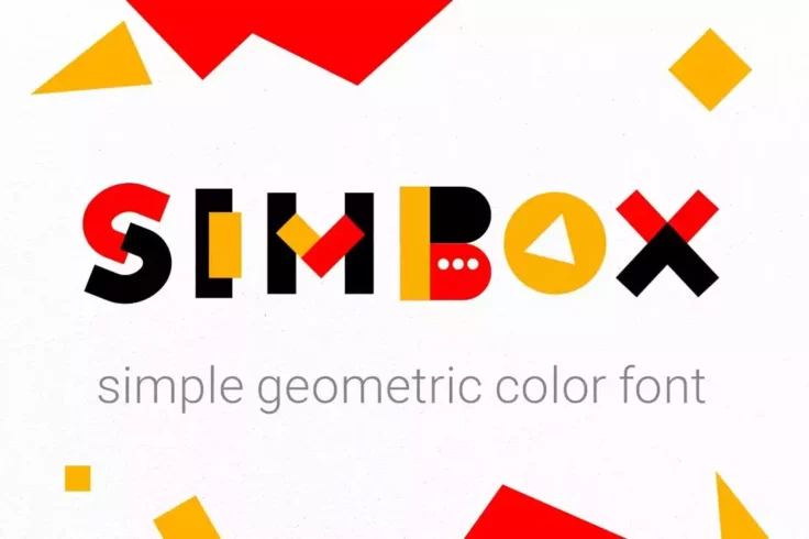
Simbox Geometric Color Font
A yet another geometric color font to use with your fun and quirky design projects. This font features a very colorful set of letters that’s ideal f...

Okana Font Family
Okana is a family of sans-serif fonts made for professionals. This font can be used to design both titles and body text of various design projects. It...

Maven Font
Maven is another fun handwritten font that’s ideal for crafting headings for posters, website headers, and book covers related to children’s. You ...

Mia Love Font
Mia Love is a special brush font designed to look bold, with a perfect texture, suitable for today’s designs. Perfect for use in design titles s...
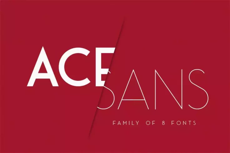
Ace Sans Font Family
Ace Sans is a complete family of fonts that includes a total of 8 fonts featuring various weights ranging from thin to extra bold and more. You can us...

Derkon Font
Here we have a stunning headline font containing two full sets of all caps letters, two handcrafted styles: regular and shadow, 18 glyphs, and a range...
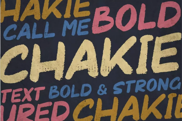
Chalkie Title Font
If you are looking for an ultimate bold font and add more versatility to your content, then you should check out this font. The Chakie font comes in a...

SPOT Headline Font
Spot is an attractive and creative font you can use to create titles and headers that instantly grabs attention. The font features all-caps letters an...

Hikou Regular Title Font
Hikou Regular is a bold and creative all-caps font that’s most suitable for design and fashion-related projects. Its thick and narrow spacing makes ...

Travel Sans Font
Travel Sans is a narrow display font that features a bold design. It’s designed for crafting titles and headlines for flyers and posters. The font a...

Blue Fonte Font Duo
Blue Fonte is a pair of modern fonts that features fonts in two different styles including a sans-serif font and a script font. Both of which you can ...

Vlogger Headline Font
Vlogger is a fun and playful font that will really help you stand out in the daily flood of headline, thumbnail, and branding typeface designs we see ...

Comodo Typeface
Comodo is a modern and trendy font that fits in well with all types of modern titles designs, including social media posts, posters, branding designs,...
FAQs About Title & Headline Fonts
Why are the title and headline fonts crucial in a design?
The title and headline fonts play a crucial role in design because they are the first elements that catch the viewers’ attention. Utilizing effective title and headline fonts can immediately draw interest and convey the tone or theme of the content effectively. They significantly influence the first impression one has regarding the content or design they are presented with.
Furthermore, title and headline fonts serve as important navigation aids for the viewer, guiding them through the content's hierarchy and structure. They set the tone for the rest of the piece, creating expectations about the content that follows and setting specific emphasis throughout the design.
How important is the readability of title and headline fonts?
Readability is extremely crucial when choosing title and headline fonts. Because the title and headlines are the first things that the audience notices, they must be clear and easy to read. The brain processes recognizable shapes and patterns faster, and using easily readable fonts can minimize the cognitive load for your audience.
However, readability doesn’t necessarily mean you need to stick to conventional or overly used fonts. There are many attractive and creative fonts available that also offer great readability. Remember, the ultimate goal is to communicate your message effectively without making your viewers work too hard to understand it.
Can I use the same font for both the title and headlines?
You certainly can use the same font for both the title and headlines in a design. This can create a sense of uniformity and cohesion, especially if the font encapsulates the tone and vibe of your content effectively. It can also ensure consistency, which is particularly beneficial for things like branding.
However, variety can enhance visual interest in your design, so consider differing the font weights, sizes, or styles within the same family of typefaces for the title and headlines. This can help establish hierarchy among your content while still preserving consistency.
Should I stick to one font family for a design?
Sticking to one font family for a design can lead to a more harmonious and cohesive visual result. Fonts within a typeface or family are designed to complement each other, which can contribute to a consistent, professional-looking design. This can be particularly useful for documents with a lot of text.
However, different fonts from different families can also be used together effectively. This can provide the design a rich visual variety and dynamic. The key is finding a balance and ensuring that the fonts you select complement each other and align with your message and brand identity.
What factors should I consider while choosing a font for titles and headlines?
Several factors come into play when selecting a font for your titles and headlines. Firstly, consider the mood or tone you want to evoke. Different fonts can express different emotions and can significantly affect how your message is perceived. Also, consider the readability and legibility of the font. The font should not only be attractive but also clear and easy to read.
Understand the context in which your design will be used is another important aspect. Certain typefaces might be more suitable for print, while others might work better for digital platforms. Finally, consider how your chosen font aligns with the overall aesthetic and color scheme of your design as well as with your brand’s identity.