105+ Best Poster Fonts
A great poster font has the power to turn even the most straightforward poster layout into a compelling design. If you’re still searching for that perfect poster font, you’re in luck. We found a set of fantastic poster fonts that’ll be perfect for any poster design. They’re big, bold, and creative enough to turn heads!
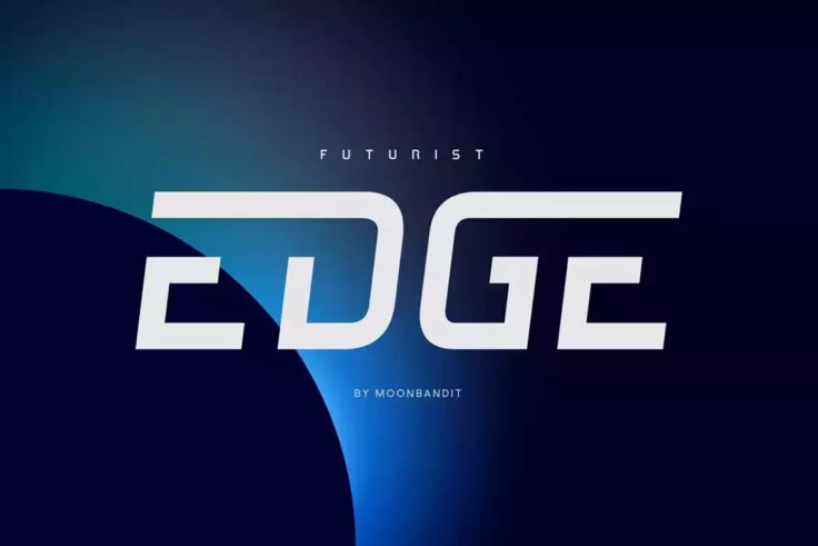
MBF Edge Font
MBF Edge is a modern and sleek font that is perfect for a variety of design projects. The font is available in both regular and italic variations, and...

Cunda Font
Cunda is a beautiful and versatile font that is perfect for a wide range of design projects. Whether you’re looking to create invitations, poste...
Learn About Poster Fonts
How to Choose a Poster Font
Tips, ideas and advice for working with poster fonts.
How Do I Add Fonts to Photoshop?
Learn how to add fonts and start working with them quickly.
What Is a Font License?
Learn the ins and outs of what type of font license you need for your project.
Where Can I Find Free Fonts?
Our pick of the greatest free sources for typefaces online.

Cosmoball Font
Cosmoball features a stylish script design ideal for creating badges, titles, headers, posters, and more. Whether you’re working on a project fo...

Fornire Font
Fornire is a minimalistic sans-serif font that has been created with the aim of providing a bold yet simple impression. The font has a unique look due...

Hitchcut Font
Hitchcut is a font that is heavily inspired by the iconic movie poster for Alfred Hitchcock’s Vertigo. The design of this font is an ode to the ...

Jurka Font
Jurka is a versatile and stylish font, perfect for designers looking to add a touch of retro charm to their work. The sans-serif design is inspired by...

Big Owl Font
Big Owl is a versatile font that can add a fun and playful touch to a variety of projects. Its bold sans-serif design makes it a great choice for chil...

Ishimura Poster Font
Ishimura is a unique font that exudes a futuristic and industrial feel. The sleek, sans-serif design of this font is perfect for technology and futuri...

Hit and Run Font
Hit and Run is a fun and playful sans-serif font that features bold, rounded letters with a quirky, hand-drawn style. The font is perfect for headline...

Jackazz Font
Jackazz is a unique and versatile display typeface that offers a wide range of layout solutions for each word. With four different weights, this typef...

Rose Gold Groovy Font
Rose Gold is a font that is perfect for those who are looking for a vintage, retro look for their designs. Whether you’re working on a website, ...

Backer Town Font
Backer Town is a natural handwriting font that can be used for a variety of design projects. The font is designed to have a natural, handwritten feel ...

Moanah Font
Moanah features a casual and relaxed feel, making it perfect for designs that are meant to evoke a sense of summer and relaxation. The hand-drawn styl...

BakerStreet Black Font
The Baker Street Black font family includes regular, italic, inline, and rustic textured styles, as well as hundreds of discretionary ligatures that c...

Sea Horse Vintage Decorative Font
Sea Horse is a perfect choice for anyone looking to add a touch of vintage charm to their designs. This poster font is inspired by the typography and ...

Gerbil Font
Gerbil is a modern sans-serif font that is designed with a geometric approach. The designer behind this font has put a lot of effort into creating a t...

Reinkey Font
Reinkey is a brushed display font that has a clean and neat appearance, making it ideal for logotypes, posters, and branding materials. The alternate ...

Neue Stanley Slab Serif Font
Introducing Neue Stanley, a vintage serif font with a bold and striking appearance. This font takes its inspiration from the classic letters seen in o...

Rodest Font
Rodest is a classic serif font that boasts a unique and elegant design, making it the perfect choice for any project that requires a touch of sophisti...

Malohallo Font
Malohallo is a playful and modern font with bold and sharp lines combined with round edges. The font includes fun characters, ligatures, and alternate...

Stannum Font
Stannum is a versatile font family that offers a sophisticated and classic look for various design projects. It consists of 9 weights, ranging from Th...
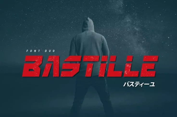
Bastille Font Duo
Bastille is the perfect font for any project requiring a unique, modern, and vintage aesthetic. Inspired by the iconic Blade Runner 2049 movie, this v...

Gulam Kingdom Poster Font
Gulam Kingdom is a modern and versatile font designed for use in a wide range of projects. The font features a bold and striking design that is sure t...

Break Font
Break is a modern and minimalist font designed by Rajesh Rajput. With its ultra-thin design, it adds a touch of sophistication and elegance to any des...

Kroist Experimental Font
Kroist is an experimental pop font that was created with the intention of breaking the rules of typographic hierarchy. The designer behind Kroist want...

Gunnar Font
Gunnar is a versatile sans-serif typeface that combines modern design elements with a touch of vintage charm. Its rounded edges and soft lines are rem...
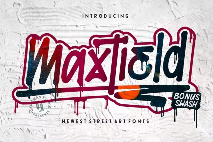
Maxtield Drip Font
Maxtield is a graffiti font that features a bold and edgy style with a mix of curved and sharp lines, making it perfect for creating eye-catching head...

Gallow Tree Font
Gallow Tree takes inspiration from vintage horror movie posters, such as “Creature from the Black Lagoon” and “House of Dracula.R...

Phephe Unique Vintage Font
Phephe is a unique and eye-catching font that is sure to make a statement in any design project. With its vintage style, this font is perfect for crea...

Saint Marche Font
Saint Marche is a font that combines vintage and modern elements, making it suitable for a variety of design projects such as logos, letterheads, post...
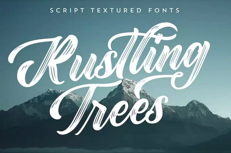
Rustling Trees Font
Rustling Trees is a stylish font that offers a unique and flowing texture. This font is perfect for digital lettering and is ideal for creating logoty...
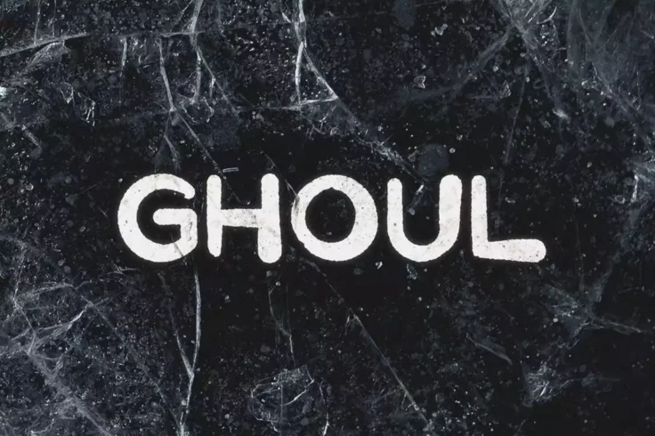
Ghoul Spooky Halloween Font
Ghoul is a brush font that is perfect for designing posters, book covers, and other materials related to horror and thriller genres. The font is hand-...
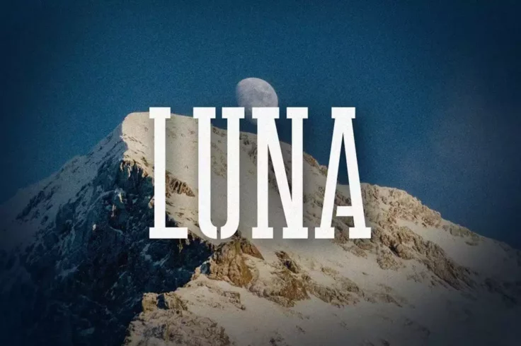
LUNA Font
Luna is a minimalist stencil font with a modern design. It features tall and narrow letters with a basic stencil design and it’s available in two di...
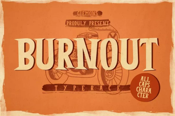
Burnout Poster Font
Burnout is a unique and versatile font that is great for a wide range of design projects. With its comic and fun design, it is particularly well-suite...
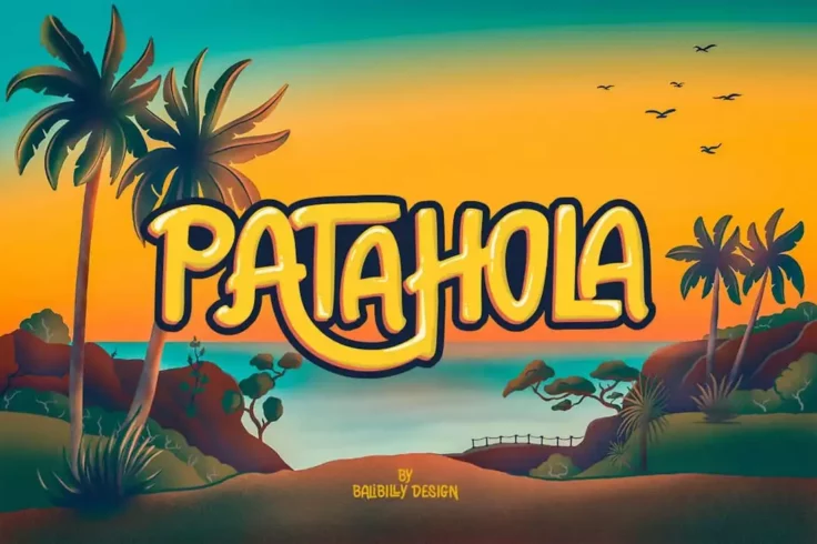
Patahola Font
Patahola is a truly exceptional typeface that boasts a one-of-a-kind hand-drawn letter design. This font family includes six different styles, includi...

Wolder Handcrafted Vintage Typeface
Wolder is a handcrafted font that features a vintage design with a worn-out look. It’s perfect for vintage badges, t-shirts, logos, labels, post...

Newgate Classic Poster Font
Newgate is a stylish font that combines retro and modern elements. Its bold curves evoke a 70s aesthetic, while its serifs add a traditional touch. Th...

Haste Handmade Rustic Font
Haste is a family of three beautifully designed, handmade lettering fonts that are perfect for a wide range of creative projects. The set includes Has...

Grodna Font
Grodna is a font that exudes sophistication and style, drawing inspiration from the art deco posters and storefront signs of the early 1900s. Its tall...

Turismo CF Font
Turismo CF is a font family that is designed with a midcentury aesthetic in mind. The inspiration for this font comes from various sources, including ...

Exon Font
Exon is a font that exudes luxury and elegance. Its clean-cut design makes it perfect for posters and flyers for high-end brands. The font is availabl...

Graun Font
Graun is a modern sans-serif font that features a handmade aesthetic, making it a versatile choice for a wide variety of design projects such as poste...

Italo Font
Italo is a decorative, and friendly san-serif font that is perfect for adding a touch of informality and cuteness to your designs. Whether you’r...

The Wildeast Font
Wildeast is a unique and playful font that features a hand-drawn style with a rough texture. The font is particularly well-suited for posters, book co...

Story Brush Poster Font
Story Brush is a unique font that sets itself apart with its high level of detail. It boasts over 240 glyphs and comes in two versions: Regular and Sl...

Nigma Brush Font
Nigma is a handmade brush font that features alternate letters, making it a versatile choice for a wide range of design projects. The font includes lo...

Furiosa Font
Furiosa is a unique and powerful font that is perfect for use in an apocalypse setting. The font is inspired by the iconic character of Furiosa from t...
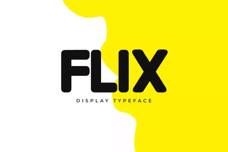
FLIX Font
Flix is a modern and versatile display title font that is ideal for branding and design projects. With its curved edges and smooth letter design, Flix...
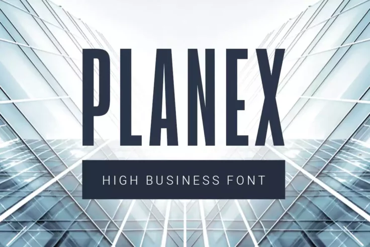
Planex Title Font
Planex is a highly legible sans-serif font that exudes a sense of professionalism and modernity. It has been meticulously crafted to offer a highly po...

Avene Brush Font
Avene is a unique and visually appealing font that is perfect for anyone looking for a grungy brush-style typeface. Created by hand with a thick brush...

Watch Font
Watch is a font that is heavily influenced by the marker typeface and graffiti style. Perfect for modern and creative designs, especially for designs ...

Hello Jack Font
Hello Jack is a playful and bold display font that is perfect for adding a touch of charm and personality to any project. With its unique and quirky f...

Revoller Font
Revoller is a decorative sans-serif font that is perfect for creating eye-catching posters and titles. It comes in three different file formats: OTF, ...

Eiffell Brush Script Font
Eiffell is a beautiful, hand-brushed typeface with a distinct French charm. Its stunningly decorative capitals make it ideal for a variety of design p...

Modern Mode Font
Modern Mode is a sleek and sophisticated font that combines both modern and vintage elements to create a unique and elegant design. Whether you’...

Covenant Font
Covenant is a brush-style font that features irregular, rough edges giving it a sense of movement and energy. The font’s unique style is ideal f...

Magnifika Font
Magnifika is a beautiful font inspired by the Victorian era. The font features a unique, elegant design that is perfect for creating vintage-style des...

Extra Giant Poster Font
Extra Giant is a versatile font that can be used in a variety of applications, from posters and clothing designs to merchandise billboards and signs. ...

Enyo Slab Font
Enyo is a handwritten slab font that will add an informal and personal touch to your designs. The font is particularly well-suited for designing kid�...

Marine Sikona Font
Marine Sikona is a unique and versatile font that combines elements of retro design with modern elegance. This display serif font is ideal for a varie...

Black Willow Font
Black Willow is a distinctive brush script font with a contemporary and bold aesthetic. Ideal for posters, logos, headlines, titles, and more, it boas...

Rogue Font
Rogue is a bold and unique font that is perfect for making a statement in your designs. One of the most common uses for Rogue is in poster designs. Th...

Chester Layered Font Family
Chester is a font family that features a design inspired by old postcard stamps and rustic sign paintings. The font is ideal for designing everything ...

Big Brandy Vintage Font
Big Brandy is a versatile font that can add a touch of elegance and sophistication to any design project. The vintage calligraphy style gives it a tim...

Grandesa Font
Grandesa is a handmade serif font that is perfect for creating professional posters and designs. The elegant and retro look of this font gives it a un...

Begin Font
Begin is a modern luxury sans-serif font that features clean and elegant lines, making it a great choice for a variety of design projects, such as bra...

Mike Sans Font
Mike Sans features a square design with rounded edges that gives it a modern and attractive look, making it perfect for designing posters, website her...

Kage Poster Font
Kage is an all-rounded typeface that offers a touch of sophistication and elegance to any design project. With its serif design, it provides a timeles...

Haynthams Spacescript Font
Haynthams Spacescript is a serif font that exudes a retro synthwave style and aerospace feel. This font is a reflection of the great new era we are in...

Fast Track Font
Fast Track is a bold and striking font that exudes a sense of speed and motion. Its unique design makes it the perfect choice for a wide range of proj...

Lorano Font
Lorano is a modern, geometric font inspired by the principles of rationalism and minimalism. The all-caps letterforms are designed with clean lines an...
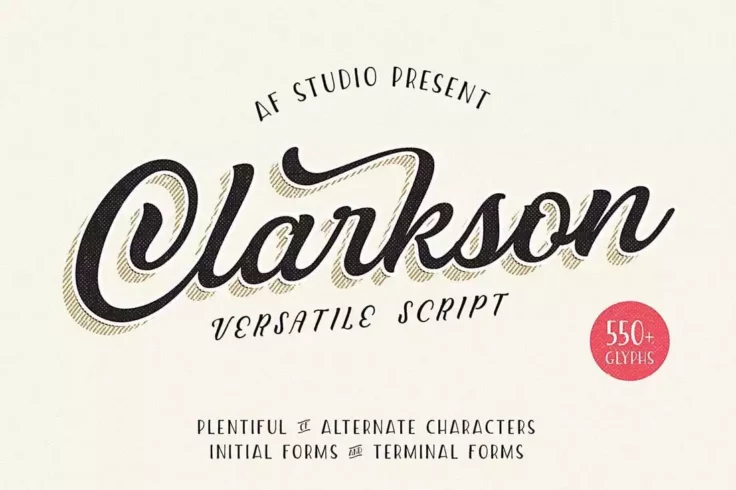
Clarkson Script Font
Clarkson is a beautifully crafted font that exudes a sense of classic elegance and timelessness. With over 550 characters in various styles, this font...

Beyone Spooky Font
Beyone is a serif font that is perfect for Halloween-themed designs. It features a unique letter design that is both fun and kid-friendly. The font in...

The Great Outdoors Font
The Great Outdoors is a versatile typeface that is perfect for outdoor and nature-themed designs. The font comes in two styles, clean and rough, which...

Zelda Font
Zelda is an art deco font that is inspired by the popular video game of the same name. This unique font comes in four different styles, including regu...

Metropolia Cyberpunk-Style Futuristic Font
Metropolia is a unique font that combines elements of both modern and vintage design to create a steampunk aesthetic. The font is perfect for designin...

Kust Brush Font
Kust is a one-of-a-kind, hand-drawn font that boasts a distinct brush-style aesthetic. Each letter is designed with its own unique distorted look that...

Forests Layered Font
Forests is a multi-layered font that offers versatility and creativity to your designs. It consists of three distinct font styles that can be used tog...

Parlour Font
Parlour is a vintage-inspired typeface that is perfect for tattoo designs and barber shop branding. The font is designed to evoke a sense of nostalgia...

Brayden Script Font
Brayden is a versatile font family that includes three script fonts and one sans-serif font, making it an ideal choice for a wide range of design proj...

Polar Press Font
Polar Press is a unique font that brings a touch of vintage charm to any project. Its sans-serif design and two distinct styles (clean and rough) make...

Big Shout Bob Font
Big Shout Bob is an all-caps font design that is perfect for making a statement. Whether you’re creating posters, designing online games, or wor...

URBANO Bold Font
Urbano is a dynamic font family designed for creating bold headlines and titles. This powerful sans-serif font is ideal for posters, magazines, and ot...

Rateline Font
Rateline is a versatile font with a modern retro style. Its stylish alternates make it perfect for various design projects, from posters and banners t...
FAQs About Poster Fonts
What are Poster Fonts?
Poster fonts are typefaces that are specifically designed to be used in large scale applications like posters, banners, billboards, and headlines. These fonts are usually bold and attention-grabbing, designed to be readable and impactful from a distance. They play a crucial role in creating a powerful visual impression and attracting the viewer's attention.
Poster fonts can come in a wide range of styles, from bold and heavy block letters to elegant and expressive scripts. The common thread is their scalability and impact at large sizes. The style of a poster font selected usually depends on the message being conveyed and the overall aesthetic of the design.
Where are Poster Fonts Typically Used?
As their name suggests, poster fonts are most commonly used in posters and other large-scale applications. They're designed to stand out and be legible even from a distance, making them ideal for any design where the text needs to be readable from afar. This can include banners, billboards, signage, and other large-format print materials.
Beyond these applications, poster fonts can also be used in any design context where a bold, impactful font is needed. This might include magazine covers, website headers, logos, or any design where the text needs to stand out and attract attention.
What is the History of Poster Fonts?
The history of poster fonts is closely tied to the history of advertising and public messaging. As mass printing technologies developed in the 19th century, posters became a popular medium for advertising, public announcements, and propaganda. To attract attention and convey messages quickly and effectively, bold, large-scale fonts were needed, giving rise to the poster fonts we know today.
While trends in poster fonts have evolved over the years, the fundamental qualities of boldness, legibility, and impact have remained consistent. Today, poster fonts continue to be a crucial tool in the designer's toolbox, providing a way to create powerful visual statements and attract viewer attention.
What Factors Should Be Considered When Using Poster Fonts?
When using poster fonts, it's important to consider factors such as legibility, scale, and the overall design context. Because poster fonts are designed to be viewed from a distance, they need to be legible and impactful at large sizes. The choice of poster font should align with the message being communicated and the overall design aesthetic.
Color, contrast, and spacing are other important factors to consider. A poster font needs to stand out against its background and should be spaced effectively to ensure readability. The color of the font should contrast well with the background and complement the overall color scheme of the design.
Can Poster Fonts Be Paired with Other Types of Fonts?
Yes, poster fonts can be effectively paired with other types of fonts to create visual hierarchy and contrast. For example, a poster font could be used for the headline to attract attention, while a more legible and subdued font could be used for body text or secondary information.
When pairing fonts, it's crucial to maintain visual harmony. The fonts should complement each other and work together to support the overall design goals. Considerations should include contrast, size, weight, and style compatibility to ensure a successful font pairing.