25+ Best Geometric Fonts
Geometric fonts have letter designs crafted to perfection. Featuring accurate designs that consist of shapes and lines made with proper measurement. They are a perfect example of professional fonts with creative designs. We've selected some of the best free and premium geometric fonts you can download and use in your projects.
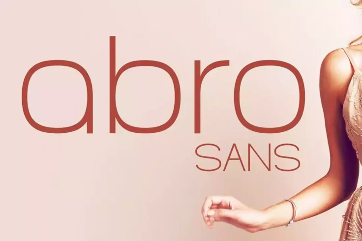
Abro Sans Font
Abro is a geometric font featuring an elegant design. It comes with a set of beautifully crafted characters featuring 3 different font weights. The fo...
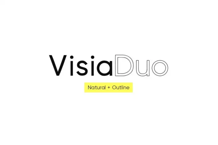
VISIA Duo Geometric Font
Visia Duo is a combination of neo-grotesque fonts that will enhance any project. It boasts clean, minimal lettering, making it ideal for a variety of ...
Learn About Geometric Fonts
What Is the Geometric Design Trend?
Learn about how this trend impacts fonts, patterns, and more.
How Do I Add Fonts to Photoshop?
Learn how to add fonts and start working with them quickly.
What Is a Font License?
Learn the ins and outs of what type of font license you need for your project.
Where Can I Find Free Fonts?
Our pick of the greatest free sources for typefaces online.
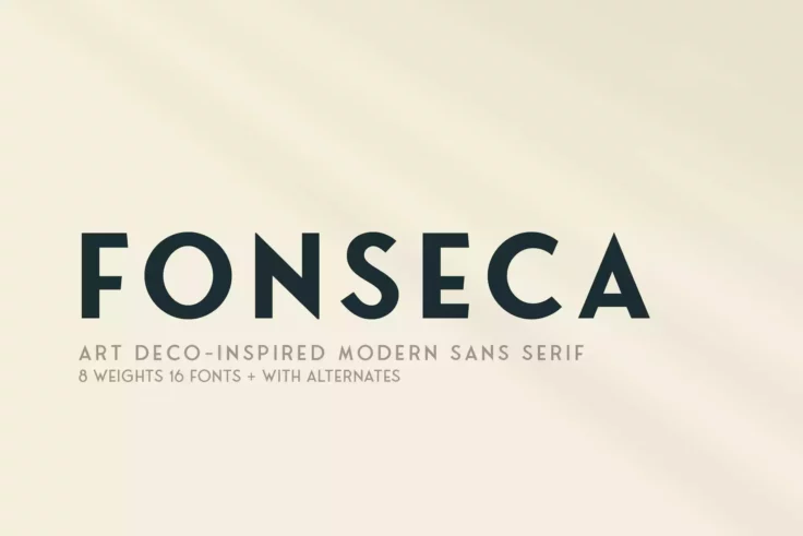
Fonseca Font Family
This modern geometric font finds its inspiration from art-deco style designs. It’s a complete font family that features 8 weights, alternate charact...
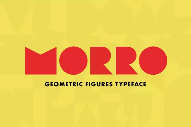
Morro Figures Font
Morro is the perfect candidate for describing the true meaning of geometric font design. This font has a set of letters entirely made up of geometric ...

Architect Geometrical Typeface
This font has a thin and minimal letter design that will fit in nicely with your modern and contemporary design projects. The font includes all-caps l...
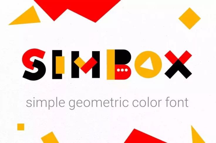
Simbox Geometric Color Font
A yet another geometric color font to use with your fun and quirky design projects. This font features a very colorful set of letters that’s ideal f...

Furiosa Font
Furiosa is a unique and powerful font that is perfect for use in an apocalypse setting. The font is inspired by the iconic character of Furiosa from t...

Magnify Pro Font Family
Magnify Pro is a family of geometric fonts that includes two styles of typefaces in one. Alongside a normal font there’s also an alternate set of le...

Lion Card Font
Lion Card is a handmade geometric font guaranteed to grab eyeballs. It has an incredibly unique design that can be perfect for a range of creative bra...
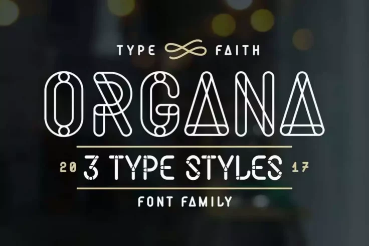
Organa Caps Font Family
Organa is a display font that features a unique, hand-drawn style with a slightly rough edge. The font is characterized by its thick, bold lines and c...
Fox Geometric Logo Font
At first glance, you can see the incredible detailing of each letter of this font. It includes a set of all-caps letters with unique geometric designs...

RNS Miles Font Family
A bold geometric sans-serif font family that comes with a modern letter design. This font is ideal for crafting all kinds of business and professional...
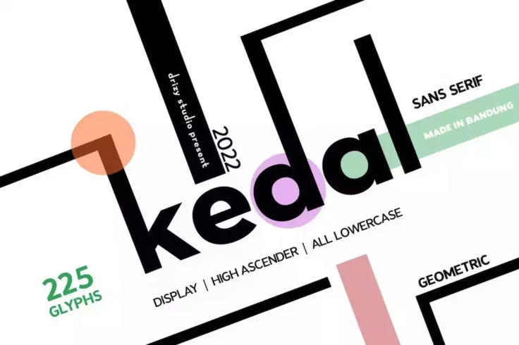
Kedal Font
Kedal is a creative font that also features a set of geometric characters. This font has a simple design that will match almost any type of project yo...

Visby CF Clean Geometric Font
Featuring 8 different weights with obliques, Visby CF is a geometric font designed for professionals. It comes with a clean and minimal design that wi...

Karomah Font
Karomah is a stylish geometric font that comes with a modern and creative letter design. It finds its inspiration from calligraphy and humanist design...

Geometricity Font
This is a geometric color font designed to add a bright and beautiful look to your various creative designs. The lettering of the font is crafted to m...

Focus Grotesk Font
Use this font to design clean and minimal titles for your various print and digital design projects. The font features a simple geometric design that ...
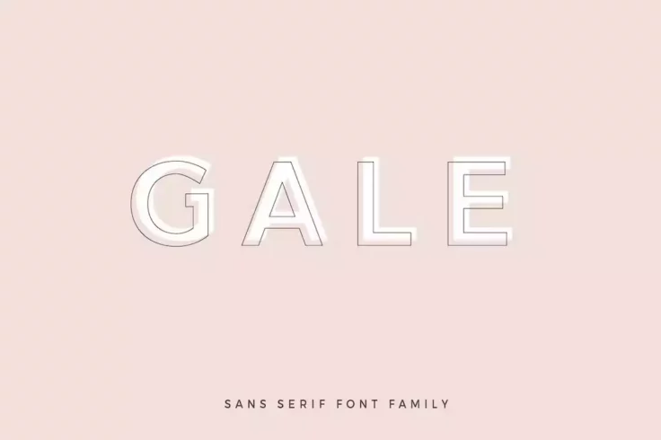
Gale Font
The beautiful modern letters crafted with geometric designs give this font a very stylish look and feel. It’s the perfect font you can use to craft ...

Nineland Serif Font
Nineland is another great geometric font you can use to craft minimalist typography designs. It features a set of serif characters with a unique style...

Ageo Geometric Sans Font
The clean-cut design of this sans-serif font is one of the features that sets it apart from the rest. Ageo is a geometric font you can use with variou...

Avalon Font
Avalon is a creative geometric font that features a design inspired by the logo of the late DJ artist Avicii. This logo seems like a tribute to the ar...

Oasis Font
Oasis is another stylish geometric font with a futuristic letter design. This font features letters made up of multiple lines. It’s ideal for logo a...

George Sans Font
Whether you’re designing a website header, social media post, or a poster, this geometric font will help add an elegant look to your creation. The c...
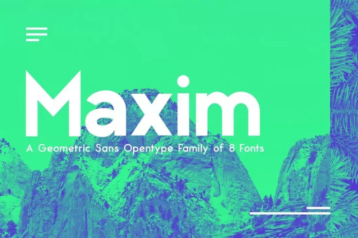
Maximus Sans Family
This font is clearly the perfect choice for designing a website header. It features a very modern and a clean design that will make your titles look c...

Moon Impact Font
Moon Impact is a bold geometric font fitting to a pool of projects that involve creating logos, headlines, titles, and posters. It’s a sleek typ...

Decora Art Deco Font
Taking inspiration from the 1920’s Art Deco Movement, the creators of Decora have done an outstanding job designing a font that oozes luxury, an...
FAQs About Geometric Fonts
What are Geometric Fonts?
Geometric fonts are typefaces that are based on geometric shapes, with letters that are crafted using perfect circles, squares, triangles, and straight lines. They are characterized by a sense of simplicity, precision, and modernity, offering a clean and minimalist aesthetic. Prominent examples of geometric fonts include Futura, Century Gothic, and Avenir.
The distinct style of geometric fonts typically provides excellent readability, especially in larger sizes. However, the emphasis on perfect shapes can sometimes lead to compromised legibility in smaller sizes or in extended passages of text, as some letters can appear quite similar.
Where are Geometric Fonts Typically Used?
Geometric fonts are commonly used in contexts that call for a modern, clean, and minimalist aesthetic. They're a popular choice for branding, especially for tech companies, fashion brands, and other businesses aiming to convey a sense of innovation, sophistication, or forward-thinking. You'll often see geometric fonts used in logos, headlines, posters, and website headers.
Because of their streamlined, straightforward design, geometric fonts can be particularly effective for digital design. They generally display well on screens and can give an interface a contemporary, user-friendly feel. However, due to potential readability issues in long texts or smaller sizes, they're not typically used for body text.
What is the History and Significance of Geometric Fonts?
Geometric fonts first emerged in the 1920s and 1930s, amid the rise of the modernist and Bauhaus movements in design and architecture. These movements embraced principles of simplicity, functionality, and universal beauty, and geometric fonts were seen as embodying these ideals. The typeface Futura, designed by Paul Renner, is one of the most iconic geometric fonts from this era.
Today, geometric fonts continue to be popular in graphic design and typography for their modern, clean aesthetic. They symbolize precision, clarity, and a break from traditional, more ornate typefaces. In branding, a geometric font can convey a company's commitment to innovation, efficiency, and the future.
What Factors Should Be Considered When Using Geometric Fonts?
When using geometric fonts, consider the overall aesthetic and message you want to communicate. Geometric fonts generally project a modern, minimalist, and sophisticated image, so they work best in design contexts that align with these attributes. The font size and amount of text are also important considerations due to potential readability issues—geometric fonts shine in large sizes and shorter texts, but may not be the best choice for long paragraphs or small print.
It's also crucial to consider how the geometric font interacts with other design elements. The clean lines and shapes of these fonts can contrast beautifully with more organic or textured elements, but can also complement a minimalist, streamlined design. Experiment with different combinations to see what works best for your specific project.
Can Geometric Fonts Be Paired with Other Types of Fonts?
Yes, geometric fonts can be effectively paired with other types of fonts. They often pair well with humanist sans-serifs or serif fonts, which can provide a pleasing contrast and balance. The geometric font can be used for headers or other prominent text, while the more traditional or organic font can be used for body text to ensure readability. Examples of good pairings can be found on font-pairing resources such as Font Pair.
When pairing fonts, the key is to maintain harmony and balance. The fonts should complement each other without competing for attention. Using fonts from the same family or that share certain characteristics—such as x-height or letter width—can help to create a cohesive, visually pleasing design. For more guidance, you can refer to resources like Typographica or Typewolf.