20+ Best Mid-Century 50’s & 60’s Fonts
Embrace the vintage charm of the mid-century with our 50's and 60's fonts. Perfect for designs requiring a retro, nostalgic vibe. These fonts capture the cool, classic spirit of these vibrant decades.
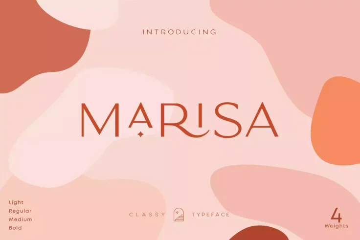
Classy Marisa Mid Century Font
Classy Marisa is the right mix of minimalism, modernity, and vintage style. This versatile font is a friendlier and warmer version of the Mid-Century ...

Herald Font
Many of the invitations and TV shows of the Mid-Century era featured fun serif fonts. Herald is a font that’s very close to the originals being ...

Boomerang Hawaiian Retro Font
Boomerang is an all caps Hawaiian inspired typeface. This mid century inspired font is perfect advertisings, branding, album covers, apparel, business...

Schmalfette Font
Schmalfette is inspired by the Mid-Century sans serif fonts of the 1950s. It is a revival of the original Schmalfette Grotesk, with small changes to a...

Fifties 50s Retro Font
Fifties is a beautiful mid century font that is well worth checking out. Inspired by the many vintage novel cover back from the 1950s, this font is a ...
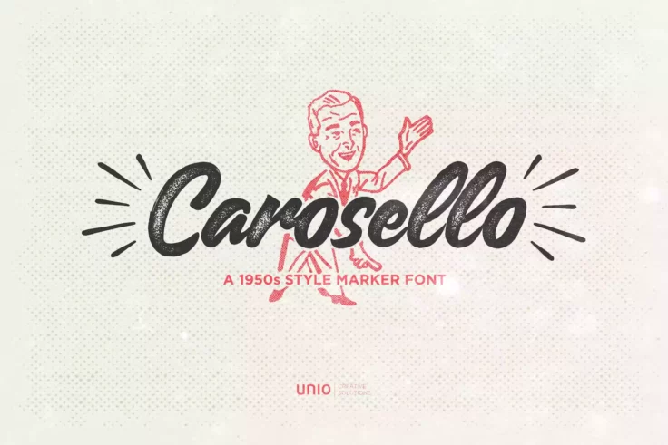
Carosello Font
This vintage-inspired font was created with a real Sharpie marker to display the imperfections. Mid-Century script fonts were very big in the 1950sâ�...

Arkland Mid Century Font
This script font is retro and modern at the same time. It is inspired by badges, signs, and pins. The Mid-Century font style contains multiple stylist...

Merisk Font
Merisk is modern vintage font with visual elegance, smooth curves and beautiful ligatures clear, making your work look true and attractive. This font ...

Broadley Script Mid Century Font
Boardley Script is a script-style display font in two layers. Boardley Script was the result of an exploration of mid-century American and European bo...

Fokus Font
Inspired by mid-century print design, the height of this condensed typeface automatically draws attention and can be utilized to create beautiful head...

Hellenic Wide Mid Century Font
Mid-Century design saw a few slab serifs in use on advertising and billboards. This wide font is full of fun and personality. This type of Mid-Century...

San Marino Font
This Mid-Century font comes in four styles, including regular, outline, and italic versions. Most geometric mid-century modern font numbers have the s...

Vintaging Mid Century Font
This Mid-Century font is very elegant, which makes it perfect for wedding invitations. The font comes in four weights and supports multiple languages....

Sunset Strip 60s Style Font
Sunset Strip is a beautiful casual script font with a wide range of applications. The flowing ease of this font with its mid-century modern style make...

Undeka Mid Century Font
Undeka Regular is a contemporary sans serif that combines geometric forms and strong type foundations. It’s inspired by the grotesk typefaces fr...

Belymon Font
Belymon is another script font that has a brush and ink feel to it. Vintage, highly legible, and fun, this font mimics many of the custom ink designs ...

Retylle Solyta Font
This awesome Mid-Century script font has a great handmade quality to it. The letters are highly legible and uncomplicated, making it perfect for any t...

Let’s Jazz 50s Retro Font
If you are designing a thematic design piece, Let’s Jazz is a fun Mid-Century font inspired by the advertising and lettering of that era. This j...

Pipetton Font
This font duo consists of two fonts: a Mid-Century sans serif font and a script. If you are still getting used to pairing fonts, this is a great duo t...

Roger Font
Roger is another elegant and minimalist font that resembles the Mid-Century sans serif fonts from the beginning of the period. The similar width and h...
FAQs About Mid-Century 50’s & 60’s Fonts
What characteristics define Mid-Century 50’s & 60’s Fonts?
Mid-Century 50’s and 60’s Fonts feature modern, clean lines and geometric shapes inspired by the minimalist design aesthetics prevalent during the mid-20th century. These typefaces share similar attributes such as limited stroke contrast, large x-heights, and a significant influence from industrial and architecture designs of the era.
These fonts often exhibit a mix of organic and rigid form, with either chunky, bold weights or elegant, thin lines. Common examples include sans-serif styles like Helvetica and Futura, or slab-serifs such as Clarendon.
How were Mid-Century 50’s & 60’s Fonts used during that era?
In the 50’s and 60’s, these fonts were used extensively across various forms of print and media. This included advertising, product packaging, editorial design for magazines and newspapers, and corporate branding, aligning with the modernistic trends of post-war consumer culture.
One famous application is the 'Swiss Style' or 'International Typographic Style' in graphic design that heavily utilized sans-serif typefaces like Helvetica. The bold, modern qualities of these typefaces became a defining characteristic of the mid-century era.
Why do designers still use Mid-Century 50’s & 60’s Fonts today?
Even in the 21st century, designers continue to use Mid-Century 50’s and 60’s Fonts due to their timeless, minimal, and clean attributes, helping them create sleek, modern designs. These fonts easily read in print and digital form, add a modern yet retro touch to designs, and are perfectly suited for different design themes and contexts, from advertising and branding to editorial design.
Moreover, there is a level of nostalgia associated with these fonts that make designs feel instantly familiar and appealing to audiences, making them a favorite among many graphic and type designers.
Are there any popular typefaces from the Mid-Century 50’s & 60's era?
Yes, there are many popular typefaces that emerged during this era and are still in wide use today. Sans-serif typefaces such as Helvetica, Futura, and Univers are some examples. Other popular fonts include the Clarendon slab-serif and the quirky yet sophisticated Mrs Eaves, a modern interpretation of the transitional serif Baskerville.
Each of these typefaces embodies the unique aesthetic of the mid-century period: a perfect blend of form and function, clean lines, and geometric shapes, reflecting the optimistic spirit and innovative design thinking of the times.
How do Mid-Century 50’s & 60’s Fonts affect the overall design esthetic?
Mid-Century 50’s and 60’s Fonts contribute significantly to the overall aesthetic of a design. They can instantly evoke a mood or era, lending designs a certain nostalgic charm or a bold, modernist edge. The clean lines and geometric shapes of these fonts are excellent for creating clear, legible design layouts that still manage to convey sophistication and style.
More than just typefaces, Mid-Century fonts are a reflection of an era marked by optimism, innovation, and progress. They communicate function, but also an underlying appreciation for design and aesthetics, reinforcing the importance of typography in creating effective and impactful design compositions.