50+ Best Gothic Fonts
There’s something unusually attractive about a gothic font design. It can make any typographical layout look magnificent and majestic, and it’s probably why gothic fonts are widely used in branding and logo design. If you’ve been looking for a unique gothic font for a new project, you’re in luck.
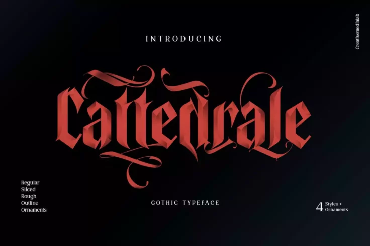
Cattedrale Font
Cattedrale is a unique font that is perfect for Gothic-themed projects. With its blackletter design and 4 different styles, this font is a great choic...
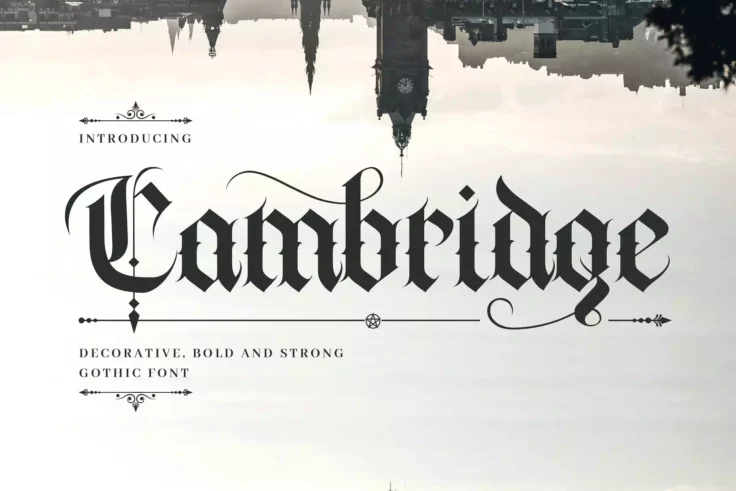
Cambridge Bold Medieval Gothic Font
Cambridge is a hand-lettering decorative font with a medieval gothic feeling. This font is suitable for a wide range of occasions, including books, lo...
Learn About Gothic Fonts
How Do I Add Fonts to Photoshop?
Learn how to add fonts and start working with them quickly.
What Is a Font License?
Learn the ins and outs of what type of font license you need for your project.
Where Can I Find Free Fonts?
Our pick of the greatest free sources for typefaces online.
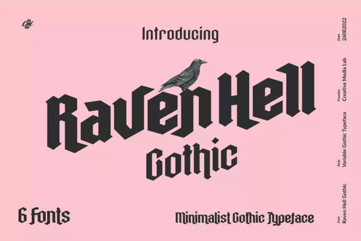
Raven Hell Gothic
Raven Hell is a modern and minimal gothic font that features a unique character design. This font is part of a font family that includes six different...
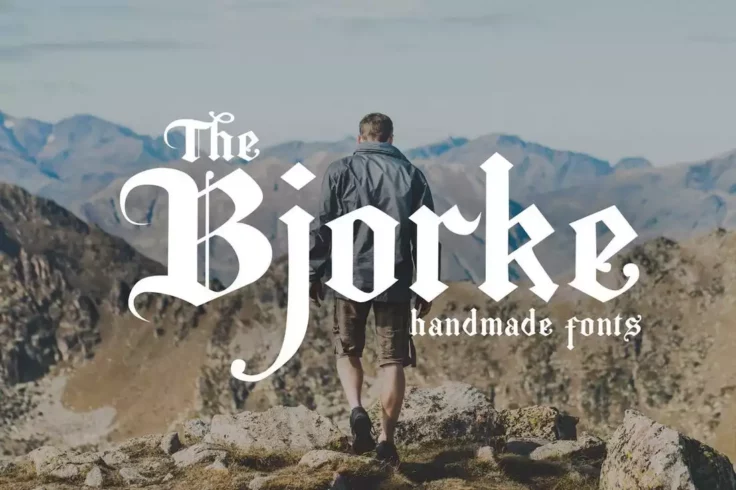
The Bjorke Font
Bjorke is a handmade font with a gothic twist that is sure to make any project stand out. This font features a unique and organic design that gives it...
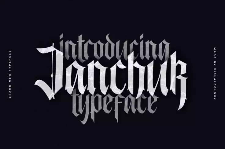
Janchuk Font
Janchuk features a distinctive serif style that sets it apart from other blackletter fonts on the market. The design of the font is also characterized...
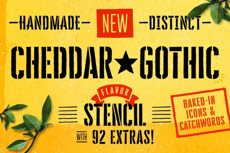
Cheddar Gothic Font
Cheddar Gothic is a striking and unique typeface that has been designed with attention to detail. This font family includes nine different styles that...
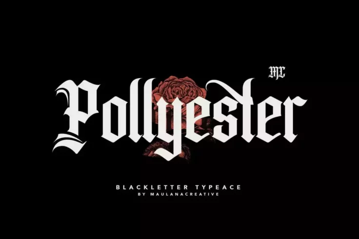
Pollyester Blackletter Old English Font
Pollyester is a stylish blackletter typeface font that combines traditional elements with modern designs. It works well in both digital and print form...
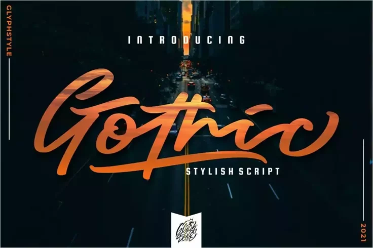
Gothic Stylish Script Font
Gothic is a stylish and bold script font that is characterized by its intricate design and a wide selection of characters, including flourishes, swash...
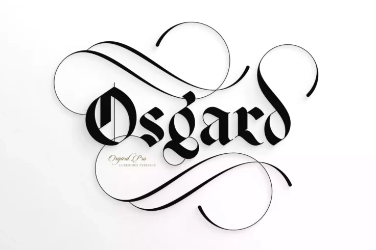
Osgard Pro Font
Osgard Pro is a powerful and luxurious typeface that combines the fluid curvaceous elements of Romanesque typography with the Gothic style of Blacklet...
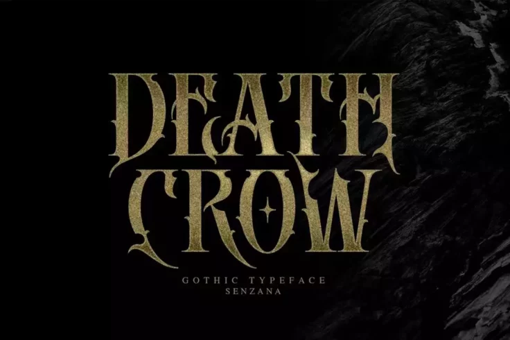
Death Crow Font
Death Crow is a bold gothic font with a unique decorative character design. Whether you’re crafting a title for a movie poster or a fantasy book cov...
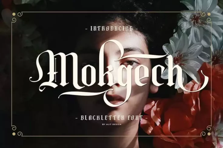
Mokgech Blackletter Font
Mokgech is a unique typeface that draws inspiration from classic blackletter letters. Its distinct style and numerous alternative characters, such as ...
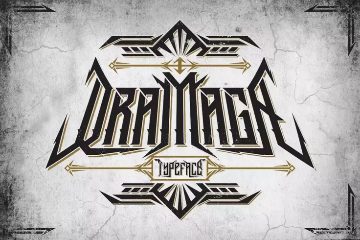
Dramaga Gothic Typeface
Dramaga is a gothic font that is designed to create a bold statement. Its unique design is perfect for any project that requires a dark and edgy feel....
Trotont Gothic Font
Trotont is a gothic-inspired font that takes its cues from the black letter and gothic scene. This font gives off a masculine, dashing, and slightly s...
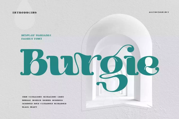
Burgie Font
Burgie is a modern gothic font that embodies the essence of elegance, luxury, and sophistication. Its unique style, combined with its modern serif fon...
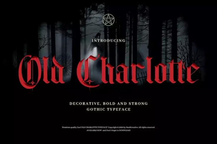
Old Charlotte Decorative Gothic Medieval Font
Old Charlotte is a bold and decorative gothic font that captures the essence of a bygone era. Designed with horror-themed projects in mind, Old Charlo...
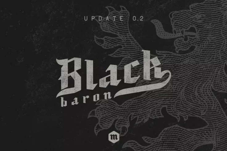
Black Baron Gothic Font
Black Baron is a modern blackletter font that draws inspiration from traditional Gothic and old English typefaces. Designed to create a dramatic and m...
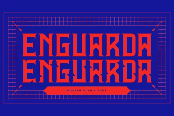
Enguarda Font
Enguarda is a stunning font that pays homage to classic martial arts movies and games like Enter the Dragon, Snake in the Eagle’s Shadow, Mortal Kom...
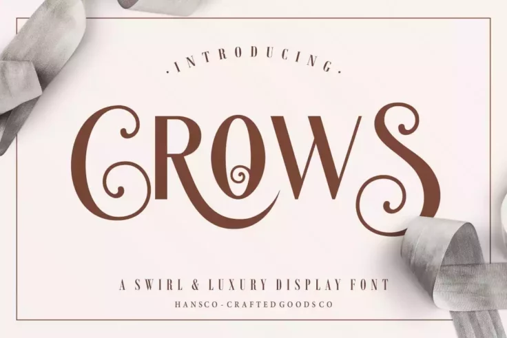
Crows Font
Crows is a display sans serif font with a unique and elegant appearance. It is designed to be versatile and suitable for a wide range of projects, fro...
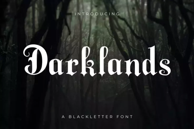
Darklands Blackletter Font
Darklands is an incredibly unique and eye-catching blackletter font that truly stands out from the crowd. With its elegant and modern design, it combi...
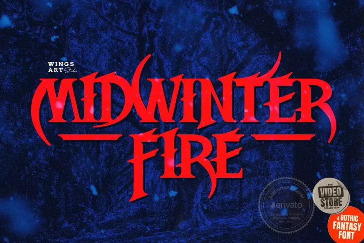
Midwinter Fire Font
Midwinter Fire is a stunning font that draws inspiration from a variety of sources, including gothic cathedrals, ancient myths, and campfire horror st...
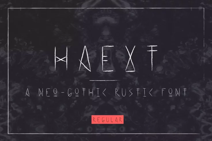
Haext Font
Haext is a unique and intriguing font that draws inspiration from a variety of sources. It has a neo-Gothic rustic feel, with elements of Art Nouveau ...
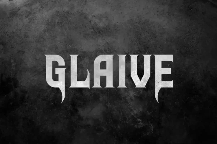
Glaive Typeface
Glaive is a unique and edgy typeface that is inspired by the music genre of rock and metal. Its bold and strong design captures the raw energy and pow...
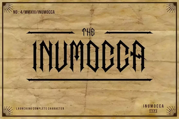
The Inumocca Font
Inumocca is a sans-serif typeface that exudes a gothic vibe with its narrow design and intricate ornaments. It is an impressive font that is perfect f...
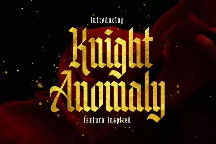
Knight Anomaly Font
Knight Anomaly is a beautifully crafted blackletter font that takes inspiration from the Textura calligraphy style, which was popular in West Europe d...
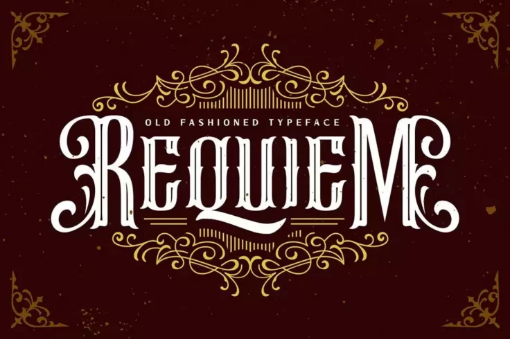
Requiem Gothic Font
Requiem is an all-caps font that exudes a vintage, and dark feel. The font has a timeless appeal and can be used for various applications, including h...
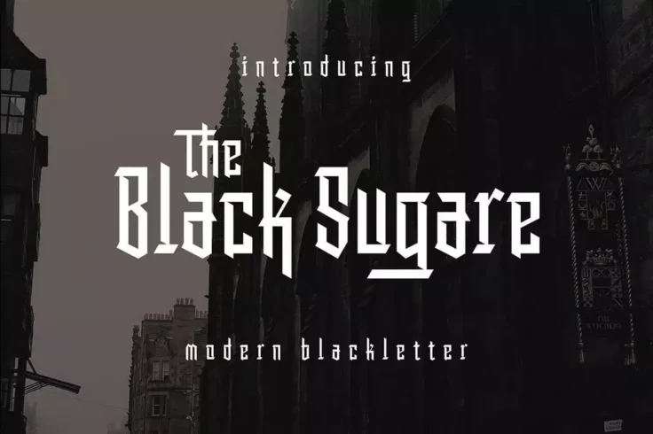
Black Sugare Font
Black Sugare is a unique and modern font that combines the classic gothic era with geometric shapes. The result is a simple, yet elegant black letter ...
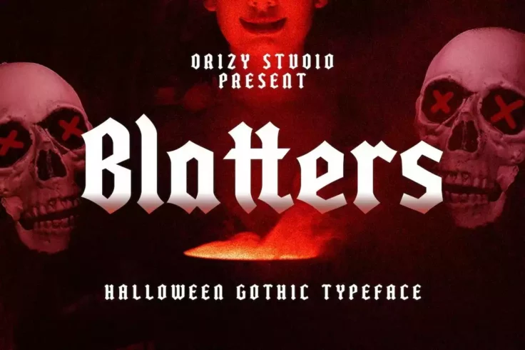
Blatters Font
Blatters is a horror-themed gothic font that comes with a set of creative letters. The font includes uppercase and lowercase letters with alternate ch...
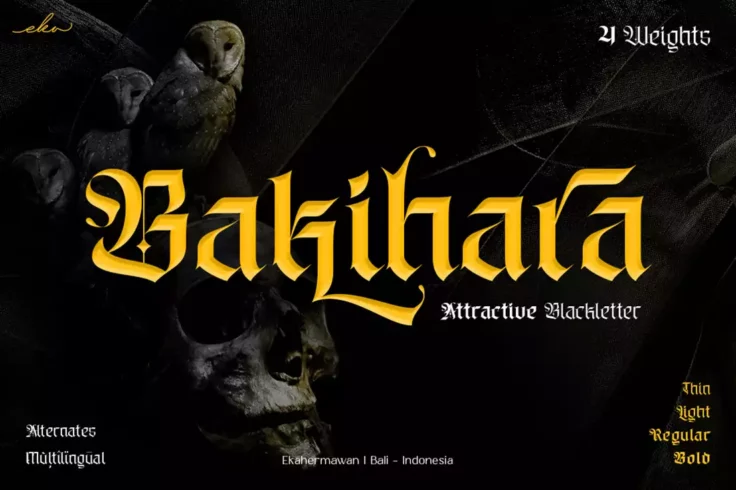
Bakihara Font
Bakihara is a versatile blackletter font that can add a touch of gothic elegance to your designs. With its full set of uppercase and lowercase charact...
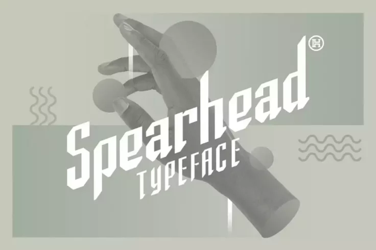
Spearhead Vintage Typeface
Spearhead is designed to give a strong visual appearance to any design project that needs an active and strong look, such as headers, logos, captions,...
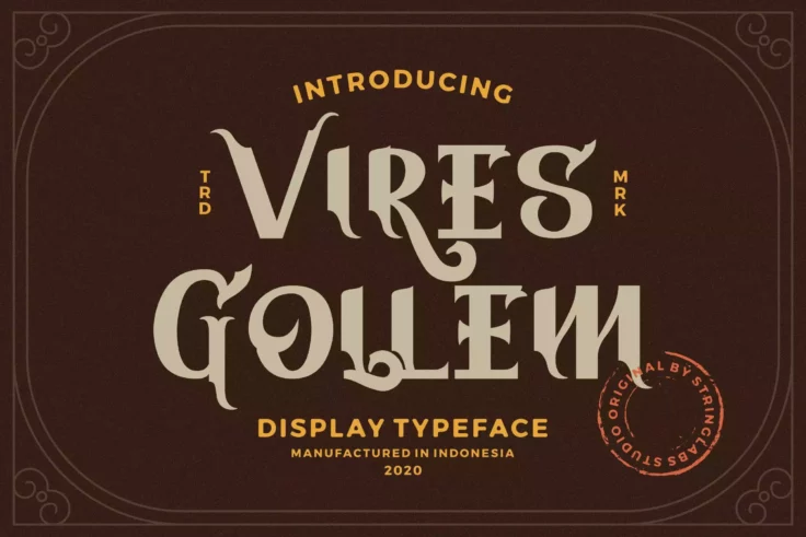
Vires Gollem Font
Vires Gollem is a unique and modern decorative display font. This playfully conceptual typeface is sure to stand out in any context. It comes with upp...
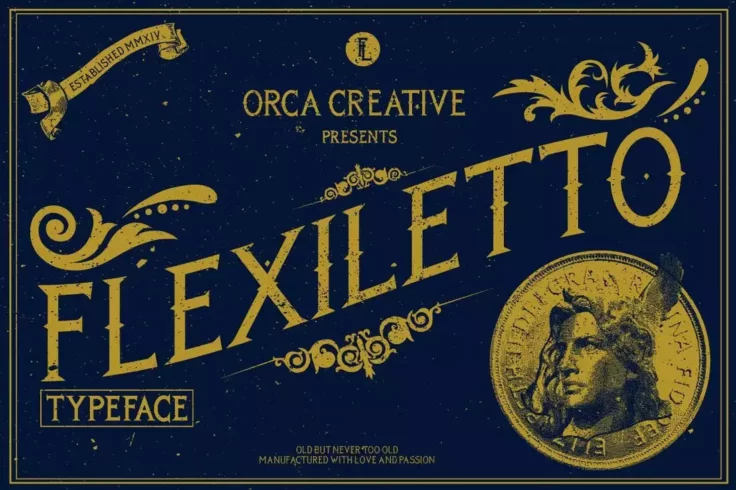
Flexiletto Vintage Font
Flexiletto features a classic vintage look and feel that’s been inspired by the old-school print and signage designs. This font is perfect for vinta...
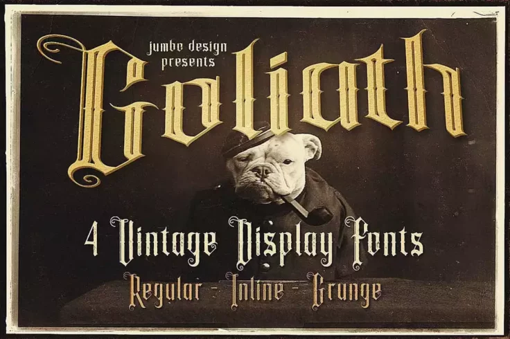
Goliath Tattoo Style Display Font
Goliath is a stunning vintage-style font that exudes an aura of raw power and boldness. This font is a perfect blend of elegance and roughness, making...
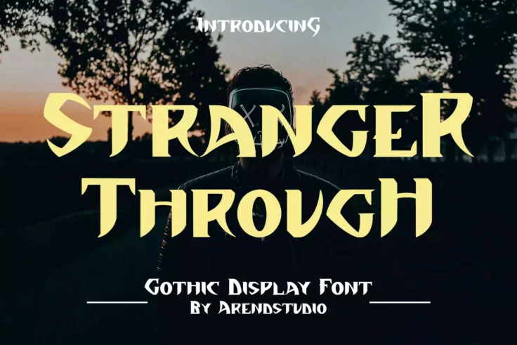
Stranger Through Font
Stranger Through is a striking and unique font that is perfect for those who want to create designs with a gothic horror theme. The font’s intri...
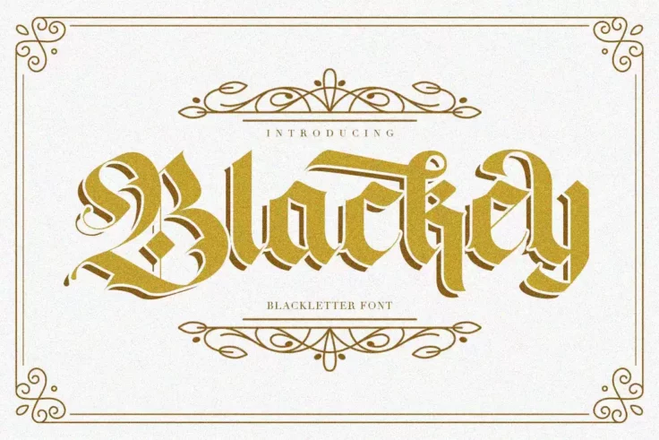
Blackey Decorative Font
Blackey is a stunning handmade Victorian blackletter font that combines classic and modern typography. The ornate, intricate lettering of Blackey take...
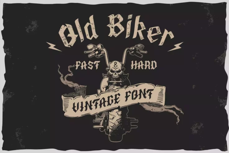
Old Biker Font
Old Biker is a multilayer typeface that has been designed with inspiration from gothic, biker, and rock cultures. It is a perfect fit for any design p...
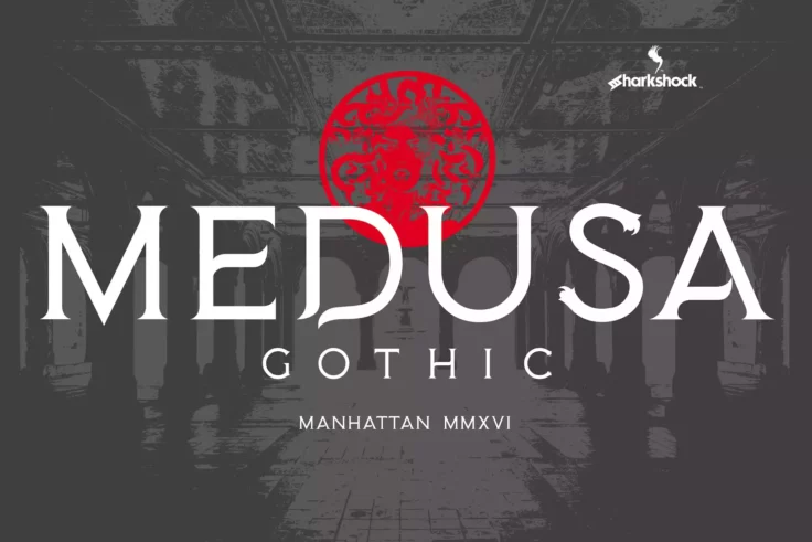
Medusa Gothic Font
Medusa Gothic is a beautiful font that captures the essence of gothic design. With its unique ornaments and serifs, the font maintains a sense of eleg...
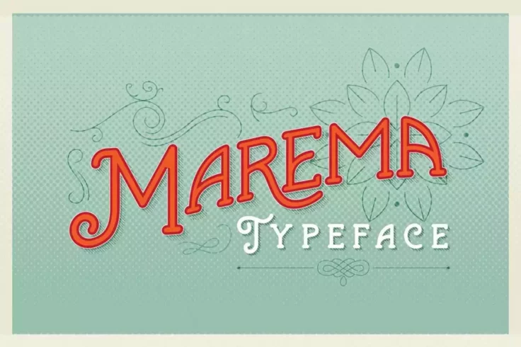
Marema Gothic Typeface
Marema is a stunning retro-vintage font that will transport you back in time with its gothic design elements. The font has a unique, creative flow tha...
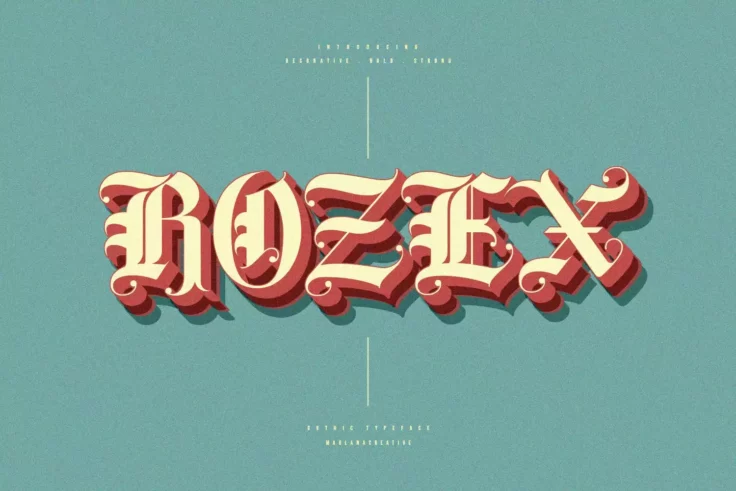
Rozex Bold Medieval Gothic Font
Rozex is a bold and decorative font with a medieval gothic touch. Its unique hand lettering style makes it a perfect choice for a wide range of profes...
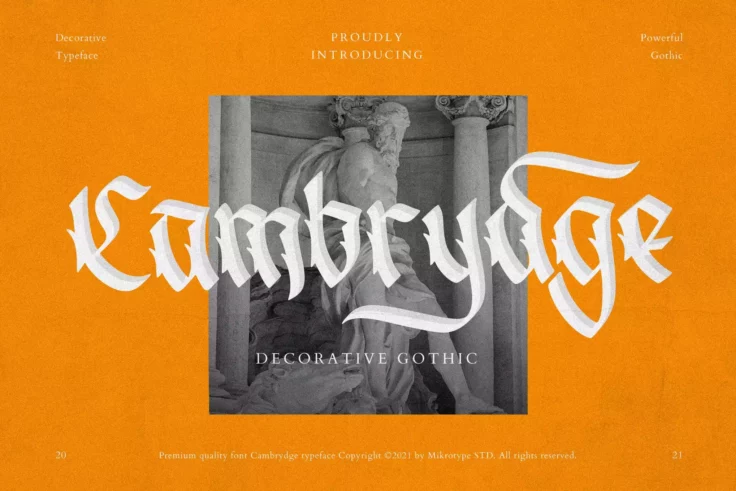
Cambrydge Font
Cambrydge is an eye-catching gothic font that is perfectly suitable for many purposes. Its modern and innovative design is in line with the latest des...
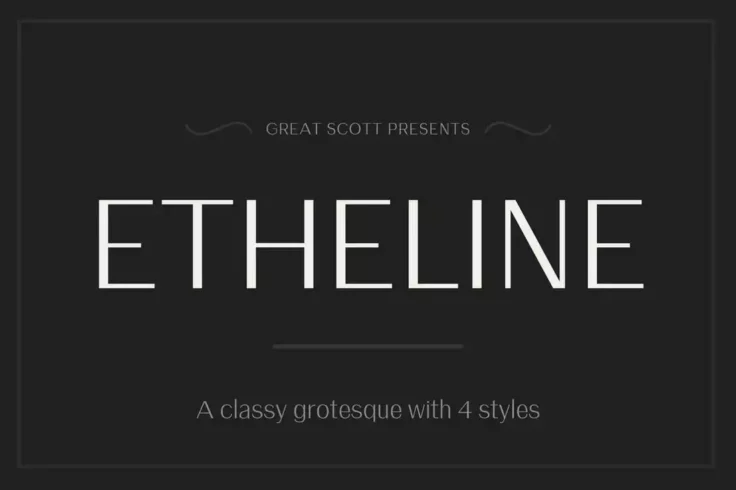
Etheline Grotesque Font
Crafted with a touch of contrast and a notably high x-height, Etheline is a classic grotesque font that lends itself well to diverse design applicatio...
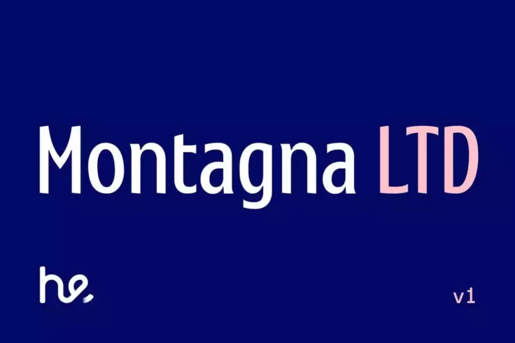
Montagna Font
Montagna is a beautiful typeface that is perfect for various applications. Its tight and pointed serifs add a unique flair to any design, making it id...
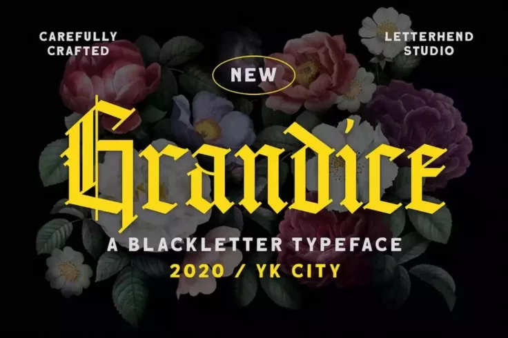
Grandice Blackletter Old English Font
Grandice is a unique gothic blackletter font that comes with a stylish letter design. This font is ideal for crafting logos and brand identities with ...
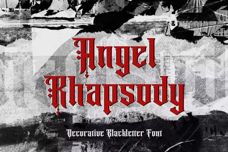
Angel Rhapsody Font
Angel Rhapsody is a blackletter font designed to create bold and impactful designs. Whether you want to create a logo for a metal band, a T-shirt desi...
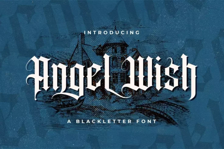
Angel Wish Font
Angel Wish is a bold and striking blackletter font that exudes a gothic and retro aesthetic. The design of the font draws inspiration from vintage sig...
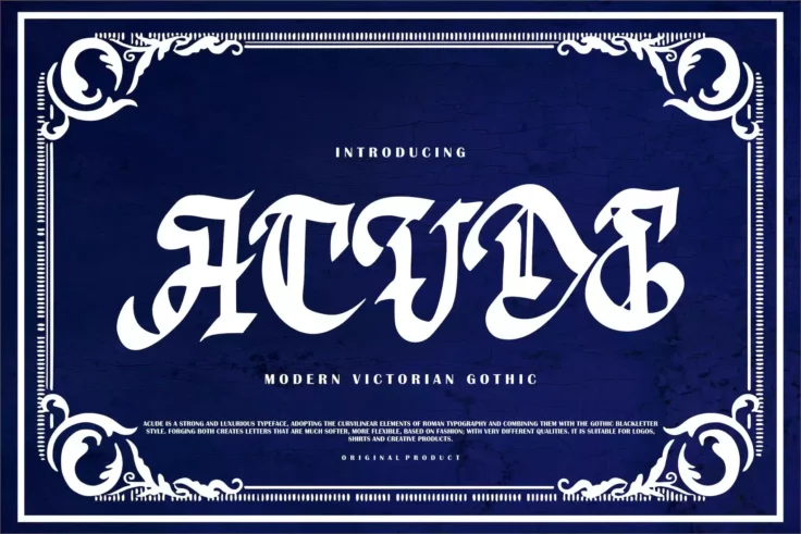
Acude Font
Acude is a calligraphy-style font with a modern Victorian Gothic design. This font is packed with features, including tons of glyphs, alternates, and ...
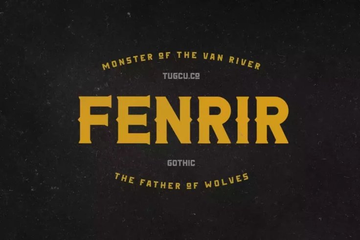
Fenrir Gothic Font
Fenrir is a bold serif font with a vintage design and gothic flair. It is a display typeface, meaning it is intended for use in large sizes for headli...
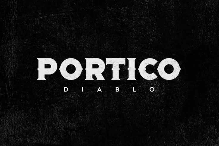
Portico Diablo Font
Portico Diablo is an impressive font that stands out with its bold and gothic design. With its unique and distinctive style, Portico Diablo is an exce...
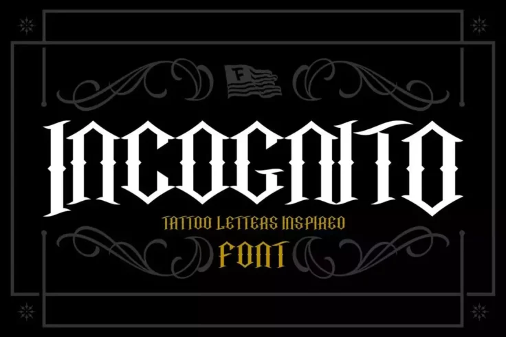
Incognito Font
Incognito is a modern gothic font that draws inspiration from the world of tattoos and kustom kulture. With its bold and intricate design, this font i...
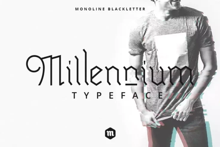
Millennium Font
Millennium is a versatile 2 font family inspired by gothic culture and monoline illustrations, which make it perfect for vintage-themed designs. This ...
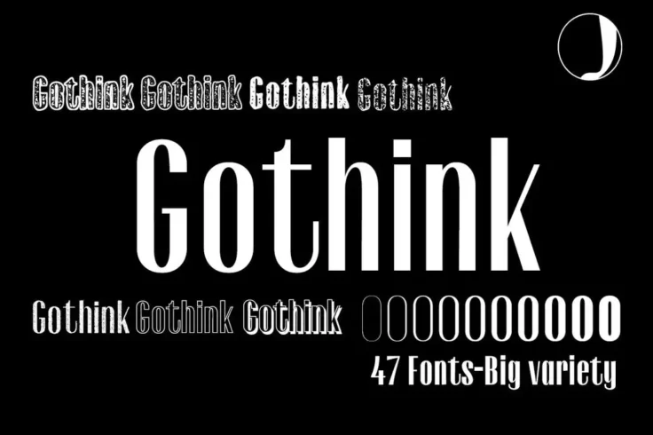
Gothink Gothic Fonts
Gothink is a powerful and comprehensive collection of gothic fonts, designed to cater to the needs of graphic designers, artists, and creatives lookin...
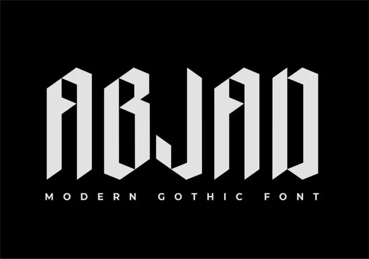
Abjad Font
Abjad is a unique display font that combines the traditional gothic style with a modern touch. The font is perfect for any design project that require...
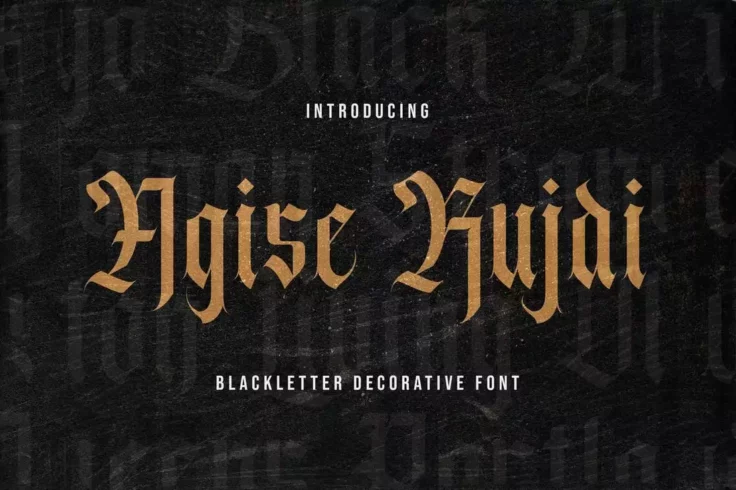
Agise Rujdi Font
Agise Rujdi features a distinct blackletter gothic look perfect for creating eye-catching and unique label and badge designs, as well as many other ty...
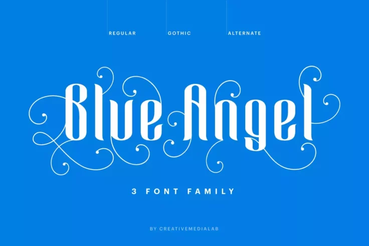
Blue Angel Gothic Font
Blue Angel is a beautifully designed serif font that is sure to add a touch of elegance and sophistication to any design project. Consisting of three ...
FAQs About Gothic Fonts
What are Gothic Fonts?
Gothic fonts, also known as Blackletter fonts, are a type of script that dates back to the Middle Ages, used widely across Western Europe from the 12th to the 17th centuries. They are characterized by their ornate, complex letterforms, with heavy strokes and angular lines. Some well-known examples of gothic fonts include Textura, Old English Text, and Fraktur.
Despite their name, Gothic fonts should not be confused with Gothic or Grotesque typefaces, terms used to describe certain types of sans-serif fonts. The term "Gothic" in typography can refer to different styles depending on the context.
What is the History of Gothic Fonts?
The Gothic script has its origins in calligraphy, developed by scribes during the Middle Ages. Its elaborate and stylized letterforms were often used in religious texts, including many copies of the Bible. The term "Gothic" was later coined in the Renaissance period, where the script was associated with the barbaric Gothic tribes, as the Renaissance scribes considered the script crude compared to the classical Roman scripts they admired.
Despite falling out of favor for many centuries, Gothic fonts saw a revival in the 19th and 20th centuries, often used in newspaper mastheads and for creating a period effect in design. Today, they continue to be used for specific design purposes, often to evoke a sense of history, tradition, or solemnity. You can learn more about the history of Gothic fonts from sources such as Typography.com.
Where are Gothic Fonts Typically Used Today?
Today, Gothic fonts are typically used for specific, often decorative purposes. Due to their historic associations, they are often used to evoke a sense of antiquity, tradition, or solemnity. You'll often see Gothic fonts used in contexts like certificates, diplomas, or traditional pub signs. They're also popular in certain music genres for album covers and logos, such as heavy metal and punk.
However, Gothic fonts are generally not used for body text, as their complex letterforms can make them difficult to read in large amounts or at smaller sizes. In design, they're more often used for headlines, logos, or other short pieces of prominent text. You can explore their use in modern designs on platforms like Behance.
What Factors Should Be Considered When Using Gothic Fonts?
When using Gothic fonts, it's essential to consider the context and the message you want to convey. Gothic fonts carry strong historical and cultural associations, and their use can greatly influence the tone of a design. It's also important to remember their limitations—while striking and expressive, Gothic fonts can be challenging to read, especially in large amounts or at smaller sizes.
The specific Gothic font also matters. While they share certain characteristics, Gothic fonts can differ greatly in their level of ornamentation and legibility. Some, like Old English Text, are quite ornate, while others, like Fraktur, are more restrained. Testing different options and considering your specific design needs is crucial. Sources such as Type.com and Typewolf can provide further insights and inspiration for using Gothic fonts.
Can Gothic Fonts Be Paired with Other Types of Fonts?
Yes, Gothic fonts can be paired with other types of fonts to create interesting contrasts and hierarchy in your design. They often pair well with simple, clean sans-serif or serif fonts. The Gothic font can be used for headings or other standout elements, while the more legible font can be used for body text or other secondary text elements.
When pairing fonts, it's essential to achieve balance and ensure that the fonts complement rather than compete with each other. Consider factors such as x-height, contrast, and mood when choosing font pairs. Websites like Font Pair can be a valuable resource for finding suitable combinations.