105+ Best Condensed & Narrow Fonts
Maximize space without losing impact with our condensed and narrow fonts. These slim characters are perfect for tight spaces or long texts, ensuring your message is clear and legible even when space is at a premium.

BiteChalk Chalkboard Font
BiteChalk is one of the best looking chalkboard fonts we’ve seen. It features a unique handcrafted design with a realistic look that’ll definitely...

Chillvornia Condensed Font
Chillvornia font comes with a unique handcrafted design with decorative letters. The font is perfect for designing modern-vintage badges, posters, tit...
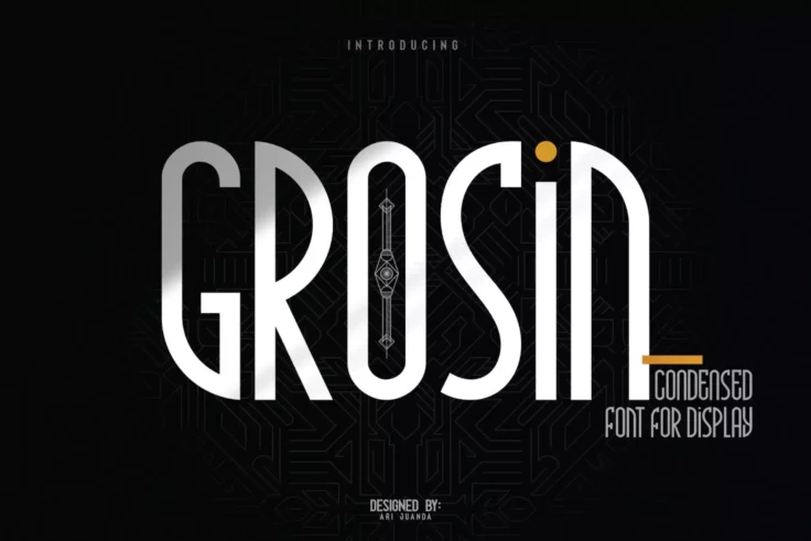
Grosin Narrow Condensed Font
Discover the charm of our new typeface, Grosin; an Art Deco-inspired display font bursting with character and individuality. Its unique design is insp...

Nordams Narrow Font
Nordams is a family of condensed fonts that comes with various styles and weights. It includes 12 different font styles in 5 different weights ranging...
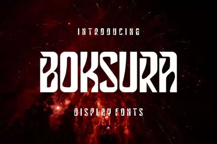
Boksura Stylish Narrow Font
The uncommon design of this font lettering will make your titles and headings look much more attractive. Boksura is a display font with a narrow lette...
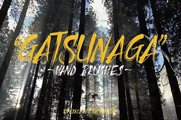
Gatsunaga
Gatsunaga is a condensed brush font that features a design inspired by a samurai sword strikes. Hence the sharp edges and precise flow of the font des...

Blocklyn Font Family
Blocklyn is a great font for showing your titles and mission statements in big bold text. The font family features 4 typefaces Condensed, Condensed It...
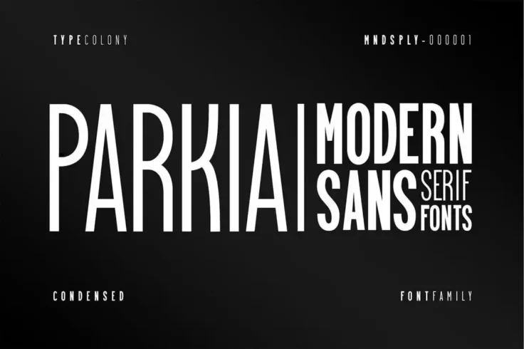
Parkia Condensed Typeface
Parkia is a family of condensed fonts that include typefaces in various styles and font weights. You can use this font with different types of profess...

California Stylish Fashion Condensed Font
This is an elegant and stylish font you can use to craft designs for luxury and fashion brands. It’s especially suitable for designing social me...

Thomson Bold Narrow Font
If you want to design big bold titles that instantly grab attention, be sure to use this font in your designs. It has a set of all-caps letters with c...
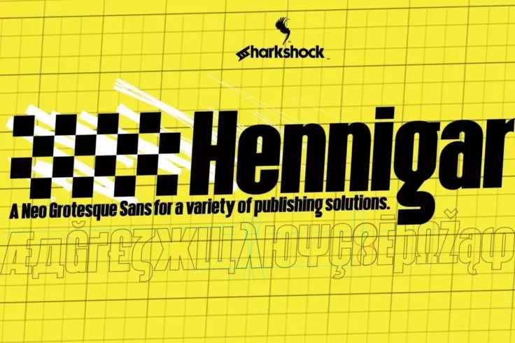
Hennigar
The designer of this font has put a serious thought into crafting each letter in this Neo-Grotesque sans typeface in precision. The font comes in both...

Kahuripan
At first sight, you can see that this is the perfect font for crafting badges, signage, and logos. Kahuripan is a bold display font that can also be u...

Drustic Dialy Modern Condensed Font
Here we have Drustic Daily, a sans-serif condensed font that offers a range of design possibilities. It offers a vintage and old design that you will ...
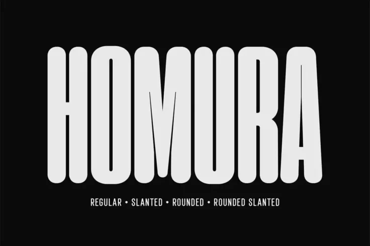
Homura Condensed Rounded Font
Homura is a narrow font made for creative designers. It comes in rounded, slanted, and regular styles. Its unique design will allow you to give a fun ...

Minty March Condensed Font
This is the type of font that you usually see on greeting cards and wedding invitations. Minty March is a condensed font that also doubles as a serif ...

Moonstaire Modern Condensed Font
Perfect for your upcoming projects, Moonstaire is a clean and modern condensed font that can be used for invitation cards, home decore book title, fas...

Yafeu Narrow Font
Yafeu is a bold narrow font you can use to design different types of print and digital creations, including posters, banners, flyers, and website head...

Global
This is a professional condensed serif typeface that’ll make your text looks like something you usually see on modern magazines and corporate we...

Sabang Island Condensed Font
Sabang Island features a unique design that will surely make your designs stand out from the crowd. The font comes in clean and rough styles, both of ...

Mangano
Mangano is a display font that also comes with a textured design. The mix of classic and modern elements make this font truly one of a kind. The font ...
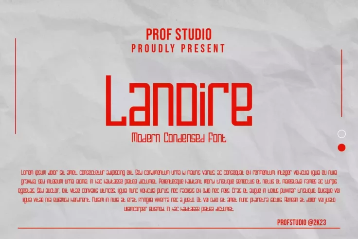
Lanoire Modern Condensed Font
Lanoire is a modern, sleekly condensed font with a distinct contemporary appeal. Perfect for logo designs, branding projects, headlines, and display p...

Nothing Matters Script Condensed Font
This font comes with a beautiful design mixed with handwritten script and condensed letter designs. It’s simply perfect for all your personalize...
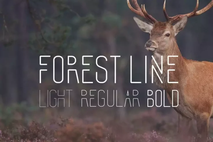
Forest Line
Forrest line is a creative font with a modern design. It’s a multi-purpose font that you can use to design logos, signage, monograms, badges, an...

Carnot All-Caps Font
This all-caps grotesque type font features a minimal and an elegant design for making your logotypes, magazine, and poster design look more profession...

HS Monsnow Experimental Font
Get to know HS Monsnow! This experimental condensed display font brings a particular flair to any project. With its stylish and authentic feel, HS Mon...
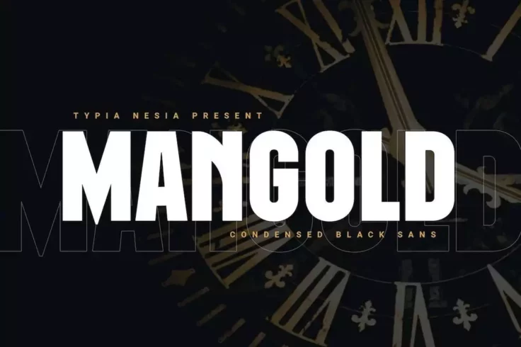
Mangold Bold Condensed Sans Font
Mangold is a bold font with a condensed letter design. This font has thick and heavy lettering to make your titles and headings look much more visible...

Manufaktur Font Family
Manufaktur is a massive font family that comes with a total of 60 fonts. It includes fonts in 5 weights and 3 styles, all of which also ranging from 3...

Lonssa Condensed Typeface
Lonssa is a gorgeous condensed font that comes with a stylishly narrow design. It’s perfect for feminine product design as well as your lifestyl...

Nedo
Nedo is a display font that features both normal and condensed versions. The retro look of this typeface makes it the best choice for neon signs, T-Sh...

Aguero Sans Luxury Sans Serif Narrow Font
Just by looking at this font, you can tell it’s a perfect fit for luxury branding designs. Whether you’re making a logo for a fashion bran...

ARGON Unique Narrow Display Font
Argon is the perfect font you can use to design logos and titles for modern businesses. The font features a set of unique narrow letters unlike any ot...

Fredonia Modern Condensed Font
Another modern condensed font with a stylish letter design. This font is perfect for crafting branding designs for modern agencies and businesses. It ...

Moonscape Unique Condensed Font
Luxury and elegance is written all over this stylish serif font that features tall and narrow letter designs. It’s a great choice for branding d...

Lorison Unique Condensed Fonts
Lorison is a unique font that comes with a set of fun and casual characters. It has a beautifully modern letter design that will fit in perfectly with...

Louvre Elegant Condensed Font
Featuring a mix of art-deco style and elegant luxury design elements, Louvre is a beautiful condensed for that’s perfect for all sorts of high-e...

Essenziale Font Family
Essenziale is a minimalist and an ultra-condensed font family that comes in 8 versions, including Bold, Slab, Slab Bold weights, and more. Each font i...
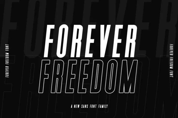
Forever Freedom Narrow Font Family
This modern font family features multiple fonts with different weights and styles. Including italic and outline designs. All of the typefaces have nar...
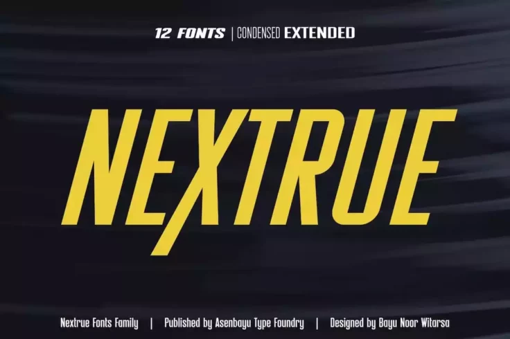
Nextrue Modern Condensed Font Family
Nextrue is another condensed font family that comes with a selection of different styles of fonts. The bundle includes 12 different fonts featuring co...
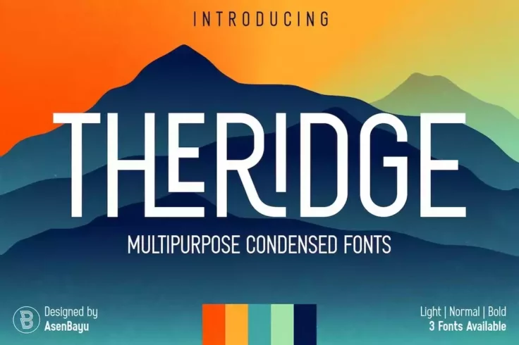
Theridge Multipurpose Condensed Font
This condensed font comes with a classic letter design that resembles typography from vintage signs and posters. It has tall and condensed letters tha...
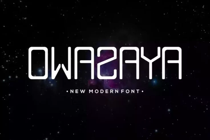
Owazaya Modern Condensed Font
If you’re looking for a modern and futuristic font with condensed letters, this font is perfect for you. It includes a set of all-caps letters f...

Eugerie Classic-Modern Condensed Font
Eugerie is a modern font that also takes inspiration from classic typography designs. It’s a condensed typeface that is ideal for giving a cute ...
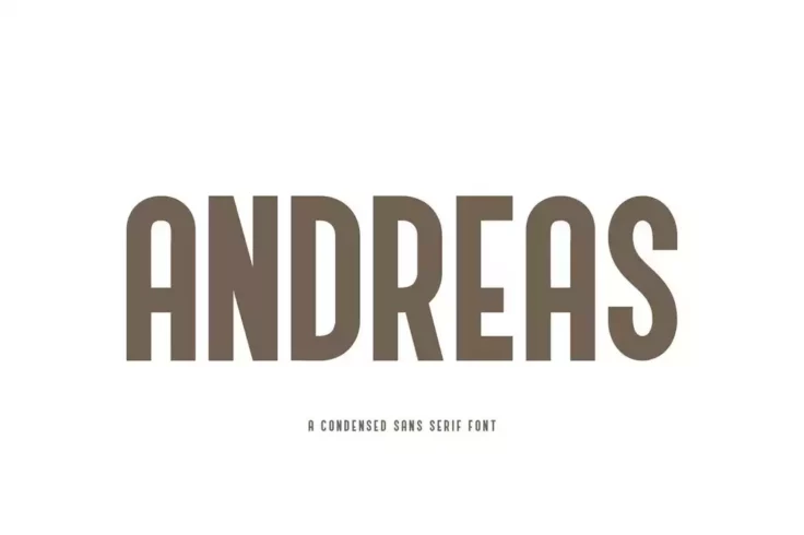
Andreas Condensed Rounded Font
Looking for a condensed font with creative lettering? Then this font is perfect for you. It features a set of unique characters in a narrow style with...

Beaver Creative Narrow Font
Beaver is a very creative narrow font that features a handwritten letter design. This font is perfect for crafting titles for posters, flyers, banners...
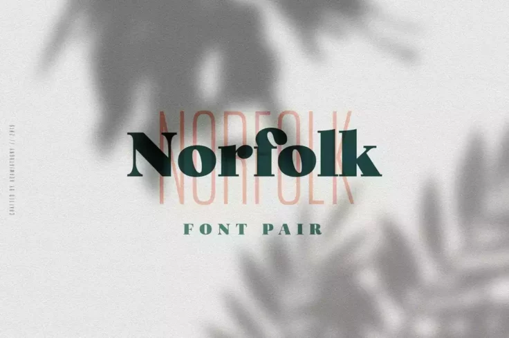
Norfolk Creative Font Pair
This elegant font pair includes both a narrow sans serif font and a bold serif font. Two of which go really well together. You can use both fonts to d...

Ceddil Creative Narrow Font
Ceddil is a creative font with chunky letters. This font also has a narrow letter design that will make your poster titles and headings look even more...

Parginer Condensed Sans
A modern and elegant sans-serif font, Parginer is a stylish font created to suit your every need. This font comes with a family of 10 fonts and matchi...

HOCHLAND Bold Narrow Font
Hochland is a narrow font that comes with a set of thick and bold characters. It’s most suitable for crafting poster titles, product labels, and...

Hammerhead Typeface
Hammerhead is a big, bold, and condensed font that you can use for vintage and retro-themed designs, including logotypes, signage, website headers, ba...
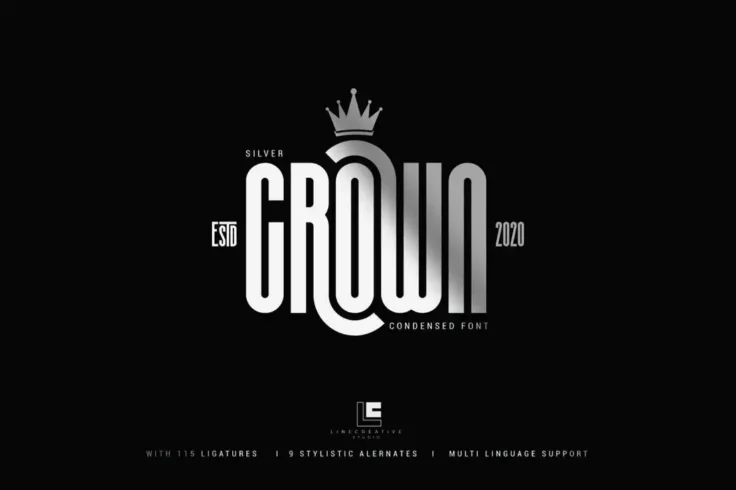
Silver Crown Elegant Condensed Font
Silver Crown is one of the most stylish condensed fonts you’ll find on our list. It features a set of beautiful characters, including stylistic ...
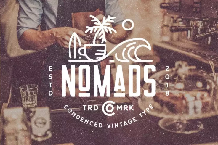
Nomads the Farmer Original Typeface
Nomads font comes with a retro-themed design and decorative elements. It has the ideal look and design making monogram badges. The font is available i...

Nordin Condensed Sans Serif Font
Nordin is a creative sans serif font that features an uncommon letter design. The narrow condensed look also adds another unique look to the font desi...

Checkpoint Display Font
Checkpoint is a professional multilingual font you can use with almost any type of design work, including logos, signage, banners, posters, and much m...
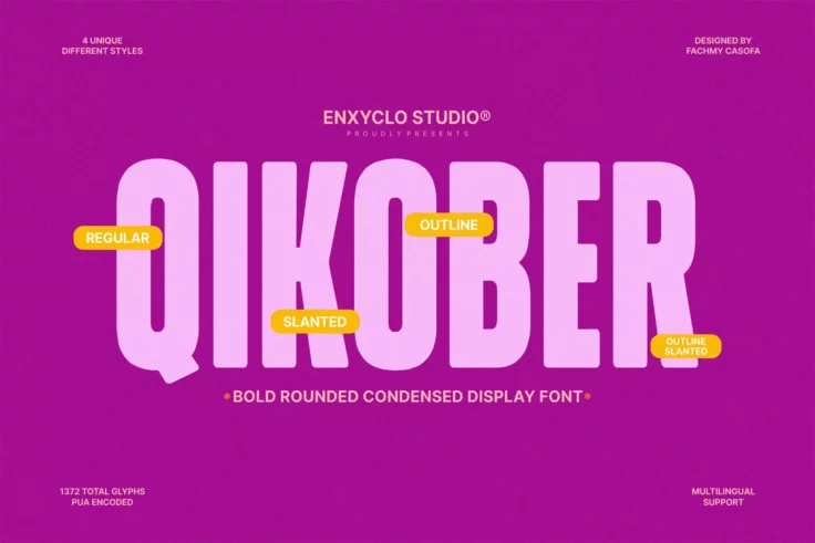
NCL Qikober Bold Rounded Font
The NCL QIKOBER Bold Rounded font is a masterfully designed typography asset that promises to become a firm favorite among creative professionals and ...

Wakatta Japan Style Narrow Font
A unique font with a letter design inspired by Japanese typography and culture. This font has a narrow condensed design alongside its uncommon letters...

Monigue Condensed Sans Font
The Monigue Condensed Sans Serif Font is an attention grabbing font that commands a bold presence. Its thick strokes draw inspiration from the sleek, ...

Ramose Experimental Classic Narrow Serif Font
Ramose is a beautiful experimental font featuring a highly condensed letter design. If you’re interested in experimenting with a new font design...

Braked Font Family
Introducing the Braked Font – A Family Sans Condensed Font. This uniquely patterned font is an artistic display of authentic designs, molded exp...

Tallios Narrow Font
Tallios font comes with a narrow design and stylish rounded edges. It’s most suitable for crafting social media posts, quotes, posters, and T-sh...

Galfego Condensed Sans Serif Font
This font comes with a cool condensed letter design with a funky look and feel. It features letters with unique design elements that will help add a p...

Tinsel Font Family
Tinsel is a family of fonts that features several condensed typefaces. You can use the font for branding work like letterheads, logotypes, business ca...

Selecta
Selecta is a rounded sans serif condensed font that’s perfect for poster and website header designs. The font also features a professional desig...
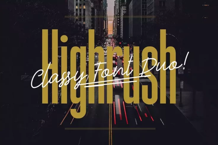
Highrush Condensed & Script Font Duo
This font bundle comes with two different fonts that go perfectly well together. It includes a condensed sans-serif font and a script handwritten font...

Edingu Condensed Sans Serif Font Family
Edingu is an elegant condensed font that features a modern design that’s ideal for professional, luxury, and branding designs. The font is avail...
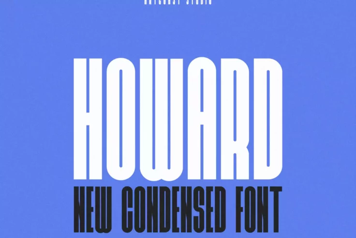
Howard Condensed Font
Designed by Kulokale Studio, Howard is a modern and elegant serif font. It comes in two versions- Regular and italic. This stylistic font is best suit...
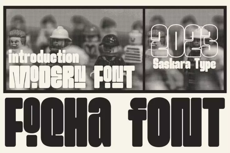
Foqha Quirky Condensed Font
This font has a very unique letter design that gives it a fun and quirky look. It features tall and narrow letters with rounded edges. The font uses a...
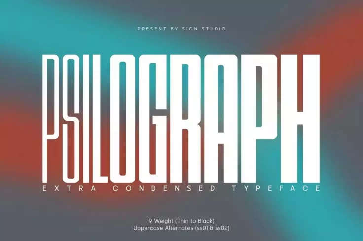
Psilograph Extra Condensed Font Family
This is a condensed font family that includes a range of font weights. There is a total of 9 different fonts in this family, featuring thin to black w...
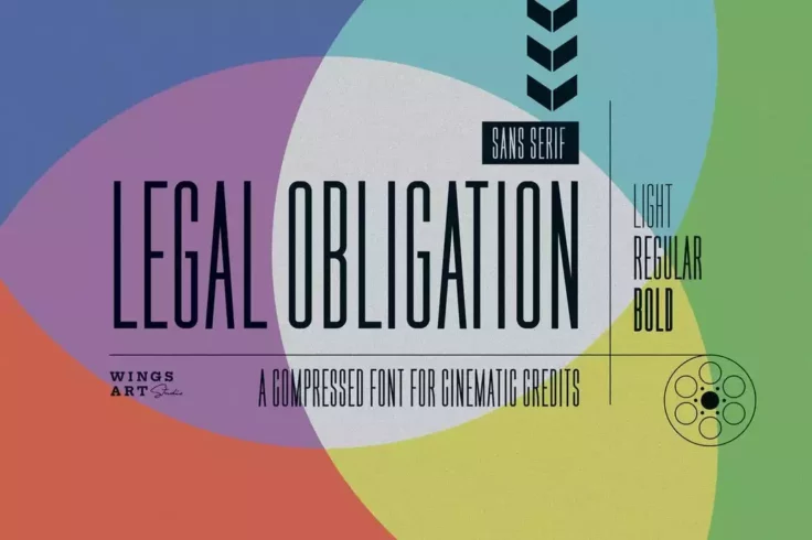
Legal Obligation Compressed Font Family
This is a unique family of fonts that features a compressed narrow design. It comes in light, regular, and bold font weights. As well as in OTF and TT...

CONQUEST Sans & Slab Serif Font
Conquest is a bold serif font with a slightly condensed design. It’s most suitable for making titles and headings related to sports and entertai...

Latinbrush Typeface Family
This highly creative brush font also features a narrow condensed design. It supports multiple languages and comes in several font variations. It’...

Marlong Modern Condensed Font
Introducing Marlong Font, our newest creation in the world of typography! This Modern Condensed Font stands out for its bold and authentic aesthetic. ...
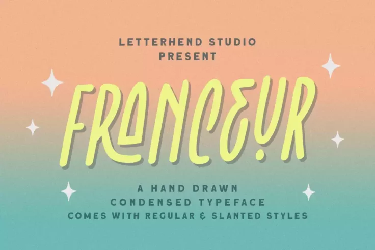
Franceur Cute Condensed Font
If you are looking for a font option with natural handwriting feel, consider Franceur, a stunning typeface design that excels when used for logos, lab...

Vera Typeface
A font made specifically for luxury brands and high-end products, Vera is ideal for showing off authority and class. Vera features a design similar to...

Story Telling Fun Condensed Font
This fun and quirky condensed font is a great choice for crafting posters, greeting cards, book covers, and more related to children of all ages. The ...

Calcio Ultra Condensed Font
Calcio font features a highly condensed design that gives it a narrower look. The font is best for creating titles, headers, and posters. It includes ...
Kurdis Condensed Logo Font
Kurdis is a unique condensed font featuring a geometric letter design. This font has tall and narrow letters that gives it a very creative look and fe...

Qrostil Minimalist Narrow Font
A minimal and stylish font for designing modern typography. This font features unique characters with a narrow letter design. It has all-caps letters ...

Berry Typeface
This slightly rounded multilingual sans-serif typeface supports spanish, portuguese, german, danish, french, and a number of other languages. The mode...

Silkocy Modern Condensed Serif Font
Another condensed serif font you can use with all your modern and luxury designs. This design is ideal for classy branding designs and it’s espe...
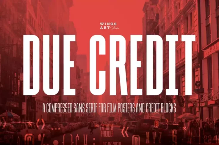
Due Credit Movie Poster Credits Font
This font is designed with movie posters and DVD covers in mind. It features a tall and narrow design to help you craft credit blocks on posters and c...

Eirene Girly Narrow Handwritten Font
Eirene is a trendy handwritten font featuring a feminine design. It has a set of tall and narrow letters. This font is perfect for crafting greeting c...
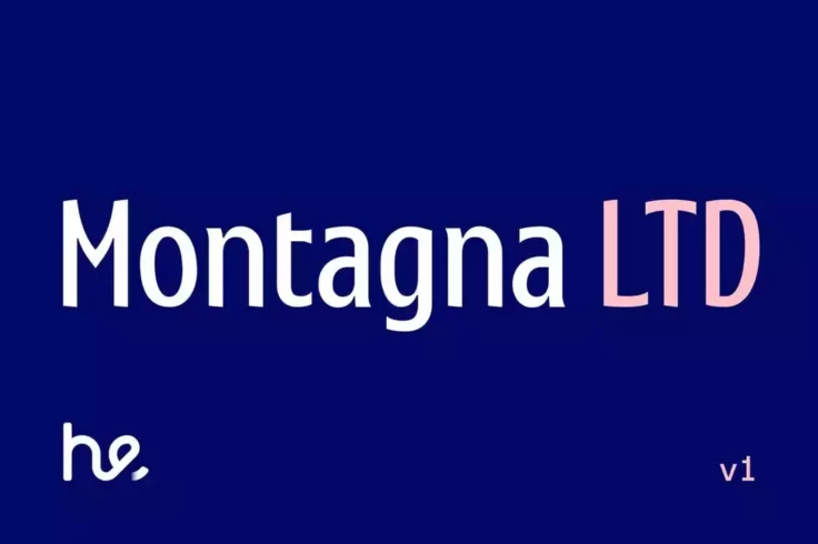
Montagna Font
Montagna is a beautiful typeface that is perfect for various applications. Its tight and pointed serifs add a unique flair to any design, making it id...

Mightyline Bold Condensed Font
If you’re looking for a font with a bold and chunky design, this font is perfect for you. It features a set of bold characters with narrow spaci...

Glorynight Tall Version
This is font will fit in nicely with all of your website header designs, logotypes, badges, and signage designs. The tall and bold design of the font ...

Wilder
This is yet another handwritten condensed sans serif font that includes 300+ glyphs and comes in .otf, .ttf, and web font versions. It’ll look g...
FAQs About Condensed & Narrow Fonts
What are Condensed & Narrow Fonts?
Condensed and narrow fonts are typefaces with a slender and elongated design. The characters of these fonts are narrower than regular or standard fonts. Generally, their letterforms are vertically stretched while maintaining proportion and balance in the horizontal direction.
These fonts are ideal for places where space-saving is a critical aspect. They allow more characters to be fit into a given space, thus improving readability, elegance, and style, especially for print and digital applications.
When should you use Condensed & Narrow Fonts?
The primary use for condensed and narrow fonts is when text space is limited. Due to their slim design, they take up less horizontal space than standard fonts. Therefore, they are particularly useful for long headlines or text columns in newspapers, magazines, posters, billboards, or any other graphic design project where space is a concern.
Apart from that, they are also used to create a visually distinctive or unique typography style. However, condensed and narrow fonts should be used thoughtfully, as excessive use can lead to a cluttered or obtrusive design.
What are some popular Condensed & Narrow Fonts?
There are numerous condensed and narrow fonts popular among designers dues to their readability and distinctive style. Some of the most well-known include Helvetica Neue Condensed, Futura Condensed, Bebas Neue, Roboto Condensed, Univers Condensed, Oswald, and Avenir Next Condensed. Each of these fonts has unique characteristics making them suitable for different design needs.
For instance, Helvetica Neue Condensed is renowned for its clean and modern appearance, while Futura Condensed packs a bold punch perfect for display purposes. Nevertheless, each of these fonts is popular due to their ability to convey information succinctly without sacrificing aesthetics.
How can Condensed & Narrow Fonts affect the overall design look?
Condensed and narrow fonts can have a significant impact on the overall look and feel of a design. Due to their unique shape, they can add a sense of modernity, sophistication, or urgency, depending on how they're used. They can help your texts stand out, especially if you're working with a busy background or alongside various other typefaces.
However, like everything else in design, they should be used thoughtfully and sparingly. While they can significantly enhance a design's appearance when used correctly, they can also make your design look cluttered or hard to read if used excessively or inappropriately.
Are Condensed & Narrow Fonts suitable for all types of content?
Condensed and narrow fonts are incredibly versatile and can be used in various designs, including headlines, logos, posters, and brochures. They are particularly effective when you need to deliver a lot of information in a tiny space. They enhance readability by enabling more words to be fit into a given area without looking crowded or overwhelming.
However, while they are suitable for a range of content, they may not be the best choice for body text or longer paragraphs, especially in small print, as their narrowness can reduce readability. When using narrow or condensed fonts, the specific usage, context, and legibility should always be considered to maintain an effective design.