Font Collections
This is our series of beautiful, inspiring collections of fonts and typefaces. These articles feature bold poster fonts, decorative scripts, and everything in-between! Find the perfect font for your next design project with one of these collections.
Whether you’re looking for a particular type of font or a style of typeface that matches an event or theme, we’ve got you covered. Some of these fonts are free, others are included in an Envato Elements subscriptions, and many cost just a few dollars. The typeface makes the design, and these fonts can elevate your work to a whole new level!
Latest Font Collection Articles
7 Jul 2026
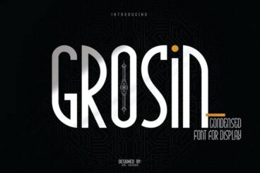
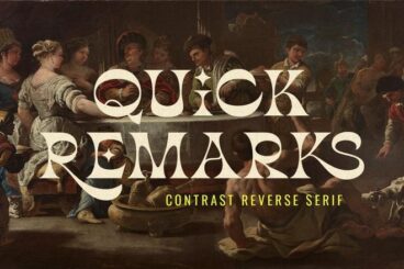
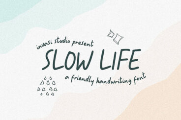
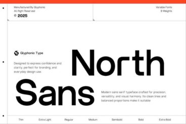
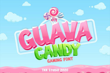
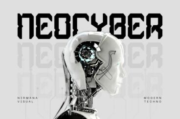
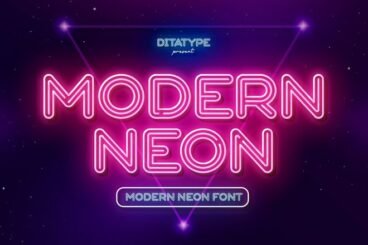
25+ Plain Fonts With Minimal Styling
Sometimes, the simplest fonts make the strongest impact.
Plain fonts strip away unnecessary styling and focus on clean, functional design. Their neutral appearance makes them incredibly versatile, allowing them to work across everything from corporate branding to minimalist websites.
Designers often rely on these fonts to create clear visual hierarchy without overwhelming the layout. With consistent spacing and well-proportioned characters, they maintain readability while supporting a sleek and modern aesthetic.
Below, you’ll discover a curated collection of plain fonts with minimal styling. These fonts are ideal for professional projects that call for clarity, elegance, and a timeless design approach.
7 Jul 2026
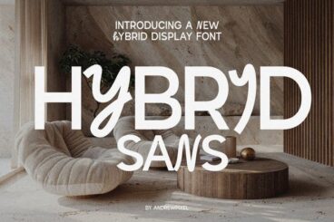
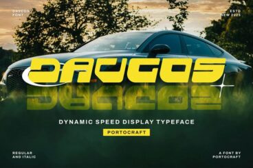
20+ Exceptional Slanted Fonts in 2026
Slanted fonts bring a sense of motion and attitude to typography with their angled letterforms.
These fonts lean forward to create a dynamic look that naturally draws the eye.
The angled design adds energy and flow, making them perfect for headlines that need to feel bold and expressive.
They’re a popular choice for titles, logos, and branding projects that need a modern and slightly unconventional look.
In this collection, you’ll find some of the best slanted fonts for creative typography designs. These typefaces are ideal for crafting eye-catching titles and logos with a strong and stylish presence.
7 Jul 2026
20+ Trustworthy Money & Finance Fonts for Professional Branding
Finance design demands clarity, confidence, and trust. And it’s important to find the right font that can communicate all three.
In this collection of money and finance fonts, you’ll find typefaces designed to convey stability, professionalism, and modern elegance.
We found fonts that feature strong, geometric structures that project authority and discipline. As well as fonts that use subtle curves, softer serifs, or open letter spacing to create a more approachable and contemporary tone that appeals to modern financial audiences.
These fonts excel in both print and digital applications, from business cards and annual reports to dashboards and marketing materials.
Whether you’re branding a fintech startup, a private firm, or a personal finance blog, these fonts will help you build trust through thoughtful typography.
Have a look!
7 Jul 2026
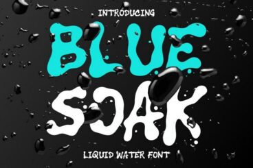
20+ Exceptional Liquid Fonts for Fluid Typography Designs
Whether you’re aiming for futuristic aesthetics, surreal visuals, or artistic branding, liquid fonts add personality that flows beyond the page.
In this collection, you’ll find typefaces that flow, ripple, and twist with creativity. Each one captures the sense of motion and texture that defines fluid design, perfect for projects that need a touch of artistry and energy.
These fonts are ideal for posters, album covers, event graphics, and digital art that calls for bold experimentation. They can transform headlines into visual centerpieces, giving your typography a dynamic, almost sculptural presence.
Liquid fonts also pair beautifully with abstract backgrounds, gradient color palettes, and motion-inspired design trends. Their organic forms bring softness to digital layouts while maintaining a sense of motion and excitement.
Have a look and start downloading.
4 Reasons to Use a Premium Font or Typeface
“Typography is two-dimensional architecture, based on experience and imagination, and guided by rules and readability.” – Hermann Zapf, legendary German type designer (Palatino, Optima, Zapfino)
There are two classes of typefaces when it comes to licensing – free or premium. While there are plenty of options for each type of font, there are some distinct advantages to selecting a premium option.
Premium typefaces are often sold by larger foundries or are part of collections such as Typekit. Prices can vary widely.
- Premium fonts come with extended characters and glyphs. Have you ever run into a font that didn’t have an ampersand or comma? That’s a common problem with many free fonts, and isn’t the case with premium options.
- Premium fonts won’t degrade in quality when used at large sizes and have been tested to render on multiple browsers and devices.
- Premium fonts have a character consistently to ensure that the family looks like it goes together among different characters and weights.
- Premium fonts often include multi-language support and come with a license so you know when you are using it legally.
How to Install a Font on a Mac
Installing a font on Mac operating systems just takes a couple clicks, using the Font Book app.
After downloading the font (make sure to unzip it), double-click the font icon and a window will pop up in font book that shows the name and basic character set. Click install to add to your default font set, using default preferences. (You can change these settings in the Font Book preferences.)
How to Install a Font on Windows
Adding a font on Windows is equally simple. (Note that administrator access is required to install on Windows NT 4.0, Windows 2000, Windows XP, or Windows Server 2003.)
After downloading the font (make sure to unzip it), right click on the font file and select Install.
The alternate method is to open the Fonts Control Panel and Fonts Manager. Then drag and drop the unzipped font file into the Fonts Manager to install.
3 Tips for Pairing Fonts
Most projects aren’t a one-font design. Pairing typefaces is an art in itself, but it is a little easier with these tips to help you create amazing font pairs.
- Look for typefaces with similar shapes: Think about whether each typeface is more round or oval, thick or thin, or tilts.
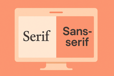
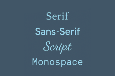
- Mix type styles: Use a serif and a sans serif or a script and sans serif. Paring different type styles is more visually interesting than mixing similar typefaces.
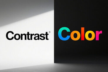
- Create plenty of contrast: Typography pairs need plenty of contrast to stand out. Pair fonts in different sizes, styles, color and use so that each font serves a distinct purpose.