35+ Best Minimal & Simple Fonts
Embrace the art of less is more with our minimal and simple fonts. They provide a clean, uncluttered look to your designs, perfect for professional projects, modern brands, or any design that values clarity and simplicity.

Centauri Font
Centauri is a captivating futuristic font that embodies the essence of outer space exploration. With its minimalist design and wide letterforms, it ex...

Lúna Luxurious Clean Font Family
Luna is another clean font made with luxury and high-end designs in mind. If you’re working on a design for a luxury clothing brand, wristwatch,...

Tessan Sans Modern Clean Font
Tessan Sans is a brilliant font that has a combination of bold, simple, and clean design elements. This makes it the ultimate choice for designing eve...

Camaufalge Minimalism Clean Font
One of the most stylish and clean fonts on our list. This font is most suitable for classy branding designs such as product packaging and labels. It f...

Grafic Minimalistic Sans-Serif Font
Here we have Grafic, a clean, and modern typeface inspired by the simple things in life. It can be used to design posters, flyers, logotypes, album co...

Steamer Creative Minimal Font
This font comes with a creative and minimalist design mixed with a hand-drawn look and feel. It’s ideal for designing titles, headings, logos, l...

Auvelle Minimal Clean Hairline Font
Auvelle is a minimal hairline font with a clean design. It features letters with a unique design that will fit in nicely with modern product packaging...

Kite Stylish Simple Font
If you’re looking for a simple font but with a trendy look, this font is for you. Kite is a simple font with creative stylistic elements. It wil...

Eros Minimal Serif Font
Designed in accordance with the latest design trends, Eros is an excellent typeface perfectly fitting to a pool of business purposes. It exudes an air...
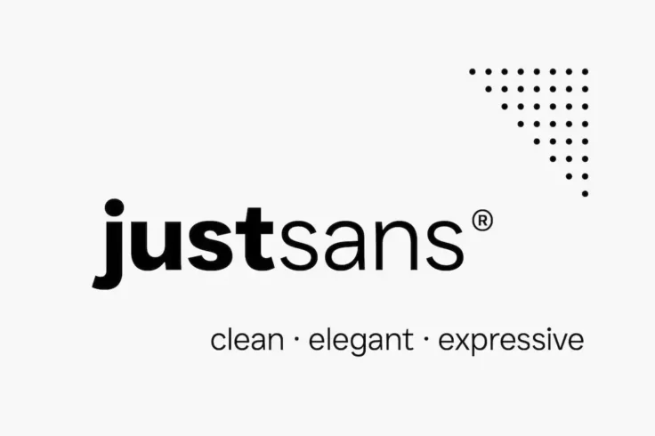
JUST Sans Clean Modern Font Family
Just Sans is a typeface that seamlessly blends minimalism and geometry into a modern, clean design. It comes with seven different font weights, rangin...

Rectory Modern Thin Font
You can use this modern thin font to craft all kinds of titles, headings, and text. The font has a multipurpose design with a unique style of characte...

Filena Casual Sans Serif Clean Font
If you’re looking for a clean font with a cute look for crafting adorable logos or titles for casual design projects, this font is made just for...

Arthead – Modern Sans-Serif Font
If you’re looking to hunt down the best minimalist fonts, Arthead is an excellent contender for your cash. It’s a modern sans-serif typefa...

Norice Thin Modern Simple Font
Minimalism is often used as a key component in elegant designs, especially in luxury and high-end branding. This font is designed with those projects ...
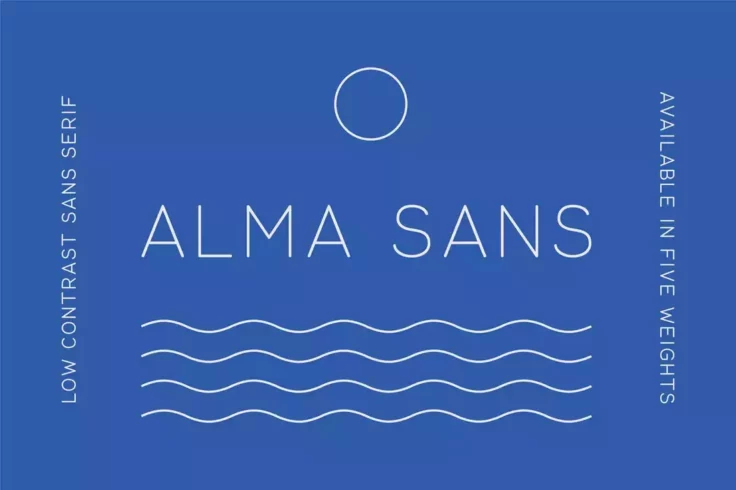
Alma Sans Rounded Font
Featuring an ultra-thin and low-contrast design, this rounded font come with a modern and minimalist letter design. It will help you craft titles with...
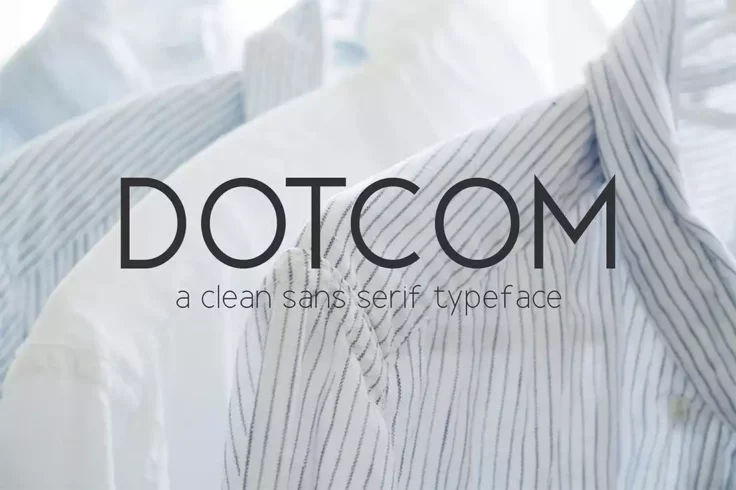
Dotcom Clean Sans Font Family
Another clean sans serif font with modern letters and sharp edges. This font is suitable for professional projects, especially related to corporate br...

Orion Pro Creative Simple Font
This is a creative font with a simple design. The font features a set of clean letters with a subtly rounded design. You can use it to design titles f...

Ripple Clean Sans-Serif Font
Ripple is a minimalist font featuring a set of thin and clean letters. It’s great for everything from logo designs to packaging designs. This is...

Alvarosa Stylish Minimal Font
Alvarosa is another minimal font that comes with a stylish letter design. This one is for crafting logos, website headers, labels, and social media co...

Hacim Simple Sans-Serif Font Family
If you’re wanting to give a simple yet modern touch to your branding and packaging designs, Hacim is the best bang for your buck. It comes with ...

Groningen Modern Clean Fonts
Groningen is a clean modern font for elegant designs. It’s perfect for crafting website headers for business websites, logos for luxury brands, ...

Halton Clean Sans Serif Font
Halton is a clean font that comes with a condensed letter design. It features a minimal yet elegant look that’s ideal for business card and logo...

HERZ Simple Sans Serif Font
Looking for a clean font to create bold titles that attract attention? Then this font is perfect for you. It comes in 3 weights and web font versions ...

Glatic Vintage Modern Simple Font
If you’re looking for a clean and professional font to design a business card, brand logo, or product packaging design, this font is perfect for...

Zevida Thin Sans Serif Font Family
Zevida is a stylishly modern and elegant font featuring a thin character design. This font looks perfect for designing logos and headings for modern b...

Monica Modern Clean Font
This great-looking font is ideal for various print and digital designs, including logos, social media posts, greeting cards, and product labels. The m...
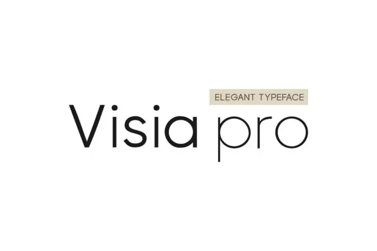
VISIA Pro Elegant Geometric Font
Visia Pro is a sophisticated and modern font that is perfect for businesses and corporations. The font’s geometric design gives it a clean and m...

Cainamons – Classy Vintage Font
Cainamons is a modern, and classy font that looks stunning on fashion, and apparel projects, album covers, logos, magazines, and a multitude of other ...

Exensa Grotesk Bold Minimal Font
If you want to use a clean font with a bold letter design to craft attractive titles, this font will come in handy. It features a thick lettering desi...

BROOKLYN Clean & Minimal Font
Brooklyn is a simple font with a minimalist design. It’s perfect for logos, headings, titles, and much more. The font includes 4 weights as well...
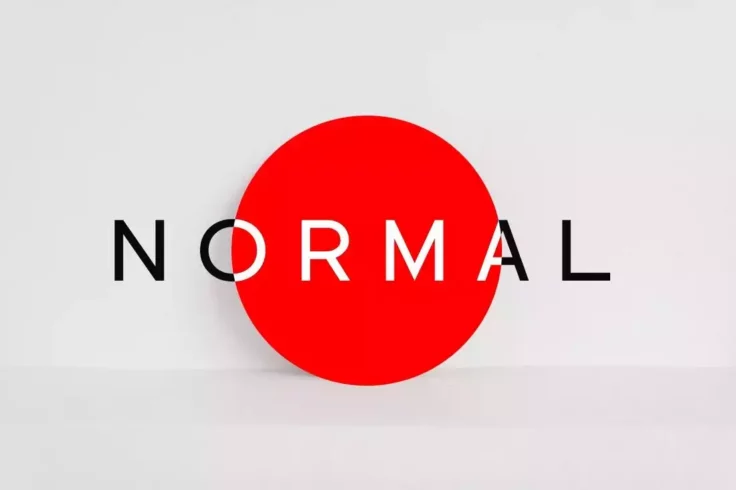
NORMAL Minimal Sans Serif Font
Normal is a modern and stylish sans-serif typeface that is perfect for a wide range of design projects. It has a clean and simple design that is easy ...

San Lorenzo Cute Chunky Simple Font
The fun, cute, and chunky letter design of this font makes it a great choice for all kinds of casual designs. Whether it’s a T-shirt, fun logo, ...

Black Gumners Simple Vintage Font
This is a vintage-style font that features a simple design. You can use it to add big and bold titles for your classy vintage-themed design projects. ...

LiteON Minimal Font Family
LiteON is a family of minimal fonts that feature clean letter designs. There are 6 different fonts in this family, with weights ranging from thin to b...
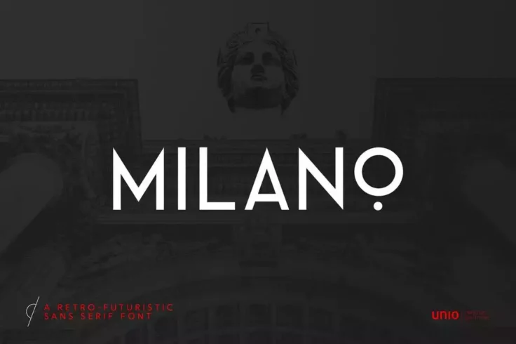
Milano Retro-Futuristic Minimal Font
Milano is a sophisticated and elegant typeface that combines both retro and contemporary elements to create a unique design. The font is constructed b...

Vacation Minimal Serif Font
Vacation is a unique serif font that features a set of minimal letters. This font fit look perfect on business cards, logos, and website headers. It&#...
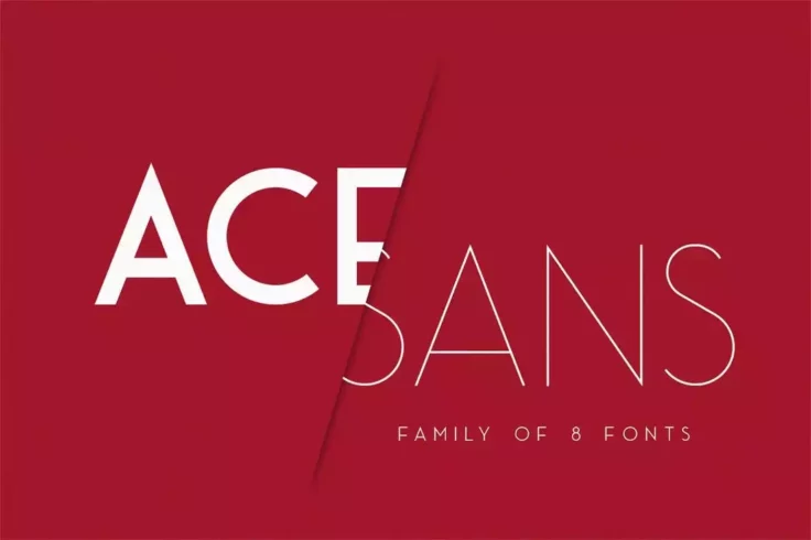
Ace Sans Font Family
Ace Sans is a complete family of fonts that includes a total of 8 fonts featuring various weights ranging from thin to extra bold and more. You can us...
FAQs About Minimal & Simple Fonts
What are Minimal & Simple Fonts?
Minimal and simple fonts, as the name suggests, are typefaces that are stripped down to their bare essentials. They are characterized by clean lines, standard shapes, and a minimalist aesthetic that prioritizes readability and functionality over ornamental design features. They are often also referred to as clean or modern fonts.
Typically, these fonts have minimal variation in line width and lack additional decorative elements, like serifs or curves. This makes them an ideal choice for a wide range of applications where clarity and simplicity are the goals, such as website design, corporate identities, print materials, and more.
Why should I use Minimal & Simple Fonts?
Minimal and simple fonts offer several advantages. Firstly, they are highly legible, making them suitable for large bodies of text. This is crucial in areas such as website and app design, where a clear and easy reading experience is key. Moreover, their simplicity makes them versatile and effective at getting a message across without any distractions.
Additionally, they convey a sense of modernity and professionalism. Minimal and simple fonts are often associated with contemporary design, and using them can give your project a polished, current feel. Whether for branding purposes or workflow improvement, these fonts provide an aesthetically pleasing and user-friendly solution.
How do I choose the right Minimal & Simple Font?
When choosing a minimal and simple font, it's important to consider the requirements of your specific project. Consider the amount of text you'll be using, what size it'll be, and the medium it's designed for. For instance, certain fonts might look good in print but may not render as well on a digital screen.
You should also think about the tone and message you want to convey. Even within the category of minimal and simple fonts, different typefaces can evoke different feelings. Some might seem more corporate while others might seem more relaxed. It's crucial to select a font that aligns with your brand or project's identity.
Can I use multiple Minimal & Simple Fonts in one project?
Absolutely. Mixing and matching different typefaces can create visual interest and help differentiate between different types of information. For example, you could use one minimal and simple font for headings and another for body text. Just ensure the fonts you choose complement each other and maintain the overall simplicity of the design.
However, a rule of thumb in design is not to use more than three different fonts in one project, as it can make your design look cluttered or confusing. Consistency is key to maintaining a professional and cohesive look, especially when employing a minimalist aesthetic.
Are Minimal & Simple Fonts suitable for logos?
Yes, minimal and simple fonts are often an excellent choice for logos. They offer clear legibility, even at small sizes, which is an essential aspect of logo design. The clean lines and straightforward design can also provide a modern, polished look that can be very appealing for branding purposes.
However, as with any design choice, it's important to consider the overall aesthetic and message of the brand when selecting a font for a logo. What works great for a tech startup might not suit a luxury fashion brand. Consult with a designer or do some research to find out which typefaces would best match your brand identity.