Add Flair to Projects With Alternate Lettering
Most typefaces have more than just 52 letters – 26 uppercase and 26 lowercase. They also contain an assortment of alternate characters that can help add flair and interest to your typography.
These special characters have been around since the beginning of type. Renowned typographer Johannes Gutenberg even used them in printing early copies of the Bible.
What are Alternate Characters?
The term “alternate character” can refer to a range of special letters. Here we will use the term fairly loosely to mean any character that is not the normal upper- or lower-case form of a letter from a typeface, resulting in an optional letterform.
Some refer to alternate characters as expert sets or glyphs, because of where the additional characters can be found in typesetting software. These terms, though, refer to characters that are of a broader reach than just letters.
There are a variety of different types of alternate characters – swash, ligatures, biforms, embellished caps and logotypes.
Types of Alternate Characters
Alternate characters are not always easy to spot because they can come in so many forms. The key to identifying these characters is knowing and understanding the different forms they may take.
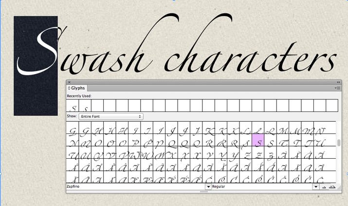
Swash
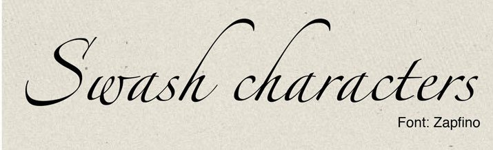
Swash characters are those that are more decorative than the usual set. Swashes typically have an extended stroke (above or below) or flourish. This style of character is often based on calligraphy and has an exceptionally fancier feel than the rest of the set. They are most often used as a first of last letter in a word or phrase.
Example typefaces: Zapfino, Longfellow, ITC Bookman, Wedding Singer and Avalon.
Ligature
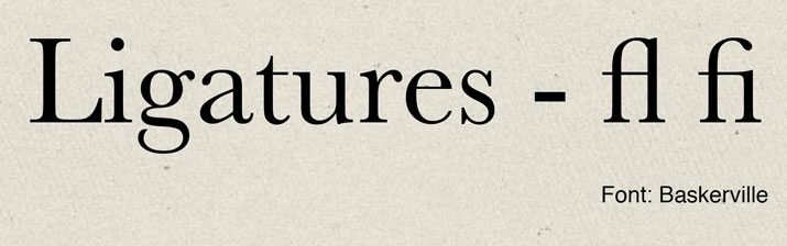
Custom ligatures are another type of alternate character. A ligature refers to the connected stroke between two letters – most commonly ascenders. The combinations “fl” and “fi” are the most common ligatures. Some fonts, though, contain alternate characters that connect other letter combinations. Ligatures can be a fun way to add flair, but should be used sparingly so not to make words difficult to understand.
Example typefaces: Bible Script, Sophia and Aphrodite Slim Pro.
Biform
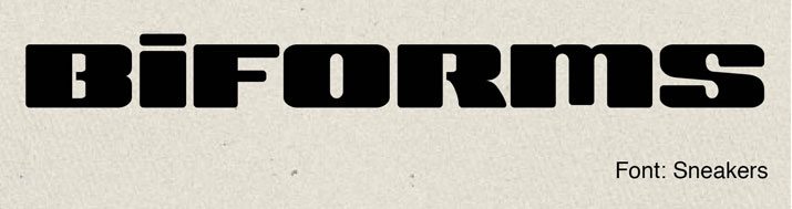
Biform characters are those that are of the opposite case but are of the same size. Biforms can be used as a lowercase letter among capitals or a capital among lowercase letters. Biform alternates are the same size as the surround letters, only the case is different. Biform characters are fairly common when dealing with simple typefaces, primarily sans serifs. This type of alternate character is most often used in logo design.
Example typefaces: Press Gothic Pro, Marat Sans, and Futura.
Embellished Cap
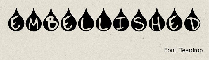
While most designers create drop and embellished caps as needed for different projects, some typefaces contain alternate letters of this style. They are almost always capitals and may have added flair (such as a swash), blocking or reverse coloring. Embellished caps can be sophisticated and fun but are best used only for special items.
Example typefaces: ITC Highlander, Buccardi and Buccaneer.
Logotype
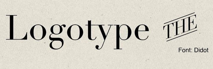
Logotypes are the most interesting of the alternate characters. They are actually alternate words. Logoforms are groupings of letters that are predesigned in a different way to have a different look that matches the rest of the typeface. The most common logotype groupings are “and,” “the,” and “of.” Ampersands can also appear as logotype characters. Logotypes are best reserved for display type and are not are good option for large blocks of type.
Example typefaces: Montel Gothic, Epicure Regular and Comic Strip.
Find Alternate Characters
Adobe’s line of software – including InDesign and Illustrator – makes it easy to switch between different characters using the glyphs panel.
Highlight a specific character before you open the panel to access the alternate characters for that specific letter if any exist (there is a drop down menu that lets you select “Alternates for Selection” or “Entire Font” among other options).
Simply double-click the letter you want to insert it into text. (Note that if any characters are selected, a double-click will replace those letters.)
For OpenType fonts, access alternate characters with the OpenType panel. Options will vary by typeface.
Controlling ligatures can be a little different. Ligatures can be turned off and on in the character panel. Check or uncheck the Ligatures option for standard ligatures. Additional and alternate ligatures can be found in the Ggphs panel with other alternate letters.
When purchasing a new typeface, be sure to look at the character map to see what alternate characters are included. Many basic typefaces include somewhere around 250 characters; if there are more, you likely will find some alternate characters. Many free fonts or free versions of typefaces, though, do not come with alternate characters.
Using Alternate Characters
Alternate characters are a great way to add a little intrigue to type. From fancy lettering to “misplaced” caps or lowercase letters, alternate characters can be found all over some of the most recognizable logos around the world.
But use them wisely. Inserting too many alternate characters can be distracting or could cause readability challenges. Designers should also avoid creating their own alternate characters by shrinking, stretching or otherwise altering type manually. (These effects seldom look polished.)
The most commonly used alternate characters tend to come with script typefaces in the form of swashes and elaborate caps. You might want to check out Aphrodite Slim, Affair, or Buffet Script.
Conclusion
Alternate characters are a great way to spice up your text, but use them with a purpose.
Alternate characters are almost wasted in small or body copy, because at a small size it can be hard to differentiate between it and the normal character. It is best to reserve special lettering for special uses, such as big type or logos.