Product Ad Instagram Post Templates

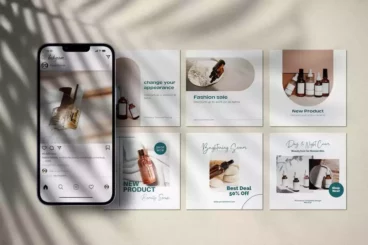
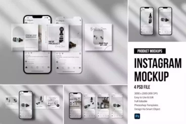
This high-valued pack of Instagram Post Templates is an indispensable tool for promoting single products on the Instagram platform. The kit includes ten unique and contemporary templates that have been specifically engineered to spotlight your products, promotions, and other sales-driven content. The designs are sleek, modern, and enticing, catching users' eyes as they scroll through their feed.
The Product Ad Instagram Posts PSD Template is distinctly impressive with its fresh and unique design. Utilizing the latest trendy material designs, these templates are perfect for unveiling new stores, announcing sales, highlighting promotions, and marketing online sales. This pack is your one-stop-solution for creating engaging posts that will entice your audience and boost your product sales.
Each template is designed to be effortlessly editable, allowing you to modify colors and text to match your brand. The Instagram post size (1080x1080px) ensures that your posts will always look optimal, without the need for additional resizing or adjustment. All templates are neatly layered by name for easy navigation and adjustment.
Details & Features
- 10 unique Instagram Post Templates
- Optimized for promoting single products
- Fully editable, customizable colors and text
- Instagram Post Size (1080x1080px)
- Templates neatly layered by name
- Uses trendy, material designs
- Perfect for product sales, promotions, and store introductions
Why We Like It
We highly recommend this item for its modern, visually-appealing designs and high customizability. Ideal for marketing single products, these templates can effortlessly catch the eye of scrolling Instagram users. Furthermore, its easy-to-edit features make it very user-friendly, allowing businesses to effectively represent their brand on the social platform.