25 Examples of Convincing Call-to-Action Buttons
Despite what many people will tell you, there are no hard-and-fast rules when it comes to call-to-action buttons. Yes, it’s true that large, colorful buttons, surrounded by plenty of space are usually the most successful, but it’s important that you tailor each button to the primary task of the web page in question, whether it’s to Signup, Checkout, Register or anything else. As a designer, it’s your job to make it as easy as possible for visitors to achieve these tasks and call-to-action buttons are the most powerful tools at your disposal, so use them wisely.
Generally speaking, call-to-action buttons should be simple and clear. They must stand out and grab a user’s attention. Everything must be carefully considered, from the trigger words used to colors, sizes, shapes and positioning. These buttons must be highly visible, but not so garish that they render your site ugly or unbalanced.
Below, we take a closer look at 25 of the most convincing call-to-action buttons found on the web. We examine why each individual button is so successful. Hopefully, they’ll give you an idea of some basic does and don’ts and help inspire your own designs.
1. WordPress e-Commerce
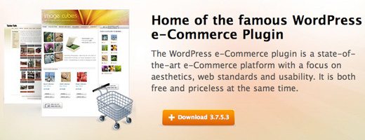
It’s important to let your button stand out by using color. If you can choose a color which ties in with your site’s palette, like this one, the results are all the more attractive.
2. Skype
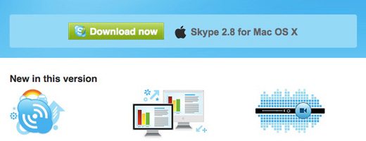
This “Download now” button is pretty simple. It’s not particularly large or brightly colored. It is, however, surrounded by plenty of white space, which makes it even more noticeable to users.
3. Picsengine

Picsengine relies on placement for the success of its “See in action” button. The button’s stuck right in the middle of the page, with no other distracting text, links or buttons surrounding it.
4. Mozilla Firefox

The Mozilla Firefox “Free Download” button has stimulated much debate. Most people, myself included, believe that its large, irregularly shaped, vividly colored design is truly revolutionary in terms of call-to-action graphics. A small minority, however, argue that it’s confusing and doesn’t resemble a button at all.
5. CakePHP
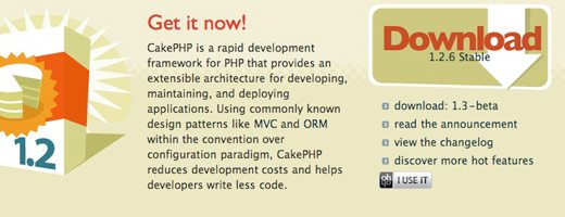
CakePHP’s “Download” button has been created with large size and unusual shape in mind. Its clarity, however, has not come at the expense of overall site aesthetic. It sits comfortably into the background thanks to its matching color scheme.
6. Crazyegg
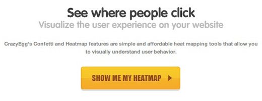
Crazyegg has designed its site around its call-to-action button, which sits proudly in the middle of the homepage, surrounded by plenty of white space. Its bright yellow color is mirrored only by the other call-to-action button on the page – the much smaller “Sign In” button in the top right.
7. Litmus
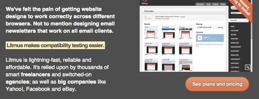
Litmus hasn’t gone overboard with its call-to-action button; nevertheless it’s very clear, thanks in large part to the empty space surrounding it and its rounded shape, which isn’t echoed anywhere else on the page.
8. StumbleUpon
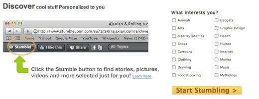
Having one primary function objective per page makes it easier for users to locate call-to-action buttons, but sometimes this just isn’t possible. There’s loads to click on the StumbleUpon homepage, but the “Start Stumbling” button really stands out, thanks to its use of color in an otherwise monotone setting
9. Remember the Milk
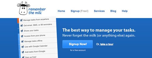
Remember the Milk offers visitors several options on its homepage, but the most important one- “Signup Now!”- is by far the clearest, positioned in the middle of the page, surrounded by a colored box and capitalized. No need for gaudy, bright colors here.
10. Lifetree Creative

Lifetree Creative has managed to make its call-to-action button really big, even bigger than the company logo, without making the page appear unbalanced. Color, shape, size and space have been used to great effect here.
11. Dailymile
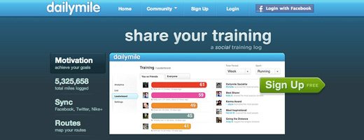
Dailymile has done something rather unusual with its call-to-action button. It’s laid out on top of everything else on the page, with a subtle drop-shadow behind it. Helped also by the fact that it’s green, the button really sticks out.
12. Carsonified
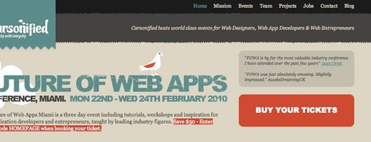
Carsonified’s homepage contains lots of information, nevertheless, the “Buy Your Tickets” button shines through, thanks to its use of capitals and color. The white letters stand out really well against the red.
13. planHQ

PlanHQ has used the power of white space to accentuate its call-to-action buttons. Neither brightly colored nor oversized, these buttons are clear thanks to the blocks of white they sit in.
14. Things

Things has two call-to-action buttons on its homepage, both of which are of similar importance to the company. For this reason, they are an identical shape, size and color, but both stand out well against the light blue and grey.
15. Livestream

Red is an excellent color to use when you want to draw attention to something. It stands out best against a black and white background, like the one used on Livestream’s homepage. The arrow shape of the “Broadcast Now” button, in the top right corner, urges users to click forward.
16. Ncover
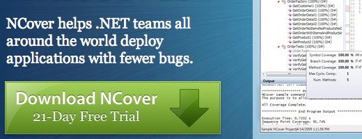
Ncover is yet another site with two call-to-action buttons on its homepage. By using the color green against a blue background, Ncover has managed to prioritize one more important button over the other.
17. Dashboard
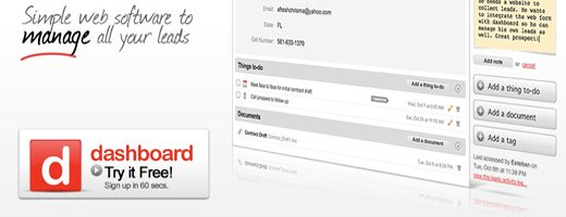
Red against a black and white background features again here. Besides its color, Dashboard’s “Try it Free!” button is highly visible thanks to its size, which offers enough room for the logo and “Sign up in 60 secs” to be included.
18. Free People

This page might look rather standard, but you’d be surprised at how many e-commerce sites get it wrong when it comes to their “add to cart/basket” buttons. Free People’s button is obvious without being ungainly, thanks to its color and large but modest size.
19. ClickFormant

Usually, it’s best to use industry-standard trigger words for call-to-action buttons. For a mailing list, the button should normally read “Signup” or “Join”. Occasionally, however, varying these words can really add to a company’s brand image. This is what ClickFormant has done by using the word “Inform”.
20. Kalculator
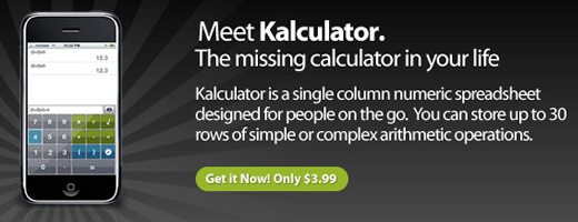
Large, over-sized call-to-action buttons are often very successful, but can look ugly and, at times, a bit desperate. Aware of this, Koombea has used positioning, color, space and shape, rather than size, to make its button shine.
21. Basecamp
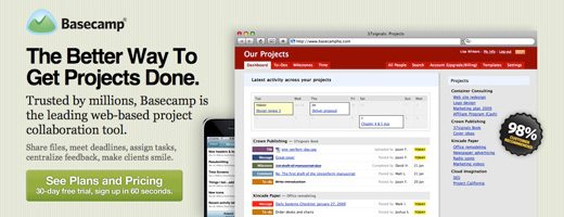
Basecamp is run by a very intelligent bunch, so it comes as no surprise that its call-to-action button is every bit as clever. Many sites make the mistake of positioning a button at the top of the page, which is great, until the user scrolls down and it’s obscured. Basecamp’s button appears twice: once at the top and again at the bottom.
22. Spotify

Spotify’s “Buy now” button is a prime example of how best to use color and space. Bright-green and surrounded by whiteness, the button is evident to all.
23. Dropbox

Dropbox’s homepage layout is every bit as logical and simple as Dropbox itself (a fantastic tool, which you really should try if you haven’t already!) Visitors are under no illusions as to what they should be doing here. They can either “Watch a Video” or “Download Dropbox”- it’s as simple as that.
24. 280 Slides
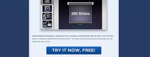
The “Try it now…” button at 280 Slides is big…really big! There’s no way that a visitor can miss it. It is blue, the same color as the background, so doesn’t look as unsightly as it easily could.
25. FlockDraw

FlockDraw’s “Start Drawing” button is one of the most attractive in this list. Besides its great color, which marks it out from the muted background, it’s subtly illuminated and underlined with multicolored brushstrokes.
Conclusion
If one type of call-to-action button was more successful than any other, you can be sure that every website would be using it. While it’s possible to identify similarities between the buttons above, there are clearly lots of differences too. It’s vital that you test different combinations of call-to-action buttons on your site, to see how each one affects conversion rates. You can do this easily using Google Website Optimizer. Whatever your call-to-action buttons look like, however, make sure that they fit your overall website design.