Trends of Blue in Icon Graphics and Web Design
Graphics designers often must choose between a wide palette of color schemes. Blue is by far one of the strongest, boldest colors to choose from. It has been prominently sponsored in websites, blogs, corporate entities, logos, and so many other digital arts throughout the 21st century.
Trends have been evolving in the design world over the past few years. We have seen a tremendous growth in new-age design techniques and strategies. Below I’ve gone over some of these ideas and how web designers are incorporating shades of blue with their works.
Towards the end I’ve also included a short gallery of blue flavor websites. These are just a few picks in no particular order gearing towards grander aspect of designs. Blues promote a benevolent sense in the user’s eye and they make a fantastic centerpiece or background canvas.
The Web Design Blues
As we change between different shades of color our emotions are deeply affected. Shades of red and orange promote a vitality and energy which cannot be matched elsewhere in the color wheel.
Flipped onto the other side of our spectrum we find blue, purple, and green. These are known as cooler colors and can bring down the tone much smoother. These colors are popular on the web because of their overall appeal to a very wide audience. This is why often times you’ll see advertisements with bright yellow backgrounds jumping out at you!

Blue offers a strong sense of security, positivity, leadership, and strength. The White House’s official site prominently displays strong shades of blue. The gradients and bold lettering provide a statement as towards what type of content to expect. We can also see a lot of powerful imagery and fancy jQuery effects sprawled throughout.
Design Associations
Along with emotions we can also relate color schemes towards events in our lives. The color blue pertains to earthly and heavenly bodies. We can easily compare the well-lit sky or glistening oceans as prominent examples.
As graphic designers it’s important to step back and consider your artwork from a higher perspective. Too often when symbolism becomes apparent it’s important to recognize where your inspiration is drawn. A website’s logo will appear on possibly every page in your site – this needs to stand strong!
I’ll often see designers using smaller bits of detail to round out a soft blue edge. Clouds and bubbles are a great set of graphics which eagerly support any logo setting. Blue backgrounds will also entice these details in a calming manner.
Professional Atmosphere
Although many of the Earthly based organizations will utilize blues to appear more natural, they are not the only people. The corporate sector of the world is growing quickly and encompasses a major share of the websites online today.
Corporations are built to provide a trust between each consumer. Thus a companies website must reflect this trust in an honest way. Bold lettering and drop shadows are a few techniques. Blues can often be seen hidden off in the background of page objects. Menu links, sidebar meta information, search forms, or possibly even icons towards the footer.
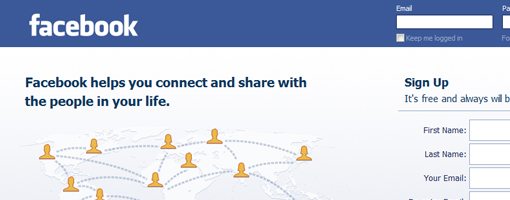
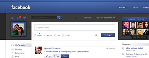
The most popular social networking website Facebook uses blue proudly throughout their entire website. In contrast with white and dark lettering the blues seem natural and offer a sense of security and futurism. The community has been growing rapidly, and although MySpace does compare in colors their user interface leaves quite a bit lacking.
Mobile Apps and Illustrators
One segment of the market which has been growing is mobile. There are more smartphones on the market than ever before and people know how to use them! Wifi is more common than ever, and it’s a growing commodity around the world.
With iPhone apps growing in popularity it’s no surprise we have seen such a strong fan base supporting software developers. Apple’s App Store is a universal shopping plaza full of glossy icons and cheap games. Most of these app developers will create a small website for their software and include download/purchase links, too.
Blues showcase heavily here as icons designers and illustrators alike demonstrate their talent. Mostly any shade of blue will provide a perfect background for scenery to almost come to life behind your monitor! Better yet, through many studies it appears softer blues placed around buttons and outgoing links will attract a higher clickthrough rate than most other alternatives.
For icon designers it’s not an easy task managing larger styles in such a small amount of space. Unique illustrations such as clouds, lily pads, airplanes, and space ships infer the color blue has been used more with artists in 2011. These are very pleasing to the eye and with Apple’s glossy template these shiny apps are selling like hot cakes!
Website Gallery
Below I’ve included 35 unique blue websites which boggle the mind. You’ll find not only great color schemes but logos and entire brands encompassed by blue designs. Try bookmarking a few of your personal favorites and see if any color schemes may fit well into your next project!
Enchanted Illusions
NaugStudio
Blackwave
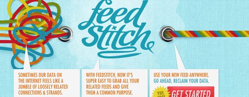
FeedStitch
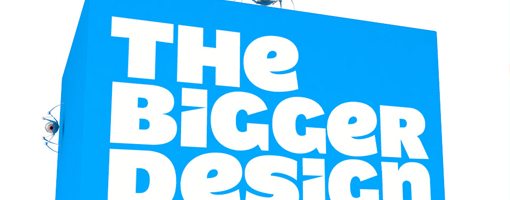
The Bigger Design
Alex Swanson

Spaceship Collaborative

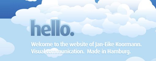
Koormann
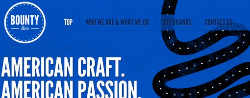
Bounty Bev
piipe

Carbonmade
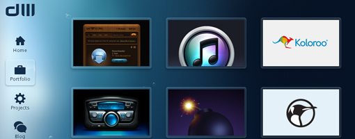
Dan Wiersema portfolio
Larva Labs

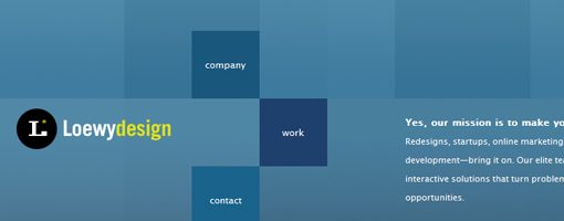
Loewy Design
Eyedraw

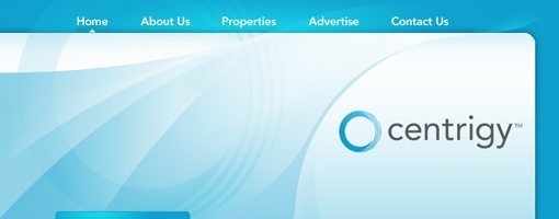
Centrigy
made by many

Talker App

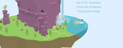
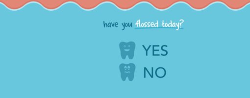
Flossed Today?
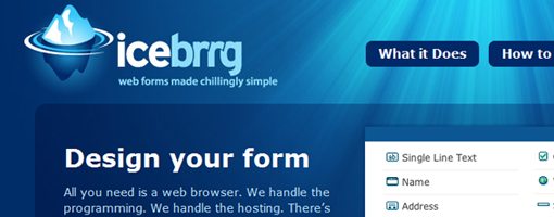
icebrrg
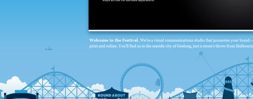
Festival Creative
answerJam

Eric Campbell

the pixel blog
![]()
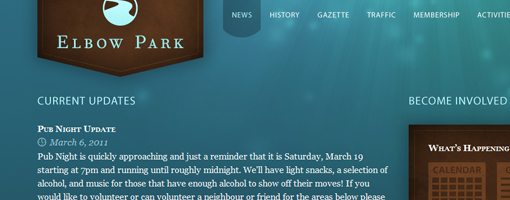
Elbow Park
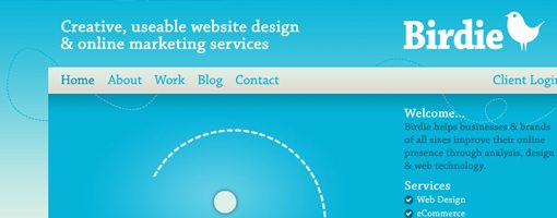
Birdie
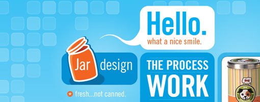
Fresh not Canned
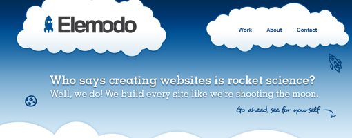
Elemodo
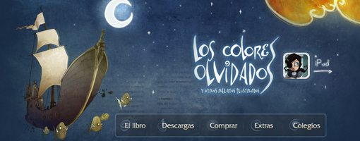
Los Colores Olvidados
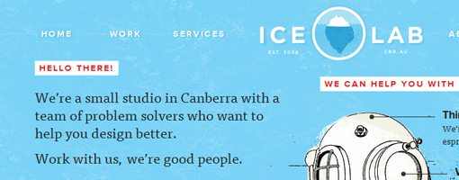
Ice Lab
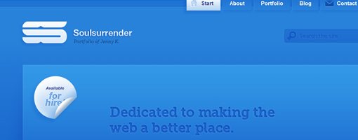
Soul Surrender
Maria Gardell Psychotherapy

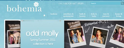
Bohemia
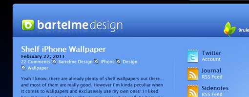
Bartelme Design
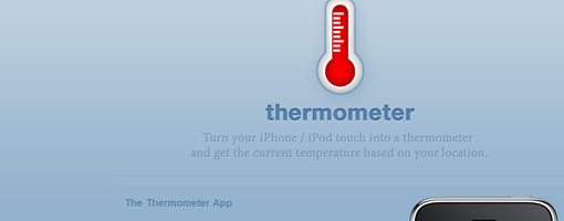
Thermometer App