10 Modern Website Navigation Tips & Ideas
One of the elements of website design that you don’t always think about first is navigation. (Although you probably should.) How will users move around the design? How will they find elements that aren’t obvious to them?
Website navigation trends have changed a lot; moving away from overwhelming mega menus to lighter more minimal options. And there’s some value to that thought – too many choices can overwhelm users. Provide the information they need in the space they need it to increase engagement. Don’t throw the kitchen sink at them!
Today, we’ll look at a few modern website navigation tips and ideas to help you do just that.
1. Subtle Animation
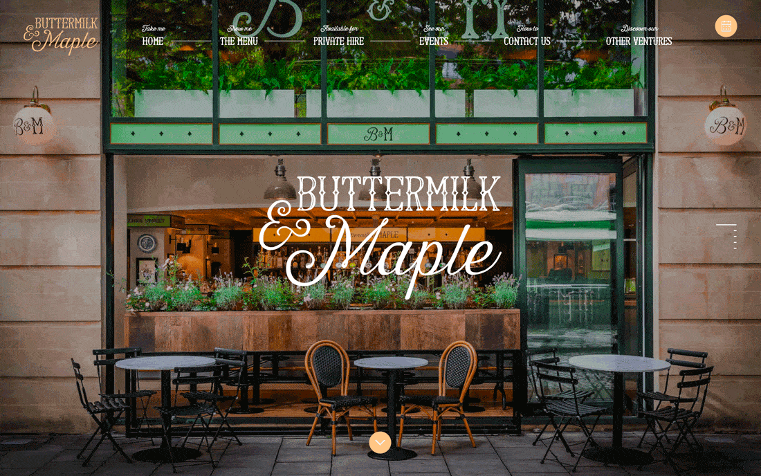
At first glance, you might not even see the navigation menu at the top of the website for Buttermilk and Maple. But there are plenty of little animations to ensure that you don’t completely miss it.
- There’s a dark overlay that drops when the mouse hovers at the top of the screen.
- There’s a timeline scroller tucked into the right side of the screen, with pop-to-screen points on scroll.
- The nav collapses into the home logo (with a hamburger) on scroll, and then pops back out to full nav on hover. (I love that you don’t actually have to click the hamburger icon to get the menu back.)
Each element includes simple animation that adds emphasis to what is happening to the nav so that you never get lost in the design. This design is highly visual and these simple cues are a major bonus to enhance usability.
2. Provide Plenty of Cues
When the navigation is hidden – as is trending with many website designs – you need to provide plenty of cues to the user.
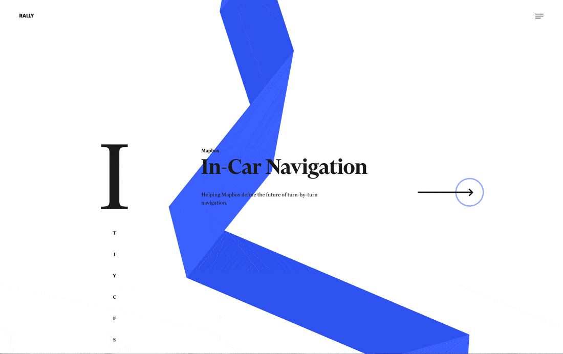
- The timeline style navigation on the scroll of Rally’s site helps users know where they are in the content flow (cue 1).
- The right arrow tells users there’s something to explore with a horizontal click.
- The hamburger menu tells users there’s more to find if they don’t see a solution right away.
3. Make it the Only Option
What if the navigation is the most important element on the screen? Make it the focus of the visual design.
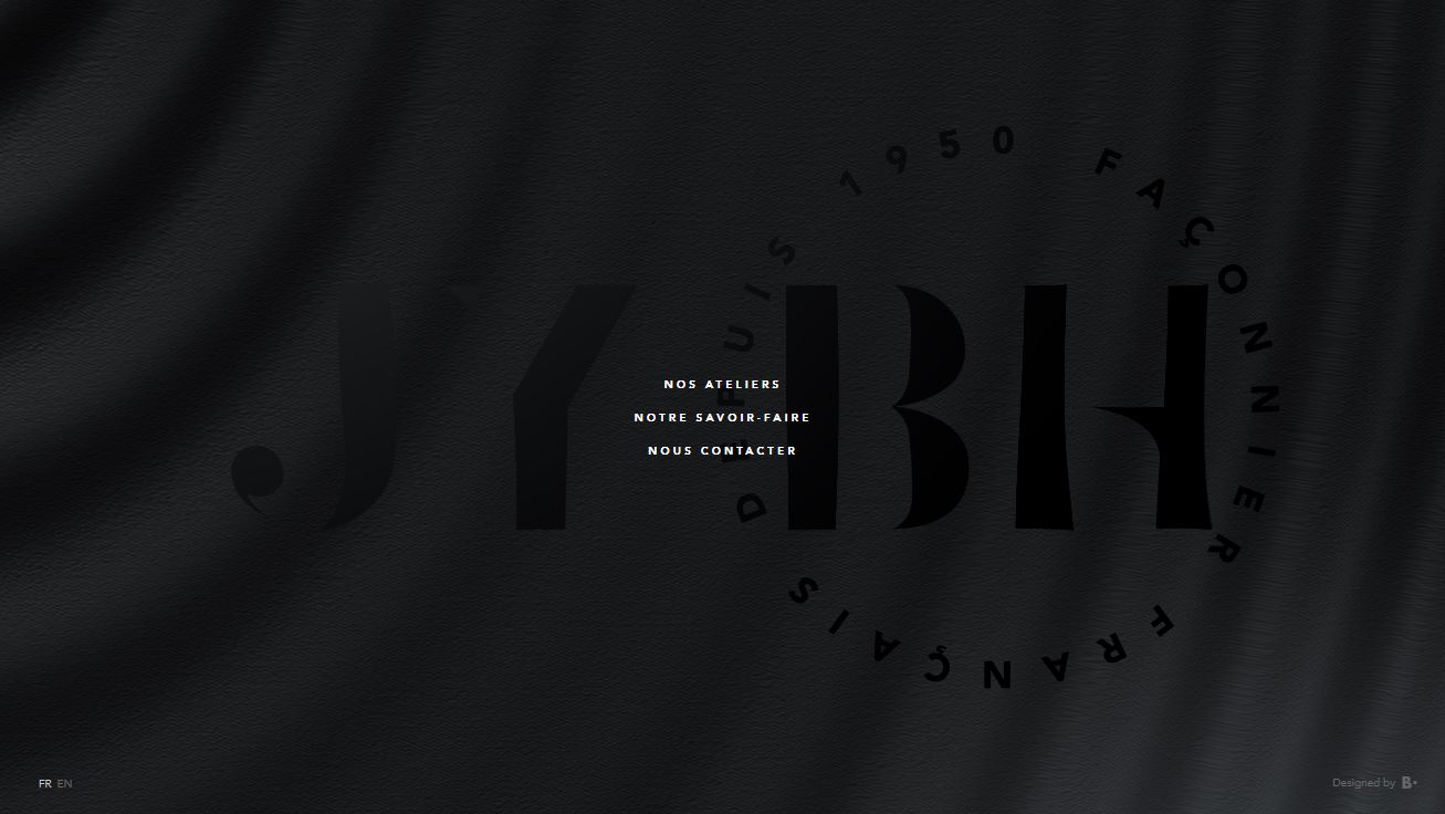
JYBH has a beautiful minimal design with a textured animation in the background and three simple navigation options in the middle of the screen. This tells users exactly what they have to do next.
4. This or That
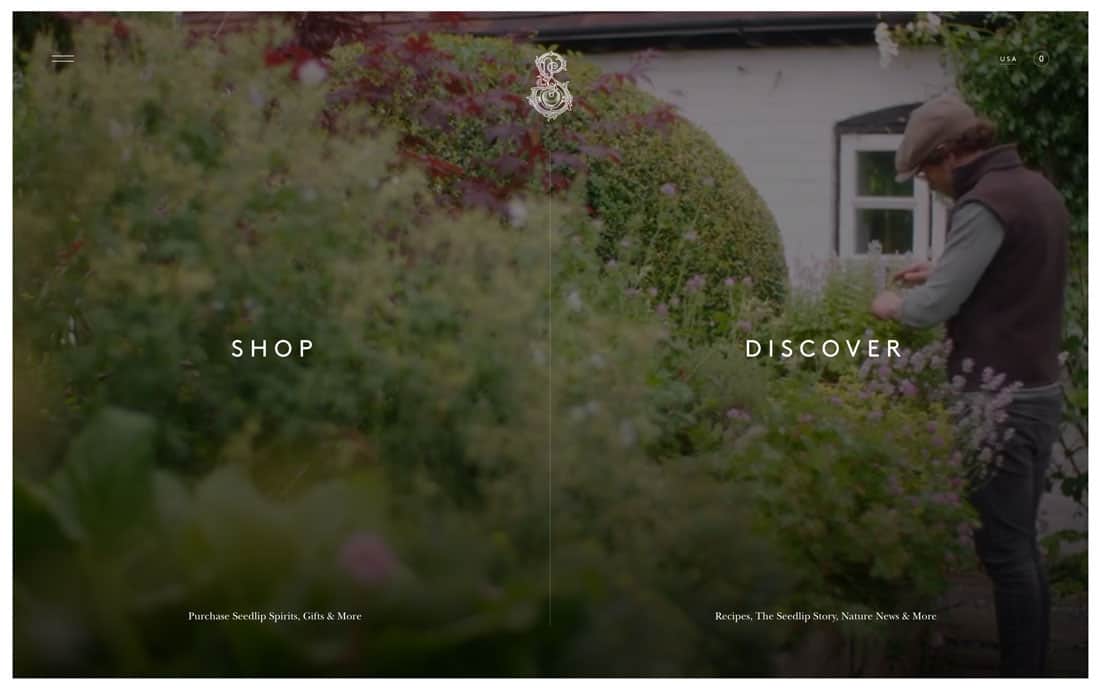
Along that same train of thought is creating a design that asks users to make a choice: Do you want to do this or that? This binary navigation option should help get people exactly where they want to be with the design quickly.
It can work exceptionally well if the design has two target audiences with different user paths.
Seedlip Drinks does this rather effectively with options to buy their products or use their products. It’s a clever approach to retail.
The design also includes a subtle hamburger icon – can we keep calling it that now that the trend has shifted to two lines, rather than three? – with additional information.
5. Simple and Traditional
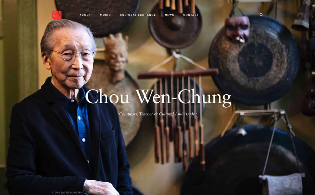
Sometimes the best use of a trend is to stick with a classic example that works. A simple, traditional navigation menu never goes out of style.
The approach for Chou Wen-Chung provides a static location for the main navigation on a full-screen photo without getting in the way. Some of the menu elements include a “mega-style” card with additional information. (These almost seem to get in the way.)
6. Oversized Pop-Outs
Mobile design practices dominate many desktop versions as well. Oversized pop-out menus (almost always from a hamburger-style icon) mimic the experience on smaller devices.
And there’s nothing wrong with this approach. (I’ll never fault anyone for consistent user experience.)
The key elements to making this work are ensuring that the pop-out is obvious, all the necessary information is included, and there’s no issue with usability (everything is easy to click or tap).
7. Try Four Corners
This is one of those navigation ideas that only work in specific use cases – you need four primary locations to send users to.
But if you do, one navigation element in each corner of the screen can be a fun and interesting alternative to planning and designing a modern navigation style.
It works rather beautifully for the design above, thanks to a simple overall aesthetic and easy to understand navigation options – the company name, about, work and contact. (There’s no question what you will get from those click elements.)
8. Vertical Stack
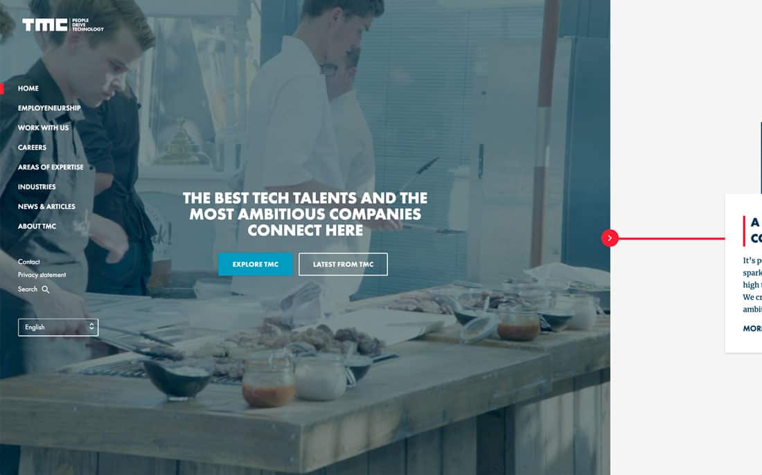
Vertical navigation menus looked like an idea that was really going to take off when monitors kept getting wider. It didn’t quite get there, although more designs are starting to feature this design trend again.
TMC uses vertical main navigation on the left side of the screen (this is a good option since people read from left to right) with the main content area and then a cut off content area that cue users to move horizontally with the design.
The rest of the design uses timeline dots and arrows to direct users through the content. It’s a fun design. The only downside is that if you get too deep into it, there’s no way back.
9. The “Skinny Flip”
Every now and then you come across pairs of unexpected elements that work exceptionally well. That’s the case with what we’ll call the “skinny flip” navigation menu above.
The top three navigation elements are stacked on the right side of the screen. They are in a timeline style format that shifts with scrolling or clicking.
The hamburger icon is actually tucked in the bottom right corner and opens to a full navigation menu at the bottom of the screen. This is one of the most unusual versions of down page navigation I have seen, but it seems to work. (Maybe because there are plenty of visual cues, from color and elements that drive you across the screen from left to right and then down to that hamburger in the corner.)
10. Downpage Nav
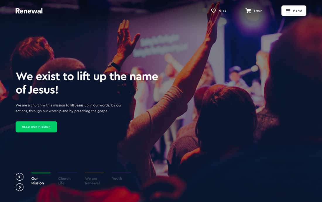
Since we got into the idea of down page navigation, it’s good to look at a highly usable approach to this concept.
Renewal has four things to dive into on the website. Each is noted at the bottom left corner of the homepage. What’s nice about this style of navigation is that it’s not at all hidden, doesn’t get in the way of the content above and is in a natural location to click through.
It also works as a quasi-timeline element as the navigation is part of a bigger slider that helps users get an introduction to all four content paths.
Conclusion
When it comes to thinking about modern navigation, remember it’s more than just a menu. Navigation is everything a user needs to move around the design with ease.
It likely starts with some type of main navigation menu but can include timelines and scroll reminders and anything else that helps a user find what they are looking for.