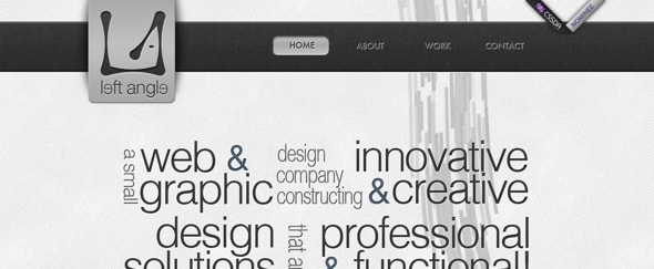
Left Angle Design
A clean and functional site for a web and graphic design company. I like that the header section is left purely text. You can immediately get a grasp on what it is the company does.
The consistent use of a monochrome colour palette is effective, although a little contrast wouldn’t have gone amiss.