DeCapoers Font
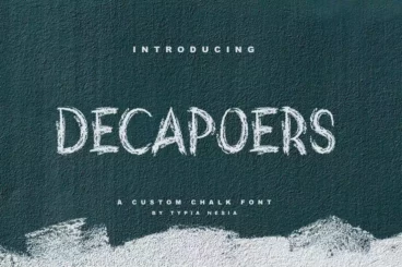


As one gets a grip on the DeCapoers Font, it is easy to appreciate its chalkboard-inspired aesthetics. Characterized by its resemblance to letters drawn clumsily on a rough wall, this font introduces a captivating rawness in digital design. It aligns seamlessly with modern design demands, making it a crowd-favorite.
The real essence of DeCapoers is its adaptability. Be it branding, a hipster card design, or a catchy flyer; its application is far-reaching. The font encapsulates a distinctive combination of quaintness with sophistication - a quality that enhances its appeal across various platforms. The look and feel of DeCapoers can effortlessly transform a regular poster or book cover into an aesthetically engaging entity.
Above all, the charm of DeCapoers is in its simplicity. "Happy creating!" - a phrase often associated with this font, encompasses the joy and thrill that users derive from using it. Its anticipation-evoking nature makes it an absolute joy to work with, leading to unique and dynamic designs.
Details & Features
- Chalkboard-inspired design
- Aesthetic appeal for modern designs
- Highly adaptable across different platforms
- Simplistic, easy to use
- Enhances aesthetic engagement
Why We Like It
The DeCapoers font hypnotizes with its simplicity, combining classic chalkboard forms with a modern twist. We recommend it for creatives seeking to break away from the norm, offering a spontaneous and raw methodology to designs. The endearing hominess of DeCapoers just bolsters its appeal, making it a resilient favorite.