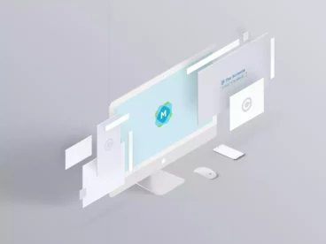
Multi Devices Responsive Website Mockup
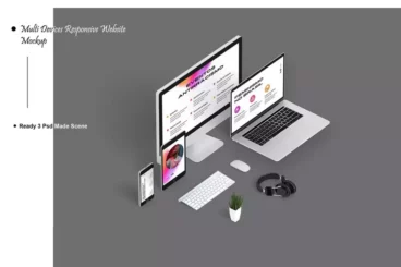
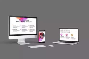
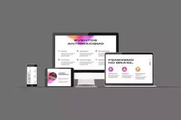
Few things can give your web design the professional edge quite like our Multi Devices Responsive Website Mockup V.4. Not just one, but three distinct mockup scenes help bring to life your design across multiple platforms. Whether it's an iMac, iPhone, iPad, or MacBook; our mockup fits them all, offering both isometric and front-facing views for variety and perspective.
Our mockup isn't just versatile; it's efficient and user-friendly. With the use of smart object features, you can transform your design in mere seconds. And should you encounter any difficulties, fear not. Each purchase comes with a handy PDF instruction set, and our team is always ready to provide support should you need it.
The Multi Devices Responsive Website Mockup V.4 is all about leveraging control to the user. The high resolution (4000×2667 px, 300dpi) images come with separate layers for each object. You can customize via Smart Object, turn on/off the specular/highlight effect, and choose from transparent background or background only color as you need.
Details & Features
- Three versatile PSD files
- High resolution at 4000x2667 px, 300 dpi
- Customizable with smart object
- Separate layers for each object for easy modifications
- Specular/highlight effect toggles
- Choice between transparent background and color-only background
- Includes detailed PDF instructions
Why We Like It
Not only does the Multi Devices Responsive Website Mockup V.4 offer impressive versatility with multiple device displays, it also promotes user-friendly navigation with smart object customization. We appreciate its ability to provide a realistic appearance to designs, along with the high level of control it provides to the user in adjusting individual elements. Its high resolution guarantees a professional finish to any project.