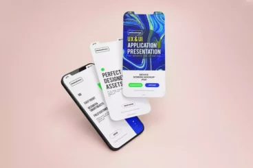
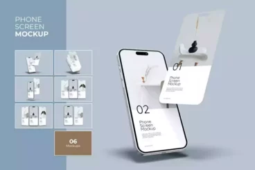
Multi-Devices Website Mockup Template


The Multi-Devices Website Mockup Template is a comprehensive design tool that allows you to present your work across various platforms. Whether it's a desktop, laptop, phone, or tablet, you get the chance to preview your design in a realistic environment. By simply inserting your designs or layouts, you can reach new heights of graphic representation.
The time-saving and user-friendly features of this mockup template are undeniably handy. With the power of smart-layers, updating one screenshot instantly reflects across all devices featuring it. It comes as a single PSD file with all original devices in the collection, alongside 15 ready-to-use examples. There’s no need for cropping, changing perspectives, or layer masking. Everything is automatic once you insert your new screenshot.
This mockup template understands the evolving digital landscape and is equipped to present designs on a plethora of devices. Be it the classic iMac screen, versatile MacBook variants, high-resolution tablets like the iPad Pro, or the range of smartphones including the iPhone 7 and Samsung Galaxy series. This template has been diligently curated to meet all your design showcasing needs.
Details & Features
- Easy-to-use interface for inserting designs
- Smart-layers for rapid screenshot replacement
- Single PSD file with all original devices
- Comes with 15 preset examples
- A wide array of device models for presentation
- Automatic update of all devices with a single screenshot
- No need for cropping or adjusting perspectives
Why We Like It
We love the Multi-Devices Website Mockup Template for its versatility and efficiency. It facilitates effortless design display across a wide range of devices. Its user-friendly, time-saving features like smart-layers eliminate tedious workflow elements. Lastly, it brilliantly caters to a diverse digital landscape with an extensive collection of device models.


