Multi Devices Website Mockup Templates

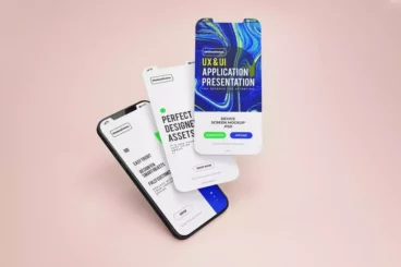
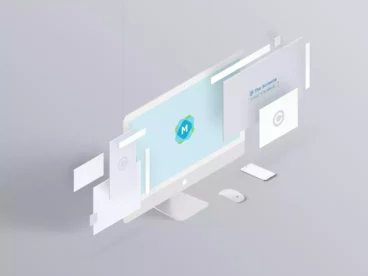
Whether you are an app developer or a website designer, presenting your designs on multiple devices may be necessary. With our Multi Devices Website Mockup Templates, you can effortlessly showcase your work in a practical working desk environment. The package comes with a variety of devices including an iPhone, iMac, MacBook, and iPad all in one scene.
At design2mgraphics, we are dedicated to aiding your creativity stand out. We provide an array of professional, top-quality mockup templates that are impressive in their unique design. Our templates are advanced, yet simple enough to modify. All you need to bring your project to life, our Multi Devices Responsive Website Mockups Desk offers. We guarantee a great fit for all your bright and dark designs.
This mockup contains a well-described layers set easy to navigate. Even when you encounter any challenge, our friendly Help file could be of help to you. It couldn't be any easier!
Details & Features
- Features two PSD files.
- High resolution of 4000 x 2770 pixels.
- 300 DPI for superior quality printouts.
- Edits through Smart Objects for user-friendliness.
- Background color is changeable.
- Fully separated objects and shadows for a realistic look.
- In-built help file for guidance.
Why We Like It
This mockup is one of our favorites due to its resourcefulness. We love its ability to adapt to both bright and dark designs. It offers a realistic projection of your design on multiple devices, making it stand out in presentations. Plus, the ease of use and the ability to customize background colors further adds to its appeal.