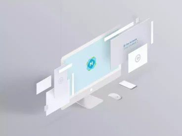
Responsive Screen Isometric Website Mockup


The Responsive Screen Isometric Website Mockup bundle is a design kit that consists of multiple beautiful website mockups. Each mockup has an isometric view, which presents itself in a three-dimensional design. With this pack, you can customize and create unique mockup scenes by rearranging the separate device mockups to suit your concept.
The Responsive Scene Device that comes with this pack is a minimalist multi-device scene creator. This tool is extremely versatile and beneficial for designers who present responsive website designs. The intuitive design enables one Photoshop file to hold various mockups, making it ideal for showcasing designs for websites, Header Images, e-Publishing Templates, Google slides, Keynote Templates, and Powerpoint Templates.
This mockup is designed for simplicity and practicality. It uses smart layers enabling you to imprint your designs onto the screen with relative ease. It also features high image quality with an impressive size of 5000×3333 and resolution of 300dpi. The mockup is easy to edit using smart objects and customize to any colour or texture that suits your preference.
Details & Features
- Includes several Isometric Website Mockups
- Featuring Multiple Device Mockups
- Customizable smart layers
- 5000×3333 Image Size, 300dpi
- Easy to edit with smart objects
- Includes a User Guide PDF
Why We Like It
We highly recommend the Responsive Screen Isometric Website Mockup bundle because of its user-friendly interface and high-quality design. It allows for creative freedom with its customizable features, and supports various design presentations, making it a valuable tool for designers in various sectors. The attention to detail is impeccable, producing a superior visual product.