30+ Best Fall & Autumn Fonts
Celebrate the cozy warmth and rich colors of the season with our Fall and Autumn fonts collection. These fonts encapsulate the essence of fall, from the rustic charm of harvest to the crisp air of autumn evenings. Ideal for seasonal greetings, Thanksgiving invitations, or any design that aims to evoke the nostalgic and reflective mood of autumn.

Barthley Font
Barthley is a charming handwritten font that exudes warmth and friendliness. Its authentic style sets it apart and makes it suitable for a variety of ...

Thankful Sunday Font Duo
The Thankful Sunday Font Duo is a delightful blend of handwritten fonts, perfect for embodying the spirit of Thanksgiving in your design projects. Wit...

Billy Holiday Font
Indulge in the nostalgic romance of Autumn in New York with the creative asset that brings this dream alive – the Billy Holiday Font. This versa...

Autumn Wind Font
The Autumn Wind is a delightful, contemporary script font that effortlessly brings a modern and polished vibe to any project. With a character set tha...

My Autumn Font
Welcome the new star in the world of typography – My Autumn Signature Font! Designed to capture the warmth and vibrancy of the fall, this is a n...

Start Autumn Font
Introducing Start Autumn, our latest offering in the category of Modern Serif Typeface. This font captures the essence of autumn with a warm, nostalgi...

Pear Leaves Font
Experience the warmth and versatility of Pear Leaves, a beautifully creative handwritten script font. Inspired by classic typeface designs, it injects...

Hello Thankies Font
Introducing the Hello Thankies font duo, a fantastic collection inspired by the warmth and affection of a Thanksgiving moment. This unique pair of fon...

Orange Leafy Autumn Font
Orange Leafy, an Autumn font duo, beautifully captures the essence of fall with its unique maple leaf display. Warm and attractive, it adds an irresis...

Samberia Font
Discover the refreshing allure of Samberia, a vibrant Modern Script Font. Ideal for a host of applications, Samberia captures the essence of todayR...

Thanks Autumn Fall Font
The Thanks Autumn Fall Font graces every project with its sweet, heartwarming presence, exuding genuine love with every letter stroke. Its inspiration...

Falling Dried Sans Serif Font
Falling Dried Sans Serif Font is your key to encapsulating the ethereal beauty of autumn in any project. Drawing inspiration from the bittersweet char...

Autumn Orange Font
Autumn Orange Font is a unique typeface capturing the vibrant hues and cozy feel of the season. Boldly authentic, it perfectly captures the transition...

Warm Autumn Font
Introducing Warm Autumn, a uniquely striking and authentic display font. This piece stands out with a bold and memorable style that perfectly encapsul...

Lord De Ayodilla Font
Show off your creative flair with the delightful Lord De Ayodilla, a spring or holiday-inspired font designed to bring a splash of fun to any project....

Savor Modern Fall Font
Explore the bold yet delicate beauty of the autumn season with our new display typeface – Savor Fall. Crafted to evoke a warm sense of nostalgia...

Fall Pies Font
Fall Pies, a modern handwritten font, is a delightful addition to our repertoire. Its playful yet refined style makes it the perfect choice for an arr...

Autumn Unique Fall Font
Presenting Autumn Unique Fall Font, a specially curated modern display font for all the elegance and class your brand craves. Complete with extra char...

Happy Fall Font
Welcome to Happy Fall, our latest creation in the world of typography. This modern handwritten typeface is a unique and creative asset that perfectly ...

Cute Maple Font
Introduce a touch of light-heartedness to any design project with Cute Maple font. This playful display typeface radiates an infectious joy, capturing...

Turning Leaf Font
Indulge in a slice of autumn magic with our brand new product, Turning Leaf Font. Encapsulating the warm pull of nostalgia felt during fall, our font ...

Savo Bawdy Typeface
Savo Bawdy is a beautiful and elegant cursive font that is perfect for designers looking to add a touch of sophistication to their work. The font is h...

November Fall-Themed Font
Looking for an elegant and versatile handwriting font? Our November Fall-Themed Font could be your answer. Its gentle spirals and seasonal flair rende...

Gobbie Gobble Font
Gobbie Gobble Font is a handwritten font that offers a Thanksgiving-themed touch to any designs. With its fun and dynamic style, this font adds a fest...
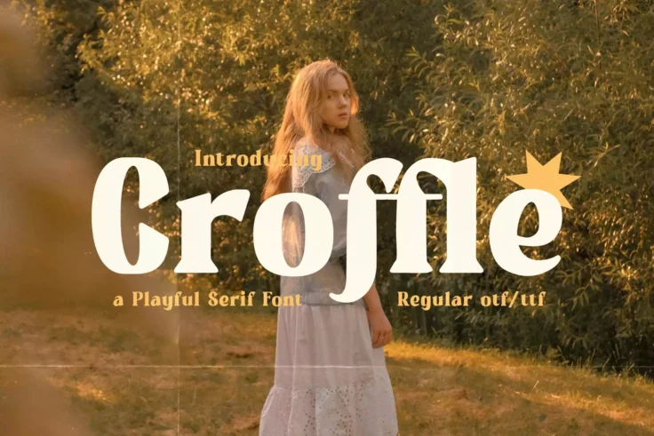
Croffle Playful Font
Croffle Playful Font transforms ordinary text into expressions of joy and beauty effortlessly. Its cheerful and informal appearance invites warmth and...

Autumn Romans Font
Meet Autumn Romans – Modern Sans Display, a fresh and distinctive font that takes type-face to a whole new level. Exuding bold originality, Autu...

Autumn Field Font
Welcome to the world of Autumn Field, a distinctive handwriting type presented by the illustrious ikiiko. This typeface invites you into a design play...

Autumn Atmosphere Font
Introducing Autumn Atmosphere, a bold, striking, and authentic display font. It is designed with an innate versatility that makes it ideal for a vast ...

Fall Season Font
Fall Season Font captures the essence of autumn perfectly with its relaxed handwritten style and slight melancholy undertones. Its unique personality ...

Maple Memories Font
The Maple Memories font is an exquisite handwritten typeface, designed with a shine of realism that gives your designs a lifelike feel. Its intricate ...

Gratefully Thanksgiving Font
Immerse yourself in the Autumn season with the delightful Gratefully Thanksgiving Font. This unique, fun serif font boasts of a ‘fall’s th...

Zaida Font
Discover the charm of the fall season effortlessly mirrored in Zaida Autumn – our new, Beauty Autumn Typeface. This unique and captivating font ...
FAQs About Fall & Autumn Fonts
What Are Fall and Autumn Fonts?
Fall and Autumn Fonts are typefaces that capture the essence of the fall season, characterized by their warm, cozy, and rustic qualities. These fonts often draw inspiration from the changing colors of autumn leaves, the texture of natural elements like wood and burlap, and the overall feeling of warmth and comfort that the season brings. Fall and Autumn Fonts can range from elegant and flowing scripts reminiscent of the wind through autumn leaves, to sturdy and earthy serifs that evoke a sense of harvest and abundance.
They are ideal for seasonal marketing campaigns, Thanksgiving invitations, autumn-themed events, and any design work that aims to reflect the richness, transition, and warmth of the fall season.
How Can You Use Fall and Autumn Fonts in Your Design Projects?
Fall and Autumn Fonts can be effectively utilized to infuse designs with the warmth and nostalgia associated with the season. They work well in promotional materials for fall sales, seasonal event invitations, branding for autumn-themed products, and editorial designs for lifestyle and culinary publications. When incorporating Fall and Autumn Fonts, it's important to complement their seasonal characteristics with suitable imagery, color palettes, and design elements to create a cohesive and engaging composition.
Given their thematic nature, Fall and Autumn Fonts are best used for headlines, titles, or short text elements where their unique character can be showcased without compromising legibility.
Are Fall and Autumn Fonts Suitable for All Types of Projects?
While Fall and Autumn Fonts can add a charming and thematic touch to many design projects, their specific style and seasonal focus may not be appropriate for all contexts. Projects requiring a more formal, minimalist, or contemporary aesthetic might not align with the decorative and nostalgic features of Fall and Autumn Fonts. However, for projects that aim to evoke the essence of autumn, celebrate harvest festivals, or convey a sense of warmth and transition, these fonts can be an excellent choice to enhance the design's thematic resonance and visual appeal.
It's essential to consider the project's tone, audience, and objectives when selecting a Fall or Autumn Font, ensuring that it complements the overall theme and enhances the message.
How Do You Pair Fonts with Fall and Autumn Fonts in Design?
Pairing fonts with Fall and Autumn Fonts involves selecting complementary typefaces that provide balance and enhance readability. A common strategy is to use a Fall or Autumn Font for the main headline or focal point and pair it with a more legible, simple font for body text. Sans-serif fonts often work well as complementary choices due to their clean lines and readability, providing a visual counterbalance to the more decorative Fall or Autumn Font.
When pairing fonts, consider the visual hierarchy and ensure that the Fall or Autumn Font enhances the design's key elements without overwhelming the content or making it difficult to read.
What Are the Best Practices for Using Fall and Autumn Fonts?
Best practices for using Fall and Autumn Fonts include using them judiciously to highlight specific elements of your design without detracting from the overall message. Due to their often decorative and expressive nature, Fall and Autumn Fonts are most effective when used for titles, logos, or calls to action. Ensuring that the use of a Fall or Autumn Font aligns with the design's overall theme and objectives is crucial, as is maintaining legibility, especially for essential information.
Additionally, testing the font across various mediums and sizes is important to ensure its effectiveness and readability in all intended applications, from digital graphics to printed materials. Pairing Fall and Autumn Fonts with appropriate imagery, colors, and design elements can also enhance the thematic consistency and cozy feel of your project.