15+ Best Gangster Fonts
Channel the bold and gritty spirit of the underworld with our gangster fonts collection. These fonts embody the raw edge and toughness associated with gangster culture, perfect for designs that require a touch of rebellion and streetwise flair.

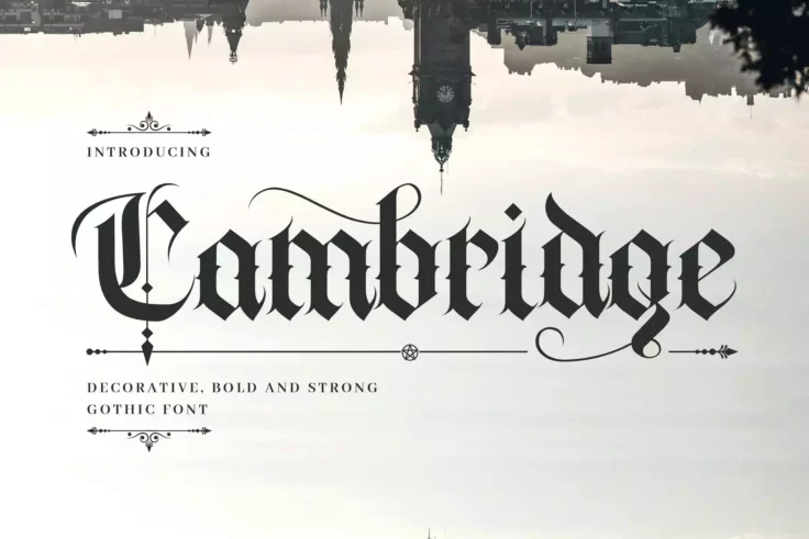
Cambridge Bold Medieval Gothic Font
Cambridge is a hand-lettering decorative font with a medieval gothic feeling. This font is suitable for a wide range of occasions, including books, lo...

Ganglia Basal Urban Font
Let the spirit of rebellion break free with Ganglia Basal, a typeface that delivers the very essence of defiance. This urban font perfectly combines t...

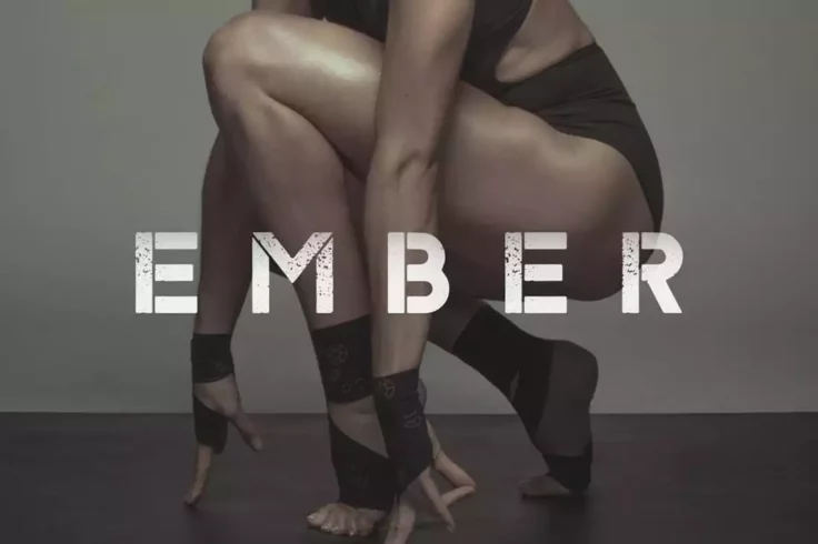
Ember Typeface
Ember is a poster stencil font that comes in two different styles that will fit in well with digital and print designs. It has a rough post-apocalypti...

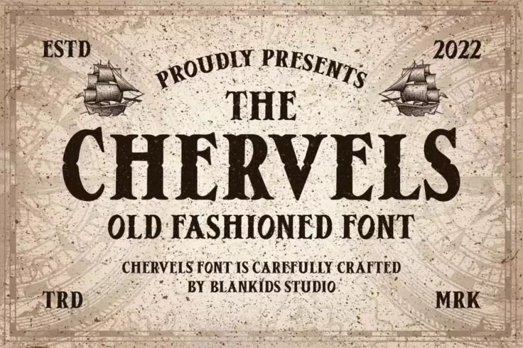
Chervels Old Fashioned Pirate Font
Chervels is a classic font that will instantly remind you of vintage signs and posters. It comes with an old-school letter design with creative and de...

Trainidath Font
Discover the untamed energy of the urban landscape in a font with the Trainidath Font. This graffiti-style font is marked by its raw and rebellious fl...

Familia Tattoo Lettering Font
Familia is a font made specifically for crafting tattoo designs. Of course, you can use it to make other types of designs as well. The font comes in O...

Wall Bomber Font
Wall Bomber is a bold and expressive typeface that combines the styles of traditional graffiti art and modern typography. This font is perfect for add...

Oregon Street Gangster Font
Discover the expressive energy of the urban chic, Oregon Street – Urban Brush Font. Laden with distinctive character, it’s a creative asse...

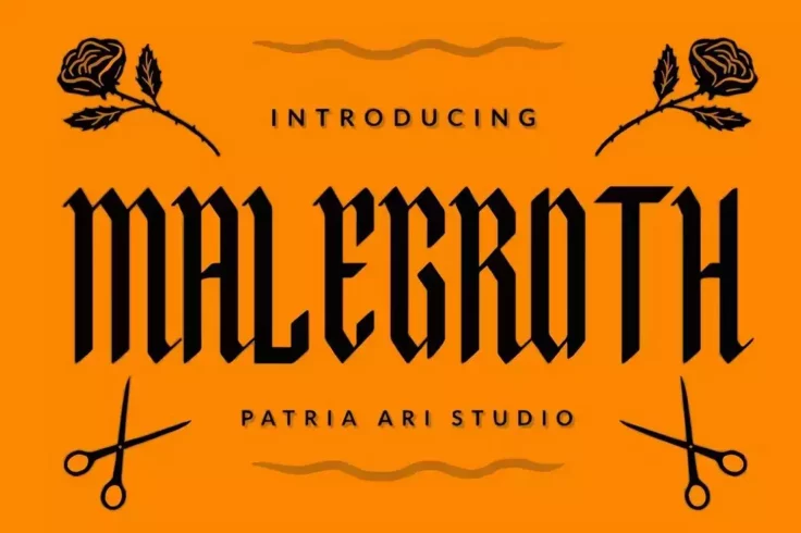
Malegroth Narrow Old English Font
The tall and narrow letter design of this font makes it a great choice for crafting titles for posters and flyers. It will especially fit in perfectly...

Chicano Tattoo Font
Incorporate a touch of unique style to your designs with our latest addition, Chicano Vol. 02 Font | Tattoo Style. This font stands out with its upper...

Graffitopia Gangster Font
Watch words come to life with Graffitopia, where every letter is infused with a touch of streetwise sophistication. Smoky contours and roughly etched ...

Warsuck Old English Font
Bring life into your texts with Warsuck, a hand-drawn masterpiece inspired by underground culture. Paying homage to blackletter scripts, Warsuck’...

Santiago Blackletter Tattoo Font
Santiago is a classic blackletter tattoo font that’s perfect for various signage and label designs. It comes with lots of ornaments for making y...

Marleone Brando Font
Marleone Brando – Condensed Sans, crafted by ikiiko, is the typographic equivalent of a perfectly tailored suit. Influenced by mafia movie typef...

Gonser Gangster Font
Meet Gonser, a modern vintage font that uniquely combines visual elegance with practical utility. Its smooth curves and clear, beautiful ligatures len...

Tratags Font
The Tratags font is a contemporary graffiti-inspired stylization, embodying a unique cool and youthful vibe. It adds a dash of punk aesthetic to any d...

Archking Blackletter Font
Archking Blackletter Font is a contemporary take on a traditional style that’s both charming and captivating. This modern blackletter typeface c...
FAQs About Gangster Fonts
What Are Gangster Fonts?
Gangster Fonts are typefaces that evoke the style and mood associated with the gangster era, particularly the 1920s and 1930s in the United States. These fonts often feature bold, stylized letterforms with sharp edges or exaggerated curves, reminiscent of the Art Deco movement and vintage signage from that period. Gangster Fonts can convey a sense of danger, elegance, or rebellion, making them suitable for designs that aim to capture the mystique and allure of the gangster lifestyle and its representation in popular culture.
These fonts are popular in thematic designs related to vintage crime films, classic literature, speakeasy bars, and any project seeking to channel the gritty glamour of the early 20th century underworld.
How Can You Use Gangster Fonts in Your Design Projects?
Gangster Fonts can be effectively used in a variety of design projects to add a touch of vintage flair and edginess. They are particularly well-suited for projects with a prohibition-era theme, such as event posters for themed parties, branding for bars or restaurants that evoke a speakeasy vibe, and promotional materials for period-specific entertainment or media. When incorporating Gangster Fonts, it's important to balance their bold and stylized nature with other design elements to ensure that the overall composition remains cohesive and legible.
Due to their strong visual impact, Gangster Fonts are best used for headlines, titles, or branding elements where they can make a significant statement without overwhelming the design.
Are Gangster Fonts Suitable for All Types of Projects?
While Gangster Fonts can add a unique and thematic element to many design projects, their distinctive style may not be suitable for all types of designs. More conservative or modern projects that require a clean and straightforward presentation, such as corporate reports or minimalist branding, might not benefit from the ornate and decorative features of Gangster Fonts. However, for projects that aim to evoke a sense of nostalgia, drama, or historical context, Gangster Fonts can be an excellent choice to convey those themes effectively.
It's crucial to match the font choice with the project's tone, audience, and objectives, ensuring that the font supports the project's goals and resonates with the intended audience.
How Do You Pair Fonts with Gangster Fonts in Design?
Pairing fonts with Gangster Fonts involves selecting complementary typefaces that provide balance and enhance readability. A common approach is to use a Gangster Font for headline or key visual elements and pair it with a more legible, simple font for body text. Sans-serif fonts often work well as complementary choices due to their readability and modern appearance, offering a visual counterpoint to the more elaborate Gangster Font.
When pairing fonts, consider the visual weight, style, and proportions of each typeface to ensure they work together harmoniously, supporting the design's theme and narrative without competing for attention.
What Are the Best Practices for Using Gangster Fonts?
Best practices for using Gangster Fonts include using them strategically to highlight key elements of your design without overpowering the viewer. Due to their bold and often complex nature, Gangster Fonts are most effective when used sparingly, such as for titles, logos, or calls to action. Ensuring that the use of a Gangster Font aligns with the design's overall theme and objectives is crucial, as is maintaining legibility, especially for essential information.
Additionally, testing the font across various mediums and sizes is important to ensure its effectiveness and readability in all intended applications, from digital displays to printed materials.
