20+ Best Grunge Fonts
Dive into the raw, edgy world of grunge fonts, perfect for projects that demand a rugged, rebellious vibe. These fonts embody the spirit of grunge culture, offering textures and styles that resonate with themes of authenticity and defiance. Ideal for band posters, alternative fashion branding, and any design seeking a touch of gritty realism.

Grunge Freestyle Font
Delve into the world of creativity with the Grunge Freestyle Font. Ideal for those who love the edge and grit that grunge offers, it is perfect for br...

Blocklyn Font Family
Blocklyn is a great font for showing your titles and mission statements in big bold text. The font family features 4 typefaces Condensed, Condensed It...

Broken Drive Font
Adding a unique twist to basic typography, Broken Drive is a grunge display font choice that is sure to make your designs pop. Built from a sans-based...

Marquee 18 Grunge Fonts
The Marquee 18 Grunge Fonts bundle is your one-stop-shop if you’re in search of grunge style textual elements. Packed with an array of eighteen ...

Wasted Youth – 90s Inspired Font
Wasted Youth is a font in three styles including a clean-edged original, plus two additional versions drawn with inky brush and marker pen. It takes i...

Salmon Victorian Font
The Salmon Victorian Font exquisitely merges the rustic charm of the Victorian era with a contemporary grunge appeal. Its calligraphy-driven style bri...

Montery Font
Montery is a contemporary, bold font that carries an interesting touch of grunge. This font was intentionally crafted to ignite a striking aesthetic a...

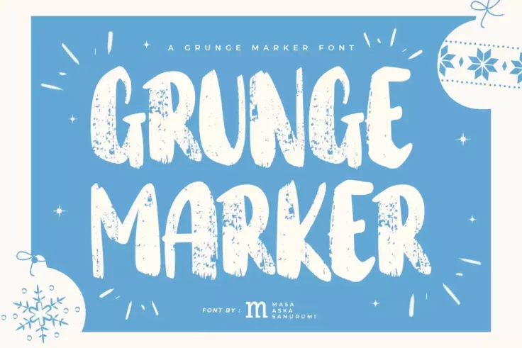
Grunge Marker Font
Unleash your creative demons with the Grunge Marker Font. Tailored to satisfy your design needs, this font is the perfect partner for your varying pro...

Phamelo Grunge Script Font
The Phamelo Grunge Script Font is a daring and unique typography tool that promises to elevate your creative projects to new heights. It masterfully e...

Death Rock Grunge Brush Font
Death Rock is a bold, scratchy brush font that stands out due to its distinctive grunge aesthetic. It’s hard-hitting and edgy, making it ideal f...

Grunges Grunge Brush Font
Introducing Grunges Grunge Brush Font, the ultimate solution to infuse a dash of artistry and uniqueness to your designs. Perfectly engineered to suit...

New York Grunge Font
New York Grunge Font is a vintage-style, display serif designed to breathe life into your new projects. With a feel that takes you back in time, this ...

Gimmi Grunge Font
Presenting the Gimmi Grunge Font, a striking new addition to the calligraphic style typefaces. Designed with an effortless brush stroke finish, this f...

Grimes Grunge Display Font
The Grimes Grunge Display Font is a unique, all caps typography that instantly captures attention. Its grungy, unconventional design makes it the perf...

Grunge Wall Stylish Wide Font
Introducing the Grunge Wall Stylish Wide Font, the newest addition to our diverse collection. This font is bold, broad, and brimming with personality,...

Toxic Brush Font
Add an artistic edge to your projects with the Toxic Brush Font. This bold, brush and grunge style sans display font is ideal for creating an adventur...

Mother Bones 90s Font
Meet Mother Bones – 90s Type Grunge Vibes, an authentic essence of the adventurous nightlife of the 90s, masterfully designed by ikiiko. Driven ...

Eather Modern Typeface
Eather Modern Typeface is a beautifully crafted Grunge calligraphy style font perfect for an array of applications. The typeface elevates the aestheti...

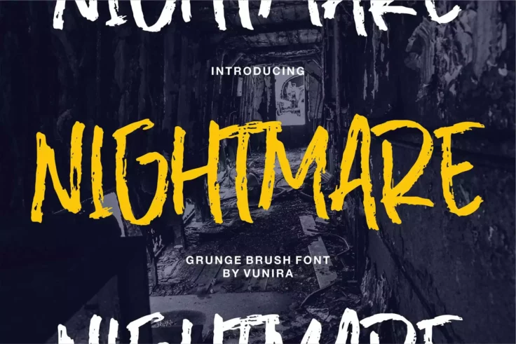
Nightmare Font
Nightmare Font is a distinctive, gripping Grunge Brush Font that oozes a sense of artistry, making any content look impactful. With a unique calligrap...

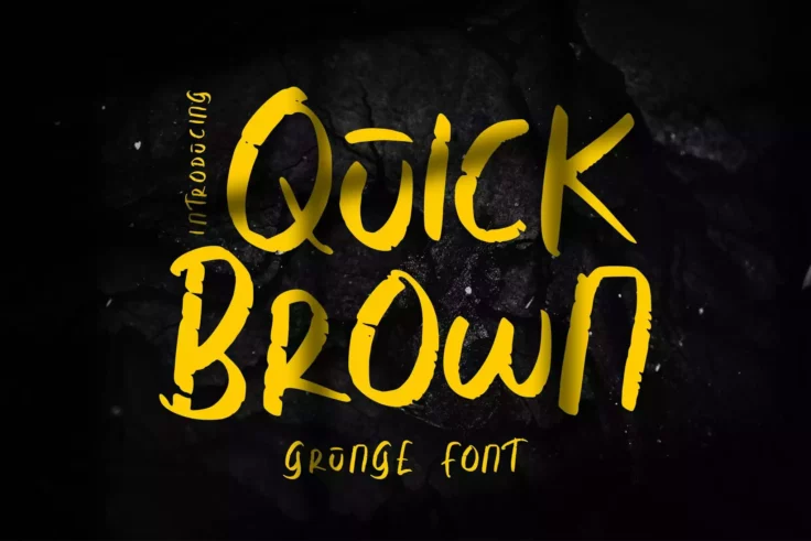
Quick Brown Font
Introducing the Quick Brown Font – a vibrant blend of grunge and calligraphy styles captivatingly effective on everything from greeting cards an...
FAQs About Grunge Fonts
What Are Grunge Fonts?
Grunge Fonts are typefaces that embody the gritty, raw, and unrefined aesthetic associated with the grunge music and fashion movements of the late 20th century. Characterized by their distressed, eroded textures and irregularities, these fonts evoke a sense of rebellion, decay, and rugged individualism. Grunge fonts often appear as though they've been subjected to wear and tear, with elements that mimic ink smudges, scratches, and other forms of degradation.
These fonts are popular in design projects that aim to convey an edgy, alternative, or vintage feel, such as band posters, album covers, urban fashion branding, and any artwork seeking to break away from polished, clean designs.
How Can You Use Grunge Fonts in Your Design Projects?
Grunge Fonts can be effectively used to add character and depth to various design projects, particularly those targeting younger or alternative audiences. They work well in music industry graphics, such as concert posters and album art, as well as in streetwear branding, skateboard and surf culture, and edgy editorial designs. When using grunge fonts, it's crucial to balance their intense textures with simpler design elements to ensure legibility and maintain the focus on the message.
Due to their strong personality, grunge fonts are best used for titles, headers, and other short text elements. Pairing them with more neutral fonts for body text can create a compelling contrast and keep your designs accessible.
Are Grunge Fonts Suitable for Professional Use?
Grunge Fonts, with their distinctive and often aggressive appearance, may not be suitable for all professional contexts, especially those requiring a more conservative or traditional aesthetic. However, in creative industries, such as advertising, graphic design, and fashion, grunge fonts can add a powerful visual element to branding and promotional materials. The key is to use these fonts judiciously and ensure they align with the brand's identity and the project's goals, enhancing the message rather than overwhelming it.
In professional settings where grunge fonts are appropriate, they should be used sparingly, primarily for headlines or standout elements, to maximize their impact without compromising the overall design's professionalism and clarity.
How Do You Pair Fonts with Grunge Fonts in Design?
Pairing fonts with Grunge Fonts involves selecting complementary typefaces that balance the design without competing for attention. A common strategy is to pair a bold and textured grunge font with a simple, clean sans-serif or serif font for body text. This creates a visual hierarchy, drawing attention to the main message conveyed by the grunge font while ensuring the supporting content is easily readable.
Consider the weight, style, and proportions of each font to ensure they harmonize. The goal is to achieve a cohesive design that leverages the unique character of the grunge font while maintaining overall legibility and aesthetic balance.
What Are the Best Practices for Using Grunge Fonts?
Best practices for using Grunge Fonts include understanding the context and audience of your design to ensure the font aligns with the intended message and aesthetic. Due to their textured and often bold nature, grunge fonts are most effective when used sparingly, such as for headlines or key branding elements. Ensuring sufficient contrast between the grunge font and the background is crucial for maintaining legibility, especially in print materials where fine textures may become muddled.
It's also advisable to consider the medium and scale of your project; grunge fonts may need to be adjusted or used differently in digital formats compared to large-scale prints. Experimenting with different levels of grunge intensity can help you find the perfect balance for your specific project, allowing you to capture the rebellious spirit of the grunge aesthetic without sacrificing clarity and readability.