15+ Best Punk Fonts
Capture the rebellious spirit of punk culture with our punk fonts collection. These fonts embody the raw energy and edgy aesthetics of punk, perfect for designs that demand attention and convey a sense of defiance. Ideal for band logos, gig posters, and any project looking to channel the punk ethos.
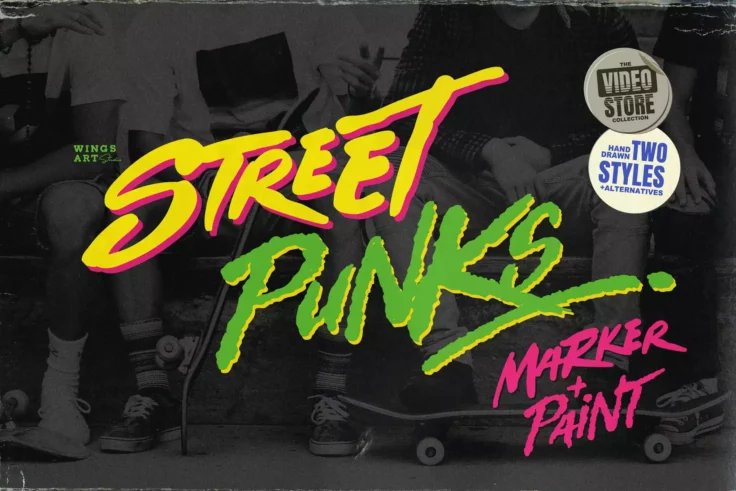
Street Punks Font
Walk into the world of rebellion with the Street Punks Font, a hand-drawn font that vibrantly encapsulates the spirit of graffiti, skate culture, and ...

Black Rocket Freestyle Punk Font
Unleash your creativity with Black Rocket, the unique freestyle punk font! Its irregular, grungy yet engaging look is the perfect pick for anyone aimi...

Rebelion Modern Font
Meet Rebelion, a cutting-edge, contemporary font that exemplifies the fine line between rebellion and grace. Its unique styling brings an air of indep...

After Punk Cool Font
The “After Punk” font unfurls a creative wave that brushes a minimalistic yet vivid style, bringing a particularly edgy and distinctive ch...

Punk Not Yet Rad Font
Introducing the unique and dynamic Punk Not Yet – a Weird Display Typeface that exudes an edgy, punk ambiance. With its handmade, authentic styl...

Punk Lover Grungy Font Duo
Meet Punk Lover, a grungy font duo that screams attitude and non-conformity. Imagine it splashed on band posters, album covers or even tattoo designs....

Great Hunt Street Punk Font
GreatHunt brings out the fierce, free-style of the streets, right at your fingertips. As a unique street art-inspired font, it encapsulates the raw en...

Brainoise Punk Display Font
Enter the rebellious world of punk aesthetics with Brainoise Punk Display Font. Characterized by bold, jagged and distorted letterforms, it vividly ca...

Cherie Bomb Punk Style Font
Meet Cherie Bomb, the brush font influenced by the electric energy of punk-rock. This edgy typeface, handmade with personality and heart, is peppy and...

Zombie Punks Retro Horror Font
At first glance, this font will surely remind you of the horror movie covers from VHS tapes from the 80s. It has a spooky and fun design that’s ...
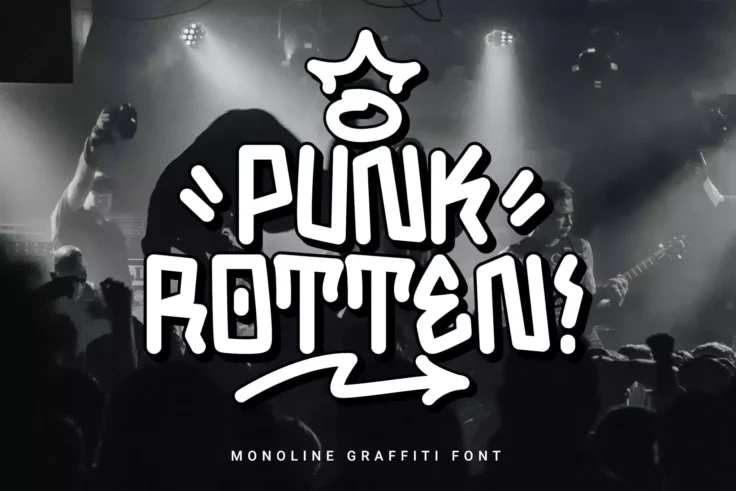
Punk Rotten Monoline Font
Dive into the urban grunge of street art with the Punk Rotten Monoline Font. This creative font breathes life into your work with its unique graffiti ...
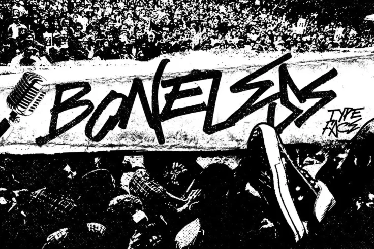
Boneless Cool Punk Font
Boneless Cool Punk Font is the resounding echo of punk rock, inspired by old gig posters and the messy handwriting typical of a true rock ‘n rol...

Rebel Nation Graffiti Punk Font
The Rebel Nation Graffiti Punk Font is a bold declaration of youthful energy, teeming with attitude and a spirit of rebellion. Its aggressive form res...

Across the Line Trash and Rebel Font
Meet Across the Line, an engaging font born from the audacious spirit of punk music and the raw grit of street culture. It’s a celebration of the ru...

Misfit Cool Punk Font
Give your designs an authentic punk edge with the Misfit Cool Punk Font. This captivating typeface, rooted in the 90’s punk scene, embodies a ra...

Wild Rebel Punk Graffiti Font
Unleash your designs’ rawest, boldest potential with the Wild Rebel Punk Graffiti Font. Displaying a powerful reflection of the urban street cul...
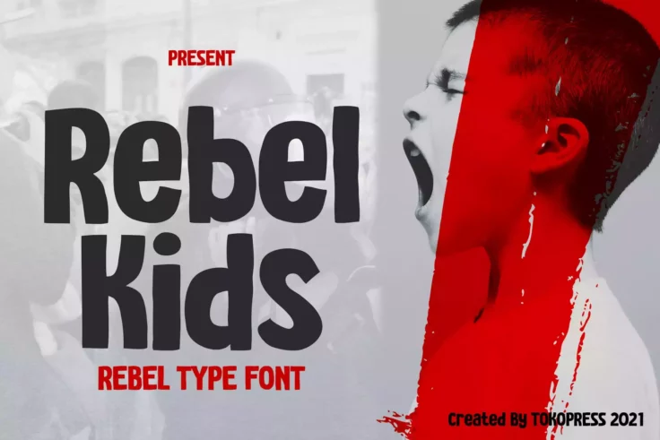
Rebel Kids Modern Font
The Rebel Kids Modern Font is a dynamic and energetic font style that radiates a carefree yet defiant character. It perfectly embodies the spirit and ...

Anarchist Wish Radical Punk Font
Unleash your inner rebel with the Anarchist Wish Radical Punk Font. This handwritten typography is not for the faint of heart. It’s edgy, itR...

Punk Cyber Modern Font
Introducing PUNK CYBER, a glimmer from the past with a Y2K Family Font that will electrify your works with early 2000s nostalgia. Bolstered by the era...
FAQs About Punk Fonts
What Are Punk Fonts?
Punk Fonts are typefaces that embody the rebellious, raw spirit of punk culture and music. Characterized by their edgy, anarchic styles, these fonts often feature irregularities, distressed textures, and bold, impactful designs. Punk fonts capture the DIY ethos of punk, drawing inspiration from band flyers, album covers, and underground zines of the punk movement. They are designed to convey a sense of rebellion, energy, and non-conformity, making them ideal for projects that require a gritty, provocative edge.
These fonts vary widely, from hand-drawn letterforms to stenciled designs, and are used in graphic design projects that aim to evoke the punk era's aesthetic or channel its anti-establishment attitude. Punk fonts are popular in music-related designs, alternative fashion branding, and any creative work that benefits from a raw, unpolished look.
How Can You Use Punk Fonts in Your Design Projects?
Punk Fonts can be effectively used in various design projects to add attitude and edge. They are particularly well-suited for music posters, album art, band logos, and merchandise for genres related to punk and its offshoots. Beyond music, punk fonts can enhance the visual appeal of streetwear brands, event flyers, and any design project that aims to stand out with a bold, unconventional look.
When using punk fonts, it's important to balance their boldness with other design elements to ensure legibility and maintain the intended message's clarity. Pairing punk fonts with simpler, more readable fonts for body text can create a dynamic contrast and keep your designs accessible.
Are Punk Fonts Suitable for Professional Use?
Punk Fonts, with their distinct and often aggressive appearance, may not be suitable for all professional contexts, especially those requiring a more conservative or formal aesthetic. However, they can be highly effective in creative industries, alternative fashion, music, and entertainment sectors, or branding projects that aim to convey a sense of rebellion, innovation, or artistic freedom.
In professional settings where punk fonts are appropriate, they should be used judiciously to complement the brand's identity and communication goals, ensuring that the design remains impactful without compromising professionalism and legibility.
How Do You Pair Punk Fonts with Other Typefaces?
Pairing Punk Fonts with other typefaces requires a careful balance to maintain design cohesion and readability. A common practice is to use punk fonts for headlines, titles, or standout elements and pair them with more neutral, legible fonts for body text, such as clean sans-serifs or simple serifs. This contrast can highlight the punk font's unique characteristics while ensuring the overall design remains readable and functional.
When pairing fonts, consider the visual weight, style, and proportions of each typeface to ensure they complement each other without clashing. The goal is to achieve a harmonious hierarchy that enhances the design's overall impact while keeping the content accessible.
What Are the Best Practices for Using Punk Fonts?
Best practices for using Punk Fonts involve considering the context and audience of the design to ensure the font aligns with the project's goals. Due to their bold and sometimes chaotic nature, punk fonts work best in moderation, used for specific elements that require emphasis rather than extensive text blocks.
It's also crucial to pay attention to legibility, particularly in designs intended for print or outdoor viewing, where readability from a distance is important. Experimenting with font size, spacing, and color can help punk fonts integrate seamlessly into your design, allowing you to capture the punk aesthetic without sacrificing the design's functionality and message clarity.