15+ Best Sharp Fonts
Elevate your designs with the crisp edges and sleek lines of our Sharp Fonts collection. These fonts offer a modern, cutting-edge aesthetic, perfect for projects that demand clarity, precision, and a contemporary feel.
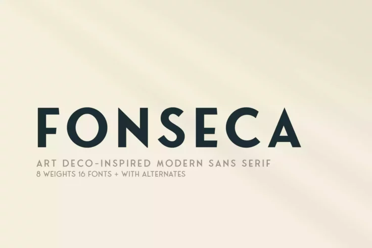
Fonseca Font Family
This modern geometric font finds its inspiration from art-deco style designs. It’s a complete font family that features 8 weights, alternate charact...

Smoke Sharp Edge Font
Dive into the world of typography with Smoke Sharp Edge Font. This uniquely crafted asset merges modern style with a daring edge, creating a visual tr...

Lancea Sharp Font
Lancea Sharp Font, a fancy serif typeface, remains a celebrated choice among designers valuing a fusion of elegance and edginess. This font has a medi...

Silvere Font
Introducing the Silvere Font, a versatile addition to your design toolbox! Silvere Font puts creativity at your fingertips, enabling you to produce ey...
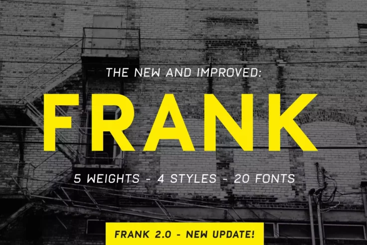
Frank Sharp Font Family
Meet the timeless, versatile font that’s making waves in the design world – the Frank Sharp Font Family. Inspired by the classic DIN, Euro...

Command Blast Font
Command Blast is the embodiment of futurism. A display font with a difference, it employs bold strokes and an ebullient spirit to make a strong, impre...

Rebel Nation Graffiti Punk Font
The Rebel Nation Graffiti Punk Font is a bold declaration of youthful energy, teeming with attitude and a spirit of rebellion. Its aggressive form res...
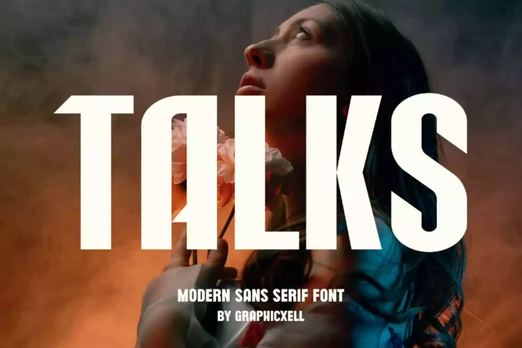
Talks Modern Sharp Font
The Talks Modern Sharp Font is the ultimate choice for those looking to marry sleek and edgy design with the charm and elegance of minimalism in their...

The Phosire Display Font
Dive into the realm of modern typography with our latest product, The Phosire Font. Unveiling a new wave of design language, this display font disting...

Woliu Maners Font
The Woliu Maners Font is a sleek and modern Sans Serif typeface that leaps off the page. Its versatile design makes it perfect for everything from bra...

Emigow Clean Font
Introducing Emigow, the sleek and modern Sans Serif font ready to capture attention. This exceptional font is designed to create a striking impact, id...

Forenight Sharp Font
Introducing “Forenight”, a vibrant and athletic sports font that’s designed to encapsulate the vitality and dynamism intrinsic to sp...

Canesa Elegant Font
The Canesa Elegant Font by rantautype strikes a balance between elegant sophistication and modern sensibility. This ligature serif font stands tall, e...

Meoky Futuristic Font
The Meoky Modern Futuristic Typeface is a cutting edge font designed with inspiration from today’s advancing technology. The font radiates a mod...

Kizard Sharp Font
Kizard Sharp Font takes typography to a new level with its modern, sans serif design. This contemporary style font offers a neat, clean look which mak...

MBF Atom Thin Font
Experience the future of typography with the MBF Atom Thin Font. Its all caps, sans serif style propels your designs forward with a minimalist, yet ca...

Carousel Modern Sharp Font
The Carousel Modern Sharp Font is pure elegancy combined with functionality. Its edgy contemporary design will breathe new life into your designs R...

Devil Inside Font
The Devil Inside Font is chillingly irresistible. Designed in bold and large, it’s a typeface that immediately grabs attention with its ominous ...
FAQs About Sharp Fonts
What Are Sharp Fonts?
Sharp Fonts are typefaces characterized by their crisp, clean edges and pointed angles, creating a sleek and modern look. These fonts often feature geometric shapes, straight lines, and acute angles, giving them a cutting-edge and contemporary feel. Sharp Fonts can convey precision, sophistication, and a forward-thinking attitude, making them suitable for designs that aim to project a modern, dynamic, or technological image.
They are popular in branding, advertising, and digital design for industries such as technology, fashion, and entertainment, where a sharp and stylish aesthetic is desired.
How Can You Use Sharp Fonts in Your Design Projects?
Sharp Fonts can be effectively used to infuse designs with a sense of modernity and precision. They work well in branding materials for tech companies, fashion labels, and entertainment media, as well as in digital interfaces and promotional materials that require a clean, impactful look. When incorporating Sharp Fonts, it's important to balance their angular nature with other design elements to ensure that the overall composition remains accessible and engaging.
Due to their bold and defined nature, Sharp Fonts are best used for headlines, titles, or branding elements where they can make a strong visual statement.
Are Sharp Fonts Suitable for All Types of Projects?
While Sharp Fonts can add a contemporary and stylish element to many design projects, their specific style and edgy appearance may not be appropriate for all types of designs. Projects requiring a more traditional, soft, or organic aesthetic might not benefit from the geometric and angular features of Sharp Fonts. However, for projects that aim to reflect a modern, sleek, or innovative theme, Sharp Fonts can be an excellent choice to convey those qualities effectively.
It's essential to match the font choice with the project's tone, audience, and objectives, ensuring that the font supports the project's goals and resonates with the intended audience in a meaningful way.
How Do You Pair Fonts with Sharp Fonts in Design?
Pairing fonts with Sharp Fonts involves selecting complementary typefaces that provide balance and enhance readability. A common strategy is to use a Sharp Font for headline or key visual elements and pair it with a more legible, simple font for body text. Sans-serif fonts often work well as complementary choices due to their readability and modern appearance, offering a visual counterpoint to the more angular Sharp Font.
When pairing fonts, consider the visual weight, style, and proportions of each typeface to ensure they work together harmoniously, supporting the design's theme and narrative without competing for attention.
What Are the Best Practices for Using Sharp Fonts?
Best practices for using Sharp Fonts include using them strategically to highlight key elements of your design without overpowering the viewer. Due to their often bold and distinctive nature, Sharp Fonts are most effective when used sparingly, such as for titles, logos, or calls to action. Ensuring that the use of a Sharp Font aligns with the design's overall theme and objectives is crucial, as is maintaining legibility, especially for essential information.
Additionally, testing the font across various mediums and sizes is important to ensure its effectiveness and readability in all intended applications, from digital displays to printed materials. Pairing Sharp Fonts with appropriate imagery, colors, and design elements can also enhance the thematic consistency and contemporary feel of your project.