What Makes a Great 404 Error Page?
No one wants to think website visitors are spending time on error pages, but it happens. The 404 error page is one place that these interactions happen rather frequently. Design it in a way that speaks to users rather than encouraging them to leave your site.
More memorable and less frustrating 404 error pages are the most successful. They can also be the most fun to design. So what can you do to create the best 404 page for your site? Here are a few tips, tricks and gallery of great examples.
What is a 404 Error Page?
Website visitors land on a 404 error page when they try to visit a page that does not exist. This can be because the page has been removed, the server or internet connection is down, users have clicked a broken link or typed a URL wrong.
Typically 404 error pages result in one of the following messages:
- 404 Not Found
- HTTP 404 Not Found
- 404 Error
- The page cannot be found
- The requested URL was not found on this server
When it comes to the overall design of 404 pages there are two options – a generic 404 page or a custom 404 page. Generic pages just spit out the messages above with no regard to the design. Custom pages are those that you design and create options for. You must have access to the host server to do this. (That is not something we will go into here, but you can learn more about it from A List Apart.)
Good custom 404 error pages tell users what to do if they get misdirected in some way. Pages should include usable information that will help a visitor stay on your site and find the information they are looking for. (Hopefully they will have a nifty design as well.)
Basic Must-Have Information
To be most effective a 404 error page should be somewhat simple in nature. It should tell users that there is an error (obviously) and what options they have to move forward from this page.
What a 404 page should not have is a bunch of technical jargon. (You don’t want to scare users, do you?) In all reality, you probably should not even use the headline “404 Error” because many of your users won’t have any idea what that means. Stick to something with more meaning, such as “The page can’t be found.”
There are some other pieces of information that you must have on the 404 page. Remember, the point is to keep visitors clicking if they found the page in error, not lose them.
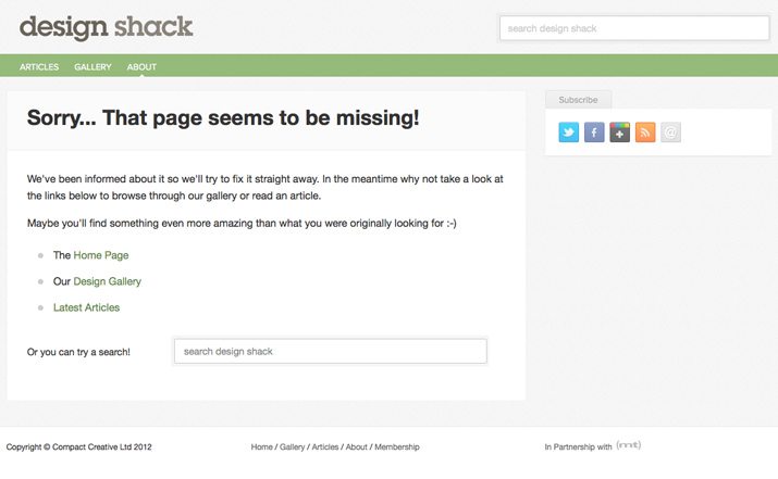
- A strong headline or text explaining to a user why they are here. It is jarring when you land on a webpage that is not what you intended. Make sure users know they are not on the right page, but they are on the right website.
- Search. Make sure the 404 error page has the same search functionality (and in the same location) as the rest of your site. That way users can look for the page they intended to visit.
- Links to your homepage and sitemap. Likely this will happen as a design element that includes a header or footer that matches the rest of the site.
- Minimal information otherwise. Consider stripping away complicated navigation. If a user gets to a page in error, only give that person a few options that will result in success. Too many options here could further frustrate or confuse the user.
- Include a obvious call to action. Tell users what to do next.
Make 404 Pages Usable
Part of the design process when thinking about 404 pages should be usability. Include features that make the page both visually appealing and functional for the lost user.
Google has a list of great suggestions for information to include on a custom 404 page in its webmaster tools. These tips include:
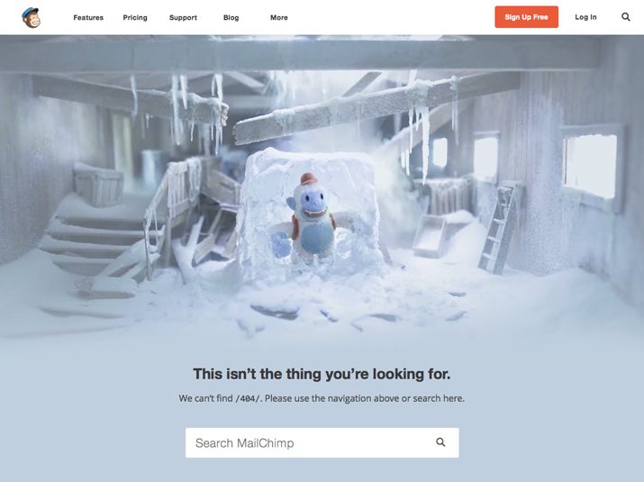
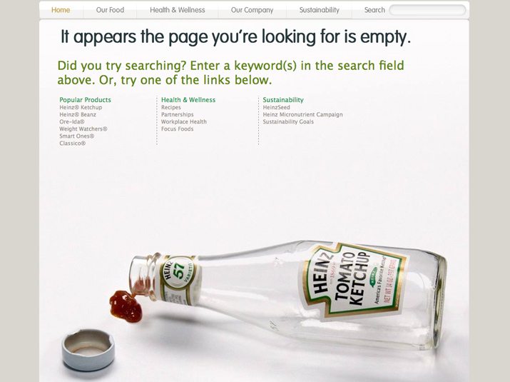
- Tell visitors clearly that the page they’re looking for can’t be found. Use language that is friendly and inviting.
- Make sure your 404 page uses the same look and feel as the rest of your site.
- Consider adding links to your most popular articles or posts.
- Think about providing a way for users to report a broken link.
- Make sure that your web server returns an actual 404 HTTP status code when a missing page is requested so that it does not show up in search results.
- Use the Enhance 404 widget to embed a search box on your custom 404 page.
- Use the Change of Address tool to tell Google about your site’s move.
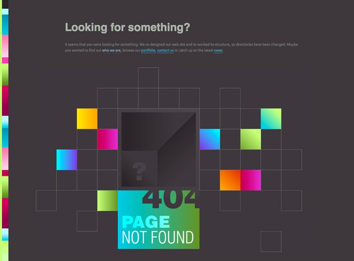
To that list of tips is one more for designers: Be creative. A 404 page does not have to be boring if it is technically sound.
Design 404 Pages With Purpose
When you are thinking about the design of a 404 error page, first consider how it works in relationship to the rest of the site. What is the mood or tone of your overall design? How can this page match that feel?
Great error pages mesh seamlessly with the site they live on. If your site has a light and humorous tone, so should the 404 page. The colors and imagery should also have a consistent design. Be careful though in the design not to blame the user for landing on the wrong page. (This happens more frequently than you might think.)
Think about the design for an error page as you would any other page in the overall design scheme.
- Maintain design consistency. Use the same color, typography and image styles that are integrated on other pages of the website.
- Maintain branding. Using the same logo, header and footer treatment will help users recognize your site.
- Keep it simple visually. Less is more when it comes to error pages.
- Don’t make users scroll. This is a one-screen design.
- Avoid too many gimmicks. While it is a good idea to maintain the tone and feel of your site and brand, too many “extras” can make users forget what they were looking for in the first place.
- Apologize and be empathetic. It’s ok to be sorry that a user landed in the wrong place.
- If your site requires a login, add a place for it. (Did the error happen because the user needed to be logged in?)
- Be creative. Or funny. But test the page first. Make sure random users “get it.”
- If you uses “404 error,” add a second line of text telling users what it means or what they need to do next.
12 Great Examples
There’s nothing like hitting a great 404 error page. It eases the frustration of a bad or broken link. Here are a dozen pages that are sure to make you want to stumble upon an error.
Deviant Art

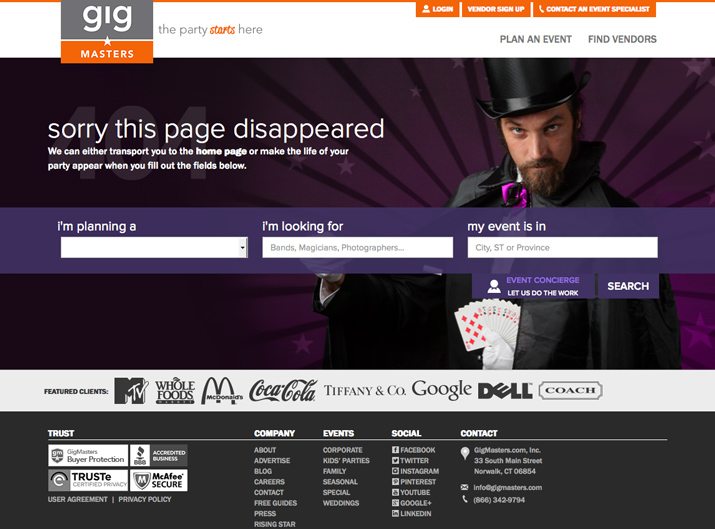
Gig Masters
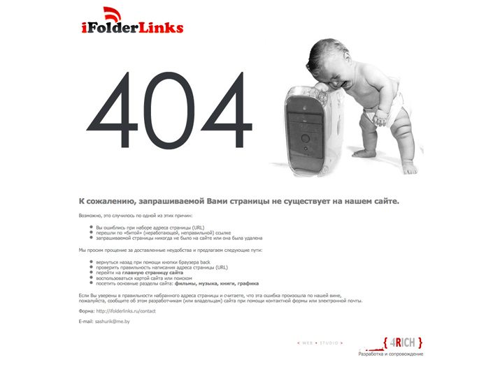
iFolderLinks
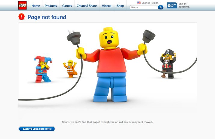
Lego
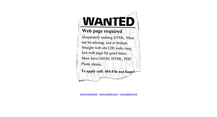
LimpFish
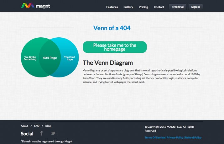
Magnt
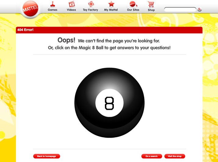
Mattel
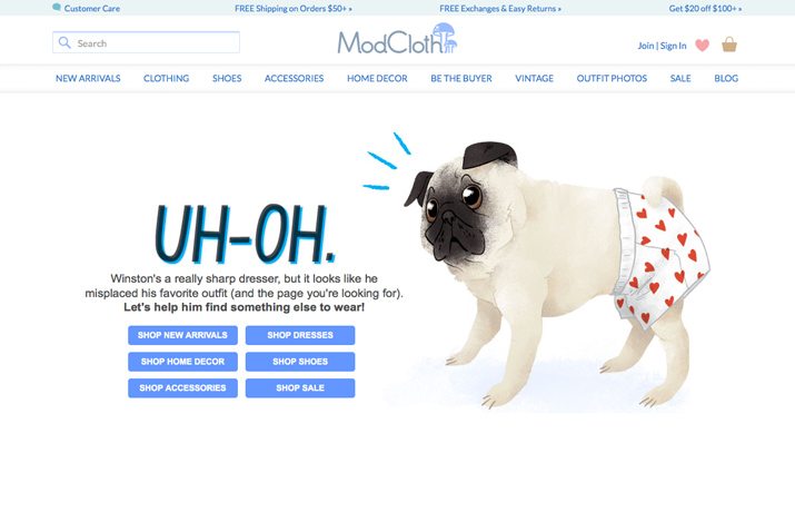
ModCloth
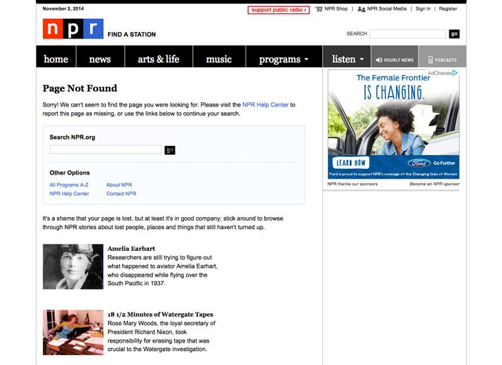
NPR
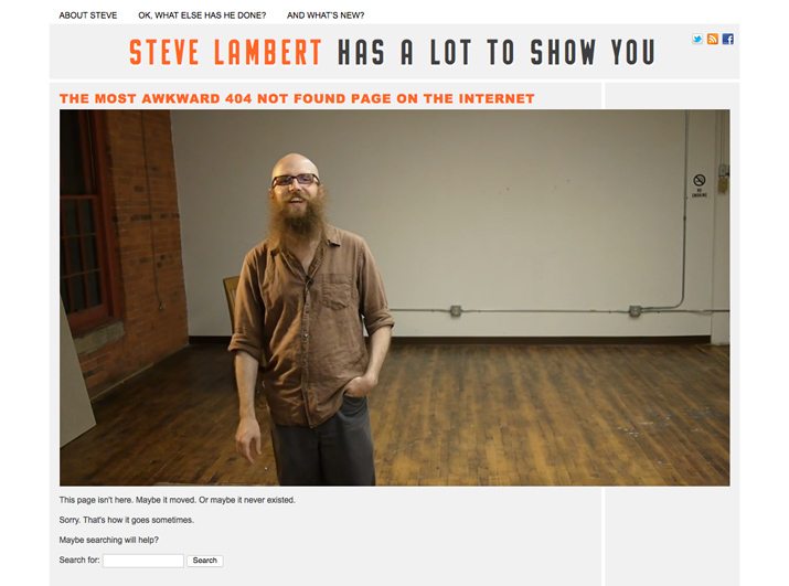
Steve Lambert
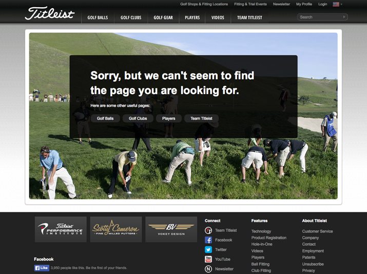
Titleist
Tobi

Conclusion
It can be hard to think of designing a page that is the result of an error as fun or a place to showcase some creativity, but it an be. Designing an effective 404 page is a mix of simplicity, usability and design flair.
Did we miss any of the elements you like to see in a 404 error page? Have you designed a great 404 page? Share your thoughts and designs with us in the comments, on Facebook or Twitter.