Web Design Critique #19: Redka3d
Every week we take a look at a new website and analyze the design. We’ll point out both the areas that are done well as well as those that could use some work. Finally, we’ll finish by asking you to provide your own feedback.
Today’s site is Redka3d, the personal portfolio of a web designer from Indonesia.
The Ultimate Designer Toolkit: 2 Million+ Assets
Envato Elements gives you unlimited access to 2 million+ pro design resources, themes, templates, photos, graphics and more. Everything you'll ever need in your design resource toolkit.


If you’d like to submit your website to be featured in a future Design Critique, it just takes a few minutes. We charge $24 for critiquing your design – considerably less than you’d pay for a consultant to take a look at your site! You can find out more here.
About the site owner
“Family and friends call me Tata, I’m a Web Designer from Indonesia and currently residing in Jakarta. ”
Here is a section of Tata’s homepage:

Site Performance
Before we begin our critique on design, I have to say that page load times can be just as important or even more so than what the site looks like. High-speed Internet has us all spoiled and users simply won’t wait more than a few seconds for a page to load.
Redka3d seems to suffer from some seriously long page load times. This is likely a temporary issue with the server but just in case it’s indicative of a long-term problem, I thought I’d recommend looking into it.
Header
Right off the bat you can see that this site is going to be unique. The idea here is certainly boldly different; the name of the site is encased in a large triangle with differing letter sizes.

I’ll admit that aesthetically, this section isn’t my favorite. But, since it’s unconventional the designer wins some style points.
A couple of areas definitely need addressing though. First, the letters in the logo bleed out of the triangle in an awkward way. Since the letters are the same color as the site background, they feel like holes cut into the triangle. However, they don’t share the shape’s shadow so they aren’t really cut out of the shape. On the edges, the letters even break out of the triangle and cover up portions of its shadow. This makes for some visual confusion as to what’s actually going on here. I recommend either masking the letters so they don’t bleed out or actually cutting them out of the triangle.
Another area that could use some attention is the arrow. The copy encourages users to “click here” with a big arrow, but there’s nothing at the end of the arrow so it feels like something didn’t load right. In truth, the item that the arrow is pointing at is very small and very far away from the arrow (the “Who am I” text). I recommend rethinking how this area works by either changing the arrow, the text, or both so that they are more clearly connected.
Finally, you might want to play around with the shadows and text color used on the site. As a general rule, I try to avoid making the shade of my shadows too close to that of the objects they’re applied to. The reason is that when these colors are too similar, the shadow almost looks like a blur rather than a shadow. An easy fix for this is just to lighten the shadow so that it is significantly different from the text.
Just look at the difference this makes in the readability of your text.

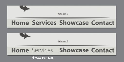
Navigation
The navigation for the site is positioned right under the header. The default state is bolded text which then slides to the left on hover while a lighter version slides in. This is a cool effect. The transition is smooth and the animation is fun to play with.
However, you might want to adjust the spacing a bit on the hover states. Each text item is positioned well in the default state, but drifts too far to the left in the hover state. For instance, in the image below, the word “Services” should be centered between “Home” and “Showcase” in both the default and hover states.
When you click on the navigation, new sections pop up via this 3D carousel effect. It’s hard to describe or show here so be sure to stop by the site and try it out. In fact, the site is just filled with neat little jQuery effects. It might be too much for some circumstances but it’s good to shoot for a “wow” factor on a personal portfolio.
Follow Me Section
The last area we’ll discuss is the social network hub near the bottom. Because of the large “Follow Me” text, this area places quite high on the visual hierarchy despite being near the bottom of the page.
The fact that this area is so attention grabbing can be either good or bad depending upon the designer’s intentions. If this area is supposed to be one of the most important aspects of the site, it’s working. If it’s not, I would recommend altering the design so it doesn’t distract so much from the content above.

As for the social icons, I think they’re a little too visually complex. All that shadowing can get a bit messy, particularly in the Digg icon. These would read much better if they were inverted and simplified. Here’s a quick mockup of what I mean.

Finally, in the context of the rest of the page, the Twitter feed actually looks a bit like an ad. Google has trained our eyes to completely ignore anything resembling a text ad so I’d bet that many viewers skip right over this without realizing what it is. Try playing with the styling a little more, ditching the blue links, and adding some extra vertical spacing so it looks less like an advertisement and more a a feature of the website.

Your Turn!
Now that you’ve read my comments, pitch in and help out by giving the designer some further advice. Let us know what you think is great about the design and what you think could be stronger. As always, we ask that you also be respectful of the site’s designer and offer clear constructive advice devoid of any harsh insults.
Interested in having your own site critiqued? You can find out more here.