4 Fun CSS Image Effects You Can Copy and Paste
Once upon a time we relied purely on Photoshop to create fancy image effects. These days though we’re turning more and more to pure CSS to add eye candy to our images. Applying custom image treatments using code makes for an infinitely flexible workflow that’s easy to tweak at any time.
Today I’ll walk you through creating some extremely simple and fun CSS image tricks. From polaroids to vignettes, you won’t believe what we can pull off.
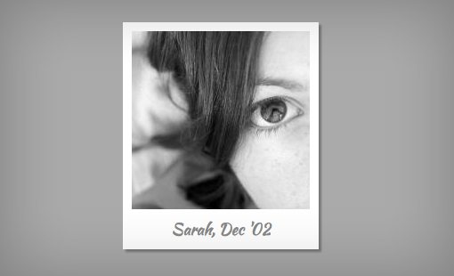
Polaroid
Demo: Click here to view the demo on Tinkerbin.
Our first image trick is a simple polaroid technique. By utilizing different border sizes, we can easily create the white frame that surrounds the popular instant photo style from a few decades ago.
Admittedly, this effect is super cheesy, but I’m sure you can come up with a decent application.
HTML
Our HTML for this effect is a div with the class “polaroid” applied. Then we’ll use both a paragraph and an image for our core markup. I’ll be using a 200px by 200px image (this matters).
<div class="polaroid">
  <p>Sarah, Dec '02</p>
  <img src="http://lorempixum.com/200/200/people/1" />
</div>
Notice in the preview above that we’re using a custom handwritten font. This is a Google Web Font called Kaushan. To implement it, make sure you have this snippet in the head portion of your HTML.
<link href='http://fonts.googleapis.com/css?family=Kaushan+Script' rel='stylesheet' type='text/css'>
CSS
Now it’s time to serve up the CSS to style this. We’ll need three selectors to pull this off: one for the polaroid class, one for the image and one for the paragraph.
For the polaroid class, we’ll set the positioning context to relative and the width to 220px. Relative positioning is important here because we’ll be using absolute positioning on the text, this will serve as the reference for the text’s zero point.
Next up, we’ll apply the borders that create the polaroid effect. Rather than applying each border individually, we’ll set a uniform border of 10px all the way around the image, then override that for the bottom. Since the bottom of a polaroid is fatter than the rest, we’ll need a border of 45px here. I also applied a box-shadow using the various required prefixes.
Finally, it’s time to scoot that paragraph into place. Once again, the trick here is to use absolute positioning. The part that usually trips me up is figuring out how to center the text once absolute positioning is applied, merely aligning the text to the center doesn’t do it. The answer or course is to set the width of the paragraph to 100%. To scoot the text down, set the bottom property to zero, then use the shorthand font syntax and make sure the line-height is 1.
.polaroid {
  position: relative;
  width: 220px;
}

.polaroid img {
  border: 10px solid #fff;
  border-bottom: 45px solid #fff;
  -webkit-box-shadow: 3px 3px 3px #777;
     -moz-box-shadow: 3px 3px 3px #777;
          box-shadow: 3px 3px 3px #777;
}

.polaroid p {
  position: absolute;
  text-align: center;
  width: 100%;
  bottom: 0px;
  font: 400 18px/1 'Kaushan Script', cursive;
  color: #888;
}
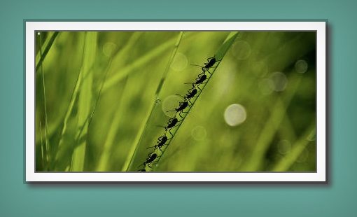
Easy Multiple Borders
Demo: Click here to view the demo on Tinkerbin.
There are a couple of ways that you can pull off multiple borders with CSS. By far one of the easiest and most popular methods for performing this trick is to take advantage of the fact that box-shadows can be stacked, meaning you can apply as many shadows to a single element as you want. If you do this while setting the blur to zero, the result looks like several borders! Keep in mind though that box-shadows are purely visual and don’t affect your layout like borders do (which can actually make them easier to work with in some cases).
HTML
We don’t need much HTML for this example. In fact, the div is merely there so you can add other elements into the container as well. If you’re just using a single image, feel free to scrap the div and apply the class directly to the image (or maybe use an li if you’re creating a gallery).
<div class="multiple-borders">
  <img src="http://lorempixum.com/400/200/nature/1" />
</div>
How Shadows Work
Before I show you the required CSS snippet, let’s walk through how box-shadows work. Though we typically get away with setting only four values for this property, there are actually six:
box-shadow: inset x y blur spread color;
Inset creates an inner shadow (we’ll use this later), x sets the horizontal offset, y sets the vertical offset, blur defines how feathered the shadow will be and spread defines how far out the shadow will reach. The shadow that we used in the previous example looked like this:
box-shadow: 3px 3px 3px #777;
This code sets the offsets and blur to 3px and the color to #777, the spread is not defined. Now let’s start working on our example, which adds the complexity of a zero pixel spread:
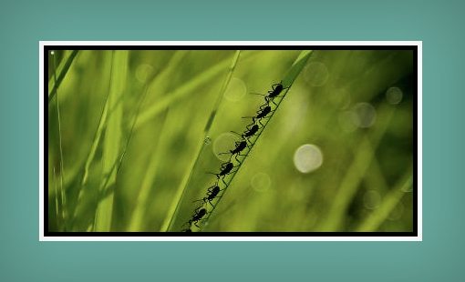
.multiple-borders {
  box-shadow: 0px 0px 0px 7px #000;
}
As you can see, we have no offsets and no blur, but the spread is seven pixels. The result of this looks just like a seven pixel black border.
To add in another shadow, all we have to do is insert a comma, then repeat the syntax, tweaking the values slightly. This time around I used a 5px spread (black) followed by a 10px spread (white).
.multiple-borders {
  box-shadow: 0px 0px 0px 5px #000, 0px 0px 0px 10px #fff;
}
The result should look like two 5px borders, one black and one white.
CSS
Now that you know the gist of how shadows work, it’s time to implement our actual CSS. The real bummer is that we have to use three different versions of this, but we definitely want to make sure all of the possible browsers are covered.
.multiple-borders {
  -webkit-box-shadow:
    		0px 0px 0px 2px rgba(0,0,0,0.6),
                0px 0px 0px 14px #fff,
                0px 0px 0px 18px rgba(0,0,0,0.2),
                6px 6px 8px 17px #555;

     -moz-box-shadow:
    		0px 0px 0px 2px rgba(0,0,0,0.6),
                0px 0px 0px 14px #fff,
                0px 0px 0px 18px rgba(0,0,0,0.2),
                6px 6px 8px 17px #555;

          box-shadow:
    		0px 0px 0px 2px rgba(0,0,0,0.6),
                0px 0px 0px 14px #fff,
                0px 0px 0px 18px rgba(0,0,0,0.2),
                6px 6px 8px 17px #555;
}
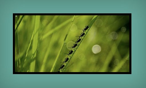
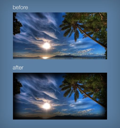
Vignette
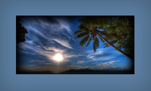
Demo: Click here to view the demo on Tinkerbin.
This time we’re going to use a different type of box-shadow to create a very different effect. By utilizing an “inset” shadow, we can create a nice Photoshop-like vignette on an image using only CSS. It’s a pretty neat trick that can really make your images stand out.
HTML
This time around we’ll need an empty div. You can optionally place some text inside but the image will have to be inserted via CSS. This is because the inset shadow will actually appear under the content inserted via HTML, meaning that an image would hide it completely.
<div class="vignette">
</div>
CSS
For the CSS, we’ll need to set an image to the background, then define a width and height for the div. After you’ve got your div set up, it’s time to apply the shadows. Notice that the inset value is implemented and both the vertical and horizontal offset is set to 0.
You might find it strange that I implemented three versions of the same exact inset shadow for each browser. The reason that I did this is simply because I wanted a really dark, intense vignette and one shadow just wasn’t cutting it!
.vignette {
  background: url("http://lorempixum.com/400/200/nature/5");
  width: 400px; height: 200px;
  -webkit-box-shadow:
    		inset 0 0 50px #000,
                inset 0 0 50px #000,
                inset 0 0 50px #000;

     -moz-box-shadow:
    		inset 0 0 50px #000,
                inset 0 0 50px #000,
                inset 0 0 50px #000;

          box-shadow:
    		inset 0 0 50px #000,
                inset 0 0 50px #000,
                inset 0 0 50px #000;
}
Grungy Photo
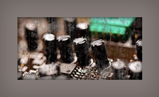
Demo: Click here to view the demo on Tinkerbin.
To prep for this one, you need to create a transparent grungy background image overlay. I used this texture to create this image. The trick here is to make the texture the exact same color as the background of the page you’ll be placing it on.
Basically, what we’ll be doing is leveraging multiple backgrounds to apply a reusable grunge texture. We could mask the image with the texture, but that wouldn’t be supported outside of Webkit so this is a much more browser friendly way to go about it.
HTML
Same drill as last time, just create an empty div that we can apply background images to.
<div class="grunge">
</div>
CSS
Just to mix things up, let’s make the grunge effect only appear on hover. To start off, we apply a background image, size the div and create a slight vignette like last time. Now all we have to do is add our grunge background image on hover.
CSS multiple backgrounds are really easy to work with. Just like with the shadows before, simply add in a second one using a comma to separate the two. The grunge image goes first since we want it on top.
body {
  background: #867d79;
}

.grunge {
  background: url("http://lorempixum.com/400/200/technics/4");
  width: 400px; height: 200px;
  margin: 50px;
  -webkit-box-shadow: inset 0 0 20px black;
     -moz-box-shadow: inset 0 0 20px black;
          box-shadow: inset 0 0 20px black;
}

.grunge:hover {
  background: url("https://designshack.net/wp-content/uploads/imagetreatments-texture3.png"), url("http://lorempixum.com/400/200/technics/4");
}
Conclusion
I hope you enjoyed these four CSS image tricks. Each one should only take a minute to apply but they all add a definite style boost to otherwise plain images. As with any design trick, be sure to use these selectively and don’t go overboard!
If you have any quick CSS image effects of your own, let us know in the comments. Also, all of the demos above are live and editable so be sure to tweak them and leave a link to your version below.