A Beginner’s Guide to Zurb Foundation 3: The Grid
In the past, we’ve discussed Twitter Bootstrap quite a bit. Much more so than its most worthy competitor: Zurb’s Foundation. Now on its third iteration, Foundation is a robust and responsive front end framework used by hundreds of developers every day.
Over the course of several articles, we’re going to jump in and take a look at its various aspects from a complete beginner’s perspective. Today’s topic is my favorite part: the grid. Follow along to see how it works!
Grid Crazy
If you’re a regular reader of Design Shack, then you probably already know that I’m a bit of a grid nut. Layout is the aspect of CSS that fascinates me the most and I simply love digging around and playing with different grid systems that people create. No, they’re not always perfectly semantic (though some are), but they can be an incredibly helpful way to bust out really complex layouts with very little effort.
The grid that comes built into Foundation is no exception to this rule. It’s remarkably easy to use, has all the features that you could want and adapts quite well to different viewports. Let’s take a look.
The Foundation Grid
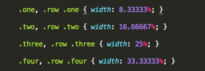
Like countless other grids, the foundation Grid is built on a twelve column system. By default, the grid’s width is 940px wide when it is at its full width. However, the grid is fluid, so as your viewport becomes narrower than 940px, the grid will adapt.
What this means on a code level is of course that each column in the grid does not have a static width but is instead assigned using percentages. If we crack open the CSS, we can see that this is indeed the case:
Responsive
The Foundation grid’s fluid nature helps it adapt as the viewport narrows, but once you hit around 767px, a media query kicks in and simplifies your complex layout into a single column. Obviously, such a simple solution might not always be desirable, so there are ways to intentionally reflow your layout into a four column mobile grid. We’ll see how to do this later.
Getting Started
If you’re at all used to grid systems, Foundation should be really easy to pick up. If you’re completely new to grids, don’t worry, I’ll walk you through it and you’ll catch on in no time.
Basically, Foundation has done most of the heavy CSS layout work for you. The center 940px of the page is split up into twelve columns and various possible column combinations are assigned to classes. This means that, to perform a basic layout, you don’t need to write a single character of CSS. All you have to do is use the right classes in your HTML.
Creating a Row
The very first thing that you need to do when adding content to the page is create a row. This is exactly what it sounds like, a chunk of content that will be displayed on the same horizontal plane. All the floating, padding, margins and various layout complexities have been taken care of so you can focus on your content.
To begin a row, simply create a div with a class of “row”.
<div class="row">
</div>
How easy was that? Now let’s see how to add in some columns.
Adding Columns
To add columns of content, you create a new div and assign two classes. The first class is a number that corresponds to the number of columns that you would like this content to span. So if you want your content to take up three of the available twelve columns, you assign “three” as a class.
The second class that you apply is “columns” (or “column”). This is uniformly applied to all your divs that you want to have the standard Foundation column treatment. Combine these two classes and you should have something like this:
<div class="row">
  <div class="eight columns">
    <h2>Eight Columns</h2>
    <p>Lorem ipsum...</p>
  </div>
</div>
Here I have a nice little container will automatically set boundaries on the content within so that it takes up no more than eight columns. Now, typically (though not always), you’ll want to eat up the entire twelve columns in a given row. We’ve already used up eight columns in our first div, so if we want one more, we’ll write “four columns” in the class area (8 + 4 = 12).
<div class="row">
  <div class="eight columns">
    <h2>Eight Columns</h2>
    <p>Lorem ipsum...</p>
  </div>

  <div class="four columns">
    <h2>Four Columns</h2>
    <p>Lorem ipsum...</p>
  </div>
</div>
After writing only this code in the body of an HTML document, if we take a look at our page in a browser, we’ll see this:
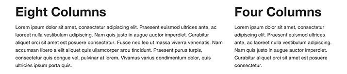
As you can see, we’ve effectively created two chunks of text with a width ratio of 2:1. This makes perfect sense because we used the classes eight and four, which also have a 2:1 ratio. When this really clicks in your brain, it becomes a powerful concept because you can suddenly pull off almost any layout you want using only a few simple class names.
Note that you don’t have to fill all twelve columns. Use the “end” class if you want a div to be the last in a row that doesn’t span twelve columns.
Going Further
Using the principles that we just learned, we can achieve all kinds of different layouts. Let’s say that we wanted a row split up into four equal sections. All we have to do is use the “three” class.
<div class="row">
  <div class="three columns">
    <h3>Three Columns</h3>
    <p>Lorem ipsum...</p>
  </div>

  <div class="three columns">
    <h3>Three Columns</h3>
    <p>Lorem ipsum...</p>
  </div>

  <div class="three columns">
    <h3>Three Columns</h3>
    <p>Lorem ipsum...</p>
  </div>

  <div class="three columns">
    <h3>Three Columns</h3>
    <p>Lorem ipsum...</p>
  </div>
</div>
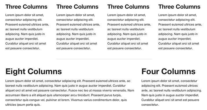
By now, you should have the hang of how this works. If you have the mathematical ability to divide things into twelve, then you can use this framework. So we can see how this works on a larger scale, let’s jump into a full on complex page layout.
Don’t let this big chunk of code intimidate you, it utilizes the exact same principles that we’ve been using in the smaller examples.
<div class="row">
  <div class="columns twelve">
    <h2>Twelve Columns</h2>
    <p>Lorem ipsum...</p>
  </div>
</div>

<div class="row">
    <div class="twelve columns">
        <img src="http://placehold.it/1000x400&text=img" alt="">
    </div>
</div>

<div class="row">
  <div class="eight columns">
    <h2>Eight Columns</h2>
    <p>Lorem ipsum...</p>
  </div>

  <div class="four columns">
    <h2>Four Columns</h2>
    <p>Lorem ipsum...</p>
  </div>
</div>

<div class="row">
  <div class="three columns">
    <h3>Three Columns</h3>
    <p>Lorem ipsum...</p>
  </div>

  <div class="three columns">
    <h3>Three Columns</h3>
    <p>Lorem ipsum...</p>
  </div>

  <div class="three columns">
    <h3>Three Columns</h3>
    <p>Lorem ipsum...</p>
  </div>

  <div class="three columns">
    <h3>Three Columns</h3>
    <p>Lorem ipsum...</p>
  </div>
</div>

<div class="row">
  <div class="eight columns">
    <h2>Eight Columns</h2>
    <p>Lorem ipsum...</p>
  </div>

  <div class="four columns">
    <h2>Four Columns</h2>
    <p>Lorem ipsum...</p>
  </div>
</div>
Live Demo
As you can see, we used a lot of different column variations here. We’ve got divs that span all twelve columns, including one with an image, and others that only span three. It all comes together into a beautiful and simple layout. Check out the demo below to see it live.
Demo: Click here to launch.
Advanced Grid Techniques
Now that we understand the basic functions of the grid, let’s take a look at some of the more advanced features.
Nesting
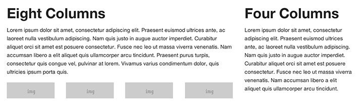
Nesting is an essential feature of any grid system. It allows you to start a whole new twelve column grid within the main grid. So let’s say you have an eight column span and a four column span, you can divide that eight column span into twelve columns of its own. Crazy right? If you go too far, your brain will fall into limbo but on a basic level, nesting is super easy to accomplish.
All you have to do to nest a grid is create a new row inside of another. Then treat that row like you would any other, no special syntax required. Here’s what it looks like:
<div class="eight columns">
    <h2>Eight Columns</h2>
    <p>Lorem ipsum... </p>

    <div class="row">
        <div class="three columns">
            <img src="http://placehold.it/300x100&text=img" alt="">
        </div>
        <div class="three columns">
            <img src="http://placehold.it/300x100&text=img" alt="">
        </div>
        <div class="three columns">
            <img src="http://placehold.it/300x100&text=img" alt="">
        </div>

        <div class="three columns">
            <img src="http://placehold.it/300x100&text=img" alt="">
        </div>
    </div>
  </div>

  <div class="four columns">
    <h2>Four Columns</h2>
    <p>Lorem ipsum...</p>
  </div>
</div>
What I’ve done here is nested a new grid inside of the eight column span and then tossed four images into that nested div. Here’s the result:
Three Ways to Change Grid Behavior
Foundation comes with three interesting ways to mess with how the layout of your grid works. For starters, it’ll often be the case that you want to center a column or span of columns. All you have to do for this is add the “centered” class.
<div class="row">
  <div class="six columns centered">
  </div>
</div>
This will create a div that spans six columns and center it on the page. If we tossed a horizontal rule in here, we’d have a nice little six column centered dividing line.
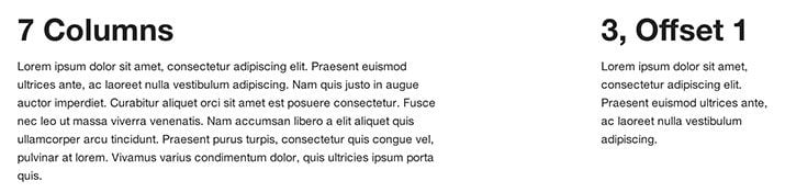
In addition to centering divs, you can also offset and rearrange them. To offset a div, use “offset-by”. So “offset-by-one” will offset it by one slot and “offset-by-two”, well, you get the point.
<div class="row">
  <div class="seven columns">
    <h2>7 Columns</h2>
    <p>Lorem ipsum...</p>
  </div>
  <div class="three columns offset-by-two">
    <h2>3, Offset 1</h2>
    <p>Lorem ipsum...</p>
  </div>
</div>
Here you can see that the class numbers only add up to ten, which leaves two spots left. I account for this with a two column offset. Here’s the result.
To rearrange divs differently in the output than they appear in the source order, you use push and pull classes, similar to in the old 960 grid system.
<div class="row">
  <div class="three columns push-nine">
    <h2>This Last</h2>
    <p>Lorem ipsum...</p>
  </div>
  <div class="nine columns pull-three">
    <h2>This First</h2>
    <p>Lorem ipsum...</p>
  </div>
</div>
Now check out the result. Even though the “three” column comes before the “nine” column in the source, the live preview shows the reverse of this.
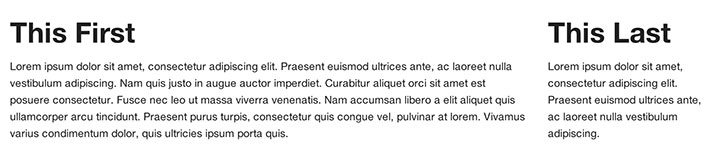
The logic behind this is usually SEO related. Say you wanted your company name as a header in the middle of the page between two other columns, it may be better for SEO if the company name is higher in the source hierarchy.
Using the Four Column Mobile Grid
By default, Foundation is responsive, but the behavior of this aspect of the framework is super simple. Returning to our big live demo in the “Going Further” section above, when the viewport becomes too narrow, everything is simply slapped into a single column grid:
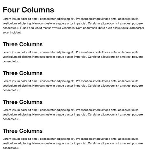
This works, but it’s not very pretty or robust. Fortunately, there’s a second grid that you have access to that activates with the mobile media query. This grid is four columns and uses the following classes:
- mobile-one
- mobile-two
- mobile-three
- mobile-four
These classes are implemented exactly like those for the full size grid. Applying “mobile-three” will cause an item to span three of the four available columns in the mobile grid. With this in mind, let’s rework out previous layout:
<div class="row">
  <div class="columns twelve">
    <h2>Twelve Columns</h2>
  <p>Lorem ipsum...</p>
  </div>
</div>

<div class="row">
  <div class="twelve columns">
    <img src="http://placehold.it/1000x400&text=img" alt="">
  </div>
</div>

<div class="row">
  <div class="eight columns">
    <h2>Eight Columns</h2>
    <p>Lorem ipsum...</p>
  </div>

  <div class="four columns">
    <h2>Four Columns</h2>
    <p>Lorem ipsum...</p>
  </div>
</div>

<div class="row">
  <div class="three columns mobile-two">
    <h3>Three Columns</h3>
    <p>Lorem ipsum...</p>
  </div>

  <div class="three columns mobile-two">
    <h3>Three Columns</h3>
    <p>Lorem ipsum...</p>
  </div>

  <div class="three columns mobile-two">
    <h3>Three Columns</h3>
    <p>Lorem ipsum...</p>
  </div>

  <div class="three columns mobile-two">
    <h3>Three Columns</h3>
    <p>Lorem ipsum...</p>
  </div>
</div>

<div class="row">
  <div class="eight columns">
    <h2>Eight Columns</h2>
    <p>Lorem ipsum...</p>
  </div>

  <div class="four columns">
    <h2>Four Columns</h2>
    <p>Lorem ipsum...</p>
  </div>
</div>
As you can see, when I get to the four “three columns” divs, I added the “mobile-two” class to each. This will not affect these divs at anything above 767px wide. However, below that width, each of these divs will take up half the available width.
Live Demo
The mobile grid is an awesome feature that allows you have a ton more control over how your layouts adapt to smaller viewports. In the end, it’s probably a good idea to consider writing a media query or two of your own, but this definitely still helps. Check out the demo below to see it live (be sure to reduce the window size).
Demo: Click here to launch.

Go Try It!
With this information, you should be able to get off to an awesome start with the Foundation grid. Responsive layout is no walk in the park and this framework goes a long way towards relieving this stress and allowing you to focus on your content.
Keep on the lookout for more Foundation articles soon. Foundation is much more than a grid, there’s still a ton of stuff that we didn’t cover!