Build an Animated Sliding Menu With Pseudo Selectors and CSS3
Today we’re going to have all kinds of fun. First we’ll build an animated menu using some shiny new CSS3 while learning how to implement pseudo selectors in a practical way on a real project. Then we’ll follow that up with how to build the same thing without pseudo selectors for better browser support. Finally, we’ll end with a look at how to scrap all that fancy CSS in favor of some good old fashioned jQuery.
Join us as we examine not one but three ways to tackle a CSS sliding navigation menu!
Why Pseudo Selectors?
One of the primary purposes of this article is to illustrate a real world example for using pseudo selectors that isn’t the obvious table tutorial.
Pseudo selectors get a lot of hype on design blogs but when it comes time for comments I always see the same question: “Great, but when will I ever really use these?” Sometimes we get caught up with using ridiculous and unrealistic examples just to show off some new toy, meanwhile readers immediately mark it up as something “neat” but not anything that will ever be practical.
Our navigation menu today will toss in only a couple of pseudo selectors in a very quick fashion, which is exactly how you’ll be using these guys in the future.
What Are We Building?

The goal here is to create a simple CSS navigation menu composed of rectangle blocks with a red background. When the user hovers over the menu item, there will be a sliding animation and both the message and the background color of the menu item will change.
It’s almost like a garage door opening effect applied via CSS animations. It’s a fun project and the final effect looks great.
Step One: The HTML
Our HTML structure is very succinct, just a div containing an unordered list with three list items. The list items might look a tad strange at first glance, each has not one but two links, one right after the other. Check it out:
<div id="menu">
    <ul>
        <li><a href="#">Home</a><a href="#">See Us</a></li>
        <li><a href="#">About</a><a href="#">Meet Us</a></li>
        <li><a href="#">Contact</a><a href="#">Email Us</a></li>
    </ul>
</div>
Each list item represents one navigation item. Each navigation item has two distinct states: default and hover. The two links represent each state. Notice how, on hover, I’ve changed the passive messages to a call to action: “About” becomes “Meet Us”, this subtly helps encourage click behavior.
That’s really all the HTML we need for this round. You can already start to think about how you would target each link in the list item differently. It would be pretty difficult without our pseudo selector friends.
Step 2: Starter Menu CSS
To start off the CSS, we’ll need to style the menu area as a whole. Each menu item will be 100px high by 200px wide and we’ll have three of them. That gives us a total area of 100px by 600px for the menu as a whole. Add in ten pixels of padding for each of the three items and our grand total becomes 100px by 630px.
#menu {
	height: 100px; width: 630px;
	overflow: hidden;
	margin: 50px auto;
	text-align: center;
}
After setting the height and width, I simply centered the menu along with its text and hid the overflow, which will be important with the animation later.
Step 3: Style the Links
Next up, we nail down the aesthetic of the menu items. We first target the list items and float them to the left with some margins. Then we follow that up by styling all the links in the menu.
#menu ul li {
	float: left;
	margin: 0 5px;
	list-style-type: none;
}

/* Menu Link Styles */
#menu ul a {
	display: block;
	background: #ff061c; color: #fff;
	height: 100px; width: 200px;
	font: lighter 2em/100px "Helvetica Neue", Arial, Helvetica, Geneva, sans-serif;
	text-decoration: none;
}
Essentially we turned each link into a big red block:
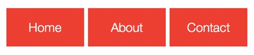
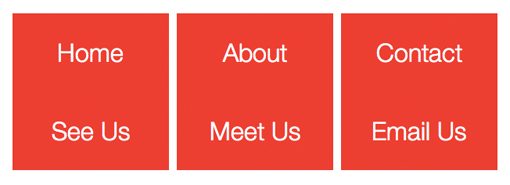
Notice that this styling has effectively cut off the second link in each set. What’s happening is that the second link in every list item is stacked under the first and is merely being hidden. If we temporarily turn off “overflow:hidden” this becomes much easier to visualize.
Step 4: Change the Secondary Link Styles
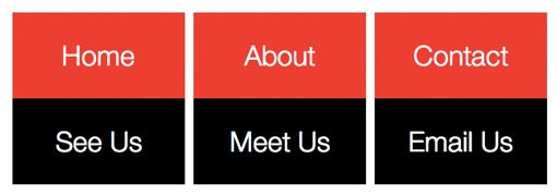
Notice in the image above that, though they have different text, the top and bottom links are essentially identical. Let’s change this up a bit to make the transition more noticeable. To do this we simply change the second box in each set to black and the text to white.
The tricky part is, how do we target only the second link? We didn’t include anything in the HTML to set the two apart: no classes, no IDs, nothing. This is where those oh so handy pseudo selectors come into play! Using pseudo selectors, we can easily target every other link through the use of odd or even.
#menu ul a:nth-of-type(even)
This selector looks a little complicated so let’s run through it. First we target the menu ID, then we drill down to the unordered list and more specifically the anchor tags in that list. Next we add our pseudo selector “:nth-of-type(even)”, which targets only the second link in each of our link sets.
Now we can toss in some styles to set these apart from the red blocks:
/* Secondary Link Styles */
#menu ul a:nth-of-type(even) {
	background: #000;
	color: white;
}
Now if we once again temporarily comment out “overflow: hidden” we can see that our links have much more differentiation.
Step 5: Hover Slide Action
Now it’s time to define the action that will take place on hover. Basically we want the red link to slide up and out of view as the black link comes into view.
It sounds easy enough, but once you really give it some thought, this action becomes super tricky! We want the top link to slide up when we hover over the button, but as it slides out of view, you won’t be hovering over it anymore, causing some really buggy action.
After some serious thought, I came to the following conclusion. We need to target the whole list item for the hover event, that way no matter if the top or bottom link is in view, everything still works. However, despite the fact that hovering over the list item should trigger the event, it’s really something else, the first link, that needs to move.
Translating these goals to CSS looks like this:
/* Hover Slide */
#menu ul li:hover :first-child {
	margin-top: -100px;
}
Many people don’t realize it but you don’t have to act on the item that you set the hover state to. Here we’re triggering the hover on the list item but moving the first child (thank you pseudo selector) of that item, which in this case will be that top link.
To make this transition a smooth one, we revisit the Step 3 code and add in some nice CSS3 transitions.
/* Menu Link Styles */
#menu ul a {
	display: block;
	background: #ff061c; color: #fff;
	height: 100px; width: 200px;
	font: lighter 2em/100px "Helvetica Neue", Arial, Helvetica, Geneva, sans-serif;
	text-decoration: none;

	-webkit-transition: margin .4s ease-in-out;
	-moz-transition: margin .4s ease-in-out;
	-o-transition: margin .4s ease-in-out;
	-ms-transition: margin .4s ease-in-out;
	transition: margin .4s ease-in-out;
}
Finished! Pseudo Selector Version
With that, our first version is complete! Our animations look great and the pseudo selectors are doing the heavy lifting to keep our markup nice and clean.
Demo: Click here to launch.
Download: Click here to download all three versions.
Scrapping the Pseudo Selectors
I personally love pseudo selectors, attribute selectors and all the other goodies provided by CSS3. The support is actually fairly good for them across the board with just about every major browser playing along, including IE9!
However, the worst browser in history wouldn’t just go and not be a pain in the neck like that so of course anything older than IE9 will have problems with these selectors. Since most people have only just gotten around to scrapping IE6 support, we’re likely years away from ignoring IE6 and IE7.
If you want to implement this menu in a live project, it’s probably a better idea to go ahead and use classes in your HTML instead. Let’s see how that works.
HTML
In light of our decision to throw away our experimental pseudo selectors, we’ll have to add an extra class in to help target the first link without affecting the second in each list item. Here I just tossed in a “top” class on each link that sits on top.
<div id="menu">
    <ul>
        <li><a href="#" class="top">Home</a><a href="#">See Us</a></li>
        <li><a href="#" class="top">About</a><a href="#">Meet Us</a></li>
        <li><a href="#" class="top">Contact</a><a href="#">Email Us</a></li>
    </ul>
</div>
CSS
Now with this extra markup in place, we don’t need the pseudo selectors in our CSS. We can simply use classes instead, which have universal support.
/* Menu Link Styles */
#menu ul a.top {
	background: #e70f23; color: #fff;
}

#menu ul a {
	display: block;
	background: #000; color: #fff;
	height: 100px; width: 200px;
	font: lighter 2em/100px "Helvetica Neue", Arial, Helvetica, Geneva, sans-serif;
	text-decoration: none;

	-webkit-transition: margin .4s ease-in-out;
	-moz-transition: margin .4s ease-in-out;
	-o-transition: margin .4s ease-in-out;
	-ms-transition: margin .4s ease-in-out;
	transition: margin .4s ease-in-out;
}

/* Hover Slide */
#menu ul li:hover .top {
	margin-top: -100px;
}
Finished! Non-Pseudo Selector Version
Our second version is complete! For those of you not keen on pseudo selectors, here’s a version without them.
Demo: Click here to launch.
Download: Click here to download all three versions.
Using jQuery For The Animations
As one final alternative, you could throw out the CSS animations and perform the same actions with jQuery (or perhaps use jQuery as a fallback via Modernizr).
Building on the previous, non-pseudo-selector version, turn off the CSS animations and toss in this bit of jQuery:
$(document).ready(function() {

	$("li").hover(function() {
	        $(this).stop().animate({ marginTop: "-100px" }, 400);
	    },function(){
	        $(this).stop().animate({ marginTop: "0px" }, 400);
	    });

 });
As you can see, this launched the hover effect on the list item and animates the transition just like we did in CSS. The results are nearly identical and should work in just about every browser around granted that they don’t have JavaScript disabled.
My original version of this was a little quirky with repeating animations so a big hat tip to Adrian Pelletier who has a similar project that reminded me to toss in the jQuery stop function!
Finished! jQuery Version
Our final version uses the same structure as the previous one but tosses out the CSS transitions in favor of jQuery. Take a look.
Demo: Click here to launch.
Download: Click here to download all three versions.
Conclusion
This tutorial gave you not one but three different methods for achieving the same awesome sliding animated menu. The first version perfectly illustrates the usefulness of pseudo selectors in real projects. The second scraps the pseudo selectors for those looking for a more widely compatible version. The final version uses jQuery for the animations instead of CSS3 transitions.
Leave a comment below and let us know which version you would use on your site today or how you would tweak it!