Code a Fantastic Animated Circular Thumbnail Gallery With CSS
Thumbnail galleries are a constant source of fascination for me. There’s so much more fun to be had than simply creating a grid of squares and calling it a day. Especially since CSS3 gives us so many powerful new tools to work with.
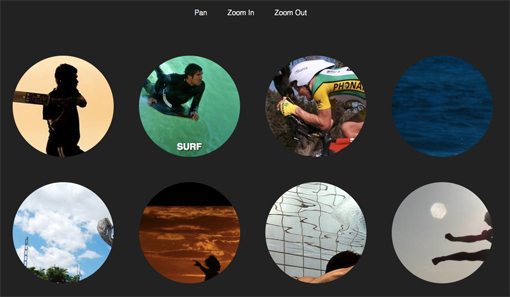
Today we’re going to mix up the boring old standard image gallery by turning it into a series of animated circles. Along the way we’ll learn a ton of helpful CSS knowledge that will help you in all manner of future projects.
Sneak Peek
If you’re the kind of person who likes to skip to the end so you can see where you’re going, check out the live demo of the finished product below. I included three different versions of the animation to give you some ideas for how to vary the effect.
Demo: Click here to launch.
The Concept
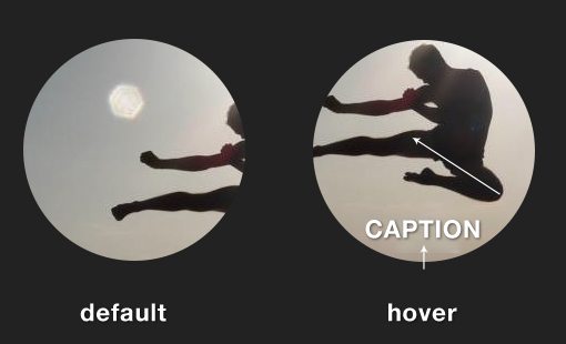
Before we get into building the thumbnail gallery, let’s talk a little bit about what we’re trying to achieve. The goal here is to have a grid of circular images that animate on hover. When the mouse enters the circle, the background image should shift and a previously hidden caption should slide into view. Sounds pretty simple right? There’s a major curveball though.
When I was planning out how to accomplish this feat, I came across a bit of a snag. The easiest and most straightforward way to implement the sliding image effect is to use CSS background images. Going this route has many practical benefits for us.
Background Image Pros
- The image will automatically be placed behind the text
- It’s easy to clip the image to its parent
- Animating the image is easy, just shift the background-position
As you can see, there’s a strong argument for taking this route. The strongest benefit is probably the first one. If we put all our content into HTML, then the text will actually push the image around rather than float over the top of it, so we’ll have to perform some CSS voodoo.
If I was just working with a single image, this would definitely be the route I’d take. However, since we’re working with an image gallery, it seems wrong somehow to take the images out of the HTML. They’re really the focus of the page’s content, so I feel like they should be in with the content. I may be over thinking it, but I feel like thumbnail gallery images should be inserted via HTML when possible. Regardless, going this route certainly makes the task more challenging, which is great for educational purposes! Let’s look at some complications that we’re going to face using this method.
HTML Image Cons
- It’s a little trickier to get the image to clip to a circle
- Moving the image won’t be as straightforward
- Our stacking order will be all screwed up
- Using relative positioning with rounded corners is a mess
As you can see, we’ve got our work cut out for us. Fortunately, it’s not as difficult as it sounds and with a little ingenuity, we’ll have our gallery up and running in no time at all. Let’s get started!
The HTML
The markup for this gallery is going to be very brief. All we really need is an unordered list. Inside of each list item, place a piece of text followed by an image (you can optionally link the image to somewhere, I left it out for simplicity).
<div class="gallery">
   <ul>
      <li><p>One</p><img src="http://lorempixum.com/400/400/sports/1" /></li>
      <li><p>Two</p><img src="http://lorempixum.com/400/400/sports/2" /></li>
      <li><p>Three</p><img src="http://lorempixum.com/400/400/sports/3" /></li>
      <li><p>Four</p><img src="http://lorempixum.com/400/400/sports/4" /></li>
      <li><p>Five</p><img src="http://lorempixum.com/400/400/sports/5" /></li>
      <li><p>Six</p><img src="http://lorempixum.com/400/400/sports/6" /></li>
      <li><p>Seven</p><img src="http://lorempixum.com/400/400/sports/7" /></li>
      <li><p>Eight</p><img src="http://lorempixum.com/400/400/sports/8" /></li>
   </ul>
</div>
I’m sure many will take one look at this and instantly complain that the paragraph should be a span. I’m not sure that it really matters all that much but if you’re more comfortable with a span, go for it. Just keep in mind that a span is an inline element while a paragraph is a block level element, so your positioning will be different than mine. Since I want the piece of text to ultimately be floating out on its own in front of the image, it felt like a block level element made more sense.
As a side note, I’m following my typical pattern of using LoremPixel for placeholder images. As you can see from the image URLs, I’ve placed in images that are 400px square.
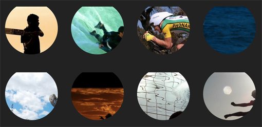
Progress Check
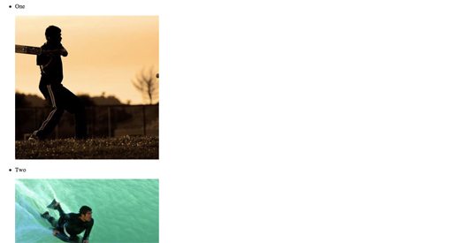
After this step, you should have a bunch of images and text all stacked on top of each other in a vertical column. Click here to launch the live Dabblet.
Define the Gallery
Our next step will be to give the gallery a width and center it on the page. We’ll also clear any list item styles that exist by default and add some basic body styling.
* {margin: 0; padding: 0;}

body {
   background: #222;
}

/*GALLERY*/
.gallery {
   width: 1000px;
   margin: 50px auto;
}

ul {
   list-style: none;
}
Note that the container width isn’t arbitrary. It will allow for four images across at 200px a piece with 50px of margin on each (250 * 4 = 1,000).
Progress Update
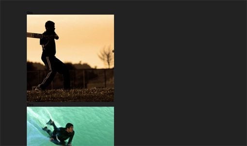
At this point, your background should be dark and the bullet points on your list items should be gone. Otherwise, it’ll largely look the same as last time. Click here to launch the live Dabblet.
Line ‘Em Up, Round ‘Em Off
Next we need to target the list items. Be sure to use a more specific selector than “li” as you’ll no doubt never want all your list items to have this styling. The “gallery” class provides a convenient hook to make these styles specific to any galleries that you set up.
Despite the fact that our images are 400px square, we actually want the circles on the page to be 200px square. To accomplish this, simply set 200px as the height and width for the list items. To round off the list items, set the border-radius to 50%. You won’t see this take effect until you apply the “overflow: hidden” command. Also be sure to float them left so that they appear in a straight line.
It’s important to note the fact that we’re doing all of this to the list item, not the images. This means that the images will still retain their larger original size, they’ll simply be clipped to the size of the list item, which will allow them to slide later.
.gallery li {
   height: 200px;
   width: 200px;
   margin: 25px;
   float: left;
   overflow: hidden;

   -webkit-border-radius: 50%;
      -moz-border-radius: 50%;
	   border-radius: 50%;
}
Progress Update
After this, your gallery should be taking shape. You should have four circular images per row with the parent container centered. The odd part is that our circles are flat on top! This is simply because our images need to be scooted into place, which we’ll handle next. Click here to launch the live Dabblet.
Scoot and Set The Animation
As we saw in the last step, our images are actually too far down. We can fix this by targeting any images inside our gallery list items and applying some negative margin to the top.
While we’re here, we’ll also go ahead and set up the animation. We just learned that we can scoot the image around using margins, so this is the property we’ll target in the transition.
.gallery li img {
   margin-top: -70px;

   -webkit-transition: margin 1.5s ease;
      -moz-transition: margin 1.5s ease;
       -ms-transition: margin 1.5s ease;
        -o-transition: margin 1.5s ease;
           transition: margin 1.5s ease;
}
Progress Update
The only visual difference that you’ll notice this time around is that the flat top on the circles has been corrected. Click here to launch the live Dabblet.
Style the Paragraphs
You’ve probably noticed that up to this point, our paragraphs have been completely hidden. This is because they’re stacked above the images and outside the bounds of the clipped list item. Fixing this isn’t as easy as you might think.
The first thought that came to my mind was simply to use the old absolute/relative positioning trick. This involves setting the paragraph elements’ position to absolute and the list item to relative. This would allow us to scoot the paragraph into place relative to the starting point of the list item. Unfortunately, there’s a bug with the way that most browsers render border-radius that’s illustrated in the image below.
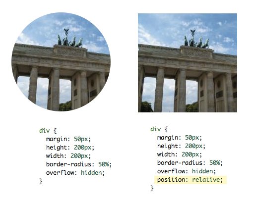
As you can see, the second we go and apply relative positioning to our parent element, it’s going to lose its rounded corners. This is definitely an annoyance, but it’s not the end of the world. Instead, we’ll just use relative positioning on our paragraph and scoot it into place with top and left.
This will bring our paragraph into view and allow us to apply some basic text styling. We’ll also set up the animation for the text, but instead of using margin like before we’ll use the top property.
.gallery li p {
   width: 100px;
   padding: 20px;
   position: relative;
   left: 15%;
   top: 75%; /*set to 110% after this step!*/

   color: white;
   text-align: center;
   text-transform: uppercase;
   font: bold 18px/1 Helvetica, Verdana, sans-serif;
   text-shadow: 2px 2px 2px rgba(0,0,0,0.5);

   -webkit-transition: top 0.5s ease;
      -moz-transition: top 0.5s ease;
       -ms-transition: top 0.5s ease;
        -o-transition: top 0.5s ease;
           transition: top 0.5s ease;
}
Notice that I set the “top” property to 75% in this step. This is merely to find a sweet spot for the final resting point of the paragraphs. In reality, we’ll want them to be hidden, so set the top value to 110%.
Progress Update

After this step, your text snippets should now be visible near the bottom of your circles. Click here to launch the live Dabblet.
Set Your Hover Styles
Now with everything set up and positioned like we need it to be, all we need to do is move everything when the user hovers over the list items. To do this, we’ll use a neat trick where we target the list items on hover, but then choose a child of that element to change. To start, we target the list items on hover, then more indicate that the images are what we’re changing. We then repeat this trick with the paragraphs.
For the images, apply a vertical and horizontal shift in the margin and for the paragraph, bring the top value back to the 75% that we decided on before.
.gallery li:hover img {
   margin-left: -150px;
   margin-top: -150px;
}

.gallery li:hover p {
   top: 75%;
}
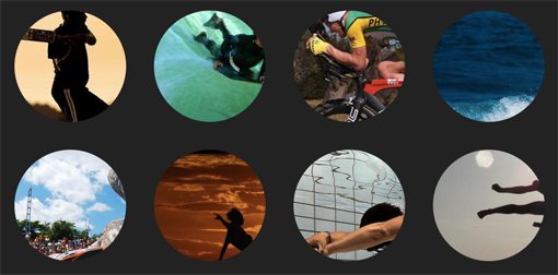
Progress Update
With that, our demo is finally working like we want it to! Hover over each of the images to see the effect in action. Click here to launch the live Dabblet.
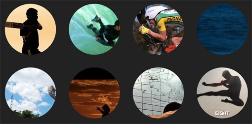
Finished Product
We’re all finished! As I mentioned in the intro, the demo page actually includes some alternative versions of the effect as well. There are three in total: pan, zoom in and zoom out. Click the link below to check it out.
Demo: Click here to launch.
Conclusion
This project stretched our comfort zone by taking a different approach to an animated background. Instead of using CSS to place the image, we were able to pull off the effect with both the text and image in our markup. It’s sort of the opposite of the typical, “less markup” strategy, but it’s a good learning experience. Being able to work with either scenario will make you a better coder, able to handle lots of different hurdles.
On a side note, one of the things that always bugs me with CSS is the fact that the often trigger some unintended visual effects on page load. So as the page is drawing, the transitions are making the normally instant process long and awkward. I know this can be addressed with JavaScript, but if you have a pure CSS solution, I’d love to hear it. For the demo, I simply applied the animations to the hover selectors, but this kills the hover out animation. Do you know of a better way? Let me know in the comments below.