Create Shaped Avatars With CSS and Webkit
In case you haven’t noticed, square avatars are so 2010. These days circles are all the rage. Every app worth its salt, from Path to Basecamp, is jumping on board this fad and waving goodbye to the squares who are stuck in the past.
Ever the forward thinker, I asked myself, “what’s next?” Let’s look beyond squares and circles and into the future of the avatar! Using CSS and Webkit, we can use pretty much any shape as the mask for an avatar. Let’s see how.
Warning: Webkit Only
Today’s project is merely a fun look forward at a design trend that you’ll no doubt see pop up as CSS masking improves in the future. For now, Webkit is really the only browser that’s equipped enough to pull off such crazy feats, so you’ll have to wait a while to put these effects into practice in production.
Method 1: Webkit Masks
The first method that we’re going to use is pretty straightforward. It utilizes the webkit-mask-image property to use one image as the mask for another.
Grab Two Images
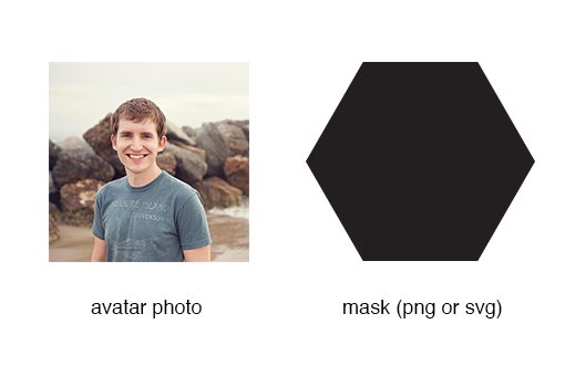
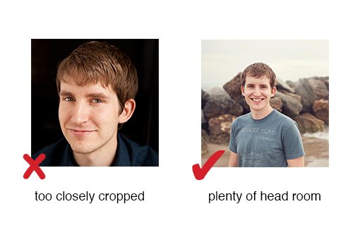
To begin, you need two images. The first image is the profile photo. This can be whatever you want, but as a general tip for odd-shaped avatars, try making sure you have plenty of head room. If you use a photo that’s too tightly cropped around your face, you’ll end up with a strange clip where parts of your face are chopped off.
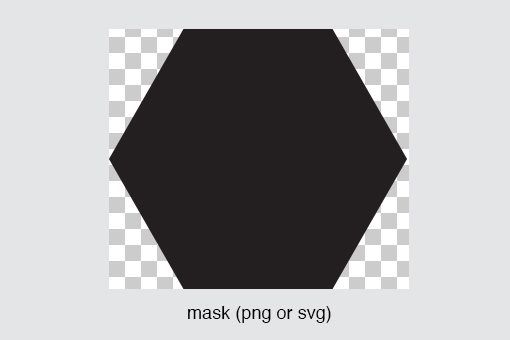
Once you have the avatar picked out, it’s time to build your mask. You can do this with just about any image editor (Photoshop, Illustrator, etc.). Simply draw out the shape that you’d like to use as a mask, then save it with a transparent background as either a PNG or SVG.
Keep in mind that things will go smoother if your photo and mask are as close in size as possible. Otherwise, you could end up with a weird result that requires a lot of tweaking.
HTML
Implementing the CSS mask method is crazy easy. For the HTML, you don’t need anything special, just throw in an image:
<!-- just a plain old image tag -->
<img src="josh.jpg">
You don’t really need anything more than the code above, but if you want a unique style hook, just toss the image into a div.
<div class="avatar">
  <img src="josh3.jpg">
</div>
CSS
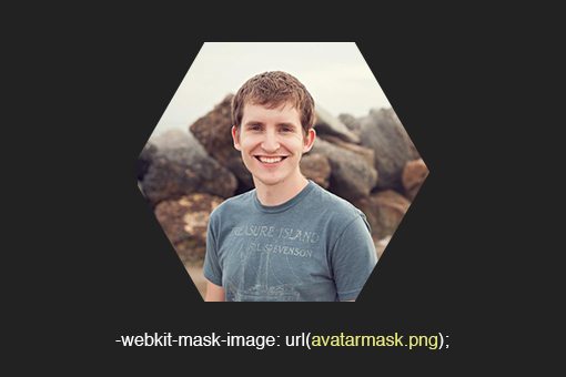
Now all we have to do is target that image in our CSS and use the -webkit-mask-image property and point to the mask PNG that we created in the previous step.
.avatar img {
  -webkit-mask-image: url(avatarmask.png);
}
Demo
That’s all there is to it! Check out the live demo below.
Demo: Click here to launch demo.
We can get as complicated as we want with that mask. For instance, you could carve a name or word into it:
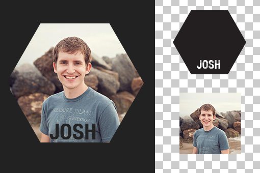
Hold the Phone
In this example, we’re using a transparent PNG to create a mask for a JPG. This seems a little weird doesn’t it? Wouldn’t it be a lot easier just to make one transparent PNG of the shaped avatar in the first place?
In a word, yes. The idea here is that you’ll create a low maintenance way to trim a whole bunch of avatars. Imagine that you have users upload their own images to a profile, instead of writing a bunch of code that attempts to trim that photo to the shape you want it to be, you can merely upload a single mask image and apply it to all of the avatars across the site with a quick line of CSS.
Pros and Cons
The benefit that this method has over what we’re going to try next is that it looks pretty good on non-webkit browsers. The avatar shows up just fine, it’s simply not masked. Given that the mask is just a little extra visual fluff, this isn’t a huge deal.
The downside, aside from the Webkit only aspect, is that it takes a bit of setup getting the various image and mask files in order.
Method 2: Background-Clip Text
Now that we’ve seen the safe route, let’s use a completely different and more experimental tactic to achieve a similar effect. This time we’re going to use text to generate the mask shapes, then clip our images to the text.
Grab a Photo and an Icon
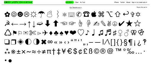
To begin, follow the instructions above for choosing a good avatar photo, then find an icon that you’d like to use for the mask. There are lots of free icon fonts that would work great with this technique. Alternatively, you could simply grab a standard HTML symbol, which is what I’ll be doing today.
Check out CopyPasteCharacter for a huge list of potential characters and icons that you can use.
HTML
This time around, all we need in our HTML is a piece of text. I’ll use an h4, but you can use anything you want.
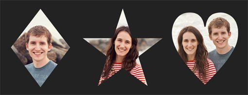
<div class="avatars">
  <h4 class="josh">♦</h4>
  <h4 class="kelley">★</h4>
  <h4 class="jk">♥</h4>
</div>
Notice that the text here is pretty funky looking. These are the escape codes for a diamond, star and heart.
CSS
Now it’s time to style these shapes with the appropriate background image. We can use webkit-background-clip with a value of text to use the contents of our h4 as as mask for the background image that we apply.
h4 {
  color: black;
  font: 260px/1.5 Helvetica, sans-serif;
  float: left;
}

h4.josh {
  background: url(josh.jpg) -10px 60px no-repeat;
  -webkit-background-clip: text;
  -webkit-text-fill-color: transparent;
}

h4.kelley {
  background: url(kelley.jpg) 0px 60px no-repeat;
  -webkit-background-clip: text;
  -webkit-text-fill-color: transparent;
}

h4.jk {
  background: url(jk.jpg) -10px 50px no-repeat;
  -webkit-background-clip: text;
  -webkit-text-fill-color: transparent;
}
As you can see, we’re setting the background images to not repeat and using positioning values to nudge the images into a spot where the faces are in a good place. This is a bit of a trial and error process, just fiddle with the values until you get something you like.
Demo
As you can see in the demo, each escape code generated a different shape, which was then used to mask the image that we placed behind it.
Demo: Click here to launch demo.
Pros and Cons
Given that icons are so versatile, it’s really easy to pull of a lot of different shapes using this method. It’s arguably even easier to set up than the previous method and is primed for variation.
That being said, non-Webkit browsers really destroy this one. Chris Coyier has a suggestion for using background-clip with Modernizr for an acceptable fallback, but it merely shows the text without the image, which isn’t the best option for avatars.
Conclusion
In the next few years, we can likely expect to see web apps increase the variation of avatar shapes. Unfortunately, for the time being, CSS isn’t really the best way to go about achieving this effect.
If you are intent on moving forward with something like this though, my suggestion would be to use Webkit masks, simply because everything should still look decent if and when they fail on other browsers.