Everything You Never Knew About CSS Floats
What do floats really do anyway? How do they affect the box model of the elements involved? How do floated elements differ from inline elements? What are the specific rules governing the position of floated elements? How does the clear property work and what is it for?
Floats can trip up even experienced developers and understanding their behavior can really set you free from many of the woes that you face with CSS. Even if you think you already know all about floats, we’ll dive deep enough that you just might learn something new!
What Is a Float?
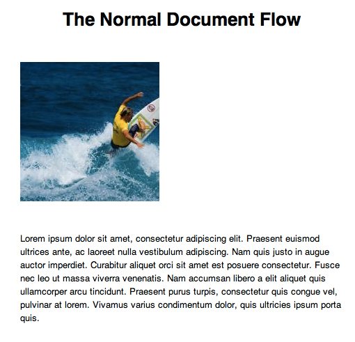
Some elements in CSS are block level elements, which means they automatically start a new line. For instance, if you create two single word paragraph elements, they won’t flow into each other but will appear on separate lines. Other elements are inline elements. This means that they appear “in line” with the previous content. One example is an anchor tag, which can appear within another element such as a paragraph without causing any extra whitespace or new lines to occur.
One way to cheat this model of layout is to use floats, which allow a given element to shift to one side of its line and have other content flow down its side. A right-floated element will be pushed all the way to the right of its container and have content flow down its left side and a left-floated element will be pushed all the way to the left side with content flowing down its right side.
The classic example is when you toss an image in with a paragraph and want the two to appear side by side rather than stacked. First we create both elements with some HTML:
<img src="http://lorempixum.com/200/200/" />
<p>Lorem ipsum...</p>
Alone, this code does not produce the effect that we want. The paragraph element is a block level element that appears on its own line and so the paragraph and the image are shown stacked in the normal document flow.
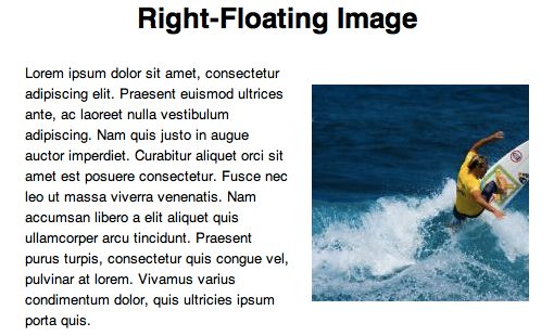
We can change this behavior by floating our image to the right. The CSS for this is very basic:
img {
  float: right;
  margin: 20px;
}
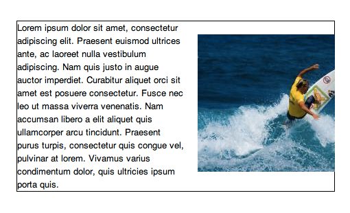
With this code in place, our image is scooted to the right side of its line and the paragraph is allowed to flow down its left side. Click here or on the image below to see and tweak a live example of this code in action.
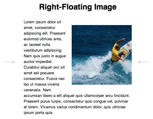
One interesting thing about the behavior of this image now that it is floated is that our other content will actually attempt to wrap around it where possible. If we resize our container or browser window to be narrower, the text simply reflows itself so that it never touches the image.
How the Box Works
Odds are you already understood this behavior to a decent degree. However, in order to wield floats properly, you need to understand how these two elements are interacting on deeper level. For instance, how do we add extra margin between the paragraph and the image? You might think that this will work:
p {margin: 20px;}
However, this won’t put even a single pixel of extra space between the image and the paragraph. Instead, we have to apply our margin to the image:
img {margin: 20px;}
The question you should be asking yourself is, “why?” Why wouldn’t increasing the paragraph margin increase the space between the image and the paragraph? The reason is that we’re failing to grasp the box model as it pertains to that paragraph.
If you’re ever doubtful about how your layout is working on a basic level, try applying a border or two to see what’s going on. If we use this technique on the paragraph, the result may surprise you.
p {
  border: solid 1px black;
}
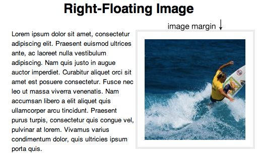
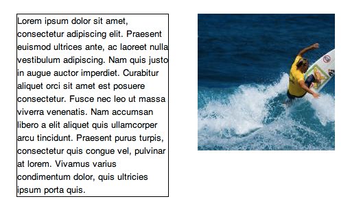
As you can see, the image is actually inside of the paragraph’s box! This solves our margin riddle. Any margin that we add to the paragraph is being applied way off to the right of the image, this is why it doesn’t increase the space between the image and the paragraph.
If we wanted the change this behavior so that the paragraph doesn’t wrap around the image, we could float the paragraph to the left and give it a specified width (without expressing the width, the paragraph is 100% wide and won’t fit next to the image).
img {
  float: right;
  margin: 20px;
}

p {
  float: left;
  width: 220px;
  margin: 20px;
}
Crazy Float Rules
Now we know what a float is and how it affects the boxes of the elements that are involved. Let’s move on to another piece of information that many developers probably don’t understand in the least: the rules that govern a floated element’s position.
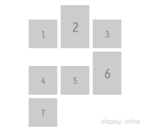
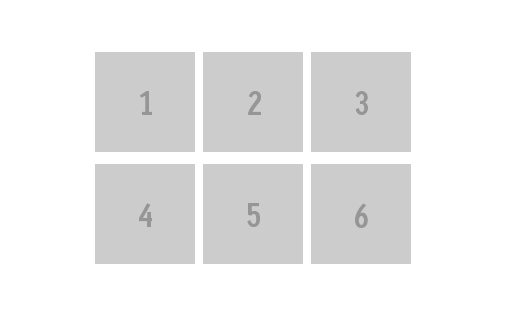
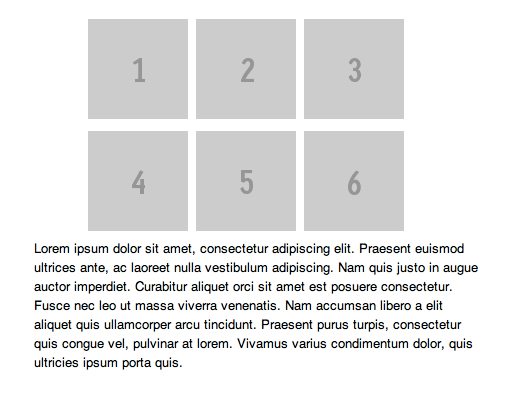
It’s often the case that developers will use floats to govern the positioning of list items, perhaps in an image gallery or feature listing. Let’s see how this works by creating a simple list full of images.
<ul>
  <li><img src="http://placehold.it/100x100&text=1"/></li>
  <li><img src="http://placehold.it/100x150&text=2"/></li>
  <li><img src="http://placehold.it/100x100&text=3"/></li>
  <li><img src="http://placehold.it/100x100&text=4"/></li>
  <li><img src="http://placehold.it/100x100&text=5"/></li>
  <li><img src="http://placehold.it/100x150&text=6"/></li>
  <li><img src="http://placehold.it/100x100&text=7"/></li>
</ul>
By default, all the list items will appear in a big vertical stack, which obviously means that they are block level elements. Even though the images are inline elements, they’ll be governed by their parent block level list items. To fix this, we might float the list items to the left. When multiple items in a row are floated, they take on a similar effect to a stream of inline elements. However, as we’ll see, there are some key differences.
li {
  float: left;
  margin: 4px;
}
Now, if all of our images were the same height, this would be a pretty unremarkable example. The result would look like a simple image gallery with the images appearing in order from left to right:
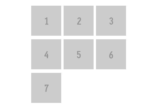
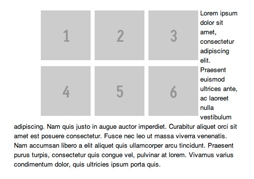
However, our images are not the same height, some of them are 100px tall, others are 150px tall. This causes some seriously wacky results! Click here or on the image below to see this effect live.
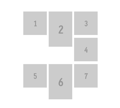
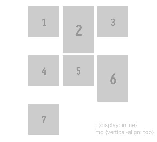
The first time I saw this effect, I was baffled. What in the world was going on here? Why is image number four off to the right side like that? Shouldn’t it be trying to float itself as far left as possible? If we remove the float and instead use display: inline on the list items, the result is drastically different.
li {
  display: inline;
}
For starters, this example is different in the fact that the images are defaulting to a state of being vertically aligned along their bottom edges. This causes them to look quite different than our previous example, but we can fix this with a single line of CSS.
img {
  vertical-align: top;
}
Now we’re starting to look a lot like the float example, only displaying the list items inline has a much more predictable stacking order. When there’s no room on the x-axis for the next item, it starts back on the left slide in the next line.
So why doesn’t our floated image gallery work like this? What strange voodoo governs floated items?
Translation Required
It turns out, the CSS spec outlines a list of nine rules that govern the behavior of floats. The problem with this list though is that it was written so that only lawyers and other boring people can understand it. Here’s a direct quote from one of the rules:
Maybe your reading comprehension is higher than mine, but this and the other rules in the list made my head spin. All this talk of the left outer edge being to the right of the right outer edge is actually pretty basic stuff dressed up to sound complicated. To make things simpler, here are Josh Johnson’s nine rules for float behavior, translated into English for your convenience.
- Floated elements are pushed to the edge of their containers, no further.
- Any floated element will either appear next to or below a previous floated element. If the elements are floated left, the second element will appear to the right of the first. If they’re floated right, the second element will appear to the left of the first.
- A left-floating box can’t be further right than a right-floating box.
- Floated elements can’t go higher than their container’s top edge (this gets more complicated when collapsing margins are involved, see original rule).
- A floated element can’t be higher than a previous block level or floated element.
- A floated element can’t be higher than a previous line of inline elements.
- One floated element next to another floated element can’t stick out past the edge of its container.
- A floating box must be placed as high as possible. (No translation necessary)
- A left-floating box must be put as far to the left as possible, a right-floating box as far to the right as possible. A higher position is preferred over one that is further to the left/right. (No translation necessary)
Here we can see that many of these are pretty much common sense, but they must be explicitly stated so that every person and browser is on the same page. Basically, the gist of the situation is that floated elements go right up to the specified edge (left or right), but no further. Unless of course there is another floated element before it, in which case it just goes next to that one.
The real surprise that confused us before comes in the rules at the end, which state that floated elements try to stay as high as possible and that this vertical positioning rule takes precedence over the horizontal left/right floating rule that pushes an item to an edge.
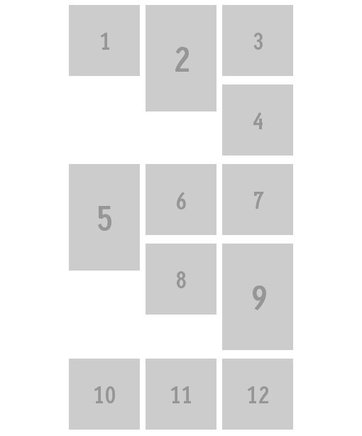
In our previous example, image number two stretched the height of the line down so that after image number three, there was still some vertical space for image number four to squeeze into. Even with these rules in mind, the pattern isn’t always easy to predict.
Just keep in mind that when you have one floated element, the next floated elements behind it will take up at least the same amount of vertical space or more before breaking the line and going lower in the flow.
Float Order
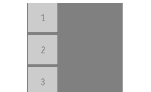
One last note regarding the rules that we’ve laid out here. The second rule has some interesting implications for the order of items that are floated. Let’s say we again have a list of images numbered one through six, like this:
<ul>
  <li><img src="http://placehold.it/100x100&text=1"/></li>
  <li><img src="http://placehold.it/100x100&text=2"/></li>
  <li><img src="http://placehold.it/100x100&text=3"/></li>
  <li><img src="http://placehold.it/100x100&text=4"/></li>
  <li><img src="http://placehold.it/100x100&text=5"/></li>
  <li><img src="http://placehold.it/100x100&text=6"/></li>
</ul>
If we float these images to the left, they’ll appear in order, starting at one and going through six; left to right, top to bottom. However, here’s what happens if we float the list items to the right:
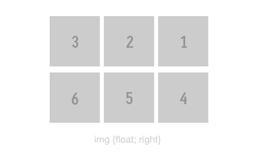
As you can see, the first image actually takes the rightmost position. Similarly, when the line breaks, the fourth image is placed on the right side. This is why you’ll rarely see anyone float a list of navigation elements to the right. To do so screws with the order and would require undesirable changes in the HTML hierarchy to resolve.
Clearing Floats
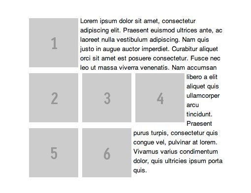
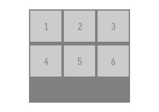
Floats are handy for accomplishing some great layout feats like creating columns of content. However, once declared, they have an effect on the rest of the document’s flow that you might or might not like! For instance, let’s say we wanted to throw in a paragraph after a block of left-floating list items like the one we had above.
The result is probably not going to be what you hoped for:
The answer here is to use the clear property, which makes it so that no floated items can appear on a given side of the element it is applied to. For instance, let’s say we target the second list item in our little gallery and apply a value of “clear: left”.
ul li:nth-child(2) {
  clear: left;
}
What this code does is tell the browser that the top of the second list item must be below the bottom of any left-floating items before it (in this case, the first list item). If we had all floated all of these elements to the right, we would’ve had to use “clear: right” instead.
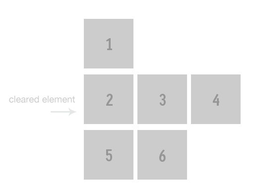
Notice that after this, the rest of the floated items maintain their course. That’s because they’re still set to float left, the clear property does not somehow cancel this out. This means that our problem with the paragraph is not fixed by clearing any of the list items.
Instead, what has to happen is that the paragraph element, which is a block level element that has not been floated, must be cleared. This will make sure it appears below the floated elements rather than next to them.
p {
  clear: both;
}
We technically only needed a left clear here, but when a developer wants to be sure to clear all floats, it’s common practice to see the both value used. This change fixed our problem up nicely!
Float Quirks and Clear Fixes
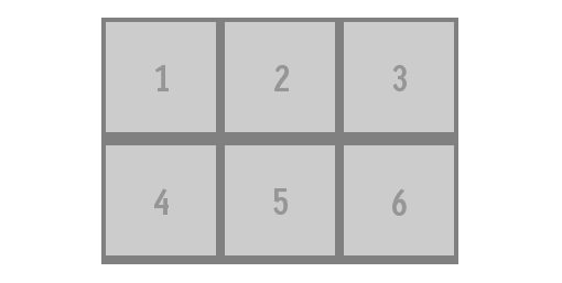
There’s a peculiar action that takes place when a given element contains only floated elements: the parent element’s height collapses. To illustrate this, let’s say we wanted to put a background color on the unordered list that we’ve being using in all our examples. If the elements in the list aren’t floated, then we need only apply the color to the background using CSS.
ul {
  background: gray;
}
As you can see in the example below, the box that defines the unordered list has been turned gray and the list items within are stacked on top of each other.
However, the second that we float those list items, that UL contains only floated elements, and so its height collapses, leaving a newbie developer wondering what the heck happened to his background color.
There are a number of ways to solve this problem. The easiest and most straightforward solution is simply to apply an explicit height to the parent element, which is the unordered list.
ul {
  height: 300px;
}
As you can see, this did indeed give us our background fill back. However, this is rarely the desirable course to take simply because it’s more convenient in the long run if the height is automatically computed based on the contents. If we add three more rows of images to our list now, that height won’t be adequate.
Clearfix To The Rescue
This is where the term “clear fix,” also written “clearfix,” comes into play. Clearfixes address this collapsing height problem traditionally through the use of the clear property.
What developers used to do is create an empty element (often a div) in their HTML on the same level as the floated items, then apply a class of “clearfix” to that empty container. Back in CSS, you would then add clear the floats on the “clearfix” property.
.clearfix {
  clear: both;
}
This immediately fixes the collapsed height issue:
Given what we’ve already learned, we know exactly why this trick fixed our problem. The reason the height had collapsed is because the parent contained only floated children. Now it has one child, albeit an empty one, that isn’t floated, so the auto height works as expected again.
The problem with this method is that no one liked that extra ugly element in the HTML. It simply wasn’t semantic, meaning that it wasn’t helping to communicate the clear hierarchy of the page.
The new fancy fix for this problem is to take advantage of the overflow property, which governs the functionality of content that extends beyond the boundaries of its containing box. It turns out that if you set overflow to hidden or auto on the parent item, it fixes the height collapse!
ul {
  overflow: auto;
}
This is definitely the briefest and most elegant solution to fixing the collapsing height issue and should be your go to strategy. That being said, there will be cases where you want the overflow of an element to be set to visible, what should you do then?
The answer is to use Nick Gallagher’s Micro Clearfix Hack, which uses some genius CSS to fix this issue. First, it uses :before and :after to add in some content that we can use to create something in the parent that isn’t floated. However, you don’t really want any content in here, so we leave it empty but set the display to table to create an anonymous cell (empty and takes up no space) and finally use our old friend clear. This creates the invisible block level item we need to fix the height collapse without extra HTML markup. Older versions of IE require their own fix so this is thrown in as well.
/* For modern browsers */
.cf:before,
.cf:after {
    content:"";
    display:table;
}

.cf:after {
    clear:both;
}

/* For IE 6/7 (trigger hasLayout) */
.cf {
    zoom:1;
}
Conclusion
In this article, we went over a ton of great information, both basic and complicated. We started with a discussion of how what floats are and how they work on a basic level, then proceeded to how setting an element to float affects the bordering boxes of the elements involved so you can properly figure out how to get your margins to work like you want them to.
Next, we moved onto the basic rules that govern the position of a floated element and arrived at some interesting conclusions for how floated elements of varying heights will be positioned as well as how right floated items appear in reverse order.
Finally, we clearly laid out the entire tale of how a parent containing only floated children will have a collapsed height and how you can solve it based on your particular scenario.
If floats were something that confused you before reading this article, join the club. They confuse us all at first. Hopefully though you now have an outstanding knowledge of how floats work and how you can use them to achieve any layout you want. Leave a comment below and let us know if you found this information helpful.