10 Tips for Designing Static Ads
Designing the perfect static ad is no easy feat. It might even be impossible. Designing ads can go against many of the things you think as a designer. Many companies want to cram as much information into a space as possible and many users put up roadblocks when it comes to viewing ads.
The catch is creating something that people want to interact with, despite the fact that it’s an ad. The advantage of a static ad is that is seems less obtrusive than some animated, audio or video options. They also have a classic style about them that makes designing fun. Here are 10 tips for creating an ad that people will look at, with some ads as they actually appear on popular websites.
1. Pick a Single Message
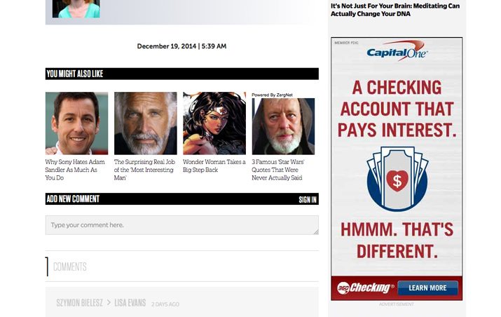
While it sounds easy, this is actually difficult to do. Many businesses try to include too many things in an advertisement. Too many words, too many images, too much stuff. And too much of everything leads to an ad that is ineffective.
Pick one thing that the ad should do. Is it to create brand building, sell a product, showcase an event or highlight something your company is doing? Create a single and simple message to highlight.
This singular message might also include leaving some parts of your standard branding out, depending on the size of the ad space. If your company has a long tagline or complicated logo, for example, consider paring it down for the ad space into something that’s recognizable but does not overwhelm the message.
2. Create a Clear Call to Action

Let’s expand on that message. What do you want users to do once they receive it? (Pick one thing because that’s all you have time for in the digital ad space.) The likely choice is to click the ad space and go to your website. But you must tell users to do it.
This may sound overly simple, but people like instructions. It makes choices easier. But think about the words you use. Rather than “click here,” consider something that tells a user more about the choice he or she is making. “Click to save 50%.” “Sign up for our newsletter.” “Learn more about deals.” Make a call to action specific and easy for users and give this space prominence within the ad space.
3. Use White Space
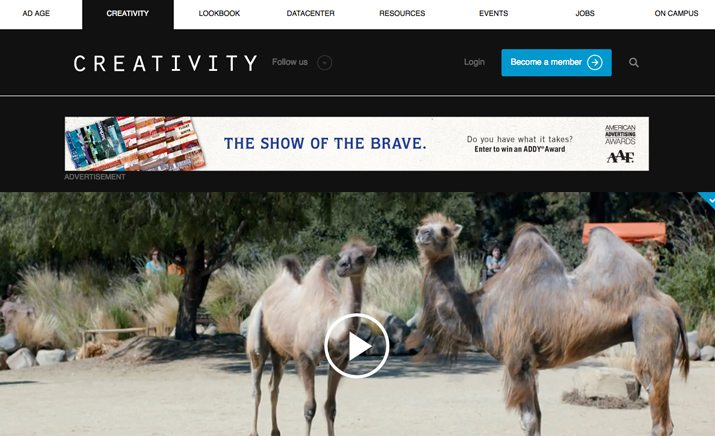
Common design techniques can help you create an ad that people will actually see on the screen. The web can be full of clutter and a cluttered ad will get lost even more. White space is your friend.
Using only a small portion of the space you buy can actually serve as a benefit. Studies have shown that a user’s eyes will go to the lightest or brightest areas of the screen first. By leaving plenty of white space around your message and content, you will encourage users to look at your information first.
4. Practice the 20 Percent Rule

Facebook advertising has always had this rule that frustrates many ad designers: No more than 20 percent of the space can include text. It’s actually a great design concept and constraint.
The web is a visual medium. Ads are visual tools. Use visuals to the fullest to get the most from your paid space. Limit text to a small portion of the overall space. (This will also help you accomplish No. 1: Pick a Single Message.)
5. Think About Color A Lot
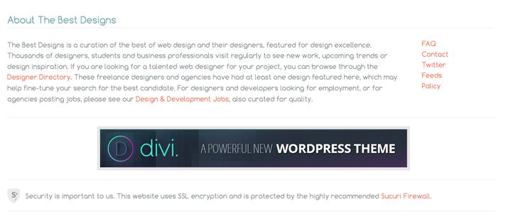
Rethink color choices when designing static ads for the web. Don’t feel like you have to stick to your typical color palette. Bright background colors can be a good way to grab the attention of users. The other trick is to research the site(s) where your ad is scheduled to run and use a color scheme that contrasts sharply with the colors on the site.
When it comes to color, white and black are also superb options. If your ad is running in a sea of color, consider a mostly black and white color scheme. By creating color contrast with the other elements on the page, you will add emphasis to your information. Just as you would use contrast within your own design projects, think of it in the context of the complete website in relationship to your small space of only a few hundred square pixels.
6. Do Something Odd or Silly
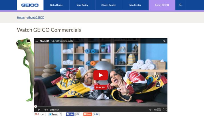
Sometimes the most memorable ads just break all the rules. They are silly and fun and don’t really seem to go with anything at all. (Think of insurance giant Geico, with the hump day camel or resurgence of music icons from days gone by. While these aren’t typically static ad campaigns, they are so successful the company has dedicated part of the website to them. And there’s a lot to be learned from this concept.)
This oddity is memorable and people will be drawn to it. It is important to note that you should not get too far away from your brand persona or message. Keep your overall brand image and credibility in mind when trying something different.
7. Use Simple Typography
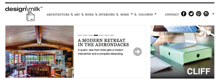
Static web ads are typically small. Use simple typography to aid readability. Opt for a sans serif and try to size the text properly for the space. It needs to be easy to see and read.
Avoid type tricks such as drop shadows or odd shading. Black or white lettering would be the preferred option in most ads. Type should feel trustworthy, direct and conversational.
8. Give Users Something
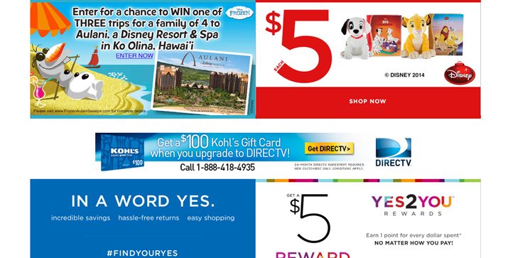
Almost as important as a call to action is a gift for users. Every good advertisement will give the user something in return – a giggle, idea for a gift, contest entry, discount or coupon, email, you get the idea.
Make users want to interact you by dangling the carrot, so to speak, in front of them. It must be “an offer too good to refuse” when it comes to generating clicks on ads.
9. Play Off Website Content
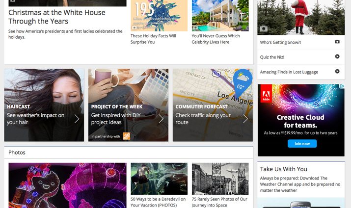
Where is your ad going to appear and what type of content is already on that site? You need to play off that content. In-app advertising seems to do a great job at this. These small ads often entice me to try a new game – always free – or look for a related item on sale at a retailer. Understanding users and their interests is the first step to creating something they want to get.
Take it a step further and consider an online ad that resembles content. Many sites are beginning to offer this option for “sponsored” boxes to help you reach users in a way that looks like part of the site you are advertising with. Often sites will let you buy a space that resembles the shape and size of content, such as the Adobe Creative Cloud ad on the weather channel site above.
10. Pick Images Carefully
Image is everything. The visuals in your ad can make or break it entirely. Remembering the small space you likely have to work with, images should be sharp, clear, singular in message and easy to understand.
Opt for faces or up-close images of products. Avoid images that have complicated patterns or backgrounds. Try this: Say out loud what visual would sum up your concept in a word. That’s your image. Simple, right?
Conclusion
Just as other parts of website design are changing rapidly, so are advertisements. While a lot of what we new online now includes video or animation, a static ad can provide the perfect entry point to your site or brand for a user.
All of the same design principles you use for any other project are important parts of ad design. One of the key things to remember with static web ads is that they are often small and almost hidden in a world of clutter. Use space, color, type and messaging to make the most out of your little piece of paid space.