5 Gorgeous Note & Point Presentations You Have to See
One of my favorite sites for design inspiration is Note & Point, which is a fantastic curator of great looking presentation decks (Keynote + PowerPoint = Note & Point). Not only is this site chock full of awesome design examples, most of their presentations are actually design and development related so you learn some great stuff along the way!
Today we’re going to look at five of my favorite Note & Point decks, which will teach us a ton of great stuff about presentation design.
Natural Habitats by Ethos3
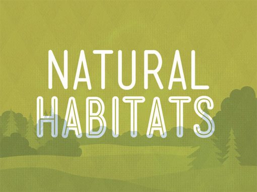
This presentation is about… giving presentations of all things! It’s a brief but powerful discussion on how good presenters are made, not born. In most cases, practice makes perfect, not innate skill. Here are three reasons you’ll love it.
Terrific Type
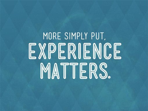
The entire presentation only uses a single typeface with two variations. You might think that sounds boring, but in practice it comes out attractive and consistent.
The main reason this works is because the typeface is well chosen. The designer used Mensch (regular and BoldInline) from Lost Type Co-op, which is super attractive on its own accord. To make it even better, the typeface’s unique style fits perfectly with the quirky aesthetic of the presentation.
Incredible Illustrations
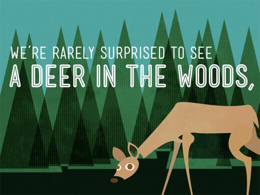
The flat, cartoony and textured illustration style used in the presentation hooked me right away. It’s not at all what you’d expect, but in a good way. The simple shapes and bold use of color make the entire presentation quite mesmerizing.
Awesome Animations
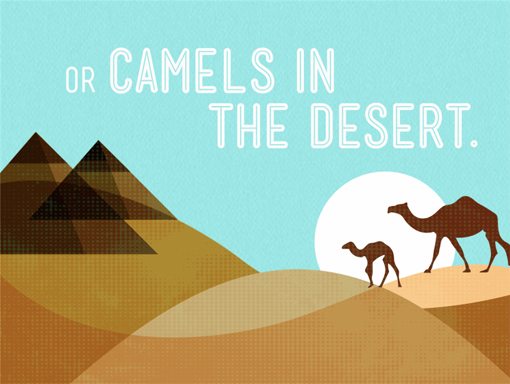
The illustrations in this deck are fascinating by their own merit but the thing that pushes them over the top is the simple animations used to bring them onto the screen. Some objects slide from the side as others fade into existence. It gives the presentation a layered, dimensional feel that you don’t get from the still images alone.
Design for Software by Erik Klimczak
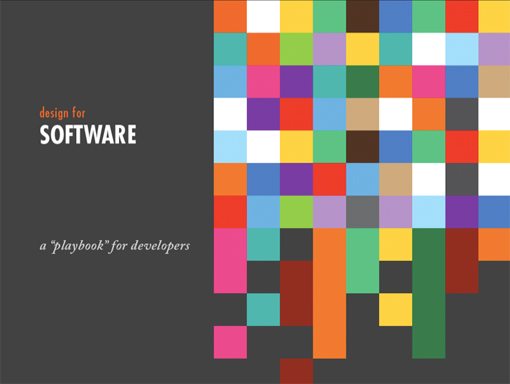
This deck serves as a basic introduction to some major design principles for developers who may have not cared too much about design in the past. The advice is solid and very well presented. Here are some reasons you’ll dig it.
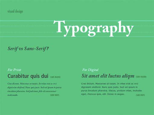
Great Visuals
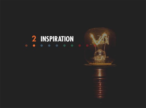
This entire presentation is a visual treat, from the full bleed photo slides to the excellent presentation of information, Klimczak makes it obvious that he’s no design novice.
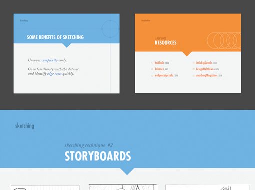
Minimal slides with hardly any content like the one shown above provide an strong way to grab your audience’s attention while your mouth does the talking. However, Klimczak proves that he’s not a one trick pony, he can handle content rich slides just as well.
Repetition
Not a week goes by without me preaching about the merits of repetition in design. This presentation is absolutely full of repeated design elements and bits of style. They’re not redundant and boring mind you, but rather pieces of a complex whole that feels consistent and professional as opposed to random and thrown together.
Stellar Organization
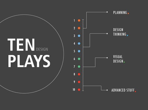
One of the keys to getting people to actually stay engaged with your presentation is to provide clear road maps that inform the viewer of both the overall outline of the presentation as well as where they currently are in that greater scheme. This reduces the sense of aimless babbling and instills a clear sense of progress.
This presentation performs this particular feat better than any other I’ve seen on Note & Point. There’s an outline slide at the beginning, a table of contents at the end and a cool colored dot theme that helps you understand how far the presentation has advanced on the section title slides.
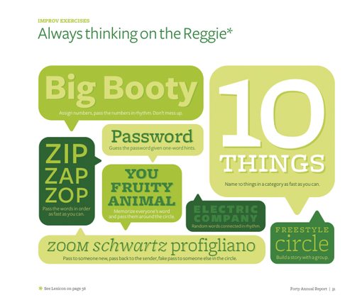
A Graphic Look at Forty
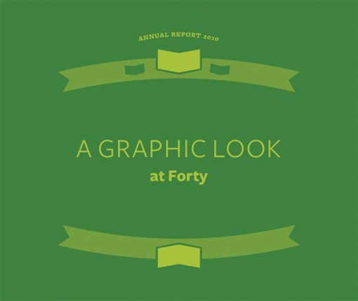
The folks at Forty have created an annual report that’s quite unlike any you’ve ever seen, I guarantee it. In place of boring financial data and business plans, they have charming graphical representations of life in the office: everything from what they wear to what’s on their iPods.
Bite-sized Infographics
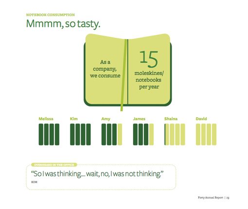
Almost every slide in the presentation is like a slice of an infographic. If you’re designing some visual data this week, this deck will serve as a great source of inspiration for how to present the information in a visually appealing way.
Humor
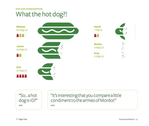
Another reason this presentation works well is that it doesn’t take itself too seriously, or seriously at all really. It’s filled with humorous quotes, clever quips and funny facts. The next time you’re speaking to a group and find that your content is a little mundane, try to stop being so dramatic and infuse some fun into your slides and speech. You’ll either crash and burn or they’ll absolutely love you. Either way, at least they’ll remember you.
Consistency Through Color
This presentation is all over the place with visuals. Some are cartoony, others are type driven, there are even some odd photographic cutouts. One of the primary ways it’s all tied together to look consistent is through color. A warm, attractive color palette was chosen and used on every single slide.
Designing the Business Experience By Matthew Smith

Matthew Smith is the extremely talented designer behind Squaredeye so you know right away that this presentation is going to be a good one. It’s extremely simple, but that’s a good thing.
Simple Is Good
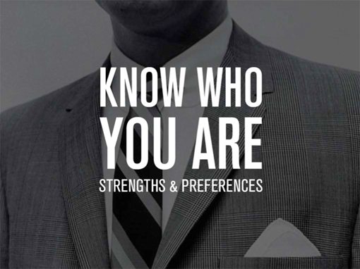
Information rich presentations like the previous one are great if you have lots of statistical data to present and can pull it off visually, but some talks are much simpler. You don’t always need complex charts or infographics, sometimes the best way to go is to grab an attractive photo, pair it with some strong type and repeat until you’ve got yourself a presentation. That’s exactly what Matthew did and the results are fantastic.

How To Create Slides That Rock
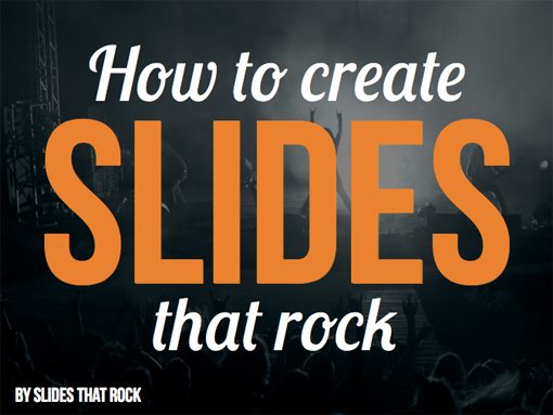
Slides That Rock is a boutique design firm that focuses on one thing and one thing only: slide design. They’re eager enough to share some of their tips that they created this free lesson, of course in slide form.
Bold Design

There’s no doubt about it, this presentation is in your face and crazy, which fits the topic perfectly. They really pulled off an aesthetic that just reaches out and grabs you, largely through the use of visually bold imagery.
Offensively Memorable

We’re all adults here and most of us aren’t so sensitive that we can’t laugh at something that’s intentionally offensive with a tongue in cheek attitude. Offensive humor can be the absolute worst thing you could use in certain situations, but in others it’s just what the doctor ordered and will make you an instant crowd favorite.
The key to this tip: know your audience. If you’re presenting cancer research findings to a panel of PhDs, you might want to steer clear of this brand of humor. If you’ve got a room full of web designers who work from home and care nothing for professional etiquette though, fire away!
Good Advice
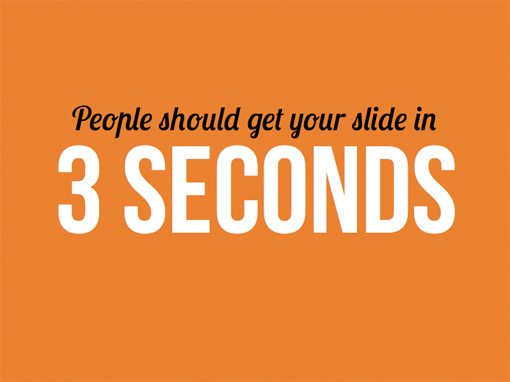
Not only is the deck itself is a great presentation design example, it also has lots of simple, practical and dead on advice for creating presentation slides (they practice what they preach). Little bits of information like having one major message per slide, capturing your audience in three seconds or less and how to keep things simple are exactly what you need to create a professional looking presentation, whether you’re a designer or not.
Conclusion
Thanks for reading our presentation of five gorgeous Note & Point presentations. I hope you enjoyed them as much as I did and picked up a few solid pointers on creating your own.
Be sure to bookmark Note & Point and stop by the next time you need some good old fashioned design inspiration and advice.