Best and Worst Design: 50 University Websites From 50 States
If you hail from the U.S., which state are you from and how would you rate the level of design from the schools there? Today we’re going to jump into this topic by examining 50 website home pages, one from a university in each of the fifty states.
We’ve divided the schools up into the best and worst and didn’t pull any punches when it comes to calling out bad design practices. Let’s see how your state fared!
Overall Impression: Predictably Poor Design
Take a look at fifty university websites and you’ll start to get the feeling that you’re seeing the same site fifty times. This is definitely yet another very specific but very large group of websites that seem to have all come together and decided to be unoriginal.
With a few exceptions, most of the sites below suffer from the same problems. They almost all cram tons of information into a small space with very little effective organization. Many of them contain an overall aesthetic ripped from cutting edge web design… ten years ago. And for some reason, quite a few of them have decided to go with awkwardly narrow page widths as if we’re all cruising around on super low resolution monitors (and no this isn’t mobile optimization at work).
What’s the Problem?
Universities represent some of the highest concentrations of talented and intelligent individuals anywhere on the planet. These are institutions built around people literally engaging in lifelong education. They create amazing inventions, cure diseases, and move civilization forward in countless ways. So why can’t they bust out a decent web design?
I have a little bit of insight into how major universities go about creating websites, and in my experience the major problem is the same that leads to most poor corporate design: Design by Committee. Two heads may be better than one, but ten to twenty heads gets you an ugly website.
As aesthetic decisions become subject to bureaucracy, inner-office politics and groupthink, the quality of the finished product decreases exponentially. I guarantee you that if you let a single talented web design student take a stab at redesigning his university homepage, he/she could easily come up with something more attractive and more effective than the building full of people the university pays to oversee the site.
Dean’s List: Most Attractive
It’s important to point out that not all of the sites below are ugly and unusable. In fact there are quite a few that really stand out in one way or another as quality websites. In this section I’ll highlight a few that I think are a notch above the rest aesthetically.
University of North Dakota
This is definitely one of my favorite sites on the list. Though I’m not crazy about the background gradient, I really like the overall design of the page. The header is a sharp piece of design, the image slider is nice and large, and the content below is neatly arranged into three columns.

University of Kentucky
I really dig the background image used here in conjunction with copious amounts of blue. Universities often have a few mandatory school colors to work in, often with the side effect of ugliness. This site however presents a strong unified look with a clear brand that even uses blue in its tagline “See blue.” I also really like the clearly organized and non-cluttered footer. From top to bottom, this is a solid design.

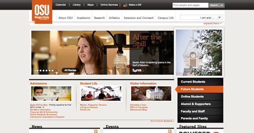
Oregon State University
Attractive colors, great use of contrast, solid implementation of modern web technologies, quality photography, and strong alignment: all important pieces in the recipe for good web design. This site really hits me as as case of modern attractive design. Way to go Oregon!
Honor Roll: Keeping it Minimal
As I mentioned above, universities and cluttered web design go hand in hand. However, a couple sites chose to break the mold and focus on providing a clean, minimal experience that’s high on efficiency.
Washington State University
Washington State definitely deserves a round of applause for their boldly simple approach. You’ve got a logo, a little bit of navigation, one main focal point subdivided into three beautiful photos, and then a section full of links that doesn’t expand until you hover over the section you want.
This allows you to take in the information in steps. First you find the section, then the menu expands and you can see the subcategories. The entire menu opens though so if you picked the wrong section you can easily find what you’re looking for in another.
It’s simple, it’s clean, and it actually holds quite a bit of information. Anyone working for the other schools should be taking notes.

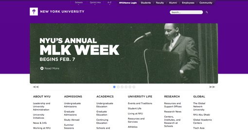
New York University
NYU is another school that really hit the mark with a minimal site. There’s really not much else than a big rotating banner and a categorized list of links.
The content is attractive and it’s easy to find whatever you’re looking for. The hover effects on those huge dropdown menus at the top could admittedly use a little work (they’re too subtle), but otherwise it’s a stellar page.
Minimal Gone Wrong
There were another couple of sites that look like they tried to go the minimal route, but ultimately would up with a fairly poor site design. In fact, I don’t really have a lot else to say about the sites in this category other than that they just aren’t attractive and don’t reflect modern professional web design.
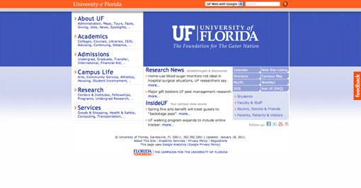
University of Florida
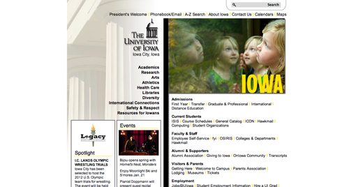
University of Iowa
Attack of the 90s
The sites in this section just scream outdated 90s design. These schools absolutely need to take a class on design trends in the 21st century, because they seem a bit out of the loop.
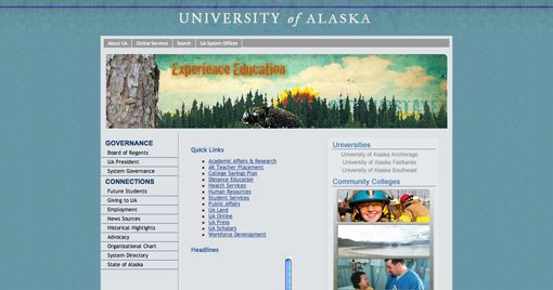
University of Alaska
This is by far one of the worst sites on the list. The animated bugs and spinning flowers are enough to make any designer openly cringe.
As soon as I saw this site I knew what I would find when I looked at the code: table-based layout. Sure enough, that’s exactly the cutting-edge technique implemented here, complete with barely-styled links and unordered lists.
Penn State University
I don’t know what else to say, this simply isn’t professional web design. This site is a crazy jumble of random elements all thrown way over on the left in awkward stacks. Sorry Penn State, but I say you scrap it and start over 100% from scratch. It simply can’t be saved.

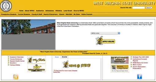
West Virginia State University
Bad clip art: check. Table-based layout: check. Intense drop shadows on thin text: check. Ugly 90s script font: check. The list of troubles with this site goes on and on. Definitely another strong candidate for a complete and total redesign.
The Rest
We’ve run out of awards but we still have plenty more states to see! I’ve already pointed out most of the best and the worst, so these all fall somewhere in the middle. Some were on the edge of making the Dean’s List, others were flirting with the 90s category, but the majority were decent sites that really just seemed an awful lot like every other homepage on the list. They all have their flaws and strong points, let us know what you think of them!
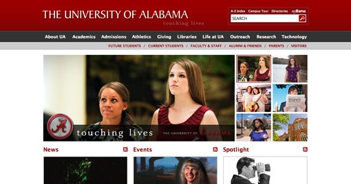
Some of my notable mentions for decent designs in this category are Alabama, Indiana and Oklahoma State (not amazing, but at least it’s unique).
The University of Alabama
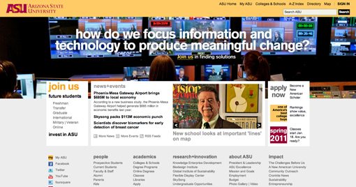
Arizona State University
University of Arkansas

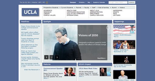
UCLA (California)
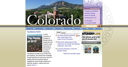
University of Colorado at Boulder
University of Connecticut

University of Delaware

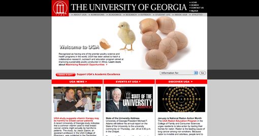
University of Georgia
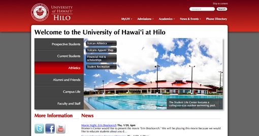
University of Hawai’i at Hilo
University of Idaho

University of Illinois

Indiana University

University of Kansas

University of Louisiana

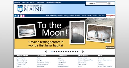
University of Maine
University of Maryland

University of Massachusetts Boston

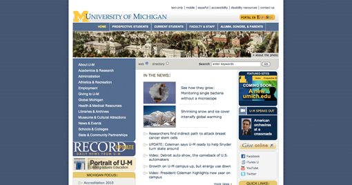
University of Michigan
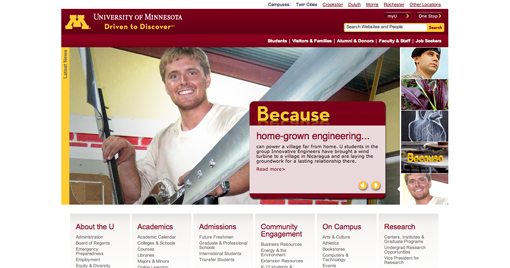
University of Minnesota
University of Mississippi

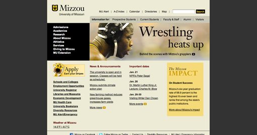
University of Missouri
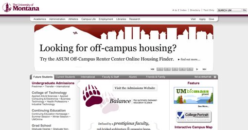
University of Montana
University of Nebraska-Lincoln

University of Nevada Reno

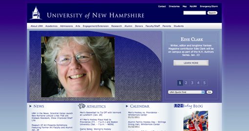
University New Hampshire
Rutgers (New Jersey)

University of New Mexico

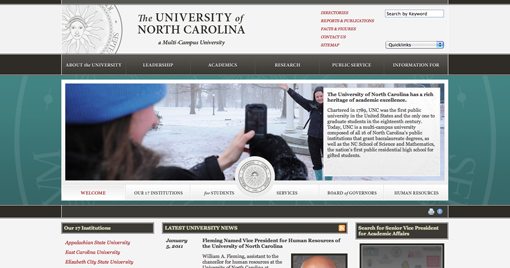
University of North Carolina
Ohio University

Oklahoma State University

University of Rhode Island

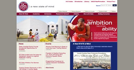
South Carolina State University
South Dakota State University

Tennessee State University

Texas State University

Utah State University

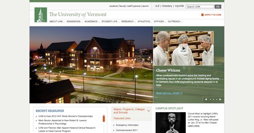
University of Vermont
Virginia State University

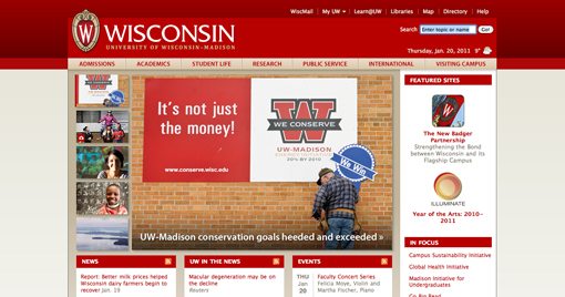
Wisconsin State University
University of Wyoming

Did We Miss Your School?
Obviously, every state has several universities and we couldn’t possibly go over all of them. If we missed your favorite school, leave a link below in addition to your comments about where they would fit on this list. Do you think the design is really good or remarkably bad? We want to know!
In case you’re wondering, I went to ASU and though they are on the list, I intentionally didn’t give them any sort of preferential treatment so no one could claim that I was biased!