Build Awesome Color Palettes Effortlessly in Illustrator
Here at Design Shack we can’t get enough of good color schemes. We recently discussed some Awesome and Unusual Places to Steal Color Palettes From and today we’ll follow up that discussion with some tips on how to build your own awesome color sets in Adobe Illustrator.
We’ll go over the extreme basics of working with color in Illustrator and jump into how to use the excellent built-in Color Guide to get you on the path to lightning-fast generation and manipulation of custom color schemes.
Color Tools: No Need to Look Far and Wide
We’ve given a lot of time and discussion to building color palettes. It’s an incredibly important aspect of your designs that has the power to shape the entire personality of whatever you’re creating. Needless to say, you don’t want to screw it up.
On design blogs, the utilities that get focused on a lot are usually free web tools that help you build great color palettes from your browser. There are even some really stellar dedicated native apps like ColorSchemer that give you this functionality outside of the browser. Interestingly enough though, the Adobe Creative Suite has some really powerful tools built right in.
One of my favorite apps for this task is Adobe Illustrator, which has received some awesome upgrades in the area of color palettes in the last few versions. Let’s take a look at what it has to offer.
Working with Colors in Ai
Before we get into some of the more advanced features, you should make sure that you understand the basics. The color system in Illustrator is similar to that in Photoshop, but definitely not the same.
For starters, instead of foreground and background colors, you have fill and stroke colors. The UI make look similar but the difference is very important. Any shape you create will take on both the fill and stroke color that you have selected.
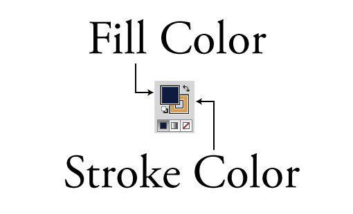
Notice all the little extras under your selected colors. Clicking the little white and black squares will bring you back to the default white fill and black stroke, you can also hit the “D” key at any time to accomplish this.
The three buttons at the bottom will allow you to choose between “solid”, “gradient” and “none” for your fill. Hitting the “/” key will give you no fill and hitting the “.” key will give you a gradient. In the image above, the fill is in the front and therefore active, if I change colors I will change the fill, not the stroke. To switch the stroke to the front, hit the “x” key. To swap the stroke and fill colors around, hit “⇧x”.
Color Palette
Going to Window>Color will pop up the color palette. Here you can not only choose your colors for the fill and stroke, but also swap between Grayscale, RGB, HSB, CMYK and Web Safe colors by clicking on the little dropdown.
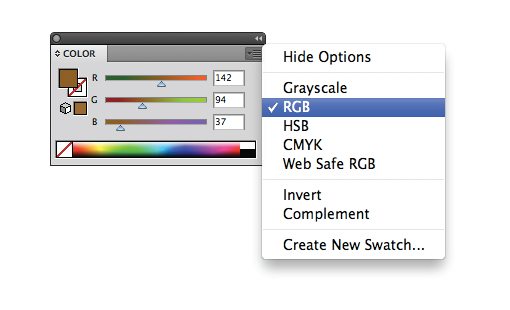
You can also switch between color modes by shift-clicking on the color spectrum at the bottom. Sometimes Illustrator will unexpectedly throw you into grayscale if you perform a certain action like applying a gradient, just follow this tip to get back to RGB or CMYK.
The Color Guide
Odds are, you already knew how all that stuff worked. It’s pretty intuitive, works a lot like Photoshop and has been an part of Illustrator for most of my life. However, there are some newer color tools that are really easy to overlook that can dramatically simplify the process of building awesome color schemes and possibly even save you a trip to the browser.
Let’s say you find a color that you like, I chose a color somewhere in the neighborhood of #8959A5, and you want to use it as the jumping off point for your color palette. For instance, if you’re building a website and want this color in the header, you’ll need some colors that look good with it to round out your design.
To begin, activate the “Color Guide” palette by going to Window>Color Guide. This should give you the following:
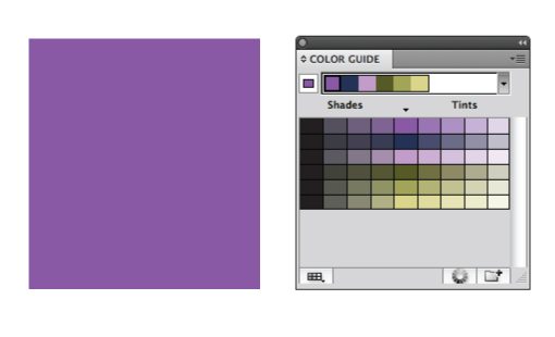
What the Color Guide is doing is actually looking at the color that you’ve chosen and suggesting other colors to go with it. Without any effort whatsoever you’ve already got a great color scheme to run with. All you do is click on one of the colors in the horizontal strip to apply it to a selected element.
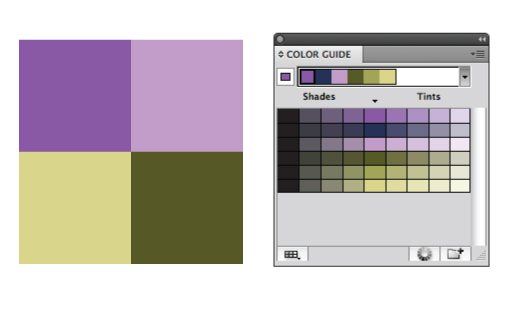
So, to use this tool on a real project, simply set a base color and then choose from the available options and see what you come up with. The results are usually quite nice with no extra work!
How It Works
This tool looks pretty simple but there’s actually a lot going on here. First, notice the strip of colors along the top, the base color is separated on the left and next to it is the automatically generated color palette based on a set of harmony rules, which we’ll look at later.
Under this is a big section containing a bunch of different colors. Notice that the horizontal strip of colors on the top corresponds to the vertical strip of colors in the center of this area.
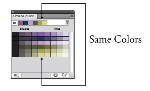
To the left and right of this column are others containing darker shades and lighter tints of the selected colors. You can quickly swap out any of your colors with another by clicking on one of these without upsetting the harmony of your original auto-generated palette.
In addition to the Tints/Shades option, you can also choose to make these colors Warm/Cool or Vivid/Muted.
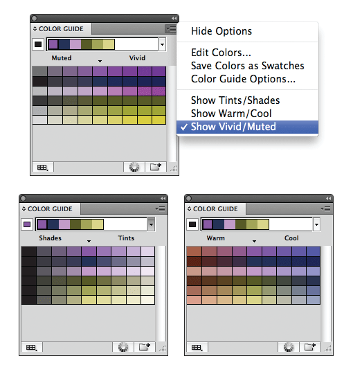
You can change how many colors appear in this section by going to the Color Guide Options in the little dropdown on the top right. Mine is set to four steps on each side of the base, but you can increase or decrease this amount.
Harmony Rules
As I mentioned above, that little auto-generated color palette is built using what Illustrator calls “Harmony Rules”. These utilize basic color theory to turn your base color into a series of colors. If you don’t like the way your color palettes are turning out, try using a new set of rules.
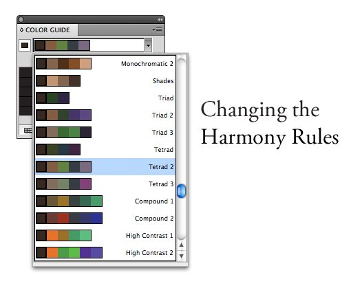
If you look into this menu you can see that all the basic ways of creating color harmonies are here: Monochromatic, Complementary, Analogous, etc. You should always experiment with different Harmony Rules to see what you like best. You’ll likely find yourself choosing from the same two or three again and again in your projects.
Editing Your Colors
Thus far the functionality in the Color Guide is great if you’re just looking for quick and basic auto color palette generation, but what if you want more power and freedom?
To achieve this, hit the “Edit or Apply Colors” button found at the bottom of the Color Guide palette. This will bring up a color wheel and set of tools not unlike what you’ll find in Adobe Kuler.
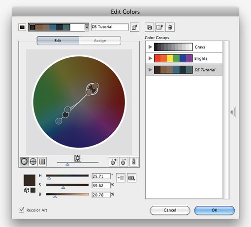
There are lots of great options in here. You can choose your Harmony Rules and move around the colors with those rules locked in, change the saturation of the colors in the wheel, edit individual color values, add and remove colors and even save groups of your favorite palettes. This almost hidden menu is a full-on professional color management system!
Editing Artwork
If you have vector artwork selected when you hit the “Edit or Apply Colors” button, an amazing thing happens: you suddenly get the ability to completely re-colorize everything that is selected. Manually, this process could take quite a long time, especially with large pieces of artwork with hundreds or thousands of individual elements. Here however, it becomes quite simple!
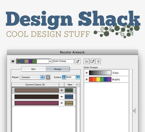
You can use either the “Edit” or “Assign” views to re-color your artwork. You can also choose to edit the color scheme as a whole in one step or drill down and swap out individual colors.
This is a simply outstanding system for experimenting with different color schemes. It’s also simpler and more powerful than a lot of our go-to online color scheme tools. I strongly encourage you to start playing around with the Illustrator Color Guide to get a feel for building your own custom color palettes.
Conclusion
This guide should serve as a super basic introduction to working with color in Adobe Illustrator. As you can see, there are many advantages here that you simply can’t find in Photoshop. Even if you’re building a site in Photoshop, it’s a good idea to pop over to Illustrator when it comes time to choose some colors to work with.
Leave a comment below and let us know how you build color schemes. Do you do it completely manually or use some tools and sources of inspiration to help you out?