Design Theory: The Rule of Three
One. Two. Three. Now stop counting and think about how elements grouped in threes can work for your projects. It’s an interesting concept but one that crosses multiple disciplines.
In public speaking, three points in sequence are crafted to drive home a point. In photography and art, the rule of thirds helps you visualize the canvas differently. Even the American Declaration of Independence is rooted in three rights: life, liberty and the pursuit of happiness. How can you think more about groupings of three and implement this magic number into your projects? We have a few suggestions.
2 Million+ Digital Assets, With Unlimited Downloads
Get unlimited downloads of 2 million+ design resources, themes, templates, photos, graphics and more. Envato Elements starts at $16 per month, and is the best creative subscription we've ever seen.


Frame Images and Video Using the Rule of 3

The rules of thirds grid divides a frame into nine equal parts. The corresponding ratio is 1 to 1 per rectangle. The imaginary grid can be used to frame, crop and edit images and video. The grid has become “more mainstream” with photo tools that include a grid overlay on camera screens – the iPhone has one, for example – that help users determine how to capture an image.
The rule of thirds is a simplified concept rooted in various other bits of theory and grids, and it is incredibly user-friendly.
As we outlined in a previous Design Shack article, “Looking at Images: Phi Grid vs. Rule of Thirds,” there are five benefits to using this concept:
- It is easy to use and understand.
- Standard software, such as Adobe Photoshop, includes rule of thirds cropping guides.
- It creates visual harmony and equal weighting in an image.
- The “sweet spots” – intersecting points along the grid – are flexible in size and easy to find and align.
- The looser variation on the Golden Ratio might feel for natural to some.
Creative Market has a nice gallery of images with the rule of thirds grid applied if you want to see it in action.
Guideline for Lists

We all know that lists are a great way to create engaging content that is easy for users to digest. What you might not know is that starting a list with three points can be ideal. A list of two isn’t really much of a list. Three elements add weight to the content, but without overwhelming the user. Three bullets are likely memorable and easy to read at a glance.
Some of the most charismatic speakers and presenters in the world use the rule of three to drive home points and create emphasis. When composing these lists, think about the harmony of the content.
Each bullet point should be similar in length and scope. Lists might be one word each or contain a sentence each. Congruous structure helps drive each of the three elements home and connects them in a way that just feels right. In writing this is referred to as a tricolon.
In the context of a pop culture references:
- “I think we’ve all arrived at a very special place. Spiritually, ecumenically, grammatically.” – Jack Sparrow in “Pirates of the Caribbean”
- “To that I say, ‘Alright, alright, alright.” – Matthew McConaughey, 2014 Oscars
- The prevalence of trilogies in movies or books, such as Star Wars or The Hunger Games.
Group Design or Navigational Elements
From images to navigational elements to cards, grouping items in multiples of three can be visually appealing, create organization and enhance overall user flow. (See what I did there?)
Use this concept as part of your grid system, horizontally or vertically. Each of the three websites below do this in quite different ways visually, but they are equally effective.
Assos

The site divides the top of the screen into three equal-size images that take you to different parts of the site. The images are interesting, communicate a visual story and serve as navigational elements to carry users through the site design. The scroll is also divided into unites of three in an interesting way, with the second panel of images in the scroll having a 2 to 1 ratio (but still in the same thirds grid) and then back to three panels again.
Lucy Says I Do
This design uses threes in a few places. It’s easiest to see in the three images below the hero image on the homepage. That theme of three is carried to the slider below the scroll, where six (multiple of three) panels move to showcase elements. Add in other groupings of three: The main footer section has three columns of information, the main nav has three primary sections with drop downs and hero imagery is designed so that each image could be split into three panels based on the placement and location of the elements in each photo.
Coleman Smith
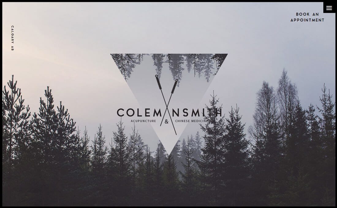
Coleman Smith uses threes in a totally different way. Do you see it? The use of thirds is in the triangular shapes that are integrated into the design. Just as you can make three points with text, this shape shows three points as well and creates a distinct style of emphasis. The points from the shape help direct your attention on the screen and draw you into the main image.
Divide Your Project or Story
Just as a play has three acts, divide your project or content into three parts. It will make the project, particularly those with a lot of content easier to navigate and understand.
There are multiple patterns to choose from, but consider something that opens almost in the same way as a play. Everything must have a beginning, middle and end, right? Set up the flow of the project in this way to help users become part of the story you are telling and follow the content from start to finish.
Use 3 Descriptors in Marketing Materials
You might remember the phrase “thinner, lighter and faster” from the Apple iPad 2 release. This combination of three was easy to remember and gave everyone a simple catch phrase to describe the product from the start. Much of the media coverage about the tablet release included this language as well. (Which is exactly what you want people to do with your marketing materials!)
This is something you can use in your work as well. Think about your website or app or even you as a professional. Describe it in three words. Now start using this three word description whenever you talk about the website, app or your career.
You are using this small thing to establish the narrative that people will tell about the product or brand. Three words are just enough to remember without being overwhelming, and if you are a master wordsmith play with the words and look for catchy combinations to make the description even more memorable.
Conclusion
Now that you have three on the brain, are you ready to get started? Also, make a point to step back and look around you. It might be surprising how many instances of three are all around.
It’s something that you never notice because of its innate harmony until you think about it. Maybe that’s why the rule of three is so timeless.