Looking at Images: Phi Grid vs. Rule of Thirds
When you are thinking about images, do you consider framing and the shape of the crop? The answer does not lie in the shape of the box you just created on a design canvas. It has a lot to do with the content of the image itself.
How you frame and crop images can impact engagement and even how a person looking at the image feels about it (whether they know it or not). Here, we’re going to look at two different ways of thinking about images – using the phi grid and rule of thirds — and how you can apply them to your work.
Grids and Science
So the key to understanding images and harmony starts with a little science. The Golden Ratio is ones of those bits of science that can be applied to design and images. (And it happens whether you intend to or not.)
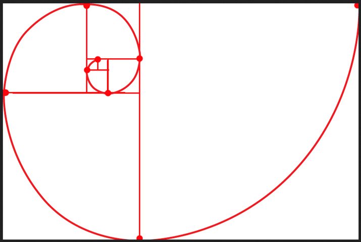
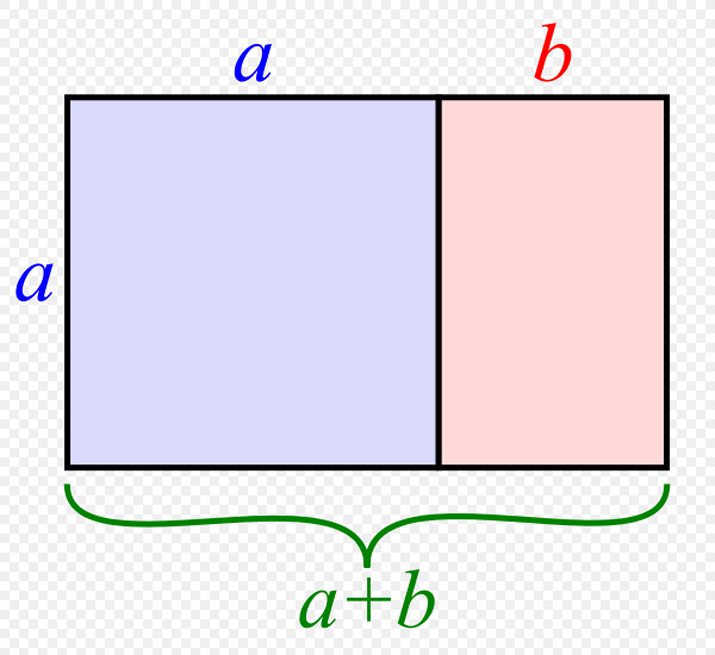
The Golden Ratio is based on the Fibonacci sequence, which was developed by a mathematician in the 12th century. Simply stated, it is a ratio of ideal proportions: 1 to 1.618. The Golden Ratio goes by a handful of other names as well including the golden mean, divine proportion, golden rectangle, extreme mean and phi. It is used across a variety of disciplines such as design, architecture, painting and music and can also be found in nature. When drawn, the Fibonacci sequence is depicted as a spiral within the shape of a perfect rectangle.
This number and “perfect rectangular shape” are important because they form the most pleasing and attractive shape for the human eye. That’s not to say that everything you create will use the Golden Ratio, but it is something to consider when framing and cropping images. (Note: While most of the images here show the grids in horizontal orientation, they work vertically as well.)
Phi Grid

The Phi Grid helps you visualize the Golden Ratio as a part of each image. It is based on a combination of smaller rectangles in a grid over an image, where four of the rectangles are based on the 1:1.618 ratio.
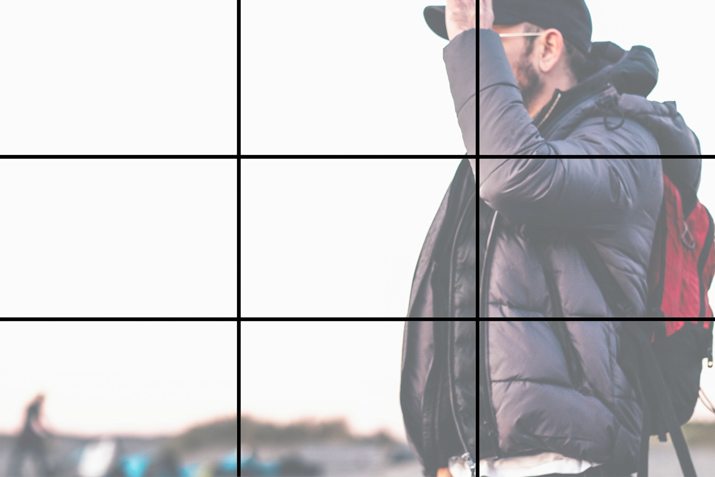
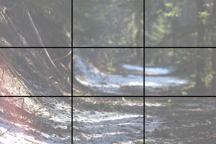
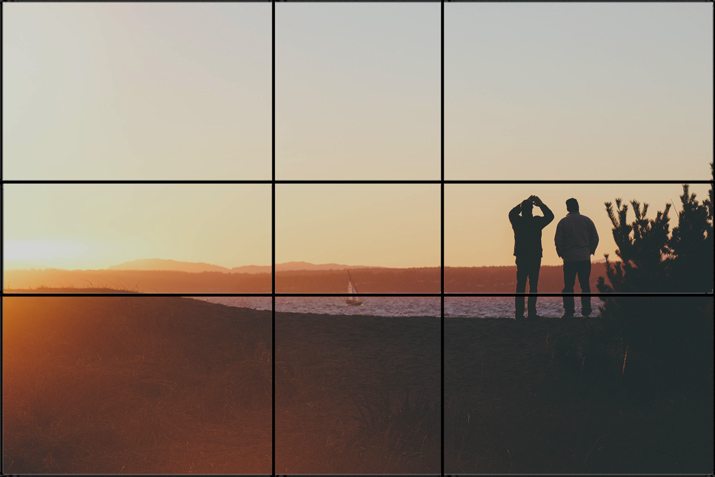
What you can see when using the Phi Grid is in the spaces where gridlines intersect. These so-called “sweet spots” are places where the eye is naturally drawn in an image. Cropping or aligning an image so that key parts fall in these areas will create focus and harmony.
Pros
- The grid creates visual harmony.
- The grid creates distinct sections on the canvas that aren’t always perfectly symmetrical.
- Works for photos where weight needs to be toward outside edges of the frame.
- Grid creates perfect division of space mathematically.
- You can use the grid lines for alignment and to ensure visual harmony.
- The top horizontal gridline can be great for landscape images and create a horizon line to make cropping easier.
Cons
- The grid can be difficult to create.
- The grid can leave “odd holes” in the eyes of some designers.
- Getting caught up in trying to design on the grid can get frustrating.
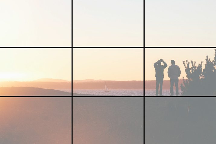
Rule of Thirds
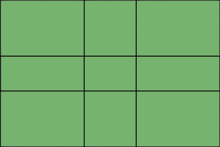
The Rule of Thirds is a more widely recognized image grid that is very much like the Phi Grid. While the origins are not precisely known, it is believed that the concept developed out of a need for a simpler solution to using the Phi Grid.
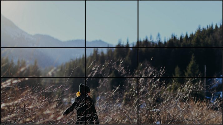
The Rules of Thirds is a grid that divides any frame into nine equal parts. The corresponding ratio is 1 to 1 per rectangle. So it’s close to the Phi Grid but not precise. The result is a perfectly symmetrical grid that easy to visualize and use. Just like with the Phi Grid, the “sweet spots” are the locations where lines intersect.
Pros
- It is easy to use.
- Standard software, such as Adobe Photoshop, includes rule of thirds cropping guides.
- It creates visual harmony and equal weighting in an image.
- The “sweet spots” are a little larger and easy to find and align.
- The looser variation on the Golden Ratio might feel more natural to some.
Cons
- It’s not mathematically perfect (if you are a stickler for those things).
- It can feel too divided in some instances – depending on the image – or too perfect, because of the forced symmetry.
Which Should I Use?


Now for the tough part, which grid should you use? What if the answer is neither or both?
Every image can be overlaid with either grid (look at the images above and compare them using each). Understanding these concepts is less about trying to actively make sure every image uses one or the other and is more about understanding how these things impact what you are doing.
Use these grids as a way to make sure that your images (or logos or illustrations) are as visually sound as they can be. Grids can help you create a foundation for harmony and balance (or lack thereof). Grids can help you tweak an image and crop to a more ideal shape if you feel like something in an image is just off. Grids can help you organize your image and design framework on the canvas.
But that brings us back to the question: Which grid should I use?
- Use the Rule of Thirds in a jiffy. It’s easy to visualize. Use it when you are actually framing and taking a photograph.
- Use the Phi Grid when you want to be precise and perfect. (I like to toss it over elements just to see how close a project is generally.)
- Use the Rule of Thirds in portraits. It can create beautiful positioning of a face in a frame with more room. (Try to align eyes in a grid intersection for impact).
- Use the Phi Grid for landscapes. Align the horizon with the top gridline or a body of water or foreground element with the bottom gridline.
- Use them both. Remember, these elements are invisible lines and can be applied to pretty much anything.
Now take it a step further. We focused on using the Phi Grid and Rule of Thirds for photos in general, but either can be used for any visual. The grids can also be used in areas of detail as well, such as aligning just one section of a project or image in a way that “feels” best.
Conclusion
Does all the math have your head spinning? Are you seeing gridlines on top of your images? That’s a good thing, but don’t focus on it too much. Understanding grids is just one of the tools in your kit.
As with any other tool, use it in combination with what you already know to create a complete project with the best aesthetics possible. Are these grids something you use in your daily workflow? Are there others you prefer? Share your experiences and thoughts in the comments.
Creative Commons images by Death to the Stock Photo.