Designing With Strong Simple Focal Points
In design, we tend to think of simplicity in terms of recent trends towards minimalism. A simple design by this definition is one with lots of literal whitespace and very little on the page outside of what is absolutely necessary.
However, instead of blindly following this trend, it’s important to understand the ideas behind it so that we don’t find ourselves trapped in a minimalist box with obvious grid-based layouts, white backgrounds and newspaper-style typography (not that this is bad, it’s just not good to be stuck in this idea). When you consider the principles of design that are at work in minimalism, you can successfully break out of the box and create clean designs that aren’t bound by an obvious and strict visual style.
Who Cares About Focal Points?
What’s the purpose of focal points and why should you care about them? The answer lies in controlling how people view your design. This is crucially important because no matter who your target audience is, they’re going to have a limited attention span.
Being able to capture the viewer’s attention and hold it, even if only for a second or two, is the key to effective design. By effective design I mean design that does more than look pretty, it accomplishes a given goal. This can be anything from getting someone to notice a sale at Wal-Mart to building awareness for the name of a political candidate.
One of the primary aspects of a minimalist design is reducing superfluous distractions, which in turn highlights the important elements on the page. You can use this same technique to simplify your designs by reducing the number of focal points without taking it to the extreme of dramatically reducing your design options.
The theory alone is a little abstract and useless so let’s see how to apply it by working with a couple of actual designs. The goal will be to create clear focal points that simplify the visual message and successfully draw the viewer in.
Example 1: Finding The Perfect Flower
We’ll start off by taking a typical design and seeing if we can improve it. Below is a sample that I created that uses an attractive photographic background. Overall, it’s an good looking design. The flowers communicate the message effectively and there’s plenty of whitespace in the sky to make the text easily readable.

However, despite being attractive, the design doesn’t really pull you in and hold you. One of the main reasons for this is the that you don’t really have any strong focal points. The headline is nice, but it’s probably not enough to grab and hold your attention all by itself.
As I said above, the field of flowers is attractive, but it’s also a little too busy to provide the strong message we’re attempting to create. Let’s try simplify this design a bit by grabbing a different photo.

Here we’ve rotated our orientation, which is completely feasible if you’re designing a business card, flyer or something else in print. The simple nature of the messaging made a vertical layout just seem like a better fit because we can maximize the size of the objects.
The primary change though is obviously in the photo selection. This time we’ve selected a photo with a strong single focal point. The result is something beautiful that we can’t help but want to stare at. The contrast of the flower against the background, the shallow depth of field and the lack of other distractions all contribute to the irresistible nature of the artwork.
Example 2: Free Concert
Let’s say you’re going to create some graphics for a free rock concert. While searching for some good imagery to use, you might be tempted to grab (or shoot) a photo like the one below:

One one hand, this is a great start. You’ve already strongly communicated the idea of music through the visuals. However, the photo has three objects that the viewer must take in and interpret. When you combine this with some sort of messaging you’re going to end up with something that’s unnecessarily complex and consequently, not enticing to your viewers.
If we look at this photo and try to decide which object clearly communicates the concept of rock music to the greatest amount of viewers, we’ll no doubt settle on the guitar head. We can then use this as inspiration for our photo search. We’ve now gone from a general concept for the photography we want to use (a rock concert) to something much more specific and concrete (the head of a guitar).
Using this as our starting point we might end up with something like the design below:

Notice that we’ve done the exact same thing we did with the flower setup above. We’ve reduced the visual complexity by cutting the unnecessary objects out of the scene. Unlike the flower concept though we’re going to take this idea much further to see how to apply this technique in a more realistic situation.
Odds are, you don’t spend too much time creating designs as simple as the one above. Instead of one headline, you have an entire page full of content that needs to be arranged in a logical manner.
The good news is, the same techniques work just as well in this setting. The key is to separate your design into visually distinct areas. Since headers are traditionally the place where you grab a viewer’s attention, this is a natural place to insert a strong focal point.
Let’s take our guitar design and expand it into a full-blown flyer or webpage.
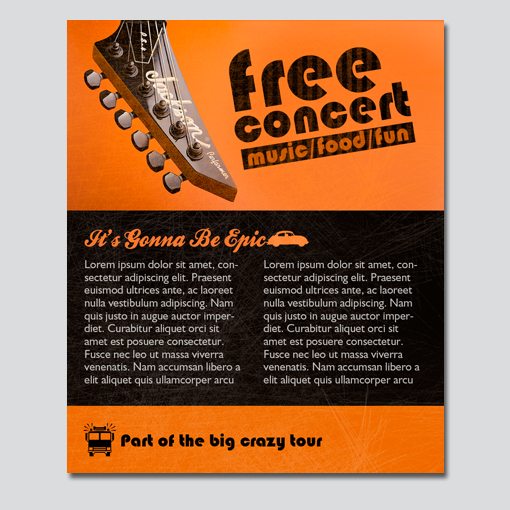
As you can see, using this setup we can cram as much content as we need into the lower portion of the design. Notice that the design doesn’t really feel minimalist in the sense that we’ve come to know the style, but it does use the heart of the theory to create a strong layout.
Examples in Web Design
Now that we’ve discussed enough theory to get you on your way to creating awesome designs with clear focal points, let’s close off with a few real examples from the world of web design. Pay close attention to how each layout grabs your attention and where the focal points lie.
Creative Mints
Supersteil
Hunderprodukte
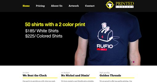
Printed Threads
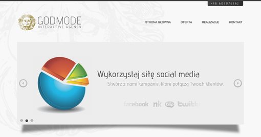
Godmode
Closing Thoughts
To sum up, complicated graphics can often detract from the visual messaging and allure of a design. By studying the principals used in minimalist design we can extract a useful technique for reducing the visual clutter and ultimately arrive at an attractive finished product that uses clear, strong focal points to both convey a message and attract attention.
Leave a comment below and let us know if you found the information above helpful. Also be sure to share any techniques you use to simplify your designs while making them more attractive.