Good Design Taste Test: Three Fast Casual Restaurant Websites Compared
Fast food restaurants are notoriously bad with web design, but the emerging market of “fast casual” eateries thus far is proving to be much better in this area.
Today we’re going to look around the web at the websites for some of the most popular fast casual restaurants to see who is doing the best work and what we can learn from them. Warning: this post will make you hungry!
Qdoba
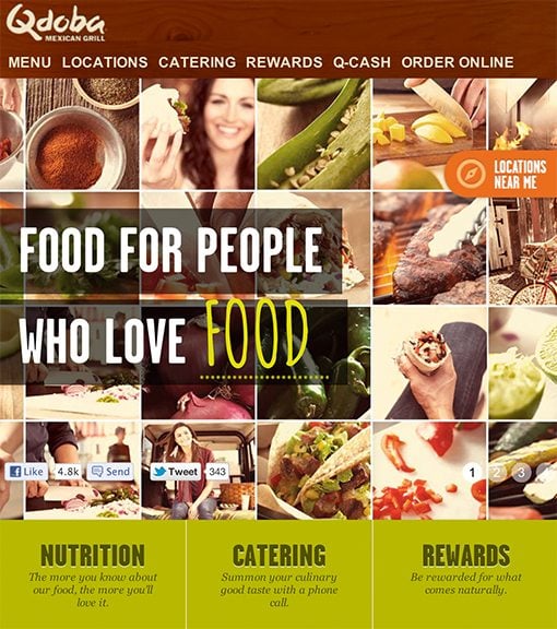
The first site we’re going to hit up is Qdoba.com, the homepage for a restaurant that serves up some delicious burritos and other southwest offerings. It’s a lot like Chipotle, which we already looked at in another post. Here’s a look at the header:

So far so good! I really like the juxtaposition of the typography and photography. The design is big and bold, yet fresh and friendly. It perfectly captures the feel of the restaurant and portrays a good blend of happy people and delicious food.
Strong Branding
Their current branding strategy is that Qdoba is “food for people who love food.” This idea is pushed all over the site, even in interactive ways. The coupon page, for instance, treats the last word as a “fill in the blank” where you type in what you love and earn different coupons based on your choice of word.

This is a great psychological trick. They’re subtly forcing me to form connections with the brand by associating it with things that I love. Again, this is reinforced by all of those smiling faces that you see interwoven with food photos.
Menu
Another thing that I really like about Qdoba.com is the menu presentation, which is absolutely one of the most important facets for any restaurant website. Each item is arranged neatly into a grid with attractive, high key food photography and clean text.

Home Page Content
When I visit the website for a restaurant, there are typically two primary things that I want to do: check out the menu and find out how to get some food. This latter action typically involves either ordering online or looking up a phone number and address.
Qdoba handles pretty much all of this right from the home page, thereby knocking content location convenience out of the ball park. At the top of the page, you’re introduced to the restaurant and told to grab some coupons. When you scroll down a little, you see the menu items with links to nutritional information. Finally, when you hit the bottom of the page, you see a map of the locations in your area.

The only major goal that’s not accomplished right on the homepage is ordering online, and that option is located at the top right of the screen (prime real estate for browsing eyes) in a persistent header that stays with you as you scroll.
Responsive to Boot
It’s awesome to see major corporations jumping on board the responsive band wagon. Qdoba.com actually responds quite well to different viewport sizes.
What Did We Learn?
Qdoba.com has a lot of great design lessons to teach us, the most significant of which is probably the power of strong branding. They’re consistent with their color palette, typography and photography, all of which come together to create a unique identity that customers can identify with. The combination of happy people and delicious looking food shots is tried and true and has been serving restaurants faithfully for decades.
There are two other great lessons at work here as well. First, responsive design isn’t just a fun trick for web designer portfolios. The corporate world can and should embrace it openly because it means a better experience for more customers.
Finally, always consider why the majority of your visitors come to your site and do your best to cater to those actions. Almost everything most people will want to do on Qdoba.com can be accomplished through the home page.
Pei Wei
Next up on the fast casual tour is another of my personal favorites: Pei Wei, a restaurant that serves up delicious entrees from a number of asian cultures. It’s the fast casual little brother of the more formal P. F. Chang’s. Here’s the home page:

Color
The first thing that I notice about Pei Wei’s site is color; bold, beautiful color. The palette is very dark and warm, it suggests spicy, rich flavor that gets my mouth watering for some honey seared chicken.

The cool thing here is that these colors are likely pulled right from the food that Pei Wei serves, a trick that Qdoba was also using.

Any time you’re trying to develop a color scheme for a company, always remember that you often need look no further than their product line.
It’s All About the Food
With Pei Wei, there’s a very different technique than what we saw on Qdoba’s site. Here the aesthetic is 100% about the food. Everywhere you look is another beautiful food shot.

I looked around on the site for a while to see if I could find a photo of a person, as far as I can tell, there aren’t any. It comes off as less personal and inviting, but I think they pull it off pretty well. If they ever do a major rebrand, I wouldn’t be surprised to see them approach it with a more friendly, human feel.
Things I Don’t Like
Overall, Pei Wei has a pretty strong site, but there are some things that I’m not crazy about from a design perspective. First of all, there’s a lot of trapped, awkward negative space that is the result of a somewhat cluttered layout. It’s not horrible, but it can get a bit distracting.
The worst offense here in my book is the menu, which looks like this:

As you can see, it’s just a boring text-based menu. Each dish does indeed have a beautiful accompanying product shot, but it’s hidden until you click on it. The nice thing is that you save on page load times, but the downside is that this doesn’t make me hungry! And remember, hungry people are your target audience here.
I definitely think that the menu page needs to be redesigned to make better use of all of those mouthwatering photos that they obviously possess. You don’t necessarily have to show every photo all of the time, but something can surely be done to liven it up a little.
What Did We Learn?
From Pei Wei, we learn a lot about how to design with food photography. We saw that food photos are a rich source of color palettes that help tie the brand identity in with the product. We also saw how much of a shame it is to hide these photos when it comes to the presentation of the menu.
Wildflower Bread Company
The last fast casual restaurant that we’re going to take a look at is Wildflower Bread Company, a one stop shop for delicious baked goods, sandwiches and pasta.
I chose this chain based on the fact that their stores are actually really well designed. Beautiful signs, great colors, awesome furniture and free wifi! It’s a great place to take an extended working lunch.
Unfortunately, it seems that the amazing design doesn’t extend to the web. Here’s their home page as it appears on my MacBook:

The content here is just so… small. In a world where responsive web design is maximizing the use of every screen, the mountain of empty space here just feels like a terrible waste.
The entire site feels like a little bit of a hodge-podge of scattered content, marketing messages, photos and text that simply does not live up to standards of the physical buildings.

Print ≠ Web
Wildflower Bread Company has the feel of a company with a stellar print design team and a tiny, poorly supported web team. Like many businesses back in the early 00s, they’re struggling to transfer their brand to the web because it’s such a different medium.
Again and again, I see parts of this design that tells me that it’s little more than a port of something created for print. The menu is a perfect example of this type of thinking:

There paragraphs are poorly aligned with very narrow widths, zero visual reinforcement and awkward line breaks. Not exactly a shining example of web typography. The type problems persist throughout the site, check out the surprisingly narrow width of the center column of text below:

Lots of Reading
In place of the large, attractive food photography that we saw on the other two sites, this one gives you paragraphs. Long, uninterrupted pages of text served up as the primary content.

Again, this is a direct result of simply not understanding how people browse the web. I’m not going to read this, almost no one else will either. If you’re bragging on your baked goods, cut this down to a single paragraph and show me some delicious looking treats.
What Did We Learn?
One revelation here is that fast casual dining sites aren’t all great. Admittedly, I’ve been pretty harsh on poor Wildflower here, but simple truth is that I’m only going to eat at one place for dinner tonight, and if I’m browsing the menus of these three sites to help me decide, the other two beat Widlflower every time.
The big lesson that I repeated over and over is that the web is not an interactive brochure. It’s a completely different medium that calls for a completely different set of design skills and challenges. It seems counterintuitive, but a company known for good “real world” design can really suck at web design.
Qdoba vs. Pei Wei vs. Wildflower
Completely incidentally, the websites above started strong and went downhill from there. Qdoba was by far my favorite with its gorgeous imagery, responsive layout and awesome branding. Pei Wei was admittedly a little weaker but overall still a pretty strong showing in the restaurant business. Wildflower brings up the rear with a pretty weak site that could really use a complete redesign from the ground up.
So what’s the point here? Why look at these three sites? Because they perfectly illustrate how different projects with the same goal can go so differently depending on the talent and resources of the people involved. All three of these businesses are popular, successful restaurants that can absolutely afford to build a strong web presence.
Use this as a lesson for your own projects, especially if you work in a team. Are you able to pull your resources together and turn out something for which you can really be proud or does something stand in your way? Is it any of the things mentioned above or something else? Let us know below.
Also be sure to tell us about your favorite fast casual restaurants and how their websites stack up against those above.