How to Design an Awesome Flyer (Even if You’re Not a Designer)
This article will walk you through the process and logic of designing a basic but attractive flyer. We’ll look at how you can plan your content, find and implement some quality images and handle the alignment of a significant amount of content while not sacrificing too much of the visual appeal.
Design Shack reader Abigail submitted a Design Dilemma to ask about flyer design. After reading through our tips on designing presentations, she wanted to know how she could apply similar advice to flyer design. In our presentation article, we advised designers to keep their slides painfully simple, but flyers understandably must contain more information than a simple headline.
We’re going to answer Abigail’s question with a full-on flyer design project that you can either browse through for general design advice or follow along with for some solid experience.
No Photoshop? No Problem
Now, one important thing to consider is that Abigail is a librarian, not a designer. She stated in her message that she doesn’t have Photoshop or any equivalent, just some basic office software like Powerpoint and Word.
This definitely complicates things. It’s much harder to achieve decent looking effects, blending etc. in apps that aren’t really intended to pull off such tricks. For the most part, I’ll try to keep this project simple enough that just about anyone can do it with run of the mill office software. I’ll be sure to point out any Photoshop-specific tricks that I used.
Getting Started: Plan Your Content
The first step in any design project is to organize your information. What is required? What are your goals? Since this is an imaginary project I’ll be using some filler text but we’ll try to keep it real with the content.
Any good concert flyer needs to say, at a minimum, where and when the concert is, who’s playing and how much it costs. I’ve designed plenty of real concert flyers using only this information, but to make it a little more difficult, let’s assume there are a couple of paragraphs of copy to include as well.
Though flyers can and should have way more information than your average presentation slide, that doesn’t mean you should go crazy with the content. The same basic rules apply here: less is more. If you create a flyer that is primarily made up of large chunks of text, very few people are going to glance at it for more than a half of a second. They’ll only see that it looks like a lot of work to sort through and move on.
Your goal then should be to pare down all of the necessary information into easily-digestible chunks. Throw out anything that you don’t really need and look for ways to make what you do need more concise.
Bullet Point Fever
Making your information concise doesn’t mean you should fill the flyer with fifty-seven bullet points. Bullets are great, and we’ll be using them today, but amateur designers are quite prone to going nuts with them. If you’re using bullet points as an easy-to-read and understand way to distribute your information, you’re on the right track. If you’re using them as a crutch because you don’t know how else to design a flyer, you need to rethink your strategy.
Finding Images
Non-designers really get intimidated when it comes to adding in imagery. Many of them know that clipart is pretty cheesy and often completely horrid, but don’t know of any other options. Fortunately, the web is a wonderland of free resources if you know where to look.
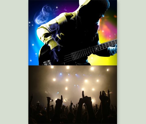
Flickr Creative Commons is a great place to start but today we’re going to use Stock.xchng, a free stock photography website. Typically, I’m not too excited by the results from this site but today I lucked out with some great images that will really make for an awesome concert flyer (Image Credit: Josiah Norton and Angus Wurth).


Step 1: Combine the Images
Set up your document to match your desired flyer size: 5″ by 7″, 17″ by 11″, etc. It doesn’t really matter, just make sure you’re going with a vertical orientation.
Once you’ve got your document set up, toss in the two images from above, allowing them to take up your entire canvas. Stack the bass player on the top of the crowd image, eating up a good portion of the available space. It’s difficult to sacrifice space in a crowded design but we really want to make this an eye-catching flyer.
At this point you’re probably thinking that these images are way too busy and that we can’t possibly put any text in, but don’t worry, we’ll take care of that in the next step.
Step 2: Fill In the Bottom
As I just mentioned, our flyer in its current condition isn’t very conducive to text overlays so let’s see if we can simplify things a bit.
To make sure our colors all look good together, it’s always a good idea to use colors that already appear in the image. With this in mind, sample the color from the top left of the bass player image. If the application you’re using doesn’t have an eyedropper tool, you’ll have to eyeball it.
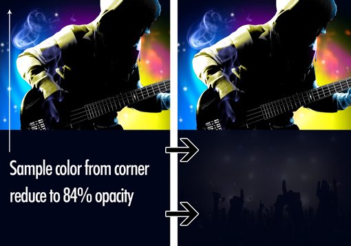
Once you’ve got your solid color rectangle over your photo, reduce its opacity to around 84%. Most applications with graphics allow you to reduce an object’s opacity, if not, you’ll just have to use a solid color.
As you can see, this gives us a background that’s more interesting than a solid color but a lot easier to place text over than our original photo. Plus, introducing the color overlay makes our two very different images look really great together.
Step 3: Add a Headline
Every good flyer needs a headline, so let’s take care of this next. Remember that the headline doesn’t necessarily have to be at the top of the page. We’re going to place ours near the bottom of the bass player image.
To do this, I repeated the same basic process as in the last step. I drew a black box coming from the right side of the flyer, then reduce the opacity just enough to let the photo start to show through. This helps make the text more readable over that busy background.

For the font, I used Six Caps from Font Squirrel. The condensed, all-caps nature of the font is perfect for the look we’re trying to achieve.
Step 4: Who, Where and When
Since we addressed the price point in our headline, we’re down to three other important pieces of information: who, where and when. We can break these out into three bullets with exactly those headers.
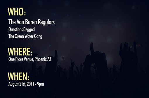
There are a couple of important things to note about this. First, I didn’t like the readability of the Six Caps font over lots of text so I switched to Futura Condensed for this portion. Furthermore, notice how I’ve structured the hierarchy of information very carefully. The headers are the largest and colored differently to stand out. Once again I grabbed this color from the bass player image. I’ve also given some size differentiation to the headliner band.
The main takeaway here is that some pieces of information that will be more important than others and you need to take care to give that special attention. This gives your work visual variety and makes it easier to browse.
Step 5: Add the Paragraphs
Dividing the bottom portion into two main columns will give us plenty of room for content. We just created the first column and left it quite narrow, which is fine for the content that it holds. This allows us to have an even wider column for our paragraphs, which wouldn’t look right if they were too narrow.
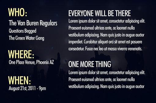
Notice that I used the same basic conventions as on the previous step, with some subtle changes. I didn’t repeat the colored headers so as not to detract from the primary information points on the left. With the same goal in mind, the paragraph headers are smaller than those on the left.
Finishing Up
With that, we’re all done! Our flyer says everything it needs to and is quite attractive to boot. The page layout work here was really minimal and most of the aesthetics were provided by the third-party images. Almost anyone can make this flyer! Click the image below for a larger preview.

Notes About Alignment
Make sure that as you’re building your flyer, you don’t just casually throw your objects on the page. There are some very strict and intentional alignments in place in my design:
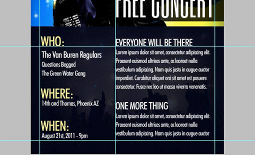
Notice how everything lines up nicely on both vertical and horizontal planes. Also, notice how much distance is placed between the edge of the page and the content. Always give your content plenty of breathing room, just like the margins on a Word document.
Notes About Printing
If you plan on designing and printing your own flyers, there’s a lot to keep in mind. First, your file layout may need to account for bleed and trim if you’re working with a commercial printing service, often templates are provided to make this easy. However, for these kinds of jobs, you really should possess some sort of professional graphics software as the templates provided by the printer will likely be for Illustrator, InDesign or Photoshop.
If you’re printing these from the office printer, full bleed will be harder to come by and may not even be possible with your model. In this case, don’t sweat it. This design looks great with a white border around the edge. In fact, it helps to give it that “flyer” look.
Finally, you really need to watch out for the quality of print you’re getting. This design features white type over a dark background, if your flyer size is too small, this quickly becomes problematic and the result may be an unreadable print. Make sure your fonts are a decent size, then run a test print. If it doesn’t work well you may have to change fonts, increase the size or rethink the design so that the bottom is white with black or gray text.
Conclusion
If you’re not a designer, projects like this can be quite intimidating. However, with the tricks I showed you above, you can really blow away your bandmates, coworkers and/or friends with your mad design skills.
Leave a comment below and let us know what other types of design projects you struggle with and how we can help out!