Style Tiles: The Flip Side of Wireframes
Style Tiles provide a fresh and productive way to approach the design process. They allow you to specifically hone in and focus on a project’s personality and mood without worrying about specific layout decisions.
Today we’re going to show you exactly what Style Tiles are, why you should use them and how to incorporate them into your design process. Follow along and you just might change the way you design forever.
What Are Style Tiles?
Style Tiles are a way to develop a site’s visual identity independent of the complicated logistics that come into play when actually trying to develop a full fledged mockup. The idea comes from Samantha Warren, an extremely talented designer and blogger at Badass Ideas.
Rather than beating around the bush, let’s jump right into what a Style Tile looks like. It’s difficult to describe so here’s an example from the Style Tiles website.
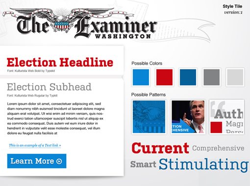
If you’re driven by visual design, then you should immediately be able to see the usefulness of this tool. It’s both remarkably simple and incredibly helpful. A lot of important decisions have been made here about typography, color, button styling and more. If we were building a website based on this board, we’d have a solid idea of the visual direction that we would be pursuing.
The Flip Side of Wireframes
The Style Tiles website describes them as a something in between a mood board, which is too vague, and a full mockup, which is too precise. I personally think of them a little differently: as the flip side of wireframes.
Think about it, your goal with wireframes is to focus on layout void of style. You’re merely thinking about how a page will be structured, what the size ratios between elements will be, etc. Using a simplified wireframe allows you to rapidly develop a lot of ideas because you’re not distracted by things like colors, shadows, patterns, fonts, and images.
A style tile is the opposite of this, which means it provides a perfect complement to this process. Here you get to abandon notions of layout and completely focus in on what could be considered the “brand feel,” those specific design decisions that give the site a unique identity.
Three Reasons To Use Style Tiles
Now that you have a good grasp of what Style Tiles are, let’s go over some of the main reasons that you should think about incorporating them into your workflow.
Speedy Visual Development of Ideas
The first reason that Style Tiles are great is that you should be able to bust out several of them in a relatively short period of time. Full mockups can take hours or even days to produce but these boards are simply small tastes of the greater design and should only take you a fraction of the time.
This means that you can easily create three to five unique ideas for your site’s personality, then choose which works the best or mix and match elements from each.
Client Feedback Is Easier To Integrate
When you’ve spent a week developing a client’s first look at a project and they send you back to the drawing board, it can be a disheartening experience. All that time and effort you spent on the project was wiped out in a single meeting and you’re left back at square one.
With Style Tiles, you can include your client in the design process at an early stage. Show a few different tiles and they’ll immediately get a feel for what’s going on and will likely love the opportunity to jump in and provide feedback.
At this stage, it’s incredibly easy to make small tweaks or even large scale global changes without feeling like you’ve wasted half of your time and budget.
Perfect For a Responsive Workflow
As responsive web design becomes more and more popular, designers are being forced to rethink their workflows. Developing static comps for a design that continually adapts is a difficult and perhaps even fruitless venture.
As an alternative, Style Tiles allow you to nail down the look of your elements without worrying about specific device dimensions or breakpoints. Once you have these figured out, you can then plug them into a responsive grid.
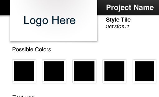
Let’s Make One
Talk is cheap, let’s see if we can actually use this process to come up with something valuable. If you want to start from scratch, great. But if you’re looking for a good starting point, be sure to download the free template from the Style Tiles website. Here’s what it looks like:
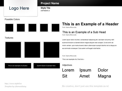
As you can see, there are several elements in place to help you get a feel for a general layout as well as the types of elements you should be thinking about at this phase of the design process. Note that there’s a very important piece of advice in the bottom right corner of this template: “Be creative, don’t just use this template as-is!”
It’s tempting to just run with what you’ve been given here but don’t let this tool impair your creativity, it’s actually meant to enhance it.
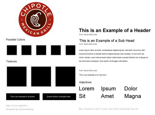
As a sample project, let’s create a Style Tile for my favorite burrito place: Chipotle. We’ll pretend that they either don’t have a site or are depending on us to create revised look.
Logo
The first step that we’ll take is to include a logo. Right off the bat we run into a need to change the template for our own purposes. The logo container above is rectangular and the Chipotle logo is round. Fortunately, the PSD template is very nicely organized so it’s easy enough for me to turn off all of the header elements and drop in our round logo.
Background
There’s no set order to follow for updating the elements, just bounce around from piece to piece as the ideas come to you. A logical next step for me was the background. Since Chipotle is a southwest style eatery I gave the background a sort of old world feel.
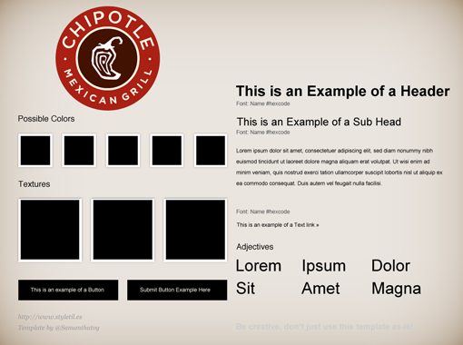
We’re only two steps in and we’ve already made a dramatic impact on the template. We can clearly see the style guide taking shape as a brand personality emerges.
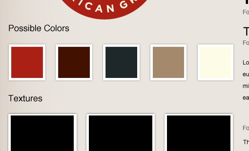
Colors
Now that we’ve got a logo and background in place, we can begin to see a bit of a color identity. I’ll take advantage of the existing color area to expand this into a full palette.
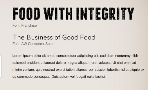
Typography
After the colors, I continue jumping around and land on the typography. I really like that the template not only gives you a place to set out some example type but also has little labels so you can make note of the fonts that you’re using.
The Finished Product
Pushing forward I just kept iterating and tweaking until I landed on something that I could consider a finished tile. Along the way I put the advice about changing the template to good use and completely reformatted the layout while keeping the sections that I found helpful. Here’s what I came up with:
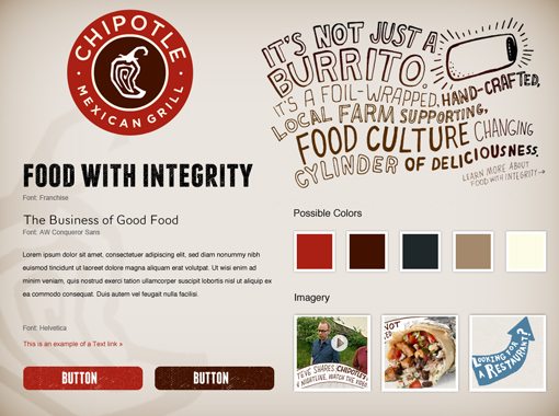
As you can see, it’s a far cry from the original template. I used the provided PSD as a launching point for my ideas, not a crutch. Now I have a solid basis from which to start when I begin to fuse layout and style together into a finished product.
Conclusion: A Breath of Fresh Air
Lately I’ve been fairly caught up with shiny new buzzwords like CSS3, HTML5 and responsive design. As a result I haven’t really dug into pure design in a while and exploring the usefulness of Style Tiles was just the reminder that I needed that this is where my true passion lies.
I absolutely loved having the freedom to develop a visual style without worrying about whether or not the home page should be a three or four column layout. It’s quite refreshing to be able to focus on specific parts of the design process without being intimidated or distracted by the greater scope of the entire project.
A huge thanks goes out to Samantha Warren for sharing her process and starting template. I think Style Tiles are going to be a very important part of my process from here on out.
Leave a comment below and let us know what you think. Do you use mood boards, wireframes or any other similar tools in your design process? Would the introduction of Style Tiles improve the way you work? We want to know!
Wireframe image courtesy of Joe Crawford.