Understanding Color: Dominant vs. Recessive Colors
Ever wonder why your colors don’t look quite right in some situations? It could be a simple as the color choice. Certain colors tend to take on the characteristics of other hues, while others always look pure. In addition, the human eye perceives color in different ways based on whether it is in the foreground or background.
This phenomenon can be explained through dominant and recessive colors. Join us as we take a closer look at these two terms today, and delve into deeper understanding of how they can guide your design choices and decisions.
Science Lesson

The terms dominant and recessive, when paired, are commonly linked to science and genetics.
From eye color to hair color to dimples, dominant and recessive genes determine much of how a person is built. In most cases each person has two copies of each gene – a pair from the mother and a pair from the father. Dominant genes such as brown eye color, trump recessive genes. Recessive genes do nothing and allow dominant genes to override them.
This same theory applies to much of nature as well when it comes to color and traits. Most animal colors are dictated by dominant and recessive genes, such as whether a dog is solid or spotted or a parakeet is blue, green or yellow.
The theory of color and light is a little more complex. Dominant color also defined by its wavelength in the color spectrum. Wavelengths of monochromatic (one color) light that remain unchanged with combined with achromatic light are dominant. Each color in the visible spectrum is assigned a chromatic strength as it relates to dominance. Dominant color values are assigned using a mathematical intensity distribution curve formula.
And it all relates to how we see and create color.
Dominant Color
A color that is dominant will hold its hue despite its surroundings. Many pure colors – think cyan, for example, will always add a bit of its own color with mixed or paired with other colors. No matter what other colors you put with a dominant color, the color will come through and remain somewhat visible.
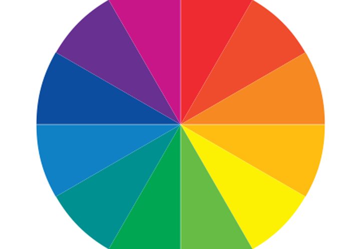
Dominant colors will always try to “push through” the design. This explains why some colors tend to be powerful while others fade quickly. Pure hues from the color wheel are innately dominant. Primary colors, though, are the most dominant (followed by secondary, then tertiary colors) because red, blue and yellow can’t be created by mixing other colors.
The eye also perceives dominant colors in the foreground of images and documents. This can occur even unintentionally if you try using a background based on dominant colors.
What Makes Color Dominant?

Color dominance can be established in several ways – use of color, strength of hue, sharpness, contrast and perception of color.
Use of Color
How color is used can also go a long way toward dominance. By simply using a lot of one color in a design project, it can become dominant. It could be said that a few colors are used more dominantly in design than others as well. Blue and red are widely used in design projects, for example, because of associations with those colors. (Blue relating to security, trust and reliability while red is connected to courage, speed and excitement.)

Strength of Hue
Strong, vibrant and saturated colors will push through almost any design scheme. Think of hues from named color categories – red, blue, green, cyan, magenta. Look at the strength of the red dress above; it is easily the most dominant color on the website. These colors are most dominant when used without tints, tones or shading.
Sharpness
Strong foregrounds will almost always make a color appear dominant because our eyes are trained to connect with the foreground of an image. Backgrounds that are blurred can also contribute to this. But what if the sharpest, most colorful part of the image is actually in the background? In most cases, that will be the point of greatest dominance.

Contrast
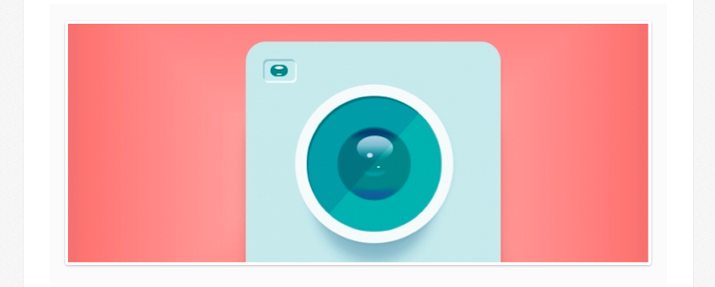
Combining colors with a lot of contrast – blue on a white background, for example, will magnify a color’s dominance. While dominant colors will come through almost anything, using them without a lot of “color clutter” will make them appear more intense. Conversely, if a color seems too strong, adding or mixing with with other colors can result in the “toning down” of a dominant color. In the image above, for example, blue is the dominant color. So much so that even the gray (recessive color) of the man’s beard picks up some of the blue tones.
Perception of Color
The way we see color also impacts how dominant a color is. By mixing light and dark hues or using large and small amounts of color, the perceived visual color mix can change. Colors with the strongest intensity, even when used in small amounts can be dominant. In addition, using multiple shades of the same hue can create a distinct sense of color dominance, especially when paired with a contrasting accent color.
Recessive Color

Simply, recessive color fades into the background. These colors – think lavender, pink or gray – take on the properties of surrounding color.
Recessive colors are often used for background images, as a “neutral” in a palette of color or to create emphasis for a focal point. Recessive colors are the blurry or muted tones behind the focal point of an image or the pattern that appears behind something you are supposed to look at.
Look at the subtle gray on this website – a perfect example of a recessive color. Notice in the header how it almost takes on a greenish look around the navigation bar?
Color Relationships
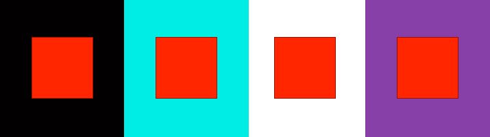
You’ve all played the game where you guess which colored square is bigger. You are presented with several colored squares inside other squares where the sizes and colors appear different, but in reality they are all the same size. Only the colors are different. That’s the principle behind the relationship between dominant and recessive color.
Now you have a feel for the relationship between dominant and recessive color, how do you use them?
By mixing it up.
While some may look at the idea behind recessive colors and see them as unnecessary, this is far from the case. Almost every good color palette contains a mix of dominant and recessive colors that create balance and work in an almost yin and yang fashion. A palette without recessive colors can be too bold and tiring for the eyes. A palette of only recessive colors can be perceived as bland and unexciting.
Conclusion
While understanding dominant and recessive colors can be a little confusing and inexact, it is a powerful tool for understanding visual focus.
Dominant colors will draw attention faster and are often at the center of visual focus in almost any design. Using dominant and recessive colors is helpful when creating a mood or emphasis. The biggest lesson is to understand that everything is a matter of perception – colors can be perceived in a variety of ways.
Image Sources: Qi Wei Fong, PuppiesAreProzac, Pedal South and Amanda Uprichard.