Ready or Not, Here Comes HD Web Design
Apple is pushing the tech industry forward by increasing the pixel density on iPhone and iPad screens. This is great from a user’s perspective, but as a web designer or developer it literally threatens to completely change the way you build websites.
Are you ready for HD web design? Do you know how your sites will look on a new generation of high resolution screens? What steps can you take to prepare yourself and what skills will you need to stay relevant in the years to come? Read on to find out.
When Apple Speaks, We Listen
I’ve been using Macs faithfully since the OS 9 days, not as long as some old timers but plenty long enough to drink the Kool-aid and become fully addicted to all things Apple.
I remember when seeing an Apple logo meant that the product was something of a niche, an outlier that only the stubborn individuals of society used in an overt attempt to go against main stream, Windows-loving culture.
Through an impressive transformation built on dedication to creating innovative next-gen products, the little underdog company has now become the most valuable corporation on the planet. There may not be a Mac on every desktop in America, but if you pick a house at random, odds are you’ll find at least one iPod, iPhone and/or iPad inside.
I’m not waxing eloquently in order to convert you to my cult, I simply want to establish that Apple is a mover and shaker in the tech industry. No one cared what new features the Newton came out with, but when Apple releases a new iOS device, the world stops and patiently listens to what the wizards at Infinite Loop are telling us the future will look like.
Apple Bets on High-Res

Until recently, Apple had nothing to do with our fascination with better screen resolution. Bigger and better HD televisions have been the focus of consumers and electronics companies for a decade. Clever marketing teamed up with impressive technology to create an insatiable thirst for high-def screens, cable programming and movies.
For the most part though, this trend has stayed away from computing. Sure, there are huge, gorgeous cinema displays but the pixel density was never such that it required a major paradigm shift. That is, until recently.
When the iPhone 4 dropped in mid 2010 it came with a surprise: the “Retina” screen, which blew us away by doubling the old resolution with an astounding 326 pixels per inch (for comparison, a 27″ iMac is 109ppi). This was a game changer. There was plenty of speculation that scaling this technology at an affordable rate would be nearly impossible, but Apple has done that very thing by also doubling the resolution on the third generation iPad, which comes in at a slightly lower but still gorgeous 264ppi.
Why This Completely Changes How You Do Your Job
So what? Thanks for the history lesson, but this is a design blog, right? Who cares about the pixel density of an iPad? As a web designer, you do, whether you know it yet or not.
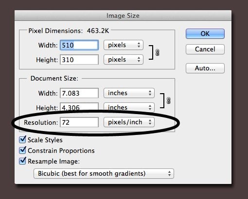
The problem is evident right here on this site as well as any other that you’ll visit today. Go ahead, grab an image from the web and open it in Photoshop. Now bring up the Image Size dialog. See anything interesting?
Web designers have always had a nice little advantage over print designers: we can use low resolution artwork. Why is it an advantage and not a disadvantage? Because high-res layered PSDs can slow your machine to a crawl, high-res stock photos cost far more money, high-res images take forever to load over the web; the list goes on and on.
The problem is clear though, that image above comes in at a mere 72ppi while the new iPad is 264ppi! (This is oversimplifying the argument a bit, read this article for more information on whether or not you’re actually viewing images at 72ppi.)
Think about what that means. Apple has retina displays on the full iOS line: iPod Touch, iPhone and iPad. This means that millions of people are browsing the web every day on high resolution screens that won’t properly display your images. Make no mistake, this trend will only get worse as other device manufacturers play catch up and Apple explores ways to bring more pixel density to the next obvious place: the laptop market.
What Can You Do?
The pixel density problem is an interesting one. The web represents so many different technologies coming together in harmony that it can be chaotic if one of these technologies runs ahead and upsets the balance.
We’re witnessing the emergence of higher resolution screens, but our content is only optimized for the old screens. Further, think about how crazy web developers are about page load times with low-res images, now imagine how much of a slow down you’d get on an image heavy site like Pinterest if it were suddenly filled with 326ppi images!
Pure HTML & CSS Web Elements
The good news is that we’ve been preparing for this in some ways for years and we didn’t even know it. The rise of CSS3 and HTML5 have really pushed forward the notion of cutting down on the number of images that we use in our markup.
These days most UI elements are rendered in the browser, which means they scale up just fine on any screen that you throw at them.
To illustrate, here’s what it looks like when I zoom in on an image-based download button on my iPhone 4.

Now, if I look at that same button built at the exact same pixel dimensions but rendered using CSS, I can zoom in as far as I want with zero image degradation.

It’s a beautiful thing is it not? The moral here is that the “imageless” trend has paid off in the long run and provided us with much less to worry about than we would’ve had retina screens hit back when we used images for gradients, shadows, rounded corners and pretty much any other advanced styling.
It’s important to note that objects rendered with HTML5 canvas and JavaScript can achieve similar scalability.
SVG
SVG, or Scalable Vector Graphics, are another important step on the road to resolution independence. This technology has been around for ages but has only recently seen cross-browser support with IE9 finally jumping on the bandwagon.
When I think of SVG I think of Adobe Illustrator. This app is primarily used for creating vector-based graphics with infinite scalability. In turn, SVG brings this same functionality to web graphics.
Almost anything you can build in Illustrator and other vector editing apps can be easily exported as an SVG file and implemented on the web as a scalable object.
The advantage here over CSS seems fuzzy at first but becomes clear when you’re working with complex images. It’s easy to create simple buttons with CSS but when it comes to building say, the Starbucks logo, things get really messy and complicated.
As an alternative to hours and hours of CSS fiddling and perhaps hundreds of lines of code for a single object (assuming it’s even possible with CSS), you could just export a vector version of the Starbucks logo as an SVG and embed it into your web page in only a minute or two! Click here to see a live example of this. Be sure to zoom in with Command+ and watch how the image scales perfectly.
To learn more about how to implement SVG in your site, check out these great resources:
- Resolution Independence With SVG
- Using SVG For Flexible, Scalable, and Fun Backgrounds, Part I
- Playing With SVG Design
But What About Photos?

This is all well and good, but given that we’ve been tackling imageless web design with UI for so long, it’s not really that much of a curve ball to take things a little further with SVG. The real problem lies in photos on the web.
Photos are raster images and as such they simply crush the dream of truly resolution independent web design. No matter what we pull out of our bag of web design tricks, we can’t get around this limitation.
For now, this means serving up different images to different devices. This sucks, but you don’t want to make non-retina screens load in those huge images and you don’t want to serve up sucky images to the retina screens, so this is your only solution.
This can be accomplished through media queries and the device-pixel-ratio feature. As an example, Hal Gatewood shows us how we can target the third generation iPad:
@media only screen and (min-device-width: 1536px) and (max-device-width: 2048px) and (-webkit-min-device-pixel-ratio: 2){
	div {background: url('biggerphoto.jpg');}
}
What About HTML Embedded Images?
The method above is all well and great, but it only works with CSS background images. What if you want to embed an image using HTML? Even further, this has drastic implications for video as well, so how can you serve up custom videos to high ppi screens?
Unfortunately, there’s no real answer using pure HTML. Perhaps the need will become so great that we’ll see something like this in the future, but for now, you’re out of luck.
The only solution is to turn to something more powerful like JavaScript. Bdoran.co.uk has a quick example of how to detect the iPhone 4 with JavaScript or PHP that you should check out.
This obviously presents huge problems though for web designers who try to stick with HTML and CSS and aren’t familiar with JavaScript and other advanced web technologies. Suddenly, this group can’t even present simple content in a way that is optimized for viewing on most devices.
Conclusion
It doesn’t matter if you love Apple or absolutely hate everything they stand for, the reality is that if you’re a web designer, the rise of the retina display is going to kickstart a trend that will fundamentally change the way you build websites.
At this point in time we have a few courses of action to explore: HTML5 canvas, JavaScript, CSS3, SVG, and media queries together comprise your arsenal of weapons with which to attack the problem of your content being viewed at upwards of 264ppi.
Hopefully in the near future we’ll see more robust options pop up for serving up different HTML-embedded images and video to the correct devices.
Leave a comment below and let us know your thoughts on all this. Are you excited by the new possibilities or intimidated by the uncertain territory? Will you start optimizing your work for retina screens any time soon? Have you done so already?